Benvenuto nelle Font Più Popolari — dove popolarità e qualità si incontrano. Qui trovi i font più scaricati e usati dell'anno. Se cerchi scelte sicure per logo, web o social, inizia da qui.
Ogni font top si distingue per equilibrio, leggibilità e versatilità. Troverai sans serif moderne, script eleganti, serif vintage e display minimalisti.
-
( Fonts by Daniel Zadorozny - www.iconian.com - Free for personal use )
A bold, playful font with rounded, hand-drawn characters.
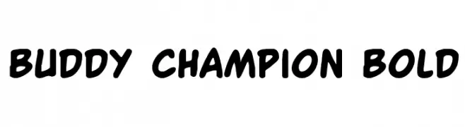 Scaricare 3428 Downloads@WebFont
 -
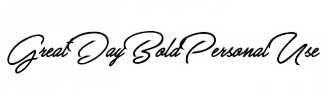
( Fonts by Billy Argel - www.billyargel.com - Personal-use only. For commercial use please contact owner. )
A bold, dynamic script font with fluid, connected letterforms and elegant curves.
![Great Day Bold Personal Use font caratteri gratis]() Scaricare 3427 Downloads@WebFont
Scaricare 3427 Downloads@WebFont -
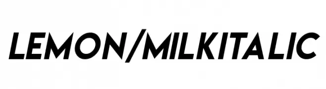
( Fonts by Ariq Sya - marsnev.com - Personal-use only. For commercial use please contact owner. )
A bold, italicized font with a modern and dynamic style.
![Lemon/Milk italic font caratteri gratis]() Scaricare 3426 Downloads@WebFont
Scaricare 3426 Downloads@WebFont -
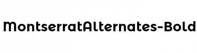
( Copyright (c) 2011-2012, Julieta Ulanovsky (julieta.ulanovsky@gmail.com), with Reserved Font Names 'Montserrat' )
A bold, modern sans-serif font with geometric structure and clean lines.
![MontserratAlternates-Bold font caratteri gratis]() Scaricare 3425 Downloads@WebFont
Scaricare 3425 Downloads@WebFont -
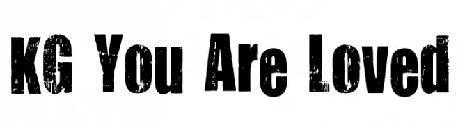
( Fonts by www.kimberlygeswein.com - Kimberly Geswein )
A bold, distressed font with a rugged, vintage feel.
![KG You Are Loved font caratteri gratis]() Scaricare 3422 Downloads@WebFont
Scaricare 3422 Downloads@WebFont -
-
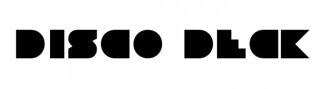
( Fonts by Daniel Zadorozny - www.iconian.com )
A bold, geometric font with a retro disco vibe.
![Disco Deck font caratteri gratis]() Scaricare 3420 Downloads@WebFont
Scaricare 3420 Downloads@WebFont -
( Fonts by www.norfok.com - Norfok® Incredible Font Design - Thomas W. Otto )
A bold, hand-drawn font with a jagged, horror-inspired style.
![Friday13 font caratteri gratis]() Scaricare 3419 Downloads@WebFont
Scaricare 3419 Downloads@WebFont -
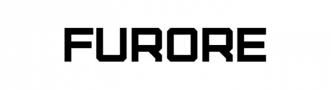
( Fonts by Jovanny Lemonad )
A bold, geometric font with a modern, industrial aesthetic.
![Furore font caratteri gratis]() Scaricare 3417 Downloads@WebFont
Scaricare 3417 Downloads@WebFont -
![Nora font caratteri gratis]() Scaricare 3417 Downloads@WebFont
Scaricare 3417 Downloads@WebFont -
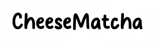
( Fonts by MJType )
A playful, rounded font with bold, smooth curves and a friendly vibe.
![Cheese Matcha font caratteri gratis]() Scaricare 3416 Downloads@WebFont
Scaricare 3416 Downloads@WebFont -
( Fonts by Raymond Larabie - Personal-use only. For commercial use please contact owner. )
A bold, modern font with thick, uniform strokes and a strong, structured appearance.
![VanchromeFront-Regular font caratteri gratis]() Scaricare 3416 Downloads@WebFont
Scaricare 3416 Downloads@WebFont -
( Fonts by a kmzero font foundry - www.zetafonts.com. Personal-use only. For commercial use please contact owner. )
A clean, geometric sans-serif font with a modern and minimalist style.
![COCOMAT Light font caratteri gratis]() Scaricare 3416 Downloads@WebFont
Scaricare 3416 Downloads@WebFont -
( Fonts by Creativework69 Studio )
A bold, playful handwritten font with smooth, rounded characters.
![$CRAZYRICH$ font caratteri gratis]() Scaricare 3415 Downloads@WebFont
Scaricare 3415 Downloads@WebFont -
Caratteri di NicholasJudy456. For commercial use please contact the owner.
( Here's More of the House Fonts )
A bold, hand-drawn font with an expressive, graffiti-like style.
![Ashyhouse font caratteri gratis]() Scaricare 3415 Downloads@WebFont
Scaricare 3415 Downloads@WebFont -
( Fonts by a Situjuh Nazara - c7n1.wordpress.com. Personal-use only. For commercial use please contact owner. )
A bold, geometric sans-serif font with a modern and impactful style.
![GRATIS font caratteri gratis]() Scaricare 3415 Downloads@WebFont
Scaricare 3415 Downloads@WebFont -
( Fonts by Castcraft Software - opti.netii.net - check the website before use )
A bold, classic serif font with strong strokes and sharp serifs.
![OPTIBerlingBold-Agency font caratteri gratis]() Scaricare 3415 Downloads@WebFont
Scaricare 3415 Downloads@WebFont -
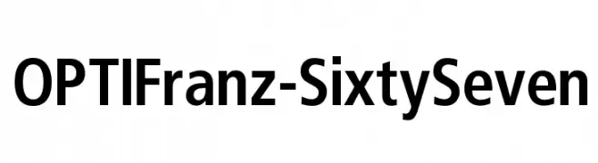
( Fonts by Castcraft Software - opti.netii.net - check the website before use )
A bold, modern sans-serif font with a slightly condensed style.
![OPTIFranz-SixtySeven font caratteri gratis]() Scaricare 3415 Downloads@WebFont
Scaricare 3415 Downloads@WebFont -
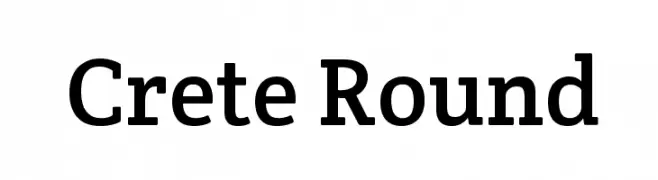
( Copyright (c) 2011, TypeTogether (www.type-together.com) )
A classic serif font with rounded edges, blending traditional and modern styles.
![Crete Round font caratteri gratis]() Scaricare 3414 Downloads@WebFont
Scaricare 3414 Downloads@WebFont -
![Alexandria font caratteri gratis]() Scaricare 3414 Downloads
Scaricare 3414 Downloads -
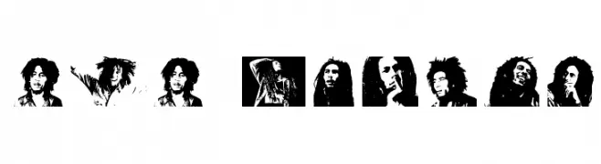
![BOB MARLEY font caratteri gratis]() Scaricare 3413 Downloads@WebFont
Scaricare 3413 Downloads@WebFont -
( Fonts by Castcraft Software - opti.netii.net - check the website before use )
A bold, modern font with thick, uniform strokes for a strong visual impact.
![OPTIEnraged-BoldAD font caratteri gratis]() Scaricare 3411 Downloads@WebFont
Scaricare 3411 Downloads@WebFont -
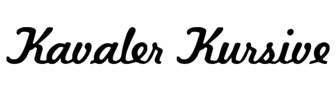
( Fonts by DeNada Industries - Mike Allard )
A flowing, cursive font with smooth, rounded edges and a dynamic slant.
![Kavaler Kursive font caratteri gratis]() Scaricare 3411 Downloads@WebFont
Scaricare 3411 Downloads@WebFont -
![Marston font caratteri gratis]() Scaricare 3410 Downloads@WebFont
Scaricare 3410 Downloads@WebFont -
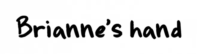
( Fonts by Jeni Hopewell )
A bold, playful handwritten font with a casual and friendly style.
![Brianne's hand font caratteri gratis]() Scaricare 3410 Downloads@WebFont
Scaricare 3410 Downloads@WebFont -
( Fonts by AJ Palmer )
A bold, playful font with rounded, thick strokes and a casual, friendly vibe.
![Casual font caratteri gratis]() Scaricare 3410 Downloads@WebFont
Scaricare 3410 Downloads@WebFont -
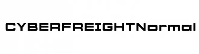
( Jamie Ferrato - jamieferrato.design )
A bold, futuristic font with a geometric and modern design.
![CYBER FREIGHT Normal font caratteri gratis]() Scaricare 3409 Downloads@WebFont
Scaricare 3409 Downloads@WebFont -
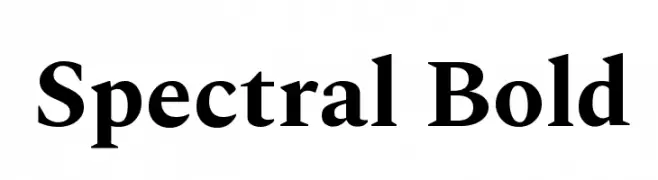
( Copyright 2017 The Spectral Project Authors (http://github.com/productiontype/spectral) )
A bold serif font with a classic yet modern style, ideal for impactful designs.
![Spectral Bold font caratteri gratis]() Scaricare 3408 Downloads@WebFont
Scaricare 3408 Downloads@WebFont -
![EOne font caratteri gratis]() Scaricare 3407 Downloads@WebFont
Scaricare 3407 Downloads@WebFont -
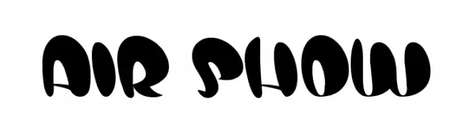
( fontm.com/author/weknow/ )
A bold, playful font with a rounded, cartoon-like style.
![air show font caratteri gratis]() Scaricare 3407 Downloads@WebFont
Scaricare 3407 Downloads@WebFont -
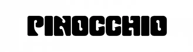
( Fonts by Dieter Steffmann )
A bold, geometric font with rounded edges and minimal contrast.
![Pinocchio font caratteri gratis]() Scaricare 3407 Downloads@WebFont
Scaricare 3407 Downloads@WebFont -
![101! Awards Won font caratteri gratis]() Scaricare 3407 Downloads@WebFont
Scaricare 3407 Downloads@WebFont -
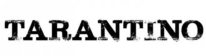
( www.hypefonts.com )
A bold, distressed font with a vintage, rugged appearance.
![Tarantino font caratteri gratis]() Scaricare 3405 Downloads@WebFont
Scaricare 3405 Downloads@WebFont -
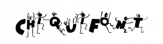
![ChiquiFont font caratteri gratis]() Scaricare 3404 Downloads@WebFont
Scaricare 3404 Downloads@WebFont -
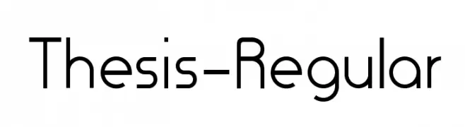
( Fonts by Robert A. Paauwe - www.revolge.com/shop/artificers/ - Personal-use only. For commercial use please contact owner. )
A modern, geometric sans-serif font with clean lines and uniform strokes.
![Thesis-Regular font caratteri gratis]() Scaricare 3403 Downloads@WebFont
Scaricare 3403 Downloads@WebFont -
![KenyanCoffee-Regular font caratteri gratis]() Scaricare 3403 Downloads@WebFont
Scaricare 3403 Downloads@WebFont


Quali sono i font più popolari adesso?
Poppins, Roboto, Montserrat, Open Sans e Lato sono molto usati per le forme pulite e l'ampia applicabilità — dall'identità di marca alle landing page e ai poster.
Quali font si usano spesso nei loghi?
Le sans serif geometriche (es. Poppins, famiglie in stile Gotham) sono scelte comuni per un branding pulito e scalabile. Per un tocco personale restano valide script e stili manoscritti. Abbina un display deciso per i titoli a un corpo testo neutro per riconoscibilità ed equilibrio.
Ogni quanto si aggiorna la lista?
Con regolarità, in base ai download e all'attività reale. Torna spesso per scoprire in anticipo le nuove preferite.
💡 Consiglio: aggiungi ai preferiti — le tendenze cambiano in fretta e i font top di oggi possono ispirare il rebranding di domani.