Benvenuto nelle Font Più Popolari — dove popolarità e qualità si incontrano. Qui trovi i font più scaricati e usati dell'anno. Se cerchi scelte sicure per logo, web o social, inizia da qui.
Ogni font top si distingue per equilibrio, leggibilità e versatilità. Troverai sans serif moderne, script eleganti, serif vintage e display minimalisti.
-
 Scaricare 233 Downloads@WebFont
 -
( Fonts by Daniel Zadorozny - www.iconian.com - Personal-use only. For commercial use please contact owner. )
A bold, italic font with sharp angles and a dynamic, geometric style.
![National Express Super-Italic font caratteri gratis]() Scaricare 233 Downloads@WebFont
Scaricare 233 Downloads@WebFont -
( Fonts by MCKL )
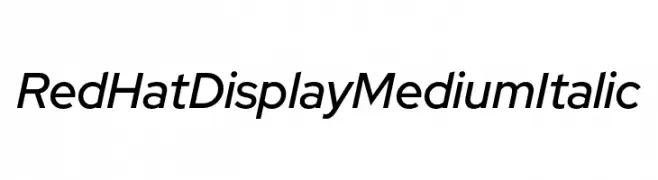
A modern, italic sans-serif font with medium weight and low contrast.
![Red Hat Display Medium Italic font caratteri gratis]() Scaricare 233 Downloads@WebFont
Scaricare 233 Downloads@WebFont -
( Fonts by Ramiro Baldivieso )
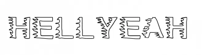
A bold, decorative font with jagged outlines and a dynamic, energetic style.
![HellYeah font caratteri gratis]() Scaricare 233 Downloads@WebFont
Scaricare 233 Downloads@WebFont -
( Fonts by wep - Wahyu Eka Prasetya - Personal-use only. For commercial use please contact owner. )
A playful, handwritten-style font with bold, irregular strokes.
![Ablasco font caratteri gratis]() Scaricare 233 Downloads@WebFont
Scaricare 233 Downloads@WebFont -
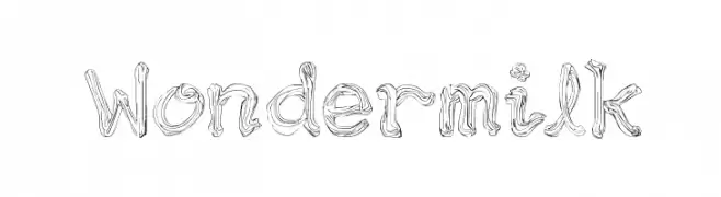
-
![Wondermilk font caratteri gratis]() Scaricare 233 Downloads@WebFont
Scaricare 233 Downloads@WebFont -
( Fonts by www.paintblackeditions.org )
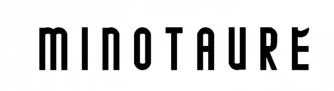
A bold, geometric font with a modern and impactful design.
![MINOTAURE font caratteri gratis]() Scaricare 233 Downloads@WebFont
Scaricare 233 Downloads@WebFont -
( Fonts by Daniel Zadorozny - www.iconian.com )
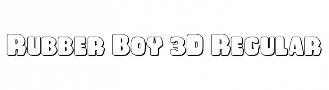
A bold, playful 3D font with a puffy, cartoonish style and prominent outlines.
![Rubber Boy 3D Regular font caratteri gratis]() Scaricare 233 Downloads@WebFont
Scaricare 233 Downloads@WebFont -
( Fonts by TarmSaft Font Factory - http://www.aska.nu/tarmsaft/ )
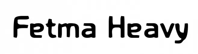
A bold, playful font with thick, rounded characters and a friendly appearance.
![Fetma Heavy font caratteri gratis]() Scaricare 233 Downloads@WebFont
Scaricare 233 Downloads@WebFont -
( Fonts by appligraphe )
A playful, bold font with screw-like design elements and rounded edges.
![screwround font caratteri gratis]() Scaricare 233 Downloads@WebFont
Scaricare 233 Downloads@WebFont -
![Rlfs V3 Regular font caratteri gratis]() Scaricare 233 Downloads@WebFont
Scaricare 233 Downloads@WebFont -
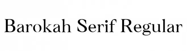
( Fonts by Alifinart Studio - Personal-use only. For commercial use please contact owner. )
A classic serif font with elegant strokes and pronounced serifs.
![Barokah Serif Regular font caratteri gratis]() Scaricare 233 Downloads@WebFont
Scaricare 233 Downloads@WebFont -
![Strange Brew font caratteri gratis]() Scaricare 233 Downloads@WebFont
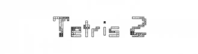
Scaricare 233 Downloads@WebFont -
![Tetris 2 font caratteri gratis]() Scaricare 233 Downloads@WebFont
Scaricare 233 Downloads@WebFont -
( Fonts by Apostrophic Lab )
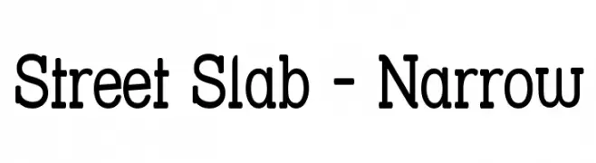
A bold, narrow slab serif font with a modern yet slightly vintage style.
![Street Slab - Narrow font caratteri gratis]() Scaricare 233 Downloads@WebFont
Scaricare 233 Downloads@WebFont -
( Paul Lloyd Fonts )
A bold, modern font with characters enclosed in squares, offering a unique geometric style.
![Chancera Bold font caratteri gratis]() Scaricare 233 Downloads
Scaricare 233 Downloads -
( Fonts by Alex Tomlinson - Skyhaven Fonts - shfonts.com )
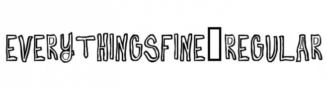
A playful, hand-drawn font with bold, sketch-like characters.
![EverythingsFine-Regular font caratteri gratis]() Scaricare 233 Downloads@WebFont
Scaricare 233 Downloads@WebFont -
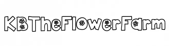
![KBTheFlowerFarm font caratteri gratis]() Scaricare 233 Downloads@WebFont
Scaricare 233 Downloads@WebFont -
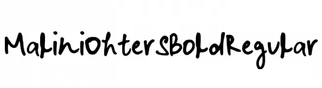
![Malini Ohter S Bold Regular font caratteri gratis]() Scaricare 233 Downloads@WebFont
Scaricare 233 Downloads@WebFont -
![Irnafont_2 font caratteri gratis]() Scaricare 233 Downloads@WebFont
Scaricare 233 Downloads@WebFont -
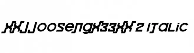
![xxjjoosengx33xx 2 Italic font caratteri gratis]() Scaricare 233 Downloads@WebFont
Scaricare 233 Downloads@WebFont -
( Fonts by www.woodcutter.es - woodcutter Manero - Personal-use only. For commercial use please contact owner. )
A bold, outlined collegiate-style font with a strong, impactful presence.
![Street College font caratteri gratis]() Scaricare 233 Downloads@WebFont
Scaricare 233 Downloads@WebFont -
( www.typedifferent.com/ )
A decorative font with intricate patterns and bold strokes, inspired by traditional Japanese art and modern graffiti.
![BDHiraganaKuro font caratteri gratis]() Scaricare 233 Downloads@WebFont
Scaricare 233 Downloads@WebFont -
![Atmosphere Light font caratteri gratis]() Scaricare 233 Downloads@WebFont
Scaricare 233 Downloads@WebFont -
( Fonts by Vladimir Nikolic - www.creativefabrica.com/designer/vladimirnikolic/ - Personal-use only. For commercial use please contact owner. )
A bold, geometric font with a modern, futuristic style.
![Gorwel Regular font caratteri gratis]() Scaricare 233 Downloads@WebFont
Scaricare 233 Downloads@WebFont -
![HandNegativ font caratteri gratis]() Scaricare 233 Downloads@WebFont
Scaricare 233 Downloads@WebFont -
( Shareware - new.myfonts.com/foundry/Intellecta_Design/?refby=paulow )
An elegant, cursive script font with flowing, connected strokes.
![ClosetoYou font caratteri gratis]() Scaricare 233 Downloads@WebFont
Scaricare 233 Downloads@WebFont -
![Telegraphic Bold Italic font caratteri gratis]() Scaricare 233 Downloads@WebFont
Scaricare 233 Downloads@WebFont -
( Fonts by www.aenigmafonts.com )
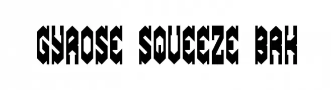
A bold, geometric font with sharp angles and a futuristic look.
![Gyrose Squeeze BRK font caratteri gratis]() Scaricare 233 Downloads@WebFont
Scaricare 233 Downloads@WebFont -
( Fonts by Origin Type )
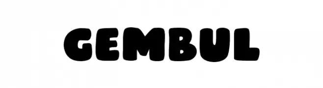
A bold, rounded font with a playful and chunky style.
![Gembul font caratteri gratis]() Scaricare 233 Downloads@WebFont
Scaricare 233 Downloads@WebFont -
( Fonts by Daniel Zadorozny - www.iconian.com - Free for personal use )
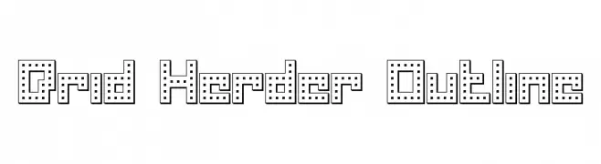
A bold, outlined font with a dotted interior pattern, offering a modern and playful look.
![Drid Herder Outline font caratteri gratis]() Scaricare 233 Downloads@WebFont
Scaricare 233 Downloads@WebFont -
( StudioSpectre - Ryan Brotherston - fontstruct.com/fontstructors/rilencavy/public )
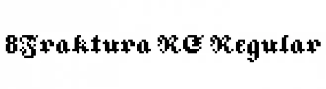
A bold, pixelated blackletter-style font with a digital retro feel.
![8Fraktura RC Regular font caratteri gratis]() Scaricare 233 Downloads@WebFont
Scaricare 233 Downloads@WebFont -
( Fonts by Arkandis Digital Foundry )
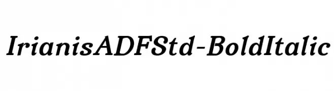
A bold, italic serif font with a modern and elegant style.
![IrianisADFStd-BoldItalic font caratteri gratis]() Scaricare 233 Downloads@WebFont
Scaricare 233 Downloads@WebFont -
( Fonts by Dieter Steffmann )
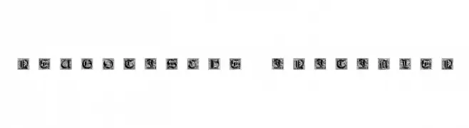
Ornate Gothic-style initials with intricate details.
![Neugotische Initialen font caratteri gratis]() Scaricare 233 Downloads@WebFont
Scaricare 233 Downloads@WebFont -
( Fonts by da_only_aan )
A playful, bold font with droplet-like decorative elements.
![Drops font caratteri gratis]() Scaricare 233 Downloads@WebFont
Scaricare 233 Downloads@WebFont


Quali sono i font più popolari adesso?
Poppins, Roboto, Montserrat, Open Sans e Lato sono molto usati per le forme pulite e l'ampia applicabilità — dall'identità di marca alle landing page e ai poster.
Quali font si usano spesso nei loghi?
Le sans serif geometriche (es. Poppins, famiglie in stile Gotham) sono scelte comuni per un branding pulito e scalabile. Per un tocco personale restano valide script e stili manoscritti. Abbina un display deciso per i titoli a un corpo testo neutro per riconoscibilità ed equilibrio.
Ogni quanto si aggiorna la lista?
Con regolarità, in base ai download e all'attività reale. Torna spesso per scoprire in anticipo le nuove preferite.
💡 Consiglio: aggiungi ai preferiti — le tendenze cambiano in fretta e i font top di oggi possono ispirare il rebranding di domani.