Benvenuto nelle Font Più Popolari — dove popolarità e qualità si incontrano. Qui trovi i font più scaricati e usati dell'anno. Se cerchi scelte sicure per logo, web o social, inizia da qui.
Ogni font top si distingue per equilibrio, leggibilità e versatilità. Troverai sans serif moderne, script eleganti, serif vintage e display minimalisti.
-
 Scaricare 1042 Downloads@WebFont
 -
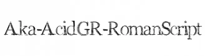
( Fonts by www.aka-acid.com )
A sketch-like, hand-drawn font with textured, artistic strokes.
![Aka-AcidGR-RomanScript font caratteri gratis]() Scaricare 1042 Downloads@WebFont
Scaricare 1042 Downloads@WebFont -
![AGA Cordoba V2 B17[] font caratteri gratis]() Scaricare 1042 Downloads@WebFont
Scaricare 1042 Downloads@WebFont -
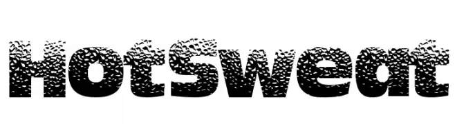
( Fonts by a Max Infeld - XEROGRAPHER FONTS - xerographer.blogspot.com . Personal-use only. For commercial use please contact owner. )
A bold, textured font with a speckled pattern and strong presence.
![HotSweat font caratteri gratis]() Scaricare 1042 Downloads@WebFont
Scaricare 1042 Downloads@WebFont -
Caratteri di JuanCasco. For commercial use please contact the owner.
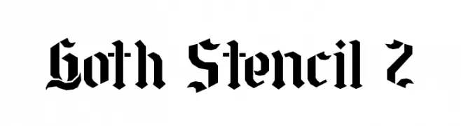
( Fonts by Juan Casco - www.juancasco.net )
A bold, gothic-inspired stencil font with sharp, angular lines and a medieval flair.
![Goth Stencil 2 font caratteri gratis]() Scaricare 1042 Downloads@WebFont
Scaricare 1042 Downloads@WebFont -
-
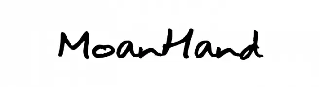
( Fonts by joeBob graff-X )
A casual, handwritten font with fluid and organic strokes.
![MoanHand font caratteri gratis]() Scaricare 1042 Downloads@WebFont
Scaricare 1042 Downloads@WebFont -
![Agent 'C' font caratteri gratis]() Scaricare 1042 Downloads@WebFont
Scaricare 1042 Downloads@WebFont -
( Fonts by Graham Meade - GemFonts )
A bold, modern font with a geometric and slightly condensed style.
![Ardour GM font caratteri gratis]() Scaricare 1042 Downloads@WebFont
Scaricare 1042 Downloads@WebFont -
( Fonts by Alpaprana Studio )
Playful handwritten font with rounded edges.
![Scout font caratteri gratis]() Scaricare 1041 Downloads@WebFont
Scaricare 1041 Downloads@WebFont -
( Fonts by Anton Chernogorov - Personal-use only. For commercial use please contact owner. )
A tall, narrow font with a modern and sleek design.
![Highliner font caratteri gratis]() Scaricare 1041 Downloads@WebFont
Scaricare 1041 Downloads@WebFont
![AGA Cordoba V2 B17[] font caratteri gratis](https://d144mzi0q5mijx.cloudfront.net/img/A/G/AGA-Cordoba-V2-B17.webp)


Quali sono i font più popolari adesso?
Poppins, Roboto, Montserrat, Open Sans e Lato sono molto usati per le forme pulite e l'ampia applicabilità — dall'identità di marca alle landing page e ai poster.
Quali font si usano spesso nei loghi?
Le sans serif geometriche (es. Poppins, famiglie in stile Gotham) sono scelte comuni per un branding pulito e scalabile. Per un tocco personale restano valide script e stili manoscritti. Abbina un display deciso per i titoli a un corpo testo neutro per riconoscibilità ed equilibrio.
Ogni quanto si aggiorna la lista?
Con regolarità, in base ai download e all'attività reale. Torna spesso per scoprire in anticipo le nuove preferite.
💡 Consiglio: aggiungi ai preferiti — le tendenze cambiano in fretta e i font top di oggi possono ispirare il rebranding di domani.