Benvenuto nelle Font Più Popolari — dove popolarità e qualità si incontrano. Qui trovi i font più scaricati e usati dell'anno. Se cerchi scelte sicure per logo, web o social, inizia da qui.
Ogni font top si distingue per equilibrio, leggibilità e versatilità. Troverai sans serif moderne, script eleganti, serif vintage e display minimalisti.
-
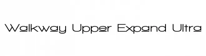
( Fonts by Graham Meade - GemFonts )
A modern, expanded font with clean, geometric lines and a professional appearance.
 Scaricare 1040 Downloads@WebFont
 -
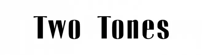
( Fonts by Emeralda Noor Achni Halilintar - emeraldanoorachni.tk )
A bold, two-tone font with striking contrast and modern elegance.
![Two Tones font caratteri gratis]() Scaricare 1040 Downloads@WebFont
Scaricare 1040 Downloads@WebFont -
![Julius font caratteri gratis]() Scaricare 1040 Downloads@WebFont
Scaricare 1040 Downloads@WebFont -
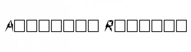
( Fonts by David Rakowski )
A bold, jagged font with sharp, dynamic angles and an energetic appearance.
![Aarcover Regular font caratteri gratis]() Scaricare 1040 Downloads@WebFont
Scaricare 1040 Downloads@WebFont -
( Fonts by Dieter Steffmann )
A playful, handwritten font with fluid and organic strokes.
![Hansa font caratteri gratis]() Scaricare 1040 Downloads@WebFont
Scaricare 1040 Downloads@WebFont -
-
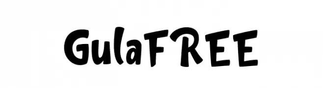
( Fonts by InspiraType )
A playful, bold, and hand-drawn font with a whimsical and energetic style.
![GulaFREE font caratteri gratis]() Scaricare 1039 Downloads@WebFont
Scaricare 1039 Downloads@WebFont -
( Copyright (c) 2012, Impallari Type (www.impallari.com). )
A modern, semi-bold sans-serif font with a clean and balanced design.
![Amiko SemiBold font caratteri gratis]() Scaricare 1039 Downloads@WebFont
Scaricare 1039 Downloads@WebFont -
( Fonts by Kimberly Geswein )
A playful and casual script font with flowing, connected letters and smooth, rounded strokes.
![KG Satisfied Script font caratteri gratis]() Scaricare 1039 Downloads@WebFont
Scaricare 1039 Downloads@WebFont -
( Copyright (c) 2012, vernon adams (vern@newtypography.co.uk), with Reserved Font Name 'BenchNine'. )
A modern, clean sans-serif font with a slightly condensed style.
![BenchNine Regular font caratteri gratis]() Scaricare 1039 Downloads@WebFont
Scaricare 1039 Downloads@WebFont -
( Fonts by www.kimberlygeswein.com - Kimberly Geswein )
A playful, rounded font with a whimsical and friendly appearance.
![Janda Closer To Free font caratteri gratis]() Scaricare 1039 Downloads@WebFont
Scaricare 1039 Downloads@WebFont


Quali sono i font più popolari adesso?
Poppins, Roboto, Montserrat, Open Sans e Lato sono molto usati per le forme pulite e l'ampia applicabilità — dall'identità di marca alle landing page e ai poster.
Quali font si usano spesso nei loghi?
Le sans serif geometriche (es. Poppins, famiglie in stile Gotham) sono scelte comuni per un branding pulito e scalabile. Per un tocco personale restano valide script e stili manoscritti. Abbina un display deciso per i titoli a un corpo testo neutro per riconoscibilità ed equilibrio.
Ogni quanto si aggiorna la lista?
Con regolarità, in base ai download e all'attività reale. Torna spesso per scoprire in anticipo le nuove preferite.
💡 Consiglio: aggiungi ai preferiti — le tendenze cambiano in fretta e i font top di oggi possono ispirare il rebranding di domani.