Benvenuto nelle Font Più Popolari — dove popolarità e qualità si incontrano. Qui trovi i font più scaricati e usati dell'anno. Se cerchi scelte sicure per logo, web o social, inizia da qui.
Ogni font top si distingue per equilibrio, leggibilità e versatilità. Troverai sans serif moderne, script eleganti, serif vintage e display minimalisti.
-
( Fonts by HungLan Design - www.hunglandesign.com )
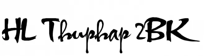
A dynamic, calligraphic font with bold, sweeping strokes and a modern flair.
 Scaricare 1039 Downloads@WebFont
 -
( Fonts by David Kerkhoff - www.hanodedphotography.com )
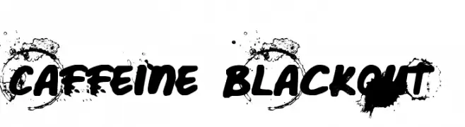
A bold, grungy font with a splattered ink appearance.
![Caffeine Blackout font caratteri gratis]() Scaricare 1039 Downloads@WebFont
Scaricare 1039 Downloads@WebFont -
( Fonts by Rick Mueller )
A bold, retro font with playful curves and a 1960s vibe.
![Sixties font caratteri gratis]() Scaricare 1039 Downloads@WebFont
Scaricare 1039 Downloads@WebFont -
( Fonts by ShyFonts )
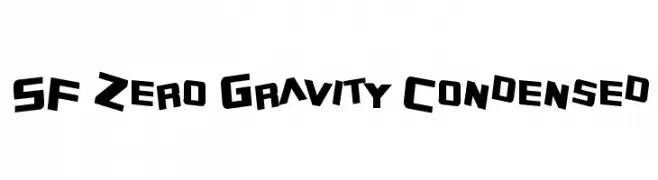
A bold, geometric, and dynamic font with a futuristic style.
![SF Zero Gravity Condensed font caratteri gratis]() Scaricare 1039 Downloads@WebFont
Scaricare 1039 Downloads@WebFont -
![game powerRegular font caratteri gratis]() Scaricare 1039 Downloads@WebFont
Scaricare 1039 Downloads@WebFont -
-
( Fonts by ShyFonts )
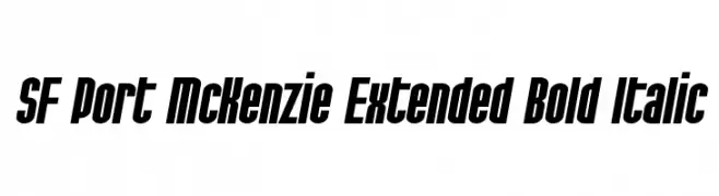
A bold, italicized, extended font with high contrast and a modern, dynamic style.
![SF Port McKenzie Extended Bold Italic font caratteri gratis]() Scaricare 1039 Downloads@WebFont
Scaricare 1039 Downloads@WebFont -
( Fonts by Khurasan )
A playful, bold font with rounded, hand-drawn characters.
![No Virus font caratteri gratis]() Scaricare 1038 Downloads@WebFont
Scaricare 1038 Downloads@WebFont -
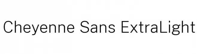
( Fonts by Cristiano Sobral - Personal-use only. For commercial use please contact owner. )
A clean, modern sans-serif font with an extra light weight and high legibility.
![Cheyenne Sans ExtraLight font caratteri gratis]() Scaricare 1038 Downloads@WebFont
Scaricare 1038 Downloads@WebFont -
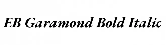
( Copyright 2017 The EB Garamond Project Authors (https://github.com/octaviopardo/EBGaramond12) )
A bold, italic serif font with a classic and elegant style.
![EB Garamond Bold Italic font caratteri gratis]() Scaricare 1038 Downloads@WebFont
Scaricare 1038 Downloads@WebFont -
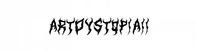
( Fonts by Art Dystopia )
A bold, gothic-inspired font with sharp, intricate details.
![ArtDystopiaII font caratteri gratis]() Scaricare 1038 Downloads@WebFont
Scaricare 1038 Downloads@WebFont


Quali sono i font più popolari adesso?
Poppins, Roboto, Montserrat, Open Sans e Lato sono molto usati per le forme pulite e l'ampia applicabilità — dall'identità di marca alle landing page e ai poster.
Quali font si usano spesso nei loghi?
Le sans serif geometriche (es. Poppins, famiglie in stile Gotham) sono scelte comuni per un branding pulito e scalabile. Per un tocco personale restano valide script e stili manoscritti. Abbina un display deciso per i titoli a un corpo testo neutro per riconoscibilità ed equilibrio.
Ogni quanto si aggiorna la lista?
Con regolarità, in base ai download e all'attività reale. Torna spesso per scoprire in anticipo le nuove preferite.
💡 Consiglio: aggiungi ai preferiti — le tendenze cambiano in fretta e i font top di oggi possono ispirare il rebranding di domani.