Benvenuto nelle Font Più Popolari — dove popolarità e qualità si incontrano. Qui trovi i font più scaricati e usati dell'anno. Se cerchi scelte sicure per logo, web o social, inizia da qui.
Ogni font top si distingue per equilibrio, leggibilità e versatilità. Troverai sans serif moderne, script eleganti, serif vintage e display minimalisti.
-
 Scaricare 1038 Downloads@WebFont
 -
( THESE ARE SHAREWARE FONTS ! NOT FREEWARE ! PLEASE VISIT www.fuelfonts.com )
A bold, geometric font with strong, squared-off edges for impactful display use.
![Veruca Black font caratteri gratis]() Scaricare 1038 Downloads@WebFont
Scaricare 1038 Downloads@WebFont -
( Fonts by Buddha Graphix - buddha.graphix.dk/fonts.html )
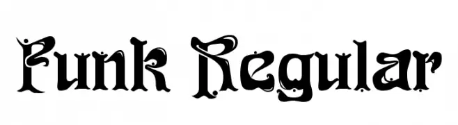
A bold, decorative font with whimsical swirls and dots, ideal for creative projects.
![Funk Regular font caratteri gratis]() Scaricare 1038 Downloads@WebFont
Scaricare 1038 Downloads@WebFont -
( Fonts by Dharma Type - Ryoichi Tsunekawa - Personal-use only. For commercial use please contact owner. )
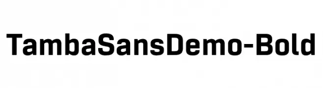
A bold, modern sans-serif font with clean lines and strong presence.
![TambaSansDemo-Bold font caratteri gratis]() Scaricare 1037 Downloads@WebFont
Scaricare 1037 Downloads@WebFont -
( Fonts by Jipartsy Jips )
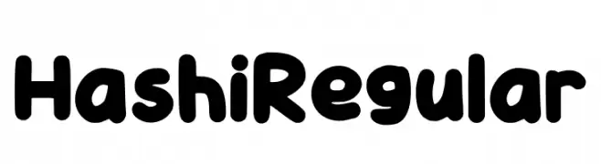
A playful, rounded font with bold, thick strokes and smooth curves.
![Hashi Regular font caratteri gratis]() Scaricare 1037 Downloads@WebFont
Scaricare 1037 Downloads@WebFont -
-
( Fonts by Cristiano Sobral - Personal-use only. For commercial use please contact owner. )
A clean, modern sans-serif font with an extra light weight and high legibility.
![Cheyenne Sans ExtraLight font caratteri gratis]() Scaricare 1037 Downloads@WebFont
Scaricare 1037 Downloads@WebFont -
( Typhoon Type - Suthi Srisopha - www.typhoontype.net )
A playful, energetic handwritten font with a brush-like appearance.
![Slow Life font caratteri gratis]() Scaricare 1037 Downloads@WebFont
Scaricare 1037 Downloads@WebFont -
( Lettersiro Studio - Muhammad Sirojuddin - creativemarket.com/Lettersiro )
A bold, flowing script font with elegant curves and loops.
![Bio Monster font caratteri gratis]() Scaricare 1037 Downloads@WebFont
Scaricare 1037 Downloads@WebFont -
![Modern Vision Regular font caratteri gratis]() Scaricare 1037 Downloads@WebFont
Scaricare 1037 Downloads@WebFont -
![Kindly Rewind font caratteri gratis]() Scaricare 1037 Downloads@WebFont
Scaricare 1037 Downloads@WebFont


Quali sono i font più popolari adesso?
Poppins, Roboto, Montserrat, Open Sans e Lato sono molto usati per le forme pulite e l'ampia applicabilità — dall'identità di marca alle landing page e ai poster.
Quali font si usano spesso nei loghi?
Le sans serif geometriche (es. Poppins, famiglie in stile Gotham) sono scelte comuni per un branding pulito e scalabile. Per un tocco personale restano valide script e stili manoscritti. Abbina un display deciso per i titoli a un corpo testo neutro per riconoscibilità ed equilibrio.
Ogni quanto si aggiorna la lista?
Con regolarità, in base ai download e all'attività reale. Torna spesso per scoprire in anticipo le nuove preferite.
💡 Consiglio: aggiungi ai preferiti — le tendenze cambiano in fretta e i font top di oggi possono ispirare il rebranding di domani.