Benvenuto nelle Font Più Popolari — dove popolarità e qualità si incontrano. Qui trovi i font più scaricati e usati dell'anno. Se cerchi scelte sicure per logo, web o social, inizia da qui.
Ogni font top si distingue per equilibrio, leggibilità e versatilità. Troverai sans serif moderne, script eleganti, serif vintage e display minimalisti.
-
( Fonts by www.junkohanhero.com - Personal-use only. For commercial use please contact owner. )
A bold, hand-drawn font with a vintage, rustic feel.
 Scaricare 1020 Downloads@WebFont
 -
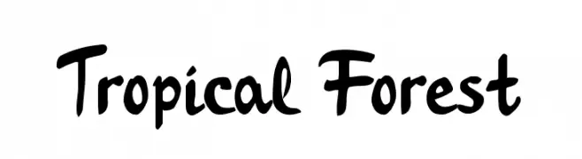
( Fonts by Alessandra M )
A bold, playful script font with a hand-drawn, brush-like style.
![Tropical Forest font caratteri gratis]() Scaricare 1020 Downloads@WebFont
Scaricare 1020 Downloads@WebFont -
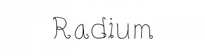
![Radium font caratteri gratis]() Scaricare 1020 Downloads@WebFont
Scaricare 1020 Downloads@WebFont -
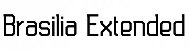
( Fonts by antoniorodriguesjr.com )
A geometric, extended font with bold, angular letterforms and a modern aesthetic.
![Brasilia Extended font caratteri gratis]() Scaricare 1020 Downloads@WebFont
Scaricare 1020 Downloads@WebFont -
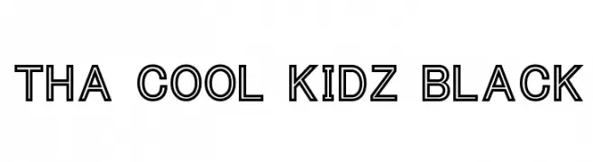
( Fonts by Chris Vile - fontmonger.com - Personal-use only. For commercial use please contact owner. )
A bold, outlined font with a modern and playful design.
![Tha Cool Kidz Black font caratteri gratis]() Scaricare 1020 Downloads@WebFont
Scaricare 1020 Downloads@WebFont -
-
( گالری فانت فارسی پژوهش آريانا - only compatible with Farsi and Arabic )
Elegant italic font with calligraphic influence and smooth curves.
![Sahar Italic font caratteri gratis]() Scaricare 1020 Downloads@WebFont
Scaricare 1020 Downloads@WebFont -
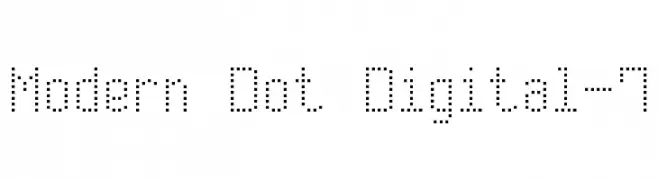
( Fonts by Style-7 - www.styleseven.com - Personal-use only. For commercial use please contact owner. )
A dot matrix style font with a digital, retro aesthetic.
![Modern Dot Digital-7 font caratteri gratis]() Scaricare 1020 Downloads@WebFont
Scaricare 1020 Downloads@WebFont -
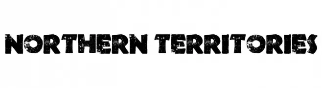
![Northern Territories font caratteri gratis]() Scaricare 1020 Downloads@WebFont
Scaricare 1020 Downloads@WebFont -
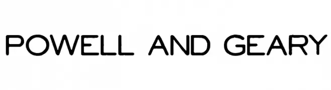
( Fonts by Cumberland Fontworks - http://www222.pair.com/sjohn/fonts.htm - S. John Ross )
A modern, rounded sans-serif font with a clean and approachable style.
![Powell and Geary font caratteri gratis]() Scaricare 1020 Downloads@WebFont
Scaricare 1020 Downloads@WebFont -
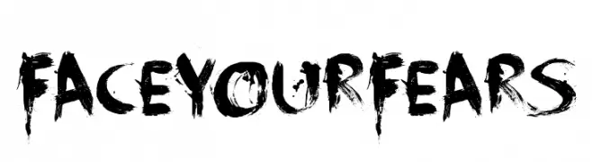
( Fonts by David Kerkhoff - www.hanodedphotography.com )
A bold, distressed font with a brush-like texture and chaotic aesthetic.
![FaceYourFears font caratteri gratis]() Scaricare 1020 Downloads@WebFont
Scaricare 1020 Downloads@WebFont

Quali sono i font più popolari adesso?
Poppins, Roboto, Montserrat, Open Sans e Lato sono molto usati per le forme pulite e l'ampia applicabilità — dall'identità di marca alle landing page e ai poster.
Quali font si usano spesso nei loghi?
Le sans serif geometriche (es. Poppins, famiglie in stile Gotham) sono scelte comuni per un branding pulito e scalabile. Per un tocco personale restano valide script e stili manoscritti. Abbina un display deciso per i titoli a un corpo testo neutro per riconoscibilità ed equilibrio.
Ogni quanto si aggiorna la lista?
Con regolarità, in base ai download e all'attività reale. Torna spesso per scoprire in anticipo le nuove preferite.
💡 Consiglio: aggiungi ai preferiti — le tendenze cambiano in fretta e i font top di oggi possono ispirare il rebranding di domani.