Benvenuto nelle Font Più Popolari — dove popolarità e qualità si incontrano. Qui trovi i font più scaricati e usati dell'anno. Se cerchi scelte sicure per logo, web o social, inizia da qui.
Ogni font top si distingue per equilibrio, leggibilità e versatilità. Troverai sans serif moderne, script eleganti, serif vintage e display minimalisti.
-
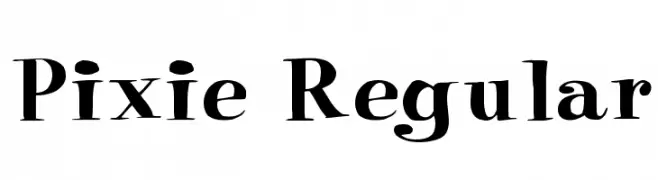 Scaricare 1014 Downloads@WebFont
 -
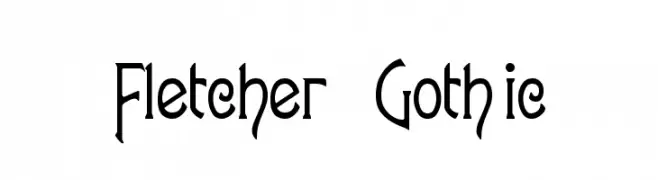
( Fonts by Alan Carr )
A gothic-inspired font with elongated, angular letterforms and sharp serifs.
![Fletcher-Gothic font caratteri gratis]() Scaricare 1014 Downloads@WebFont
Scaricare 1014 Downloads@WebFont -
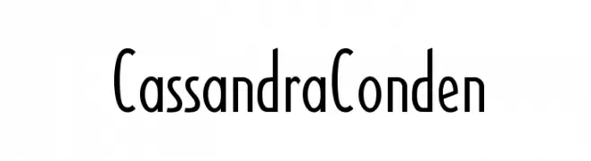
![CassandraConden font caratteri gratis]() Scaricare 1014 Downloads
Scaricare 1014 Downloads -
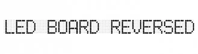
![LED BOARD REVERSED font caratteri gratis]() Scaricare 1014 Downloads@WebFont
Scaricare 1014 Downloads@WebFont -
( Fonts by Daniel Bruce )
Minimalist, geometric icon set with uniform stroke and rounded corners.
![Entypo font caratteri gratis]() Scaricare 1013 Downloads@WebFont
Scaricare 1013 Downloads@WebFont -
-
( Fonts by Eknoji Studio - www.eknojistudio.com - Personal-use only. For commercial use please contact owner. )
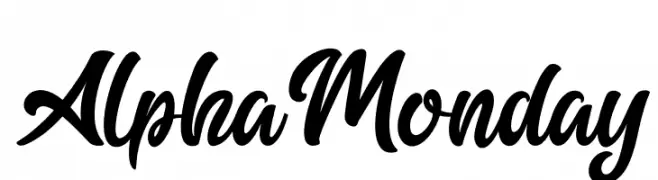
A bold, cursive font with a flowing, handwritten style.
![Alpha Monday font caratteri gratis]() Scaricare 1013 Downloads@WebFont
Scaricare 1013 Downloads@WebFont -
( Fonts by dot colon - Personal-use only. For commercial use please contact owner. )
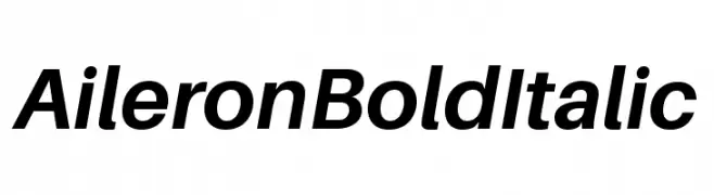
A modern, bold, and italicized typeface with consistent stroke thickness.
![Aileron Bold Italic font caratteri gratis]() Scaricare 1013 Downloads@WebFont
Scaricare 1013 Downloads@WebFont -
( Khay Redd - www.facebook.com/KBKpictures )
A modern, bold sans-serif font with geometric shapes and uniform stroke width.
![Progress-ORDIN font caratteri gratis]() Scaricare 1013 Downloads@WebFont
Scaricare 1013 Downloads@WebFont -
( Intellecta Design - Paulo W - new.myfonts.com/foundry/Intellecta_Design/?refby=paulow )
A bold, geometric font with strong, angular lines and a modern aesthetic.
![Das Modern font caratteri gratis]() Scaricare 1013 Downloads@WebFont
Scaricare 1013 Downloads@WebFont -
( Fonts by Iconian Fonts )
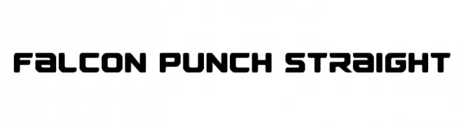
A bold, geometric font with rounded edges and a modern, futuristic style.
![Falcon Punch Straight font caratteri gratis]() Scaricare 1013 Downloads@WebFont
Scaricare 1013 Downloads@WebFont


Quali sono i font più popolari adesso?
Poppins, Roboto, Montserrat, Open Sans e Lato sono molto usati per le forme pulite e l'ampia applicabilità — dall'identità di marca alle landing page e ai poster.
Quali font si usano spesso nei loghi?
Le sans serif geometriche (es. Poppins, famiglie in stile Gotham) sono scelte comuni per un branding pulito e scalabile. Per un tocco personale restano valide script e stili manoscritti. Abbina un display deciso per i titoli a un corpo testo neutro per riconoscibilità ed equilibrio.
Ogni quanto si aggiorna la lista?
Con regolarità, in base ai download e all'attività reale. Torna spesso per scoprire in anticipo le nuove preferite.
💡 Consiglio: aggiungi ai preferiti — le tendenze cambiano in fretta e i font top di oggi possono ispirare il rebranding di domani.