Benvenuto nelle Font Più Popolari — dove popolarità e qualità si incontrano. Qui trovi i font più scaricati e usati dell'anno. Se cerchi scelte sicure per logo, web o social, inizia da qui.
Ogni font top si distingue per equilibrio, leggibilità e versatilità. Troverai sans serif moderne, script eleganti, serif vintage e display minimalisti.
-
( Fonts by www.aenigmafonts.com )
A bold, modern, and condensed font with a geometric design.
 Scaricare 1016 Downloads@WebFont
 -
( Fonts by Abstract Type Design - Patrick Durr )
A playful, 3D decorative font with a hand-drawn, energetic style.
![Crazy Cock font caratteri gratis]() Scaricare 1016 Downloads@WebFont
Scaricare 1016 Downloads@WebFont -
![Gort's Fair Hand UprightShadow font caratteri gratis]() Scaricare 1016 Downloads@WebFont
Scaricare 1016 Downloads@WebFont -
( Fonts by Apostrophic Lab )
A distressed, grunge-style font with a rugged, textured appearance.
![Futurex Distro - Survival font caratteri gratis]() Scaricare 1016 Downloads@WebFont
Scaricare 1016 Downloads@WebFont -
( Copyright 2018 The Kodchasan Project Authors (https://github.com/cadsondemak/Kodchasan) )
A modern, rounded font with a clean and friendly design.
![Kodchasan SemiBold font caratteri gratis]() Scaricare 1015 Downloads@WebFont
Scaricare 1015 Downloads@WebFont -
-
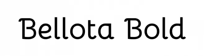
( Copyright 2019 The Bellota Project Authors (https://github.com/kemie/Bellota-Font) )
A playful and modern font with rounded edges and smooth curves.
![Bellota Bold font caratteri gratis]() Scaricare 1015 Downloads@WebFont
Scaricare 1015 Downloads@WebFont -
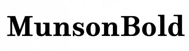
( PJM Homebrew Fonts - pauljmiller.wordpress.com/ )
A bold serif font with strong, classic lines and pronounced serifs.
![Munson Bold font caratteri gratis]() Scaricare 1015 Downloads@WebFont
Scaricare 1015 Downloads@WebFont -
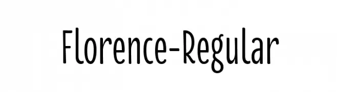
( Sascha Timplan - blog.stereotypes.de )
A modern, clean sans-serif font with a slightly condensed style.
![Florence-Regular font caratteri gratis]() Scaricare 1015 Downloads@WebFont
Scaricare 1015 Downloads@WebFont -
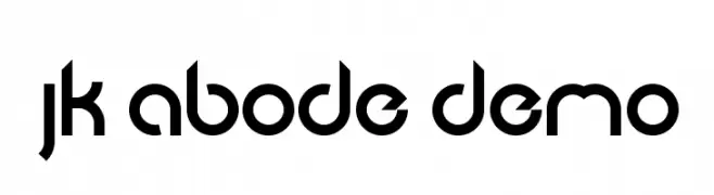
( Jacob King - Jacob King - www.typespace.co.uk )
A modern, geometric font with consistent strokes and a futuristic style.
![JK Abode Demo font caratteri gratis]() Scaricare 1015 Downloads@WebFont
Scaricare 1015 Downloads@WebFont -
( Fonts by Luke Owens - Personal-use only. For commercial use please contact owner. )
A modern, condensed sans-serif font with a clean and professional look.
![Oregon LDO Condensed font caratteri gratis]() Scaricare 1015 Downloads@WebFont
Scaricare 1015 Downloads@WebFont

Quali sono i font più popolari adesso?
Poppins, Roboto, Montserrat, Open Sans e Lato sono molto usati per le forme pulite e l'ampia applicabilità — dall'identità di marca alle landing page e ai poster.
Quali font si usano spesso nei loghi?
Le sans serif geometriche (es. Poppins, famiglie in stile Gotham) sono scelte comuni per un branding pulito e scalabile. Per un tocco personale restano valide script e stili manoscritti. Abbina un display deciso per i titoli a un corpo testo neutro per riconoscibilità ed equilibrio.
Ogni quanto si aggiorna la lista?
Con regolarità, in base ai download e all'attività reale. Torna spesso per scoprire in anticipo le nuove preferite.
💡 Consiglio: aggiungi ai preferiti — le tendenze cambiano in fretta e i font top di oggi possono ispirare il rebranding di domani.