Benvenuto nelle Font Più Popolari — dove popolarità e qualità si incontrano. Qui trovi i font più scaricati e usati dell'anno. Se cerchi scelte sicure per logo, web o social, inizia da qui.
Ogni font top si distingue per equilibrio, leggibilità e versatilità. Troverai sans serif moderne, script eleganti, serif vintage e display minimalisti.
-
( Fonts by MJType )
A bold, rounded font with a playful and friendly style.
 Scaricare 973 Downloads@WebFont
 -
( Misti's Fonts - mistifonts.com/ )
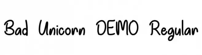
A playful, handwritten font with a casual and friendly style.
![Bad Unicorn DEMO Regular font caratteri gratis]() Scaricare 973 Downloads@WebFont
Scaricare 973 Downloads@WebFont -
( Fonts by Studio Typo )
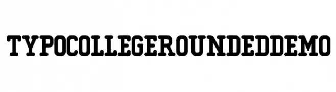
A bold, rounded font with a collegiate style and friendly appearance.
![Typo College Rounded Demo font caratteri gratis]() Scaricare 973 Downloads@WebFont
Scaricare 973 Downloads@WebFont -
( Fonts by Daniel Zadorozny - www.iconian.com )
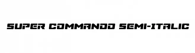
A bold, semi-italic font with angular, geometric letterforms and a dynamic style.
![Super Commando Semi-Italic font caratteri gratis]() Scaricare 973 Downloads@WebFont
Scaricare 973 Downloads@WebFont -
( Fonts by Daniel Zadorozny - www.iconian.com )
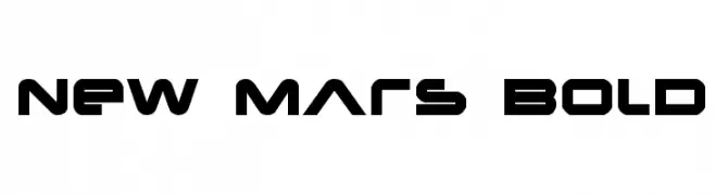
A bold, futuristic font with geometric shapes and sharp angles.
![New Mars Bold font caratteri gratis]() Scaricare 973 Downloads@WebFont
Scaricare 973 Downloads@WebFont -
-
( Fonts by Galdino Otten - galdinootten.com )
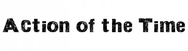
A bold, distressed font with a cracked texture for a rugged look.
![Action of the Time font caratteri gratis]() Scaricare 973 Downloads@WebFont
Scaricare 973 Downloads@WebFont -
( Fonts by Andrew McCluskey - nalgames.com. Personal-use only. For commercial use please contact owner. )
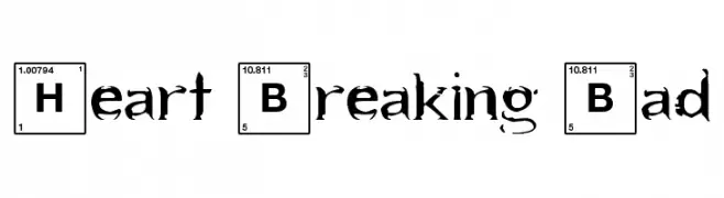
A decorative font inspired by the periodic table, featuring bold, grunge-style characters.
![Heart Breaking Bad font caratteri gratis]() Scaricare 973 Downloads@WebFont
Scaricare 973 Downloads@WebFont -
( Fonts by Arkandis Digital Foundry )
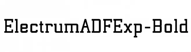
A bold, geometric font with a modern and structured design.
![ElectrumADFExp-Bold font caratteri gratis]() Scaricare 973 Downloads@WebFont
Scaricare 973 Downloads@WebFont -
( Copyright (c) 2012, Brian J. Bonislawsky DBA Astigmatic (AOETI) (astigma@astigmatic.com), with Reserved Font Names "Romanesco" )
A dynamic script font with elegant calligraphic influences and dramatic flourishes.
![Romanesco font caratteri gratis]() Scaricare 973 Downloads@WebFont
Scaricare 973 Downloads@WebFont -
![Wurper Comics font caratteri gratis]() Scaricare 973 Downloads@WebFont
Scaricare 973 Downloads@WebFont

Quali sono i font più popolari adesso?
Poppins, Roboto, Montserrat, Open Sans e Lato sono molto usati per le forme pulite e l'ampia applicabilità — dall'identità di marca alle landing page e ai poster.
Quali font si usano spesso nei loghi?
Le sans serif geometriche (es. Poppins, famiglie in stile Gotham) sono scelte comuni per un branding pulito e scalabile. Per un tocco personale restano valide script e stili manoscritti. Abbina un display deciso per i titoli a un corpo testo neutro per riconoscibilità ed equilibrio.
Ogni quanto si aggiorna la lista?
Con regolarità, in base ai download e all'attività reale. Torna spesso per scoprire in anticipo le nuove preferite.
💡 Consiglio: aggiungi ai preferiti — le tendenze cambiano in fretta e i font top di oggi possono ispirare il rebranding di domani.