Benvenuto nelle Font Più Popolari — dove popolarità e qualità si incontrano. Qui trovi i font più scaricati e usati dell'anno. Se cerchi scelte sicure per logo, web o social, inizia da qui.
Ogni font top si distingue per equilibrio, leggibilità e versatilità. Troverai sans serif moderne, script eleganti, serif vintage e display minimalisti.
-
 Scaricare 839 Downloads@WebFont
 -
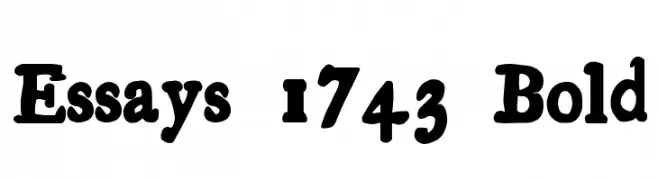
( Fonts by Daniel Gauthier )
A bold, jagged font with an electrifying outline, perfect for dynamic and playful designs.
![MadScience font caratteri gratis]() Scaricare 839 Downloads@WebFont
Scaricare 839 Downloads@WebFont -
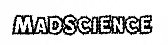
( Fonts by Buddha Graphix - buddha.graphix.dk/fonts.html )
A bold, distressed font with an industrial, mechanical aesthetic.
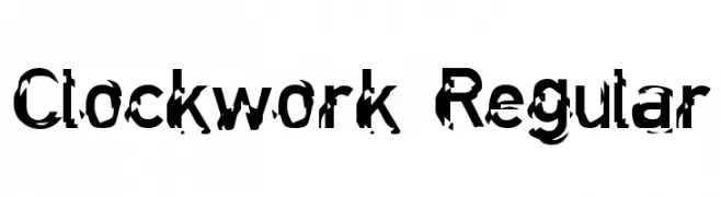
![Clockwork Regular font caratteri gratis]() Scaricare 839 Downloads@WebFont
Scaricare 839 Downloads@WebFont -
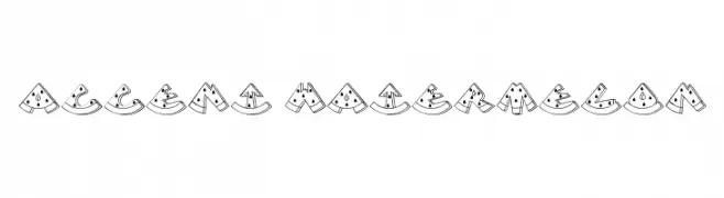
![Accent Watermelon font caratteri gratis]() Scaricare 839 Downloads@WebFont
Scaricare 839 Downloads@WebFont -
( Fonts by StringLabs - stringlabscreative.com - Personal-use only. For commercial use please contact owner. )
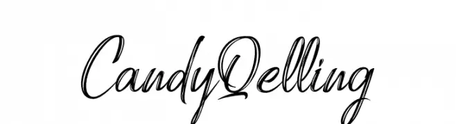
A lively, cursive script font with a handwritten feel.
![Candy Qelling font caratteri gratis]() Scaricare 838 Downloads@WebFont
Scaricare 838 Downloads@WebFont -
-
( Fonts by armenia.renderforest.com - Personal-use only. For commercial use please contact owner. )
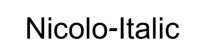
A modern, italic sans-serif font with clean lines and balanced proportions.
![Nicolo-Italic font caratteri gratis]() Scaricare 838 Downloads@WebFont
Scaricare 838 Downloads@WebFont -
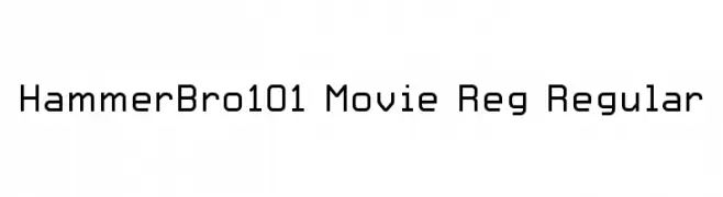
Caratteri di HammerBro101. For commercial use please contact the owner.
![HammerBro101 Movie Reg Regular font caratteri gratis]() Scaricare 838 Downloads@WebFont
Scaricare 838 Downloads@WebFont -
( Mas Anis Studio - Naufal Anis - creativemarket.com/naufalans?u=naufalans )
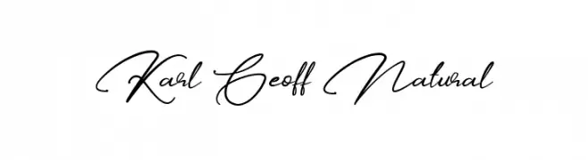
A sophisticated script font with fluid, cursive strokes and elegant loops.
![Karl Geoff Natural font caratteri gratis]() Scaricare 838 Downloads@WebFont
Scaricare 838 Downloads@WebFont -
( Fonts by 28fonts )
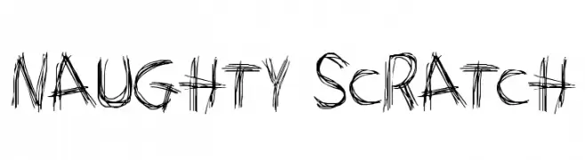
A playful, sketch-like font with bold, jagged strokes.
![Naughty Scratch font caratteri gratis]() Scaricare 838 Downloads@WebFont
Scaricare 838 Downloads@WebFont -
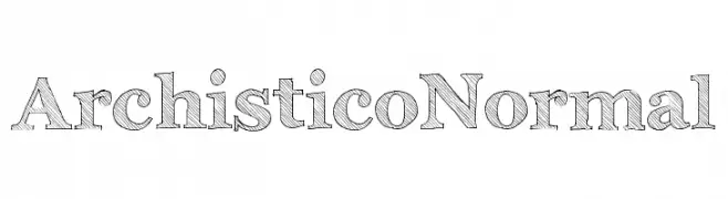
( Fonts by Emilie Rollandin - www.archistico.com. Personal-use only. For commercial use please contact owner. )
A hand-drawn serif font with a sketch-like, textured appearance.
![Archistico Normal font caratteri gratis]() Scaricare 838 Downloads@WebFont
Scaricare 838 Downloads@WebFont
Quali sono i font più popolari adesso?
Poppins, Roboto, Montserrat, Open Sans e Lato sono molto usati per le forme pulite e l'ampia applicabilità — dall'identità di marca alle landing page e ai poster.
Quali font si usano spesso nei loghi?
Le sans serif geometriche (es. Poppins, famiglie in stile Gotham) sono scelte comuni per un branding pulito e scalabile. Per un tocco personale restano valide script e stili manoscritti. Abbina un display deciso per i titoli a un corpo testo neutro per riconoscibilità ed equilibrio.
Ogni quanto si aggiorna la lista?
Con regolarità, in base ai download e all'attività reale. Torna spesso per scoprire in anticipo le nuove preferite.
💡 Consiglio: aggiungi ai preferiti — le tendenze cambiano in fretta e i font top di oggi possono ispirare il rebranding di domani.