Benvenuto nelle Font Più Popolari — dove popolarità e qualità si incontrano. Qui trovi i font più scaricati e usati dell'anno. Se cerchi scelte sicure per logo, web o social, inizia da qui.
Ogni font top si distingue per equilibrio, leggibilità e versatilità. Troverai sans serif moderne, script eleganti, serif vintage e display minimalisti.
-
( Free for personal use )
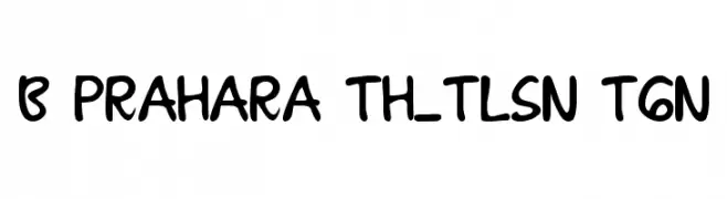
A playful, bold font with rounded, hand-drawn characters.
 Scaricare 837 Downloads@WebFont
 -
( Fonts by Des Gomez )
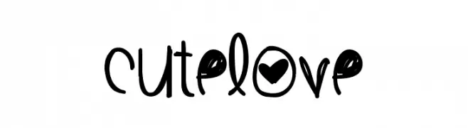
A playful, handwritten font with whimsical elements and a youthful charm.
![CuteLove font caratteri gratis]() Scaricare 837 Downloads@WebFont
Scaricare 837 Downloads@WebFont -
( Fonts by www.blambot.com )
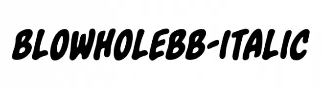
A bold, playful, and dynamic font with rounded, slanted characters.
![BlowholeBB-Italic font caratteri gratis]() Scaricare 837 Downloads@WebFont
Scaricare 837 Downloads@WebFont -
( Fonts by Mario Arturo - marioarturo.com. Personal-use only. For commercial use please contact owner. Contact the owner for a donation. )
A classic serif font with elegant, sharp serifs and a refined, traditional appearance.
![Amarfil font caratteri gratis]() Scaricare 837 Downloads@WebFont
Scaricare 837 Downloads@WebFont -
( Copyright (c) 2011, Dan Sayers (i@iotic.com) )
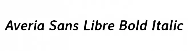
A bold, italicized font with a smooth, rounded, and modern appearance.
![Averia Sans Libre Bold Italic font caratteri gratis]() Scaricare 837 Downloads@WebFont
Scaricare 837 Downloads@WebFont -
-
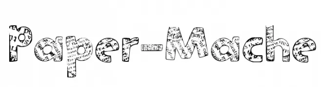
Caratteri di spideraysfonts. For commercial use please contact the owner.
![Paper-Mache font caratteri gratis]() Scaricare 837 Downloads@WebFont
Scaricare 837 Downloads@WebFont -
( Fonts by www.houseoflime.com )
![Tools font caratteri gratis]() Scaricare 837 Downloads@WebFont
Scaricare 837 Downloads@WebFont -
( Fonts by Apostrophic Lab )
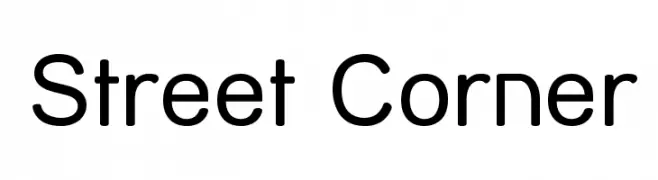
A modern, rounded sans-serif font with excellent readability.
![Street Corner font caratteri gratis]() Scaricare 837 Downloads@WebFont
Scaricare 837 Downloads@WebFont -
( Fonts by Jester Font Studio )
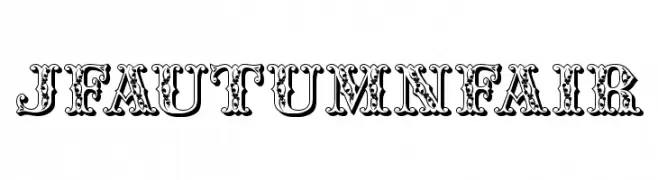
An ornate, high-contrast decorative font with vintage flair.
![JFAutumnFair font caratteri gratis]() Scaricare 837 Downloads@WebFont
Scaricare 837 Downloads@WebFont -
( Fonts by Dreadful Productions - http://usersites.horrorfind.com/home/horror/dreadful/ )
A bold, hand-drawn font with a rough, textured, and artistic style.
![MonsterChild font caratteri gratis]() Scaricare 837 Downloads@WebFont
Scaricare 837 Downloads@WebFont


Quali sono i font più popolari adesso?
Poppins, Roboto, Montserrat, Open Sans e Lato sono molto usati per le forme pulite e l'ampia applicabilità — dall'identità di marca alle landing page e ai poster.
Quali font si usano spesso nei loghi?
Le sans serif geometriche (es. Poppins, famiglie in stile Gotham) sono scelte comuni per un branding pulito e scalabile. Per un tocco personale restano valide script e stili manoscritti. Abbina un display deciso per i titoli a un corpo testo neutro per riconoscibilità ed equilibrio.
Ogni quanto si aggiorna la lista?
Con regolarità, in base ai download e all'attività reale. Torna spesso per scoprire in anticipo le nuove preferite.
💡 Consiglio: aggiungi ai preferiti — le tendenze cambiano in fretta e i font top di oggi possono ispirare il rebranding di domani.