Benvenuto nelle Font Più Popolari — dove popolarità e qualità si incontrano. Qui trovi i font più scaricati e usati dell'anno. Se cerchi scelte sicure per logo, web o social, inizia da qui.
Ogni font top si distingue per equilibrio, leggibilità e versatilità. Troverai sans serif moderne, script eleganti, serif vintage e display minimalisti.
-
 Scaricare 838 Downloads@WebFont
 -
( Fonts by Graham Meade - GemFonts )
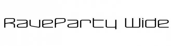
A modern, geometric font with a futuristic and sleek design.
![RaveParty Wide font caratteri gratis]() Scaricare 838 Downloads@WebFont
Scaricare 838 Downloads@WebFont -
![Pollyanna font caratteri gratis]() Scaricare 838 Downloads@WebFont
Scaricare 838 Downloads@WebFont -
( Fonts by Revo Farisky )
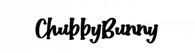
A bold, playful handwritten font with thick, rounded strokes and a lively appearance.
![Chubby Bunny font caratteri gratis]() Scaricare 837 Downloads@WebFont
Scaricare 837 Downloads@WebFont -
( Fonts by armenia.renderforest.com - Personal-use only. For commercial use please contact owner. )
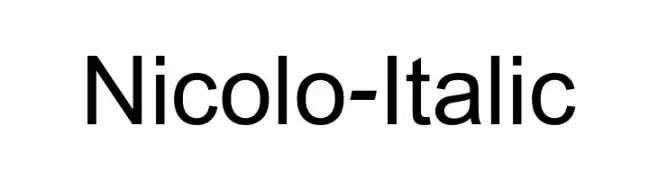
A modern, italic sans-serif font with clean lines and balanced proportions.
![Nicolo-Italic font caratteri gratis]() Scaricare 837 Downloads@WebFont
Scaricare 837 Downloads@WebFont -
-
( Fonts by Peter Wiegel - www.peter-wiegel.de - Personal-use only. For commercial use please contact owner. )
A bold, modern typeface with clean lines and strong presence.
![Osterbar font caratteri gratis]() Scaricare 837 Downloads@WebFont
Scaricare 837 Downloads@WebFont -
( Noto is a trademark of Google Inc. Noto fonts are open source. All Noto fonts are published under the SIL Open Font License, Version 1.1 )
A classic serif font with elegant and readable design.
![Noto Serif Devanagari font caratteri gratis]() Scaricare 837 Downloads@WebFont
Scaricare 837 Downloads@WebFont -
( Fonts by Khurasan )
A playful, bold font with rounded, cartoonish characters and decorative elements.
![Cute Jellyfish font caratteri gratis]() Scaricare 837 Downloads@WebFont
Scaricare 837 Downloads@WebFont -
( 9031 - www.9031.com/p-font/ )
A modern, geometric monospaced font with rounded edges.
![UHF font caratteri gratis]() Scaricare 837 Downloads@WebFont
Scaricare 837 Downloads@WebFont -
( Zetafonts - www.zetafonts.com )
A bold, italic font with a modern and dynamic style.
![Codec Warm Trial Heavy Italic font caratteri gratis]() Scaricare 837 Downloads@WebFont
Scaricare 837 Downloads@WebFont


Quali sono i font più popolari adesso?
Poppins, Roboto, Montserrat, Open Sans e Lato sono molto usati per le forme pulite e l'ampia applicabilità — dall'identità di marca alle landing page e ai poster.
Quali font si usano spesso nei loghi?
Le sans serif geometriche (es. Poppins, famiglie in stile Gotham) sono scelte comuni per un branding pulito e scalabile. Per un tocco personale restano valide script e stili manoscritti. Abbina un display deciso per i titoli a un corpo testo neutro per riconoscibilità ed equilibrio.
Ogni quanto si aggiorna la lista?
Con regolarità, in base ai download e all'attività reale. Torna spesso per scoprire in anticipo le nuove preferite.
💡 Consiglio: aggiungi ai preferiti — le tendenze cambiano in fretta e i font top di oggi possono ispirare il rebranding di domani.