Benvenuto nelle Font Più Popolari — dove popolarità e qualità si incontrano. Qui trovi i font più scaricati e usati dell'anno. Se cerchi scelte sicure per logo, web o social, inizia da qui.
Ogni font top si distingue per equilibrio, leggibilità e versatilità. Troverai sans serif moderne, script eleganti, serif vintage e display minimalisti.
-
 Scaricare 2397 Downloads
 -
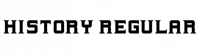
![History Regular font caratteri gratis]() Scaricare 2395 Downloads@WebFont
Scaricare 2395 Downloads@WebFont -
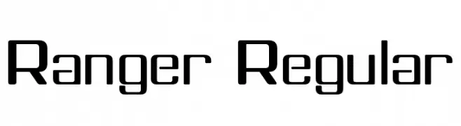
![Ranger Regular font caratteri gratis]() Scaricare 2395 Downloads@WebFont
Scaricare 2395 Downloads@WebFont -
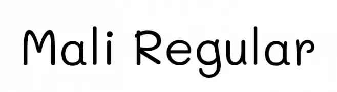
( Copyright 2018 The Mali Project Authors (https://github.com/cadsondemak/Mali) )
A playful, rounded, and casual handwritten font with excellent readability.
![Mali Regular font caratteri gratis]() Scaricare 2394 Downloads@WebFont
Scaricare 2394 Downloads@WebFont -
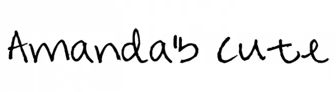
( Free for a personal use. For a commercial use please visit www.kevinandamanda.com )
A playful, handwritten font with a casual and whimsical style.
![Amanda's Cute font caratteri gratis]() Scaricare 2394 Downloads@WebFont
Scaricare 2394 Downloads@WebFont -
-
![Metal Gear font caratteri gratis]() Scaricare 2393 Downloads@WebFont
Scaricare 2393 Downloads@WebFont -
( Fonts by Khurasan )
A playful, bold font with rounded, bubbly characters.
![Ohyou font caratteri gratis]() Scaricare 2392 Downloads@WebFont
Scaricare 2392 Downloads@WebFont -
( Fonts by Jean Wojciechowski - Personal-use only. For commercial use please contact owner. )
A bold, impactful typeface with strong, thick strokes and uniform character width.
![Soulcraft Regular font caratteri gratis]() Scaricare 2392 Downloads@WebFont
Scaricare 2392 Downloads@WebFont -
![Tall & Lean font caratteri gratis]() Scaricare 2392 Downloads@WebFont
Scaricare 2392 Downloads@WebFont -
( Fonts by Manfred Klein - manfred-klein.ina-mar.com )
A bold, sans-serif font with a strong, impactful presence.
![SansBlackSmall font caratteri gratis]() Scaricare 2392 Downloads@WebFont
Scaricare 2392 Downloads@WebFont -
( Fonts by CannotIntoSpaceFonts - KineticPlasma Fonts - Personal-use only. For commercial use please contact owner. )
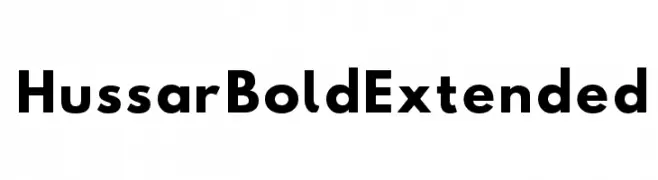
A bold, extended font with a modern and geometric style.
![Hussar Bold Extended font caratteri gratis]() Scaricare 2391 Downloads@WebFont
Scaricare 2391 Downloads@WebFont -
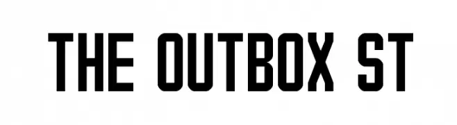
![The Outbox St font caratteri gratis]() Scaricare 2391 Downloads@WebFont
Scaricare 2391 Downloads@WebFont -
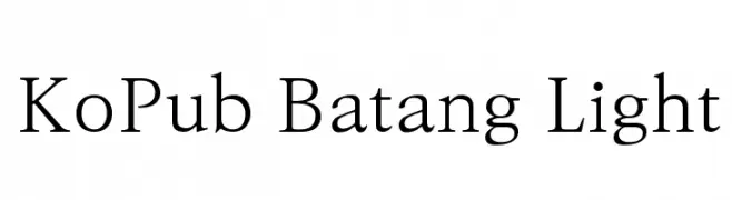
( Copyright 2014 Ministry of Culture, Sports and Tourism and Korea Publishers Society (kopus@kopus.org) )
A classic serif font with elegant, thin strokes and refined appearance.
![KoPub Batang Light font caratteri gratis]() Scaricare 2391 Downloads@WebFont
Scaricare 2391 Downloads@WebFont -
( Fonts by www.philing.net )
A playful, casual handwritten font with rounded, irregular letterforms.
![Sophie font caratteri gratis]() Scaricare 2391 Downloads@WebFont
Scaricare 2391 Downloads@WebFont -
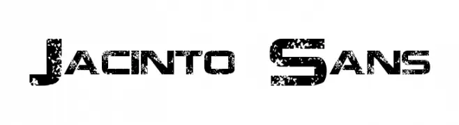
![Jacinto Sans font caratteri gratis]() Scaricare 2391 Downloads@WebFont
Scaricare 2391 Downloads@WebFont -
( Please check the owner website: http://www.billie.grosse.is-a-geek.com )
An elegant, flowing script font with a traditional calligraphic style.
![Raaj Script Medium font caratteri gratis]() Scaricare 2391 Downloads@WebFont
Scaricare 2391 Downloads@WebFont -
( Fonts by The Scriptorium - Dave Nalle )
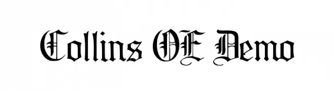
A classic blackletter font with ornate, angular designs and high contrast strokes.
![Collins OE Demo font caratteri gratis]() Scaricare 2391 Downloads@WebFont
Scaricare 2391 Downloads@WebFont -
( www.facebook.com/artistic.reema )
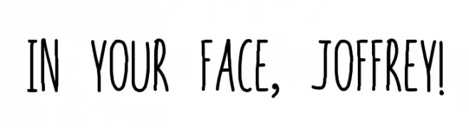
A playful, handwritten font with tall, narrow letters and a quirky style.
![In your face, Joffrey! font caratteri gratis]() Scaricare 2390 Downloads@WebFont
Scaricare 2390 Downloads@WebFont -
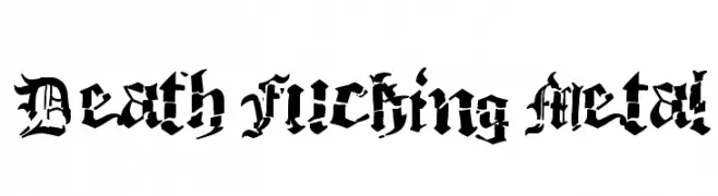
![Death Fucking Metal font caratteri gratis]() Scaricare 2390 Downloads@WebFont
Scaricare 2390 Downloads@WebFont -
( Fonts by EssentialsStudio - Personal-use only. For commercial use please contact owner. )
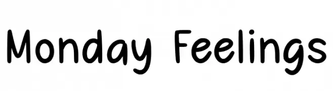
A playful, hand-drawn font with rounded, whimsical characters.
![Monday Feelings font caratteri gratis]() Scaricare 2389 Downloads@WebFont
Scaricare 2389 Downloads@WebFont -
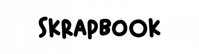
( Fonts by Alexa )
A playful, bold font with rounded, hand-drawn strokes.
![Skrapbook font caratteri gratis]() Scaricare 2389 Downloads@WebFont
Scaricare 2389 Downloads@WebFont -
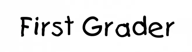
( Fonts by or from www.graffitifonts.net )
A playful, hand-drawn font mimicking a child's handwriting.
![First Grader font caratteri gratis]() Scaricare 2389 Downloads
Scaricare 2389 Downloads -
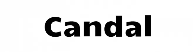
( Copyright (c) 2011, Vernon Adams (vern@newtypography.co.uk) )
A bold, modern font with clean lines and strong presence.
![Candal font caratteri gratis]() Scaricare 2389 Downloads@WebFont
Scaricare 2389 Downloads@WebFont -
( Fonts by Apostrophic Lab )
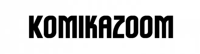
A bold, geometric font with a playful, comic-inspired style.
![Komikazoom font caratteri gratis]() Scaricare 2389 Downloads@WebFont
Scaricare 2389 Downloads@WebFont -
![Freak out, Go bananas Normal font caratteri gratis]() Scaricare 2389 Downloads@WebFont
Scaricare 2389 Downloads@WebFont -
![Wurper Regular font caratteri gratis]() Scaricare 2388 Downloads@WebFont
Scaricare 2388 Downloads@WebFont -
( Fonts by Debut Studio - Ari Fadli - creativemarket.com/debutstudio - Personal-use only. For commercial use please contact owner. )
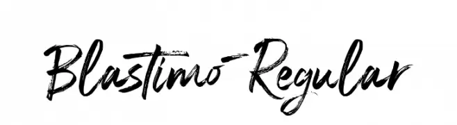
A dynamic, brush-style font with expressive strokes and artistic flair.
![Blastimo-Regular font caratteri gratis]() Scaricare 2387 Downloads@WebFont
Scaricare 2387 Downloads@WebFont -
( Fonts by Mozilla Foundation - Personal-use only. For commercial use please contact owner. )
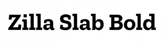
A bold slab serif font with strong, block-like serifs and a modern appeal.
![Zilla Slab Bold font caratteri gratis]() Scaricare 2387 Downloads@WebFont
Scaricare 2387 Downloads@WebFont -
( Fonts by fontazilla.com. Personal-use only. For commercial use please contact owner. )
A bold, geometric font with strong, uniform strokes and a modern aesthetic.
![Wheels font caratteri gratis]() Scaricare 2387 Downloads@WebFont
Scaricare 2387 Downloads@WebFont -
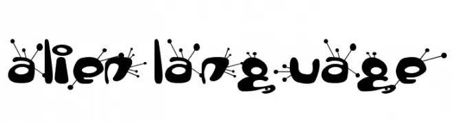
![alien language font caratteri gratis]() Scaricare 2387 Downloads@WebFont
Scaricare 2387 Downloads@WebFont -
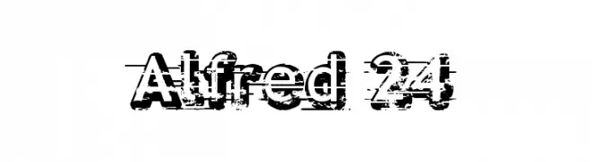
( Fonts by Jonathan Paquette - www.jonathanpaquette.com )
A bold, distressed font with a grunge texture, perfect for impactful designs.
![Alfred 24 font caratteri gratis]() Scaricare 2387 Downloads@WebFont
Scaricare 2387 Downloads@WebFont -
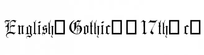
![English-Gothic--17th-c- font caratteri gratis]() Scaricare 2387 Downloads@WebFont
Scaricare 2387 Downloads@WebFont -
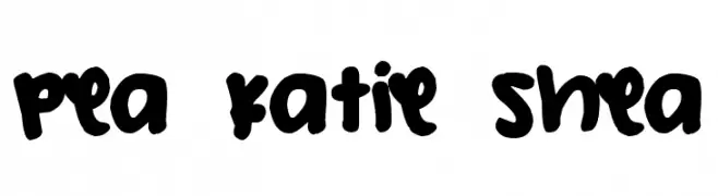
( Free for a personal use. For a commercial use please visit www.kevinandamanda.com )
A bold, playful handwritten font with rounded strokes and a casual vibe.
![Pea Katie Shea font caratteri gratis]() Scaricare 2386 Downloads@WebFont
Scaricare 2386 Downloads@WebFont -
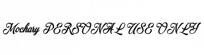
( Fonts by Måns Grebäck )
An elegant and flowing script font with a classic and sophisticated style.
![Mochary PERSONAL USE ONLY font caratteri gratis]() Scaricare 2385 Downloads@WebFont
Scaricare 2385 Downloads@WebFont -
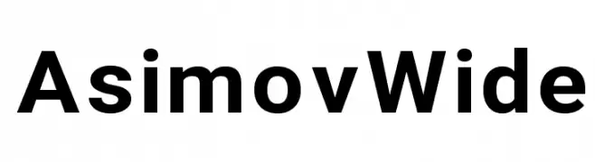
( Fonts by CannotIntoSpaceFonts - KineticPlasma Fonts - Personal-use only. For commercial use please contact owner. )
A bold, modern sans-serif font with clean lines and geometric structure.
![Asimov Wide font caratteri gratis]() Scaricare 2385 Downloads@WebFont
Scaricare 2385 Downloads@WebFont


Quali sono i font più popolari adesso?
Poppins, Roboto, Montserrat, Open Sans e Lato sono molto usati per le forme pulite e l'ampia applicabilità — dall'identità di marca alle landing page e ai poster.
Quali font si usano spesso nei loghi?
Le sans serif geometriche (es. Poppins, famiglie in stile Gotham) sono scelte comuni per un branding pulito e scalabile. Per un tocco personale restano valide script e stili manoscritti. Abbina un display deciso per i titoli a un corpo testo neutro per riconoscibilità ed equilibrio.
Ogni quanto si aggiorna la lista?
Con regolarità, in base ai download e all'attività reale. Torna spesso per scoprire in anticipo le nuove preferite.
💡 Consiglio: aggiungi ai preferiti — le tendenze cambiano in fretta e i font top di oggi possono ispirare il rebranding di domani.