Benvenuto nelle Font Più Popolari — dove popolarità e qualità si incontrano. Qui trovi i font più scaricati e usati dell'anno. Se cerchi scelte sicure per logo, web o social, inizia da qui.
Ogni font top si distingue per equilibrio, leggibilità e versatilità. Troverai sans serif moderne, script eleganti, serif vintage e display minimalisti.
-
( Fonts by Zetafonts - Personal-use only. For commercial use please contact owner. )
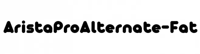
A bold, rounded font with a playful and modern style.
 Scaricare 2377 Downloads@WebFont
 -
( Copyright (c) 2010-2013 by Software Industry Promotion Agency (Public Organization) (SIPA). All rights reserved. )
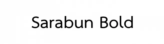
A bold, modern sans-serif font with a clean and professional appearance.
![Sarabun Bold font caratteri gratis]() Scaricare 2377 Downloads@WebFont
Scaricare 2377 Downloads@WebFont -
( Fonts by Graham Meade - GemFonts )
A modern, geometric font with expanded width and uniform stroke width.
![Walkway Expand Bold font caratteri gratis]() Scaricare 2377 Downloads@WebFont
Scaricare 2377 Downloads@WebFont -
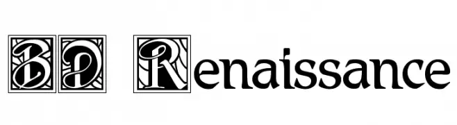
![BD Renaissance font caratteri gratis]() Scaricare 2377 Downloads@WebFont
Scaricare 2377 Downloads@WebFont -
( Fonts by Khurasan )
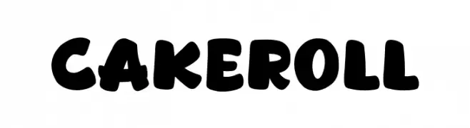
A bold, playful font with rounded, whimsical characters.
![Cakeroll font caratteri gratis]() Scaricare 2376 Downloads@WebFont
Scaricare 2376 Downloads@WebFont -
-
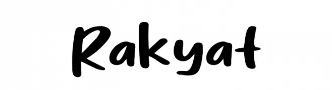
( Fonts by Syaf Rizal - Khurasan - Personal-use only. For commercial use please contact owner. )
A bold, playful handwritten font with smooth curves and consistent thickness.
![Rakyat font caratteri gratis]() Scaricare 2376 Downloads@WebFont
Scaricare 2376 Downloads@WebFont -
![Secrets font caratteri gratis]() Scaricare 2376 Downloads@WebFont
Scaricare 2376 Downloads@WebFont -
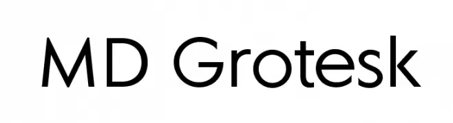
( Margarita Dyakovich )
A modern, geometric sans-serif font with clean lines and uniform strokes.
![MD Grotesk font caratteri gratis]() Scaricare 2375 Downloads@WebFont
Scaricare 2375 Downloads@WebFont -
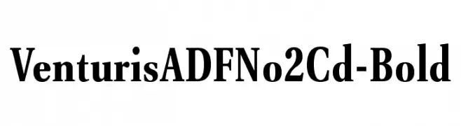
( Fonts by Arkandis Digital Foundry )
A bold, classic serif font with strong strokes and clear characters.
![VenturisADFNo2Cd-Bold font caratteri gratis]() Scaricare 2375 Downloads@WebFont
Scaricare 2375 Downloads@WebFont -
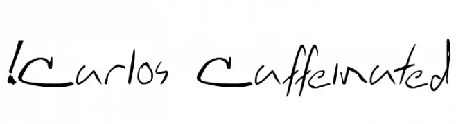
( !Exclamachine Type Foundry - exclamachine.com/ )
A dynamic, handwritten font with fluid and irregular strokes.
![!Carlos Caffeinated font caratteri gratis]() Scaricare 2374 Downloads@WebFont
Scaricare 2374 Downloads@WebFont -
( Fonts by Erwin Denissen - Personal-use only. For commercial use please contact owner. )
A bold, geometric font with angular lines and a modern, industrial aesthetic.
![Blockbusted font caratteri gratis]() Scaricare 2374 Downloads@WebFont
Scaricare 2374 Downloads@WebFont -
( Fonts by www.TomzWeb.com - Thomas E. Harvey - NOT free - Commercial use requires license )
A tall, condensed font with a modern and sleek appearance.
![Higherup Normal font caratteri gratis]() Scaricare 2374 Downloads@WebFont
Scaricare 2374 Downloads@WebFont -
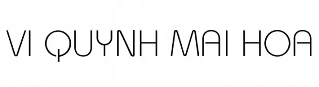
![VI Quynh Mai Hoa font caratteri gratis]() Scaricare 2374 Downloads@WebFont
Scaricare 2374 Downloads@WebFont -
( Fonts by www.fontdiner.com )
A bold, playful font with rounded edges and a retro feel.
![Fontdinerdotcom Huggable font caratteri gratis]() Scaricare 2374 Downloads@WebFont
Scaricare 2374 Downloads@WebFont -
( Fonts by www.fugit-tempus.de )
A bold, dynamic script font with elegant, flowing letterforms.
![Holla font caratteri gratis]() Scaricare 2374 Downloads@WebFont
Scaricare 2374 Downloads@WebFont -
( Ana - www.anasfonts.com/ )
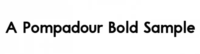
A bold, modern sans-serif font with clean, geometric lines.
![A Pompadour Bold Sample font caratteri gratis]() Scaricare 2373 Downloads@WebFont
Scaricare 2373 Downloads@WebFont -
( Fonts by Situjuh Nazara - 7ntypes.com - Personal-use only. For commercial use please contact owner. )
A playful, handwritten font with rounded, irregular letterforms.
![Hastoler font caratteri gratis]() Scaricare 2373 Downloads@WebFont
Scaricare 2373 Downloads@WebFont -
( Fonts by Alif Devan R. )
A dynamic and elegant script font with fluid, sweeping letterforms.
![Vincentia font caratteri gratis]() Scaricare 2373 Downloads@WebFont
Scaricare 2373 Downloads@WebFont -
( Fonts by Manfred Klein. Free for private and charity use. Free for commercial with donation to organizations )
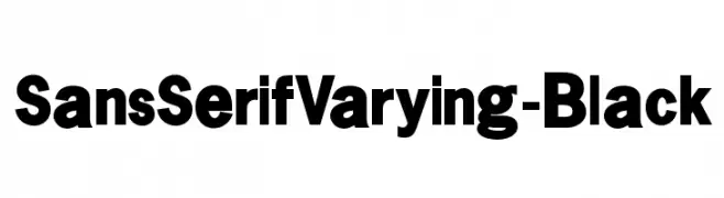
A bold, sans-serif font with thick, uniform strokes and strong visual impact.
![SansSerifVarying-Black font caratteri gratis]() Scaricare 2373 Downloads@WebFont
Scaricare 2373 Downloads@WebFont -
( Fonts by Jacob Fisher - www.pizzadude.dk )
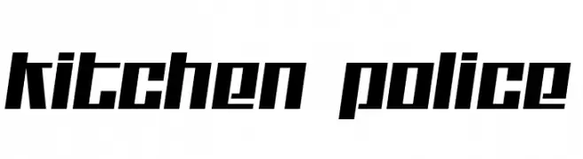
A bold, angular font with a geometric and modern style.
![Kitchen police font caratteri gratis]() Scaricare 2373 Downloads@WebFont
Scaricare 2373 Downloads@WebFont -
( Fonts by Balpirick Studio - https://www.creativefabrica.com/designer/balpirick/ref/308299/ - Personal-use only. For commercial use please contact owner. )
A bold, modern font with playful curves and expressive strokes.
![Glamori font caratteri gratis]() Scaricare 2372 Downloads@WebFont
Scaricare 2372 Downloads@WebFont -
( Fonts by Castcraft Software - OPTI Fonts Archive - opti.netii.net - Personal-use only. For commercial use please contact owner. )
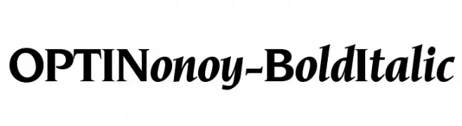
A bold, italicized font with strong strokes and a dynamic slant.
![OPTINonoy-BoldItalic font caratteri gratis]() Scaricare 2372 Downloads@WebFont
Scaricare 2372 Downloads@WebFont -
![Qaskin Black Personal Use font caratteri gratis]() Scaricare 2372 Downloads@WebFont
Scaricare 2372 Downloads@WebFont -
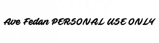
![Ave Fedan PERSONAL USE ONLY font caratteri gratis]() Scaricare 2372 Downloads@WebFont
Scaricare 2372 Downloads@WebFont -
( Copyright (c) 2011, Cyreal (www.cyreal.org) )
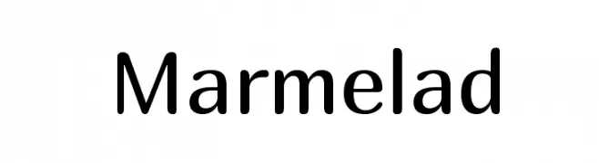
A modern, clean sans-serif font with balanced proportions and excellent readability.
![Marmelad font caratteri gratis]() Scaricare 2372 Downloads@WebFont
Scaricare 2372 Downloads@WebFont -
![Portishead Dummy font caratteri gratis]() Scaricare 2372 Downloads@WebFont
Scaricare 2372 Downloads@WebFont -
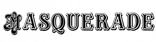
![Masquerade font caratteri gratis]() Scaricare 2372 Downloads@WebFont
Scaricare 2372 Downloads@WebFont -
( Fonts by Divide By Zero! - fonts.tom7.com )
A geometric, linear font with a modern, hollow design.
![Linear font caratteri gratis]() Scaricare 2372 Downloads@WebFont
Scaricare 2372 Downloads@WebFont -
( Fonts by Khurasan )
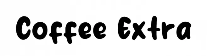
A bold, playful font with rounded, thick strokes and a hand-drawn feel.
![Coffee Extra font caratteri gratis]() Scaricare 2370 Downloads@WebFont
Scaricare 2370 Downloads@WebFont -
( Fonts by Castcraft Software - opti.netii.net - check the website before use )
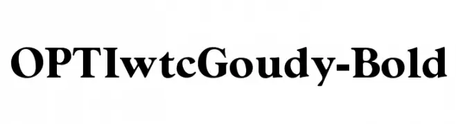
A bold, classic serif font with strong, authoritative presence.
![OPTIwtcGoudy-Bold font caratteri gratis]() Scaricare 2370 Downloads@WebFont
Scaricare 2370 Downloads@WebFont -
( Fonts by Arkandis Digital Foundry )
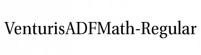
A classic serif font with elegant strokes and balanced contrast.
![VenturisADFMath-Regular font caratteri gratis]() Scaricare 2370 Downloads@WebFont
Scaricare 2370 Downloads@WebFont -
( Fonts by Jecko Development - www.jeckodevelopment.com )
A bold, geometric font with a modern and angular design.
![JD Erica Regular font caratteri gratis]() Scaricare 2370 Downloads@WebFont
Scaricare 2370 Downloads@WebFont -
( Fonts by Nick Curtis - www.nicksfonts.com )
A bold, rounded font ideal for impactful and attention-grabbing designs.
![PhattPhreddy font caratteri gratis]() Scaricare 2370 Downloads@WebFont
Scaricare 2370 Downloads@WebFont -
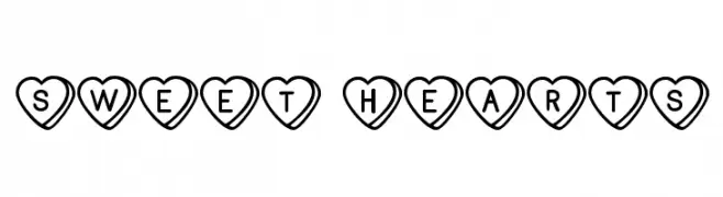
( Free for Personal Use. To use commercially please visit the www.bvfonts.com )
A decorative font with characters inside heart shapes, perfect for romantic themes.
![Sweet Hearts font caratteri gratis]() Scaricare 2369 Downloads@WebFont
Scaricare 2369 Downloads@WebFont -
![RoadTrip font caratteri gratis]() Scaricare 2369 Downloads@WebFont
Scaricare 2369 Downloads@WebFont


Quali sono i font più popolari adesso?
Poppins, Roboto, Montserrat, Open Sans e Lato sono molto usati per le forme pulite e l'ampia applicabilità — dall'identità di marca alle landing page e ai poster.
Quali font si usano spesso nei loghi?
Le sans serif geometriche (es. Poppins, famiglie in stile Gotham) sono scelte comuni per un branding pulito e scalabile. Per un tocco personale restano valide script e stili manoscritti. Abbina un display deciso per i titoli a un corpo testo neutro per riconoscibilità ed equilibrio.
Ogni quanto si aggiorna la lista?
Con regolarità, in base ai download e all'attività reale. Torna spesso per scoprire in anticipo le nuove preferite.
💡 Consiglio: aggiungi ai preferiti — le tendenze cambiano in fretta e i font top di oggi possono ispirare il rebranding di domani.