Benvenuto nelle Font Più Popolari — dove popolarità e qualità si incontrano. Qui trovi i font più scaricati e usati dell'anno. Se cerchi scelte sicure per logo, web o social, inizia da qui.
Ogni font top si distingue per equilibrio, leggibilità e versatilità. Troverai sans serif moderne, script eleganti, serif vintage e display minimalisti.
-
( Fonts by Edric Studio - Personal-use only. For commercial use please contact owner. )
A modern serif font with sharp serifs and high contrast strokes.
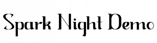 Scaricare 666 Downloads@WebFont
 -
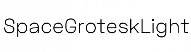
( Fonts by Florian Karsten - Personal-use only. For commercial use please contact owner. )
A modern, geometric sans-serif font with clean lines and excellent readability.
![Space Grotesk Light font caratteri gratis]() Scaricare 666 Downloads@WebFont
Scaricare 666 Downloads@WebFont -
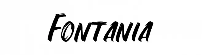
![Fontania font caratteri gratis]() Scaricare 666 Downloads@WebFont
Scaricare 666 Downloads@WebFont -
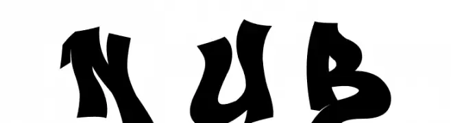
( imagex - www.imagex-fonts.com )
A bold, graffiti-inspired font with sharp, angular edges and dynamic styling.
![Next Ups Black font caratteri gratis]() Scaricare 666 Downloads@WebFont
Scaricare 666 Downloads@WebFont -
( Sabrtype - creativemarket.com/Sabrtype )
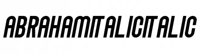
A bold, italicized font with a condensed and dynamic style.
![Abraham Italic Italic font caratteri gratis]() Scaricare 666 Downloads@WebFont
Scaricare 666 Downloads@WebFont -
-
( Chequered Ink - chequered.ink/ )
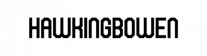
A bold, geometric font with a modern, structured design.
![Hawking Bowen font caratteri gratis]() Scaricare 666 Downloads@WebFont
Scaricare 666 Downloads@WebFont -
( Bill Walker )
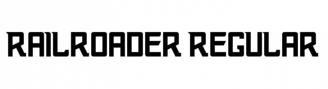
A bold, geometric font with an industrial, vintage railway aesthetic.
![Railroader Regular font caratteri gratis]() Scaricare 666 Downloads@WebFont
Scaricare 666 Downloads@WebFont -
( Copyright 2018 The Cute Font Project Authors )
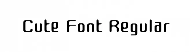
A playful, rounded font with smooth curves and a friendly appearance.
![Cute Font Regular font caratteri gratis]() Scaricare 666 Downloads@WebFont
Scaricare 666 Downloads@WebFont -
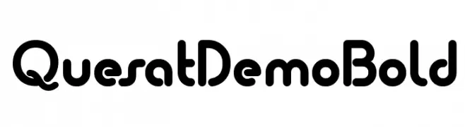
( Fonts by www.studiotypo.com - Personal-use only. For commercial use please contact owner. )
A bold, rounded font with smooth curves and a modern, approachable style.
![Quesat Demo Bold font caratteri gratis]() Scaricare 666 Downloads@WebFont
Scaricare 666 Downloads@WebFont -
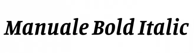
( Copyright 2016 The Manuale Project Authors (omnibus.type@gmail.com) )
A bold, italic serif font with elegant and dynamic styling.
![Manuale Bold Italic font caratteri gratis]() Scaricare 666 Downloads@WebFont
Scaricare 666 Downloads@WebFont
Quali sono i font più popolari adesso?
Poppins, Roboto, Montserrat, Open Sans e Lato sono molto usati per le forme pulite e l'ampia applicabilità — dall'identità di marca alle landing page e ai poster.
Quali font si usano spesso nei loghi?
Le sans serif geometriche (es. Poppins, famiglie in stile Gotham) sono scelte comuni per un branding pulito e scalabile. Per un tocco personale restano valide script e stili manoscritti. Abbina un display deciso per i titoli a un corpo testo neutro per riconoscibilità ed equilibrio.
Ogni quanto si aggiorna la lista?
Con regolarità, in base ai download e all'attività reale. Torna spesso per scoprire in anticipo le nuove preferite.
💡 Consiglio: aggiungi ai preferiti — le tendenze cambiano in fretta e i font top di oggi possono ispirare il rebranding di domani.