Benvenuto nelle Font Più Popolari — dove popolarità e qualità si incontrano. Qui trovi i font più scaricati e usati dell'anno. Se cerchi scelte sicure per logo, web o social, inizia da qui.
Ogni font top si distingue per equilibrio, leggibilità e versatilità. Troverai sans serif moderne, script eleganti, serif vintage e display minimalisti.
-
( Fonts by Aryel Filipe )
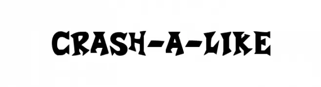
A bold, dynamic font with sharp, angular edges and a playful, cartoonish style.
 Scaricare 618 Downloads@WebFont
 -
![Wab font caratteri gratis]() Scaricare 618 Downloads@WebFont
Scaricare 618 Downloads@WebFont -
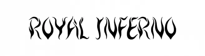
( Font by Jonathan Harris - www.tattoowoo.com )
A bold, flame-inspired decorative font with dynamic curves and sharp edges.
![Royal Inferno font caratteri gratis]() Scaricare 618 Downloads@WebFont
Scaricare 618 Downloads@WebFont -
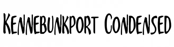
( Fonts by Daniel Zadorozny - www.iconian.com - Free for personal use )
A bold, condensed, hand-drawn font with a playful and energetic style.
![Kennebunkport Condensed font caratteri gratis]() Scaricare 618 Downloads@WebFont
Scaricare 618 Downloads@WebFont -
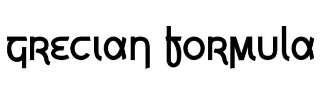
( Fonts by www.vicfieger.com )
A bold, geometric font with angular letterforms and minimal stroke contrast.
![Grecian Formula font caratteri gratis]() Scaricare 618 Downloads@WebFont
Scaricare 618 Downloads@WebFont -
-
![Ænigma Scrawl [BRK] font caratteri gratis]() Scaricare 618 Downloads@WebFont
Scaricare 618 Downloads@WebFont -
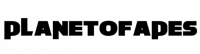
( Fonts by Fran Fernandez - Personal-use only. For commercial use please contact owner. )
A bold, blocky font with strong geometric shapes and uniform width.
![Planet of Apes font caratteri gratis]() Scaricare 618 Downloads@WebFont
Scaricare 618 Downloads@WebFont -
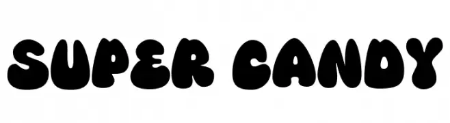
( Fonts by allsuperfont.com - Personal-use only. For commercial use please contact owner. )
A playful, bold font with bubbly, rounded characters perfect for fun and whimsical designs.
![Super Candy font caratteri gratis]() Scaricare 618 Downloads@WebFont
Scaricare 618 Downloads@WebFont -
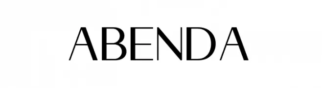
( Fonts by Pen Culture - Revo Farisky - Personal-use only. For commercial use please contact owner. )
A modern, geometric font with clean lines and a professional appearance.
![Abenda font caratteri gratis]() Scaricare 618 Downloads@WebFont
Scaricare 618 Downloads@WebFont -
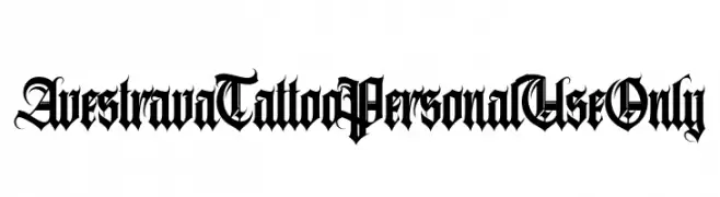
( Fonts by ilhamtaro - Personal-use only. For commercial use please contact owner. )
A bold, ornate Blackletter font with intricate serifs and flourishes.
![AvestravaTattooPersonalUseOnly font caratteri gratis]() Scaricare 618 Downloads@WebFont
Scaricare 618 Downloads@WebFont

![Ænigma Scrawl [BRK] font caratteri gratis](https://d144mzi0q5mijx.cloudfront.net/img/0/N/nigma-Scrawl-BRK.webp)
Quali sono i font più popolari adesso?
Poppins, Roboto, Montserrat, Open Sans e Lato sono molto usati per le forme pulite e l'ampia applicabilità — dall'identità di marca alle landing page e ai poster.
Quali font si usano spesso nei loghi?
Le sans serif geometriche (es. Poppins, famiglie in stile Gotham) sono scelte comuni per un branding pulito e scalabile. Per un tocco personale restano valide script e stili manoscritti. Abbina un display deciso per i titoli a un corpo testo neutro per riconoscibilità ed equilibrio.
Ogni quanto si aggiorna la lista?
Con regolarità, in base ai download e all'attività reale. Torna spesso per scoprire in anticipo le nuove preferite.
💡 Consiglio: aggiungi ai preferiti — le tendenze cambiano in fretta e i font top di oggi possono ispirare il rebranding di domani.