Benvenuto nelle Font Più Popolari — dove popolarità e qualità si incontrano. Qui trovi i font più scaricati e usati dell'anno. Se cerchi scelte sicure per logo, web o social, inizia da qui.
Ogni font top si distingue per equilibrio, leggibilità e versatilità. Troverai sans serif moderne, script eleganti, serif vintage e display minimalisti.
-
 Scaricare 617 Downloads@WebFont
 -
( melpc.blogspot.com )
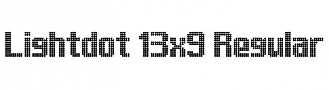
A dot matrix font with a modern, digital display style.
![Lightdot 13x9 Regular font caratteri gratis]() Scaricare 617 Downloads@WebFont
Scaricare 617 Downloads@WebFont -
( Fonts by Omnibus Type )
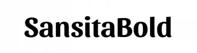
A bold, modern font with elegant curves and strong character presence.
![Sansita Bold font caratteri gratis]() Scaricare 617 Downloads@WebFont
Scaricare 617 Downloads@WebFont -
( Copyright 2016 The Cabin Project Authors (impallari@gmail.com) )
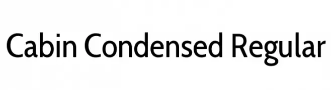
A modern, condensed sans-serif font with clean lines and excellent readability.
![Cabin Condensed Regular font caratteri gratis]() Scaricare 617 Downloads@WebFont
Scaricare 617 Downloads@WebFont -
( Copyright (c) 2011, wmk69 (wmk69@o2.pl) )
A sleek, modern font with rounded edges and uniform stroke width.
![Nova Slim font caratteri gratis]() Scaricare 617 Downloads@WebFont
Scaricare 617 Downloads@WebFont -
-
( Fonts by imagex )
A bold, decorative font with a unique dripping effect, perfect for impactful designs.
![Columbine font caratteri gratis]() Scaricare 617 Downloads@WebFont
Scaricare 617 Downloads@WebFont -
![Yellow Peas Regular font caratteri gratis]() Scaricare 617 Downloads@WebFont
Scaricare 617 Downloads@WebFont -
( گالری فانت فارسی پژوهش آريانا - only compatible with Farsi and Arabic )
The image does not depict a valid font.
![Chin font caratteri gratis]() Scaricare 617 Downloads@WebFont
Scaricare 617 Downloads@WebFont -
( Pollem Studio - Muhammad Nur - www.creativefabrica.com/designer/polem/ref/2050/ )
A bold, expressive script font with sweeping curves and high contrast.
![Mighttel font caratteri gratis]() Scaricare 616 Downloads@WebFont
Scaricare 616 Downloads@WebFont -
( Fonts by Dieter Steffmann )
A bold, artistic font with a hand-crafted appearance, perfect for creative projects.
![Carmen Regular font caratteri gratis]() Scaricare 616 Downloads@WebFont
Scaricare 616 Downloads@WebFont


Quali sono i font più popolari adesso?
Poppins, Roboto, Montserrat, Open Sans e Lato sono molto usati per le forme pulite e l'ampia applicabilità — dall'identità di marca alle landing page e ai poster.
Quali font si usano spesso nei loghi?
Le sans serif geometriche (es. Poppins, famiglie in stile Gotham) sono scelte comuni per un branding pulito e scalabile. Per un tocco personale restano valide script e stili manoscritti. Abbina un display deciso per i titoli a un corpo testo neutro per riconoscibilità ed equilibrio.
Ogni quanto si aggiorna la lista?
Con regolarità, in base ai download e all'attività reale. Torna spesso per scoprire in anticipo le nuove preferite.
💡 Consiglio: aggiungi ai preferiti — le tendenze cambiano in fretta e i font top di oggi possono ispirare il rebranding di domani.