Benvenuto nelle Font Più Popolari — dove popolarità e qualità si incontrano. Qui trovi i font più scaricati e usati dell'anno. Se cerchi scelte sicure per logo, web o social, inizia da qui.
Ogni font top si distingue per equilibrio, leggibilità e versatilità. Troverai sans serif moderne, script eleganti, serif vintage e display minimalisti.
-
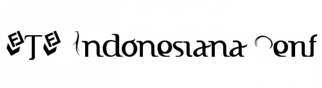
( Fonts by Fizzetica DepokAsiana TypeFoundry - fizzeticatypefoundry.tumblr.com )
A decorative serif font with elegant curves and modern flair.
 Scaricare 1912 Downloads@WebFont
 -
( Fonts by Daniel Zadorozny - www.iconian.com - Free for personal use )
A playful, bold, and cartoonish font with rounded edges and quirky character shapes.
![Wimp-Out font caratteri gratis]() Scaricare 1912 Downloads@WebFont
Scaricare 1912 Downloads@WebFont -
![Brittany font caratteri gratis]() Scaricare 1911 Downloads@WebFont
Scaricare 1911 Downloads@WebFont -
( Fonts by Apostrophic Lab )
A clean, modern sans-serif font with uniform strokes and high legibility.
![Florencesans SC font caratteri gratis]() Scaricare 1911 Downloads@WebFont
Scaricare 1911 Downloads@WebFont -
( Fonts by Khurasan )
A playful, bold typeface with rounded edges and a friendly appearance.
![Dobidoo font caratteri gratis]() Scaricare 1910 Downloads@WebFont
Scaricare 1910 Downloads@WebFont -
-
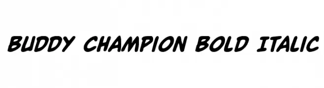
( Fonts by Daniel Zadorozny - www.iconian.com - Free for personal use )
A bold, italicized font with a playful and dynamic style.
![Buddy Champion Bold Italic font caratteri gratis]() Scaricare 1910 Downloads@WebFont
Scaricare 1910 Downloads@WebFont -
( Fonts by Christopher Hansen )
A bold, distressed font with a grunge texture and rugged appearance.
![Living Hell font caratteri gratis]() Scaricare 1910 Downloads@WebFont
Scaricare 1910 Downloads@WebFont -
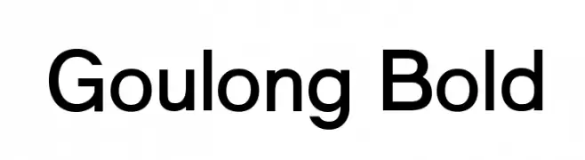
( Fonts by Graham Meade - GemFonts )
A bold, modern sans-serif font with geometric influences and high legibility.
![Goulong Bold font caratteri gratis]() Scaricare 1910 Downloads@WebFont
Scaricare 1910 Downloads@WebFont -
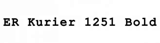
![ER Kurier 1251 Bold font caratteri gratis]() Scaricare 1910 Downloads@WebFont
Scaricare 1910 Downloads@WebFont -
![Marbolo-Normal font caratteri gratis]() Scaricare 1910 Downloads
Scaricare 1910 Downloads -
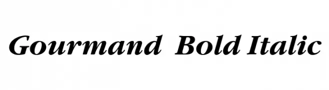
![Gourmand Bold Italic font caratteri gratis]() Scaricare 1910 Downloads@WebFont
Scaricare 1910 Downloads@WebFont -
( Fonts by Typographer Mediengestaltung - Personal-use only. For commercial use please contact owner. )
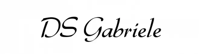
An elegant, flowing script font with smooth, cursive strokes.
![DS Gabriele font caratteri gratis]() Scaricare 1909 Downloads@WebFont
Scaricare 1909 Downloads@WebFont -
( Magique Fonts - www.facebook.com/typesgal/ )
A bold, geometric font with strong symmetry and modern appeal.
![Capture Smallz Clean font caratteri gratis]() Scaricare 1909 Downloads@WebFont
Scaricare 1909 Downloads@WebFont -
( Fonts by Studio Typo )
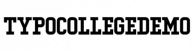
A bold, collegiate-style font with strong, block-like characters.
![Typo College Demo font caratteri gratis]() Scaricare 1909 Downloads@WebFont
Scaricare 1909 Downloads@WebFont -
( Copyright 2016 The Sansita Project Authors (omnibus.type@gmail.com) )
A bold, italic font with a dynamic and modern style.
![Sansita Black Italic font caratteri gratis]() Scaricare 1909 Downloads@WebFont
Scaricare 1909 Downloads@WebFont -
( Fonts by www.kimberlygeswein.com - Kimberly Geswein )
A bold, playful font with a unique shadow effect and rounded characters.
![KG HAPPY font caratteri gratis]() Scaricare 1909 Downloads@WebFont
Scaricare 1909 Downloads@WebFont -
( Font by Jonathan Harris - www.tattoowoo.com )
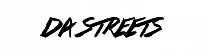
A bold, dynamic script font with a graffiti-inspired style.
![Da Streets font caratteri gratis]() Scaricare 1909 Downloads@WebFont
Scaricare 1909 Downloads@WebFont -
![Sathiy Normal font caratteri gratis]() Scaricare 1909 Downloads@WebFont
Scaricare 1909 Downloads@WebFont -
( Fonts by www.vicfieger.com )
A bold, textured font with a playful, distressed style.
![Alpha Echo font caratteri gratis]() Scaricare 1909 Downloads@WebFont
Scaricare 1909 Downloads@WebFont -
( Fonts by Holydie Studio - Personal-use only. For commercial use please contact owner. )
A bold, aggressive font with sharp, jagged edges, perfect for impactful designs.
![DEADLY KILLERS font caratteri gratis]() Scaricare 1908 Downloads@WebFont
Scaricare 1908 Downloads@WebFont -
( Fonts by CannotIntoSpaceFonts - KineticPlasma Fonts - Personal-use only. For commercial use please contact owner. )
A bold, modern font with clean lines and strong geometric shapes.
![Rabbid Highway Sign IV Black font caratteri gratis]() Scaricare 1908 Downloads@WebFont
Scaricare 1908 Downloads@WebFont -
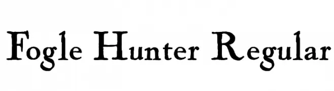
( Fonts by HENRIavecunK. Personal-use only. For commercial use please contact owner. )
A rustic, hand-drawn font with uneven edges and a natural feel.
![Fogle Hunter Regular font caratteri gratis]() Scaricare 1908 Downloads@WebFont
Scaricare 1908 Downloads@WebFont -
( Google Web Fonts )
A classic serif font with elegant, well-defined serifs and moderate contrast.
![QuattrocentoRoman font caratteri gratis]() Scaricare 1908 Downloads@WebFont
Scaricare 1908 Downloads@WebFont -
( Fonts by Dieter Steffmann )
A traditional Blackletter font with ornate, angular design and historical elegance.
![Sebaldus-Gotisch font caratteri gratis]() Scaricare 1908 Downloads@WebFont
Scaricare 1908 Downloads@WebFont -
( Fonts by Nick Curtis - www.nicksfonts.com )
A bold, geometric font with a three-dimensional, faceted design.
![Facets NF font caratteri gratis]() Scaricare 1908 Downloads@WebFont
Scaricare 1908 Downloads@WebFont -
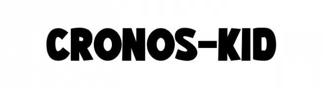
( Fonts by Pinisiart )
A bold, playful font with rounded, slightly irregular characters.
![CRONOS-KID font caratteri gratis]() Scaricare 1907 Downloads@WebFont
Scaricare 1907 Downloads@WebFont -
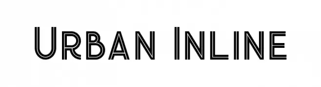
( Peter Olexa - www.dealjumbo.com )
A modern, geometric font with an inline style for added depth.
![Urban Inline font caratteri gratis]() Scaricare 1907 Downloads@WebFont
Scaricare 1907 Downloads@WebFont -
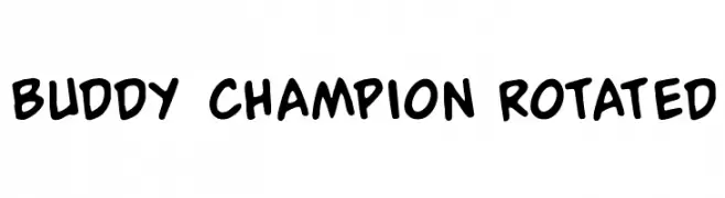
( Fonts by Daniel Zadorozny - www.iconian.com - Free for personal use )
A playful, bold font with rounded strokes and a dynamic, friendly appearance.
![Buddy Champion Rotated font caratteri gratis]() Scaricare 1907 Downloads@WebFont
Scaricare 1907 Downloads@WebFont -
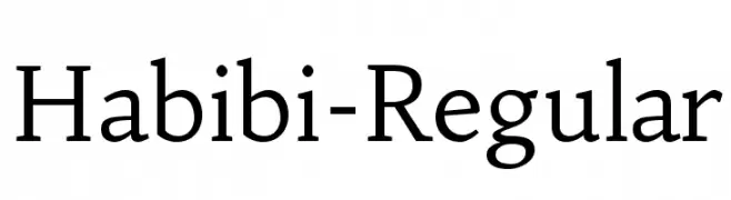
( Copyright (c) 2011 by Sorkin Type Co (www.sorkintype.com) )
A classic serif font with modern elegance and balanced proportions.
![Habibi-Regular font caratteri gratis]() Scaricare 1907 Downloads@WebFont
Scaricare 1907 Downloads@WebFont -
![SV Basic Manual font caratteri gratis]() Scaricare 1907 Downloads@WebFont
Scaricare 1907 Downloads@WebFont -
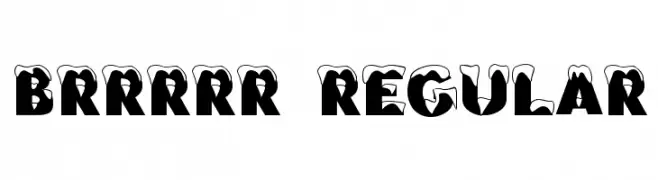
![Brrrrr Regular font caratteri gratis]() Scaricare 1907 Downloads@WebFont
Scaricare 1907 Downloads@WebFont -
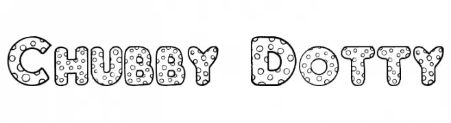
( Fonts by www.houseoflime.com )
A playful, polka-dotted font with bold, rounded letters.
![Chubby Dotty font caratteri gratis]() Scaricare 1907 Downloads@WebFont
Scaricare 1907 Downloads@WebFont -
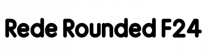
![Rede Rounded F24 font caratteri gratis]() Scaricare 1906 Downloads@WebFont
Scaricare 1906 Downloads@WebFont -
( Copyright (c) 2011-2012, Martin Sommaruga (martin@estudiotrama.com), with Reserved Font Name 'Rambla' )
A bold, clean sans-serif font with a modern and professional look.
![Rambla Bold font caratteri gratis]() Scaricare 1906 Downloads@WebFont
Scaricare 1906 Downloads@WebFont -
![Cutie Pop font caratteri gratis]() Scaricare 1906 Downloads@WebFont
Scaricare 1906 Downloads@WebFont


Quali sono i font più popolari adesso?
Poppins, Roboto, Montserrat, Open Sans e Lato sono molto usati per le forme pulite e l'ampia applicabilità — dall'identità di marca alle landing page e ai poster.
Quali font si usano spesso nei loghi?
Le sans serif geometriche (es. Poppins, famiglie in stile Gotham) sono scelte comuni per un branding pulito e scalabile. Per un tocco personale restano valide script e stili manoscritti. Abbina un display deciso per i titoli a un corpo testo neutro per riconoscibilità ed equilibrio.
Ogni quanto si aggiorna la lista?
Con regolarità, in base ai download e all'attività reale. Torna spesso per scoprire in anticipo le nuove preferite.
💡 Consiglio: aggiungi ai preferiti — le tendenze cambiano in fretta e i font top di oggi possono ispirare il rebranding di domani.