Benvenuto nelle Font Più Popolari — dove popolarità e qualità si incontrano. Qui trovi i font più scaricati e usati dell'anno. Se cerchi scelte sicure per logo, web o social, inizia da qui.
Ogni font top si distingue per equilibrio, leggibilità e versatilità. Troverai sans serif moderne, script eleganti, serif vintage e display minimalisti.
-
( Fonts by Syaf Rizal - Khurasan - Personal-use only. For commercial use please contact owner. )
A dynamic, brush-style font with bold, expressive strokes.
 Scaricare 1696 Downloads@WebFont
 -
( Fonts by Luke Owens - Personal-use only. For commercial use please contact owner. )
A modern, extended sans-serif font with clean lines and geometric precision.
![Oregon LDO Extended font caratteri gratis]() Scaricare 1696 Downloads@WebFont
Scaricare 1696 Downloads@WebFont -
( Copyright (c) 2015, Christian Thalmann and the Cormorant Project Authors (github.com/CatharsisFonts/Cormorant) )
Elegant serif font with high contrast and refined strokes.
![Cormorant SC Light font caratteri gratis]() Scaricare 1696 Downloads@WebFont
Scaricare 1696 Downloads@WebFont -
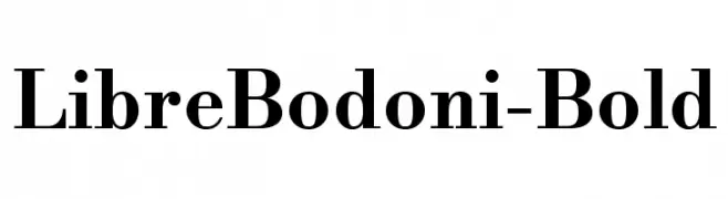
![LibreBodoni-Bold font caratteri gratis]() Scaricare 1696 Downloads@WebFont
Scaricare 1696 Downloads@WebFont -
( Fonts by a Neale Davidson - www.pixelsagas.com. Personal-use only. For commercial use please contact owner. )
Bold, italicized font with strong, angular lines and a dynamic slant.
![Virtucorp Bold Italic font caratteri gratis]() Scaricare 1696 Downloads@WebFont
Scaricare 1696 Downloads@WebFont -
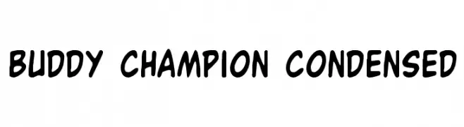
( Fonts by Daniel Zadorozny - www.iconian.com - Free for personal use )
A playful, bold, and hand-drawn font with rounded edges and a condensed style.
![Buddy Champion Condensed font caratteri gratis]() Scaricare 1696 Downloads@WebFont
Scaricare 1696 Downloads@WebFont -
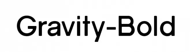
![Gravity-Bold font caratteri gratis]() Scaricare 1696 Downloads@WebFont
Scaricare 1696 Downloads@WebFont -
( Fonts by www.gust.org.pl )
A clean and modern sans-serif font with balanced proportions and excellent readability.
![LMSansQuot8-Regular font caratteri gratis]() Scaricare 1696 Downloads@WebFont
Scaricare 1696 Downloads@WebFont -
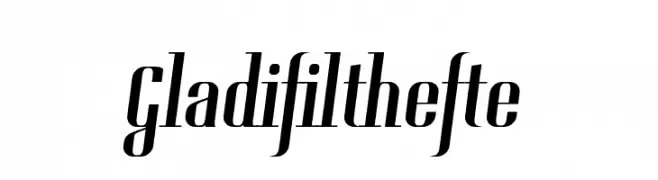
( Fonts by Tup Wanders - www.tupwanders.nl )
A modern, high-contrast serif font with tall, narrow letterforms and elegant serifs.
![Gladifilthefte font caratteri gratis]() Scaricare 1696 Downloads@WebFont
Scaricare 1696 Downloads@WebFont -
( Fonts by ShyFonts )
A bold, extended typeface with a modern, assertive style.
![SF Port McKenzie Extended font caratteri gratis]() Scaricare 1696 Downloads@WebFont
Scaricare 1696 Downloads@WebFont -
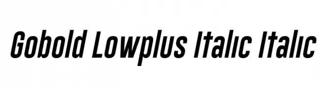
( Fonts by a Situjuh Nazara - c7n1.wordpress.com. Personal-use only. For commercial use please contact owner. )
A bold, italicized font with a modern, dynamic style and consistent stroke width.
![Gobold Lowplus Italic Italic font caratteri gratis]() Scaricare 1695 Downloads@WebFont
Scaricare 1695 Downloads@WebFont -
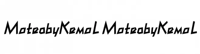
Caratteri di Kemal. For commercial use please contact the owner.
![MateobyKemaL MateobyKemaL font caratteri gratis]() Scaricare 1695 Downloads@WebFont
Scaricare 1695 Downloads@WebFont -
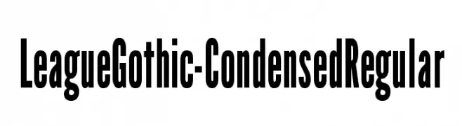
( Fonts by The League of Moveable Type - theleagueofmoveabletype.com )
A bold, condensed font with tall, narrow letterforms for impactful design.
![LeagueGothic-CondensedRegular font caratteri gratis]() Scaricare 1695 Downloads@WebFont
Scaricare 1695 Downloads@WebFont -
![apantasia font caratteri gratis]() Scaricare 1695 Downloads@WebFont
Scaricare 1695 Downloads@WebFont -
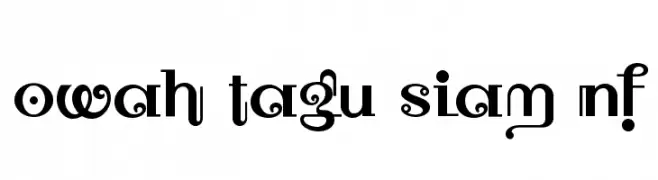
( Fonts by Nick Curtis - www.nicksfonts.com )
A bold, decorative font with high contrast and artistic letterforms.
![Owah Tagu Siam NF font caratteri gratis]() Scaricare 1695 Downloads@WebFont
Scaricare 1695 Downloads@WebFont -
( Fonts by Creative Zone )
A bold, playful, and hand-drawn font with rounded, thick characters.
![Balinesia font caratteri gratis]() Scaricare 1694 Downloads@WebFont
Scaricare 1694 Downloads@WebFont -
( Zetafonts - www.zetafonts.com )
A bold, italicized font with a modern and dynamic style.
![Heading Pro Trial Bold Italic font caratteri gratis]() Scaricare 1694 Downloads@WebFont
Scaricare 1694 Downloads@WebFont -
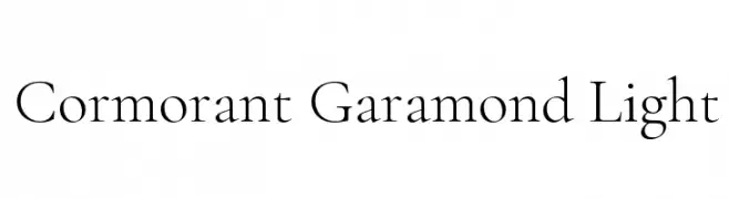
( Copyright (c) 2015, Christian Thalmann and the Cormorant Project Authors (github.com/CatharsisFonts/Cormorant) )
A classic serif font with high contrast and elegant thin strokes.
![Cormorant Garamond Light font caratteri gratis]() Scaricare 1694 Downloads@WebFont
Scaricare 1694 Downloads@WebFont -
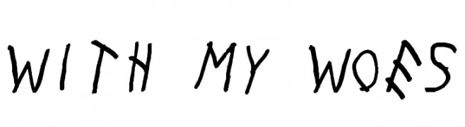
( Fonts by OJ Customs )
A playful, handwritten font with irregular, tilted letterforms and a casual charm.
![With My Woes font caratteri gratis]() Scaricare 1694 Downloads@WebFont
Scaricare 1694 Downloads@WebFont -
![Skyline font caratteri gratis]() Scaricare 1694 Downloads@WebFont
Scaricare 1694 Downloads@WebFont -
( Fonts by www.typodermicfonts.com - Ray Larabie )
A modern, geometric sans-serif font with clean lines and uniform strokes.
![ExpresswayRg-Regular font caratteri gratis]() Scaricare 1694 Downloads@WebFont
Scaricare 1694 Downloads@WebFont -
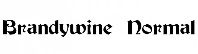
![Brandywine Normal font caratteri gratis]() Scaricare 1694 Downloads@WebFont
Scaricare 1694 Downloads@WebFont -
![Astra font caratteri gratis]() Scaricare 1694 Downloads@WebFont
Scaricare 1694 Downloads@WebFont -
( Fonts by Woodcutter Manero - http://www.woodcutter.es - Personal-use only. For commercial use please contact owner. )
A bold, Gothic-style font with sharp, angular lines and intricate detailing.
![Gothic War font caratteri gratis]() Scaricare 1693 Downloads@WebFont
Scaricare 1693 Downloads@WebFont -
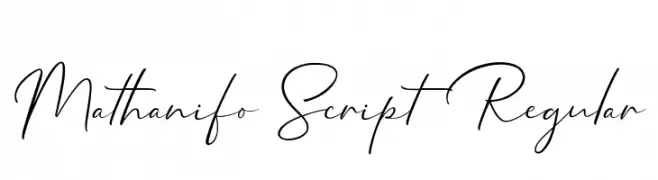
( Cotbada Studio - Isfani - creativemarket.com/Cotbada_studio )
A modern, elegant script font with a flowing, handwritten style.
![Mathanifo Script Regular font caratteri gratis]() Scaricare 1693 Downloads@WebFont
Scaricare 1693 Downloads@WebFont -
( Fonts by antoniorodriguesjr.com )
A modern, rounded font with clean lines and a friendly appearance.
![Havana Rounded font caratteri gratis]() Scaricare 1693 Downloads@WebFont
Scaricare 1693 Downloads@WebFont -
( Font by Jonathan Harris - www.tattoowoo.com )
A bold, expressive handwritten font with dynamic strokes and a textured appearance.
![The Best Night font caratteri gratis]() Scaricare 1693 Downloads@WebFont
Scaricare 1693 Downloads@WebFont -
![Garishing Worse font caratteri gratis]() Scaricare 1693 Downloads@WebFont
Scaricare 1693 Downloads@WebFont -
![48ver lost font caratteri gratis]() Scaricare 1693 Downloads@WebFont
Scaricare 1693 Downloads@WebFont -
![Borg font caratteri gratis]() Scaricare 1693 Downloads@WebFont
Scaricare 1693 Downloads@WebFont -
( Fonts by Khurasan )
A playful, bold font with rounded, hand-drawn characters.
![Lemon Shake Shake font caratteri gratis]() Scaricare 1692 Downloads@WebFont
Scaricare 1692 Downloads@WebFont -
( Fonts by Lafontype - Anugrah Pasau - Personal-use only. For commercial use please contact owner. )
A bold, modern sans-serif font with strong, uniform strokes.
![CreatoDisplay-ExtraBold font caratteri gratis]() Scaricare 1692 Downloads@WebFont
Scaricare 1692 Downloads@WebFont -
( The Northern Block - Jonathan Hill - www.thenorthernblock.co.uk )
A modern, geometric sans-serif font with balanced proportions and uniform stroke width.
![Corbert-Regular font caratteri gratis]() Scaricare 1692 Downloads@WebFont
Scaricare 1692 Downloads@WebFont -
( www.cloutierfontes.ca/ )
A bold, vintage-style font with a decorative, distressed texture.
![CF Old Milwaukee Regular font caratteri gratis]() Scaricare 1692 Downloads@WebFont
Scaricare 1692 Downloads@WebFont -
( Fonts by Casady & Greene )
A bold, condensed sans-serif font with a modern and clean appearance.
![SansSerifBldFLFCond font caratteri gratis]() Scaricare 1692 Downloads@WebFont
Scaricare 1692 Downloads@WebFont


Quali sono i font più popolari adesso?
Poppins, Roboto, Montserrat, Open Sans e Lato sono molto usati per le forme pulite e l'ampia applicabilità — dall'identità di marca alle landing page e ai poster.
Quali font si usano spesso nei loghi?
Le sans serif geometriche (es. Poppins, famiglie in stile Gotham) sono scelte comuni per un branding pulito e scalabile. Per un tocco personale restano valide script e stili manoscritti. Abbina un display deciso per i titoli a un corpo testo neutro per riconoscibilità ed equilibrio.
Ogni quanto si aggiorna la lista?
Con regolarità, in base ai download e all'attività reale. Torna spesso per scoprire in anticipo le nuove preferite.
💡 Consiglio: aggiungi ai preferiti — le tendenze cambiano in fretta e i font top di oggi possono ispirare il rebranding di domani.