Benvenuto nelle Font Più Popolari — dove popolarità e qualità si incontrano. Qui trovi i font più scaricati e usati dell'anno. Se cerchi scelte sicure per logo, web o social, inizia da qui.
Ogni font top si distingue per equilibrio, leggibilità e versatilità. Troverai sans serif moderne, script eleganti, serif vintage e display minimalisti.
-
 Scaricare 1625 Downloads
 -
( Fonts by uatype.faithweb.com - UnAuthorized Type )
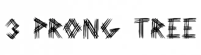
A bold, scratch-like font with a chaotic, hand-drawn appearance.
![3 Prong Tree font caratteri gratis]() Scaricare 1625 Downloads@WebFont
Scaricare 1625 Downloads@WebFont -
( Fonts by Namara Creative Studio - Personal-use only. For commercial use please contact owner. )
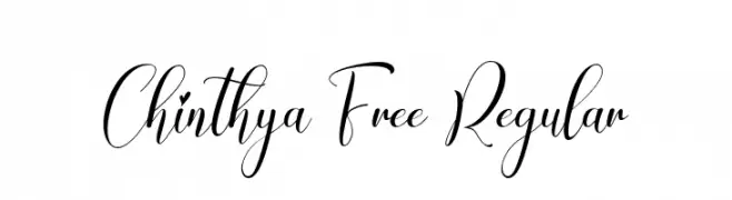
An elegant script font with flowing, interconnected letters and ornate flourishes.
![Chinthya Free Regular font caratteri gratis]() Scaricare 1624 Downloads@WebFont
Scaricare 1624 Downloads@WebFont -
( Fonts by AZ Std )
Hand-drawn, marker-style decorative doodle font.
![Uncle House Extra font caratteri gratis]() Scaricare 1624 Downloads@WebFont
Scaricare 1624 Downloads@WebFont -
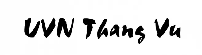
![UVN Thang Vu font caratteri gratis]() Scaricare 1624 Downloads@WebFont
Scaricare 1624 Downloads@WebFont -
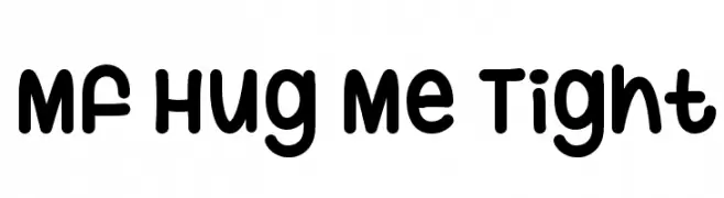
( Fonts by Misti`s Fonts - mistifonts.com - Personal-use only. For commercial use please contact owner. )
A playful, rounded font with a friendly and approachable style.
![Mf Hug Me Tight font caratteri gratis]() Scaricare 1624 Downloads@WebFont
Scaricare 1624 Downloads@WebFont -
![Vacer Sans Personal Fat font caratteri gratis]() Scaricare 1624 Downloads@WebFont
Scaricare 1624 Downloads@WebFont -
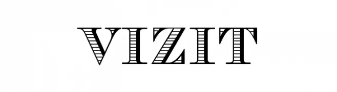
( Fonts by www.gliphmaker.com. Personal-use only. For commercial use please contact owner. )
A bold, decorative font with a unique striped pattern, ideal for display use.
![Vizit font caratteri gratis]() Scaricare 1624 Downloads@WebFont
Scaricare 1624 Downloads@WebFont -
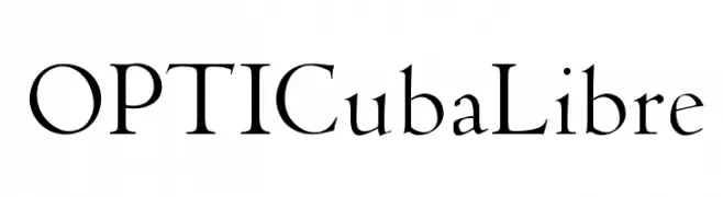
( Fonts by Castcraft Software - opti.netii.net - check the website before use )
A classic serif font with elegant curves and medium contrast.
![OPTICubaLibre font caratteri gratis]() Scaricare 1623 Downloads@WebFont
Scaricare 1623 Downloads@WebFont -
( Fonts by www.kimberlygeswein.com - Kimberly Geswein )
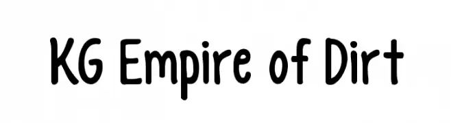
A playful, handwritten font with rounded edges and a casual style.
![KG Empire of Dirt font caratteri gratis]() Scaricare 1623 Downloads@WebFont
Scaricare 1623 Downloads@WebFont -
![TipTop font caratteri gratis]() Scaricare 1623 Downloads@WebFont
Scaricare 1623 Downloads@WebFont -
( Fonts by www.waltervelezart.com )
A whimsical and artistic font with elongated, flowing strokes.
![Fontasia font caratteri gratis]() Scaricare 1623 Downloads@WebFont
Scaricare 1623 Downloads@WebFont -
![Stargate font caratteri gratis]() Scaricare 1623 Downloads@WebFont
Scaricare 1623 Downloads@WebFont -
( Fonts by ShyFonts )
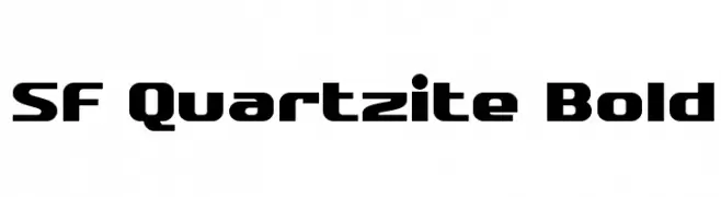
A bold, modern typeface with geometric shapes and rounded edges.
![SF Quartzite Bold font caratteri gratis]() Scaricare 1623 Downloads@WebFont
Scaricare 1623 Downloads@WebFont -
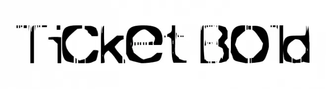
![Ticket Bold font caratteri gratis]() Scaricare 1623 Downloads@WebFont
Scaricare 1623 Downloads@WebFont -
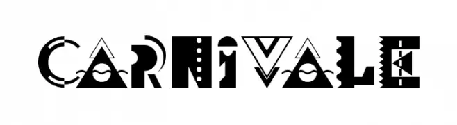
![Carnivale font caratteri gratis]() Scaricare 1623 Downloads@WebFont
Scaricare 1623 Downloads@WebFont -
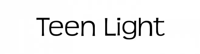
![Teen Light font caratteri gratis]() Scaricare 1623 Downloads@WebFont
Scaricare 1623 Downloads@WebFont -
( Footnote Fonts )
A bold, impactful font with thick strokes and strong legibility.
![Don't Panic font caratteri gratis]() Scaricare 1622 Downloads@WebFont
Scaricare 1622 Downloads@WebFont -
( Fonts by Karla Vazquez - Personal-use only. For commercial use please contact owner. )
A decorative serif font with intricate, angular embellishments and a bold, sophisticated style.
![Mayan font caratteri gratis]() Scaricare 1622 Downloads@WebFont
Scaricare 1622 Downloads@WebFont -
( Fonts by www.blambot.com )
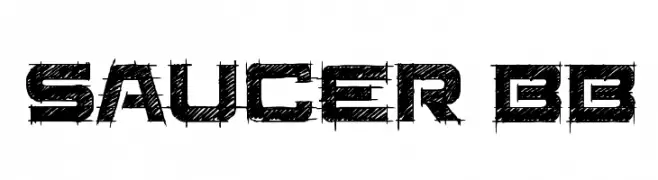
A bold, distressed font with a grunge texture and angular, geometric shapes.
![Saucer BB font caratteri gratis]() Scaricare 1622 Downloads@WebFont
Scaricare 1622 Downloads@WebFont -
![Manga Normal font caratteri gratis]() Scaricare 1622 Downloads@WebFont
Scaricare 1622 Downloads@WebFont -
( Fonts by Nick Curtis - www.nicksfonts.com )
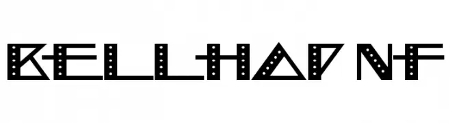
A bold, geometric font with modern, decorative elements and dot patterns.
![Bellhop NF font caratteri gratis]() Scaricare 1622 Downloads@WebFont
Scaricare 1622 Downloads@WebFont -
![CD Esoteric Plain font caratteri gratis]() Scaricare 1622 Downloads
Scaricare 1622 Downloads -
![Airlock Regular font caratteri gratis]() Scaricare 1622 Downloads@WebFont
Scaricare 1622 Downloads@WebFont -
![gogo]() Scaricare 1622 Downloads@WebFont
Scaricare 1622 Downloads@WebFont -
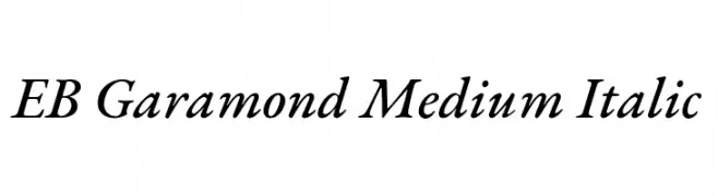
( Copyright 2017 The EB Garamond Project Authors (https://github.com/octaviopardo/EBGaramond12) )
A classic, elegant serif font with an italic style and medium weight.
![EB Garamond Medium Italic font caratteri gratis]() Scaricare 1621 Downloads@WebFont
Scaricare 1621 Downloads@WebFont -
( Fonts by Yusril Muhtadi )
A dynamic, expressive handwritten font with fluid strokes and a brush-like texture.
![Bringshoot font caratteri gratis]() Scaricare 1621 Downloads@WebFont
Scaricare 1621 Downloads@WebFont -
( Fonts by Aulia Rahman )
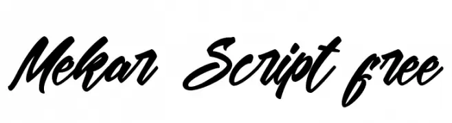
A bold, fluid script font with interconnected letters and expressive strokes.
![Mekar Script free font caratteri gratis]() Scaricare 1621 Downloads@WebFont
Scaricare 1621 Downloads@WebFont -
( Fonts by www.kimberlygeswein.com - Kimberly Geswein )
A bold, textured font with a hand-drawn, sketch-like appearance.
![KG Broken Vessels Sketch font caratteri gratis]() Scaricare 1621 Downloads@WebFont
Scaricare 1621 Downloads@WebFont -
![Aleph font caratteri gratis]() Scaricare 1621 Downloads@WebFont
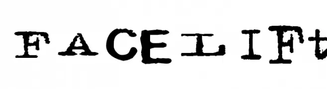
Scaricare 1621 Downloads@WebFont -
![Facelift font caratteri gratis]() Scaricare 1621 Downloads@WebFont
Scaricare 1621 Downloads@WebFont -
( Fonts by Octotype - www.foundmyfont.com - Personal-use only. For commercial use please contact owner. )
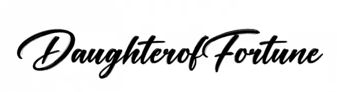
A classic, elegant script font with flowing cursive letterforms.
![Daughter of Fortune font caratteri gratis]() Scaricare 1620 Downloads@WebFont
Scaricare 1620 Downloads@WebFont -
( Fonts by Hanoded )
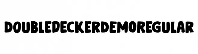
A bold, playful font with rounded letters and a unique double-decker bus symbol.
![Doubledecker DEMO Regular font caratteri gratis]() Scaricare 1620 Downloads@WebFont
Scaricare 1620 Downloads@WebFont -
( GNU FreeFont - savannah.gnu.org/projects/freefont/ )
A clean, monospaced typeface with uniform spacing and modern design.
![Free Monospaced font caratteri gratis]() Scaricare 1620 Downloads@WebFont
Scaricare 1620 Downloads@WebFont -
( Copyright 2012-2016 Hussain K.H, Santhosh Thottingal, Anilan NG, AKM Kutty, Swathanthra Malayalam Computing (http://smc.org.in) )
A modern sans-serif font with clean lines and excellent readability.
![Meera Inimai Regular font caratteri gratis]() Scaricare 1620 Downloads@WebFont
Scaricare 1620 Downloads@WebFont


Quali sono i font più popolari adesso?
Poppins, Roboto, Montserrat, Open Sans e Lato sono molto usati per le forme pulite e l'ampia applicabilità — dall'identità di marca alle landing page e ai poster.
Quali font si usano spesso nei loghi?
Le sans serif geometriche (es. Poppins, famiglie in stile Gotham) sono scelte comuni per un branding pulito e scalabile. Per un tocco personale restano valide script e stili manoscritti. Abbina un display deciso per i titoli a un corpo testo neutro per riconoscibilità ed equilibrio.
Ogni quanto si aggiorna la lista?
Con regolarità, in base ai download e all'attività reale. Torna spesso per scoprire in anticipo le nuove preferite.
💡 Consiglio: aggiungi ai preferiti — le tendenze cambiano in fretta e i font top di oggi possono ispirare il rebranding di domani.