Benvenuto nelle Font Più Popolari — dove popolarità e qualità si incontrano. Qui trovi i font più scaricati e usati dell'anno. Se cerchi scelte sicure per logo, web o social, inizia da qui.
Ogni font top si distingue per equilibrio, leggibilità e versatilità. Troverai sans serif moderne, script eleganti, serif vintage e display minimalisti.
-
( Fonts by RaisProject )
A playful, cartoonish font with bold, exaggerated characters and whimsical elements.
 Scaricare 1602 Downloads@WebFont
 -
( Footnote Fonts )
A bold, impactful font with thick strokes and strong legibility.
![Don't Panic font caratteri gratis]() Scaricare 1602 Downloads@WebFont
Scaricare 1602 Downloads@WebFont -
( Fonts by a Emily Spadoni - http://creativemarket.com/emilyspadoni/. Personal-use only. For commercial use please contact owner. )
A playful and whimsical script font with flowing, interconnected letters.
![What I Want For Christmas font caratteri gratis]() Scaricare 1602 Downloads@WebFont
Scaricare 1602 Downloads@WebFont -
( Fonts by www.woodcutter.es - woodcutter Manero - Personal-use only. For commercial use please contact owner. )
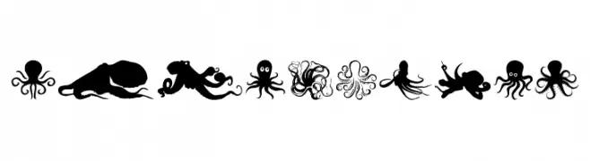
A decorative dingbat font with diverse octopus illustrations.
![The Octopus font caratteri gratis]() Scaricare 1602 Downloads@WebFont
Scaricare 1602 Downloads@WebFont -
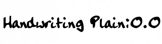
![Handwriting Plain:0.0 font caratteri gratis]() Scaricare 1602 Downloads@WebFont
Scaricare 1602 Downloads@WebFont -
-
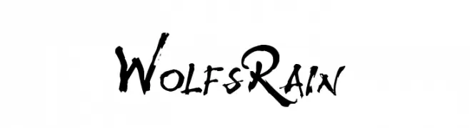
![WolfsRain font caratteri gratis]() Scaricare 1602 Downloads@WebFont
Scaricare 1602 Downloads@WebFont -
( Fonts by Manfred Klein - manfred-klein.ina-mar.com )
A bold, modern sans-serif font with clean lines and uniform stroke width.
![FrancophilSans-Bold font caratteri gratis]() Scaricare 1602 Downloads@WebFont
Scaricare 1602 Downloads@WebFont -
( Noto is a trademark of Google Inc. Noto fonts are open source. All Noto fonts are published under the SIL Open Font License, Version 1.1 )
A clean, monospaced sans-serif font ideal for coding and data presentation.
![Noto Sans Mono Regular font caratteri gratis]() Scaricare 1601 Downloads@WebFont
Scaricare 1601 Downloads@WebFont -
( deFharo - Fernando Haro - defharo.com )
A bold slab serif font with strong, block-like serifs and consistent stroke width.
![DiezmaRd-ExtraBold font caratteri gratis]() Scaricare 1601 Downloads@WebFont
Scaricare 1601 Downloads@WebFont -
( Andres Sanchez - www.andresls.com )
A modern, geometric font with clean lines and consistent stroke width.
![Neometric-Medium font caratteri gratis]() Scaricare 1601 Downloads@WebFont
Scaricare 1601 Downloads@WebFont -
![Raider Crusader Semi-Straight font caratteri gratis]() Scaricare 1601 Downloads@WebFont
Scaricare 1601 Downloads@WebFont -
( Fonts by www.monofonts.com. Personal-use only. For commercial use please contact owner. )
A bold, geometric font with strong, uniform shapes and minimal contrast.
![Fresko font caratteri gratis]() Scaricare 1601 Downloads@WebFont
Scaricare 1601 Downloads@WebFont -
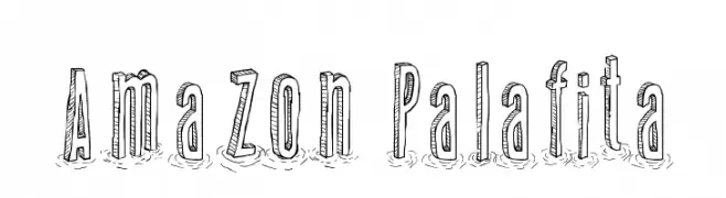
( Fonts by Galdino Otten - galdinootten.com )
A hand-drawn, sketch-like font with tall, narrow letters and a playful style.
![Amazon Palafita font caratteri gratis]() Scaricare 1601 Downloads@WebFont
Scaricare 1601 Downloads@WebFont -
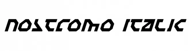
![Nostromo Italic font caratteri gratis]() Scaricare 1601 Downloads@WebFont
Scaricare 1601 Downloads@WebFont -
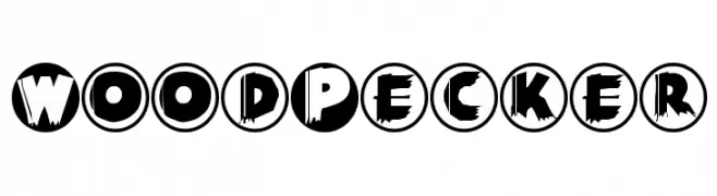
( Fonts by Manfred Klein. Free for private and charity use. Free for commercial with donation to organizations )
A bold, textured font with circular backgrounds and a woodcut style.
![WoodPecker font caratteri gratis]() Scaricare 1601 Downloads@WebFont
Scaricare 1601 Downloads@WebFont -
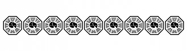
![LOST Font font caratteri gratis]() Scaricare 1601 Downloads@WebFont
Scaricare 1601 Downloads@WebFont -
![001Starship Gmma font caratteri gratis]() Scaricare 1601 Downloads@WebFont
Scaricare 1601 Downloads@WebFont -
![Romantically Yours font caratteri gratis]() Scaricare 1601 Downloads@WebFont
Scaricare 1601 Downloads@WebFont -
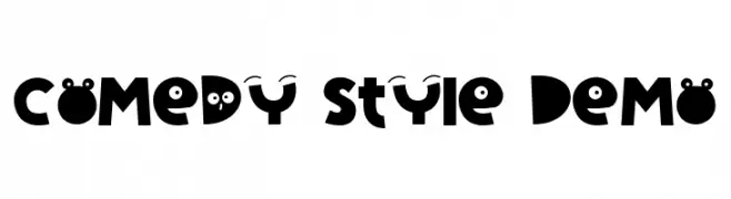
![Carmilla Demo font caratteri gratis]() Scaricare 1601 Downloads@WebFont
Scaricare 1601 Downloads@WebFont -
( Fonts by www.kimberlygeswein.com - Kimberly Geswein )
A playful, handwritten font with rounded edges and a casual style.
![KG Empire of Dirt font caratteri gratis]() Scaricare 1600 Downloads@WebFont
Scaricare 1600 Downloads@WebFont -
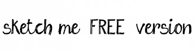
( Fonts by www.fontscafe.com )
A playful, hand-drawn font with a sketch-like appearance.
![sketch me_FREE-version font caratteri gratis]() Scaricare 1600 Downloads@WebFont
Scaricare 1600 Downloads@WebFont -
( Fonts by www.aimwell.org/Fonts/fonts.html )
An elegant serif font with sharp serifs and high contrast strokes.
![Carita font caratteri gratis]() Scaricare 1600 Downloads@WebFont
Scaricare 1600 Downloads@WebFont -
![TypographerGotisch C font caratteri gratis]() Scaricare 1600 Downloads@WebFont
Scaricare 1600 Downloads@WebFont -
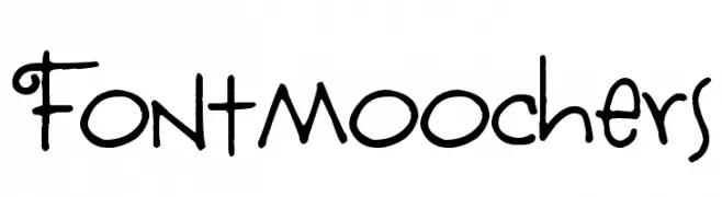
( Free for a personal use. For a commercial use please visit www.kevinandamanda.com )
A whimsical, playful font with decorative swirls and a casual script style.
![Fontmoochers font caratteri gratis]() Scaricare 1600 Downloads@WebFont
Scaricare 1600 Downloads@WebFont -
![BV Cursive Ital Italic font caratteri gratis]() Scaricare 1600 Downloads@WebFont
Scaricare 1600 Downloads@WebFont -
( Copyright 2013 Seoul Metropolitan Government (gonabis@seoul.go.kr) )
A bold, modern sans-serif font with clean lines and excellent readability.
![SeoulNamsan CBL font caratteri gratis]() Scaricare 1599 Downloads@WebFont
Scaricare 1599 Downloads@WebFont -
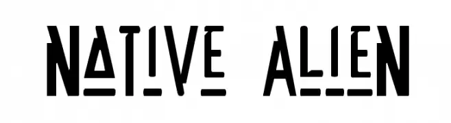
( Fonts by Daniel Zadorozny - www.iconian.com - Free for personal use )
A bold, futuristic font with angular, alien-like characters.
![Native Alien font caratteri gratis]() Scaricare 1599 Downloads
Scaricare 1599 Downloads -
![Face Off! font caratteri gratis]() Scaricare 1599 Downloads@WebFont
Scaricare 1599 Downloads@WebFont -
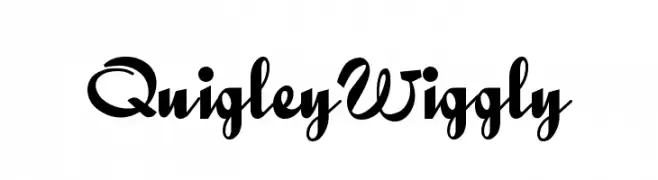
( Fonts by Nick Curtis - www.nicksfonts.com )
A playful, whimsical font with flowing, cursive-like strokes and decorative flair.
![QuigleyWiggly font caratteri gratis]() Scaricare 1599 Downloads@WebFont
Scaricare 1599 Downloads@WebFont -
( Fonts by Levi Halmos )
A bold, italicized font with a futuristic and dynamic style.
![Baby Universe Italic font caratteri gratis]() Scaricare 1599 Downloads@WebFont
Scaricare 1599 Downloads@WebFont -
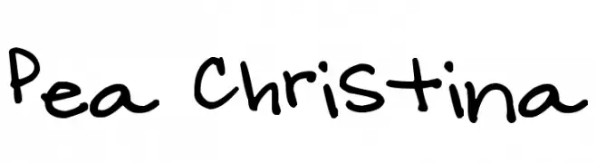
( Free for a personal use. For a commercial use please visit www.kevinandamanda.com )
A playful, casual handwritten font with a dynamic and informal style.
![Pea Christina font caratteri gratis]() Scaricare 1598 Downloads@WebFont
Scaricare 1598 Downloads@WebFont -
( - www.norwegianink.com )
A bold, geometric font with angular shapes and consistent thickness.
![Salty font caratteri gratis]() Scaricare 1598 Downloads@WebFont
Scaricare 1598 Downloads@WebFont -
![Odessa Script font caratteri gratis]() Scaricare 1598 Downloads
Scaricare 1598 Downloads -
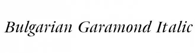
![Bulgarian Garamond Italic font caratteri gratis]() Scaricare 1598 Downloads@WebFont
Scaricare 1598 Downloads@WebFont -
![Broken74 font caratteri gratis]() Scaricare 1598 Downloads@WebFont
Scaricare 1598 Downloads@WebFont


Quali sono i font più popolari adesso?
Poppins, Roboto, Montserrat, Open Sans e Lato sono molto usati per le forme pulite e l'ampia applicabilità — dall'identità di marca alle landing page e ai poster.
Quali font si usano spesso nei loghi?
Le sans serif geometriche (es. Poppins, famiglie in stile Gotham) sono scelte comuni per un branding pulito e scalabile. Per un tocco personale restano valide script e stili manoscritti. Abbina un display deciso per i titoli a un corpo testo neutro per riconoscibilità ed equilibrio.
Ogni quanto si aggiorna la lista?
Con regolarità, in base ai download e all'attività reale. Torna spesso per scoprire in anticipo le nuove preferite.
💡 Consiglio: aggiungi ai preferiti — le tendenze cambiano in fretta e i font top di oggi possono ispirare il rebranding di domani.