Benvenuto nelle Font Più Popolari — dove popolarità e qualità si incontrano. Qui trovi i font più scaricati e usati dell'anno. Se cerchi scelte sicure per logo, web o social, inizia da qui.
Ogni font top si distingue per equilibrio, leggibilità e versatilità. Troverai sans serif moderne, script eleganti, serif vintage e display minimalisti.
-
 Scaricare 1586 Downloads@WebFont
 -
( Fonts by Rodrigo German - RASDESIGN )
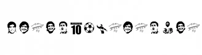
A bold, sports-themed decorative font with illustrated icons and blocky numerals.
![grande maradona font caratteri gratis]() Scaricare 1586 Downloads@WebFont
Scaricare 1586 Downloads@WebFont -
( Fonts by Perspectype Studio - Letterena.com - Personal-use only. For commercial use please contact owner. )
A playful, handwritten font with smooth, rounded edges and consistent stroke width.
![Belajar Menulis font caratteri gratis]() Scaricare 1585 Downloads@WebFont
Scaricare 1585 Downloads@WebFont -
( GNU FreeFont - savannah.gnu.org/projects/freefont/ )
A clean, monospaced typeface with uniform spacing and modern design.
![Free Monospaced font caratteri gratis]() Scaricare 1585 Downloads@WebFont
Scaricare 1585 Downloads@WebFont -
( Fonts by Roland Huse - rolandhuse.com )
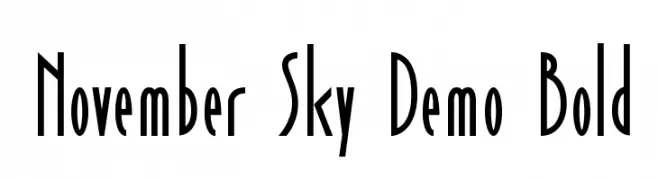
A tall, narrow font with an Art Deco style and consistent stroke width.
![November Sky Demo Bold font caratteri gratis]() Scaricare 1585 Downloads@WebFont
Scaricare 1585 Downloads@WebFont -
-
( Fonts by Vanessa Bays - bythebutterfly.com )
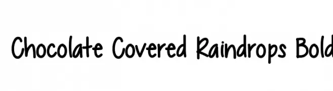
A playful, bold handwritten font with a whimsical and casual vibe.
![Chocolate Covered Raindrops Bold font caratteri gratis]() Scaricare 1585 Downloads@WebFont
Scaricare 1585 Downloads@WebFont -
( Free for a personal use. For a commercial use please visit www.kevinandamanda.com )
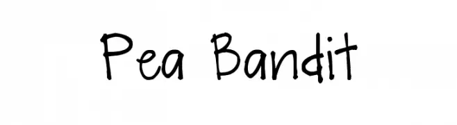
A playful, handwritten font with a casual and approachable style.
![Pea Bandit font caratteri gratis]() Scaricare 1585 Downloads@WebFont
Scaricare 1585 Downloads@WebFont -
( Google Web Fonts )
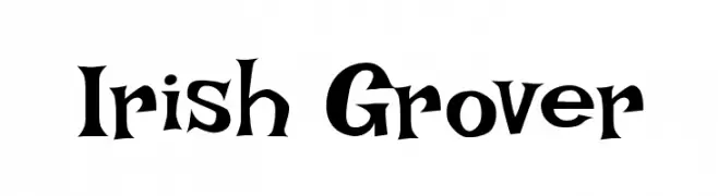
A bold, decorative font with whimsical, medieval-inspired elements.
![Irish Grover font caratteri gratis]() Scaricare 1585 Downloads@WebFont
Scaricare 1585 Downloads@WebFont -
( Fonts by Casady & Greene )
A tall, narrow typeface with elongated characters and a modern style.
![VertigoPlusFLF font caratteri gratis]() Scaricare 1585 Downloads@WebFont
Scaricare 1585 Downloads@WebFont -
( Fonts by Apostrophic Lab )
A modern, rounded font with uniform stroke width and geometric structure.
![Brassiere font caratteri gratis]() Scaricare 1585 Downloads@WebFont
Scaricare 1585 Downloads@WebFont -
Caratteri di BoldFonts. For commercial use please contact the owner.
( Introducing a gorgeous and outstanding typeface that is New Wishes Modern Script Font. The typeface falls in the category of Script font family and is the best creation of Fontles. )
A bold, cursive font with elegant loops and a handwritten style.
![New Wishes font caratteri gratis]() Scaricare 1584 Downloads@WebFont
Scaricare 1584 Downloads@WebFont -
( Fonts by Hanoded )
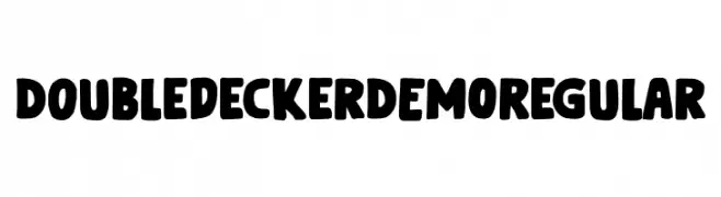
A bold, playful font with rounded letters and a unique double-decker bus symbol.
![Doubledecker DEMO Regular font caratteri gratis]() Scaricare 1584 Downloads@WebFont
Scaricare 1584 Downloads@WebFont -
![Big Black Bear font caratteri gratis]() Scaricare 1584 Downloads@WebFont
Scaricare 1584 Downloads@WebFont -
( DrJohnDee - www.fontspace.com/profile/drjohndee )
A dynamic, expressive handwritten font with fluid, cursive letterforms.
![CheGuevara Sign Alt font caratteri gratis]() Scaricare 1584 Downloads@WebFont
Scaricare 1584 Downloads@WebFont -
( Iconian Fonts - Daniel Zadorozny - www.iconian.com )
A futuristic, angular font with a bold, sci-fi aesthetic.
![Space Ranger font caratteri gratis]() Scaricare 1584 Downloads@WebFont
Scaricare 1584 Downloads@WebFont -
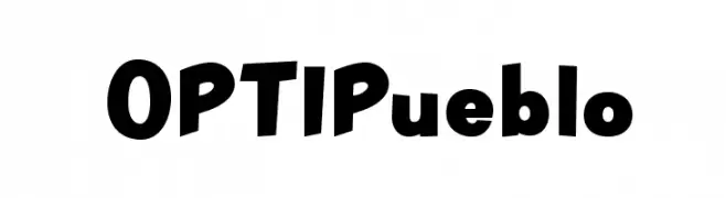
( Fonts by Castcraft Software - OPTI Fonts Archive - opti.netii.net - Personal-use only. For commercial use please contact owner. )
A bold, playful font with irregular, dynamic shapes.
![OPTIPueblo font caratteri gratis]() Scaricare 1584 Downloads@WebFont
Scaricare 1584 Downloads@WebFont -
![Xenogears font caratteri gratis]() Scaricare 1584 Downloads@WebFont
Scaricare 1584 Downloads@WebFont -
( Fonts by uatype.faithweb.com - UnAuthorized Type )
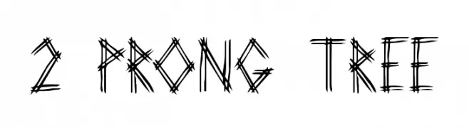
An edgy, hand-drawn font with a rustic, organic appearance.
![2 Prong Tree font caratteri gratis]() Scaricare 1584 Downloads@WebFont
Scaricare 1584 Downloads@WebFont -
( Lee Gordon )
A bold, vintage-style font with rounded serifs and a nostalgic flair.
![Bosox Revised font caratteri gratis]() Scaricare 1583 Downloads@WebFont
Scaricare 1583 Downloads@WebFont -
( Fonts by Octotype - www.foundmyfont.com - Personal-use only. For commercial use please contact owner. )
A fluid and elegant script font with dynamic curves and balanced rhythm.
![Walking in the Street font caratteri gratis]() Scaricare 1583 Downloads@WebFont
Scaricare 1583 Downloads@WebFont -
![Triforce font caratteri gratis]() Scaricare 1583 Downloads@WebFont
Scaricare 1583 Downloads@WebFont -
( Fonts by Nick Curtis - www.nicksfonts.com )
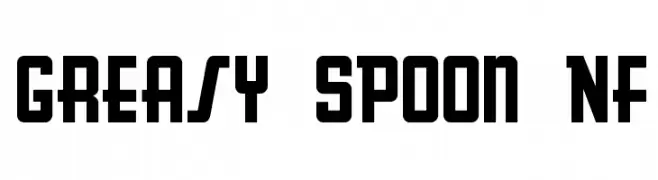
A bold, geometric font with a vintage diner-inspired style.
![Greasy Spoon NF font caratteri gratis]() Scaricare 1583 Downloads@WebFont
Scaricare 1583 Downloads@WebFont -
![Vera Humana 95 BoldItalic font caratteri gratis]() Scaricare 1583 Downloads@WebFont
Scaricare 1583 Downloads@WebFont -
( Fonts by Digital Graphics Labs - www.digitalgraphiclabs.com )
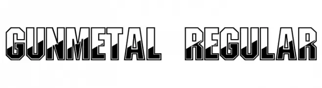
A bold, geometric font with a 3D shadow effect, ideal for modern and industrial designs.
![Gunmetal Regular font caratteri gratis]() Scaricare 1583 Downloads@WebFont
Scaricare 1583 Downloads@WebFont -
( Fonts by Divide By Zero! - fonts.tom7.com )
An artistic font with elongated features and a modern, elegant style.
![Gauss Jordan font caratteri gratis]() Scaricare 1583 Downloads@WebFont
Scaricare 1583 Downloads@WebFont -
( Fonts by Font People - Personal-use only. For commercial use please contact owner. )
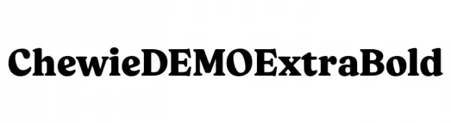
A bold, serif typeface with strong strokes and commanding presence.
![Chewie DEMO ExtraBold font caratteri gratis]() Scaricare 1582 Downloads@WebFont
Scaricare 1582 Downloads@WebFont -
( Copyright 2019 The Red Hat Project Authors (https://github.com/RedHatOfficial/RedHatFont) )
A modern, geometric sans-serif font with excellent readability and versatility.
![Red Hat Text font caratteri gratis]() Scaricare 1582 Downloads@WebFont
Scaricare 1582 Downloads@WebFont -
( Sunrise Digital - Juan Hodgson - sunrise-digital.net/lazer84/ )
A bold, brush-style font with dynamic and expressive strokes.
![lazer84 font caratteri gratis]() Scaricare 1582 Downloads@WebFont
Scaricare 1582 Downloads@WebFont -
( Fonts by Geronimo Fonts - Personal-use only. For commercial use please contact owner. )
A bold, geometric font with a modern, industrial style.
![Northwest Regular font caratteri gratis]() Scaricare 1582 Downloads@WebFont
Scaricare 1582 Downloads@WebFont -
![Bonn Bold Beta font caratteri gratis]() Scaricare 1582 Downloads@WebFont
Scaricare 1582 Downloads@WebFont -
( Fonts by Mans Greback - www.mawns.com )
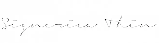
A thin, elegant script font with a flowing, handwritten style.
![Signerica Thin font caratteri gratis]() Scaricare 1582 Downloads@WebFont
Scaricare 1582 Downloads@WebFont -
![Eziear font caratteri gratis]() Scaricare 1582 Downloads@WebFont
Scaricare 1582 Downloads@WebFont -
![HavingWrit font caratteri gratis]() Scaricare 1582 Downloads@WebFont
Scaricare 1582 Downloads@WebFont -
( Fonts by or from www.graffitifonts.net )
A playful, jagged font with an edgy, torn-paper appearance.
![Rival font caratteri gratis]() Scaricare 1582 Downloads
Scaricare 1582 Downloads -
( Fonts by Paul Lloyd )
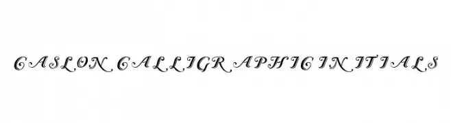
An elegant calligraphic font with ornate swashes and flourishes.
![Caslon Calligraphic Initials font caratteri gratis]() Scaricare 1582 Downloads@WebFont
Scaricare 1582 Downloads@WebFont


Quali sono i font più popolari adesso?
Poppins, Roboto, Montserrat, Open Sans e Lato sono molto usati per le forme pulite e l'ampia applicabilità — dall'identità di marca alle landing page e ai poster.
Quali font si usano spesso nei loghi?
Le sans serif geometriche (es. Poppins, famiglie in stile Gotham) sono scelte comuni per un branding pulito e scalabile. Per un tocco personale restano valide script e stili manoscritti. Abbina un display deciso per i titoli a un corpo testo neutro per riconoscibilità ed equilibrio.
Ogni quanto si aggiorna la lista?
Con regolarità, in base ai download e all'attività reale. Torna spesso per scoprire in anticipo le nuove preferite.
💡 Consiglio: aggiungi ai preferiti — le tendenze cambiano in fretta e i font top di oggi possono ispirare il rebranding di domani.