Benvenuto nelle Font Più Popolari — dove popolarità e qualità si incontrano. Qui trovi i font più scaricati e usati dell'anno. Se cerchi scelte sicure per logo, web o social, inizia da qui.
Ogni font top si distingue per equilibrio, leggibilità e versatilità. Troverai sans serif moderne, script eleganti, serif vintage e display minimalisti.
-
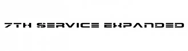
( Fonts by Daniel Zadorozny - www.iconian.com )
A bold, futuristic font with geometric and technical design elements.
 Scaricare 1575 Downloads@WebFont
 -
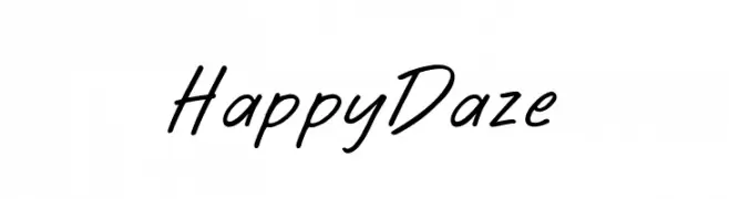
( Fonts by BLKBK Fonts - www.blkbk.shop - Personal-use only. For commercial use please contact owner. Commerciali Caratteri )
A casual, handwritten font with smooth, flowing lines and a friendly vibe.
![Happy Daze font caratteri gratis]() Scaricare 1574 Downloads
Scaricare 1574 Downloads -
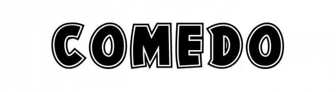
( Fonts by share font )
A bold, outlined font with a playful, three-dimensional effect.
![Comedo font caratteri gratis]() Scaricare 1574 Downloads@WebFont
Scaricare 1574 Downloads@WebFont -
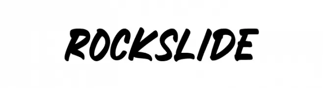
( Fonts by Mozatype )
A bold, dynamic script font with a handwritten style.
![ROCKSLIDE font caratteri gratis]() Scaricare 1574 Downloads@WebFont
Scaricare 1574 Downloads@WebFont -
![BroshK font caratteri gratis]() Scaricare 1574 Downloads@WebFont
Scaricare 1574 Downloads@WebFont -
-
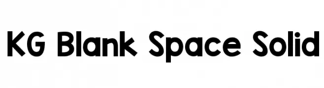
( Fonts by www.kimberlygeswein.com - Kimberly Geswein )
A bold, modern sans-serif font with clean, geometric lines.
![KG Blank Space Solid font caratteri gratis]() Scaricare 1574 Downloads@WebFont
Scaricare 1574 Downloads@WebFont -
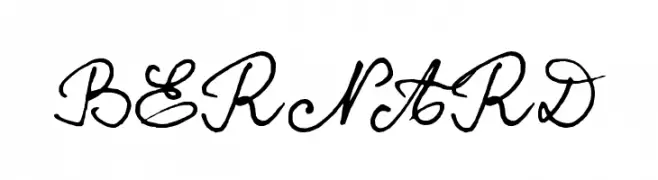
( Fonts by www.philing.net )
A decorative cursive font with elegant, flowing script style.
![BERNARD font caratteri gratis]() Scaricare 1574 Downloads@WebFont
Scaricare 1574 Downloads@WebFont -
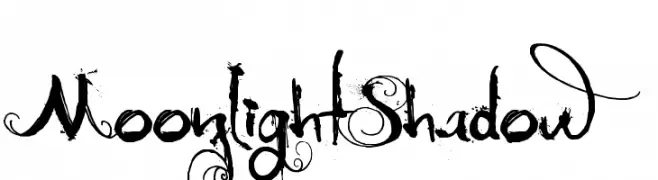
( Fonts by David Kerkhoff - www.hanodedphotography.com )
An ornate and decorative font with elaborate swirls and flourishes.
![MoonlightShadow font caratteri gratis]() Scaricare 1574 Downloads@WebFont
Scaricare 1574 Downloads@WebFont -
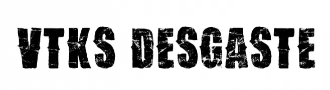
( Fonts by Douglas Vitkauskas - www.vtksdesign.com. Personal-use only. For commercial use please contact owner. )
A bold, distressed font with a rugged, grunge style.
![Vtks Desgaste font caratteri gratis]() Scaricare 1574 Downloads@WebFont
Scaricare 1574 Downloads@WebFont -
![SSF4-ABUKET font caratteri gratis]() Scaricare 1574 Downloads@WebFont
Scaricare 1574 Downloads@WebFont -
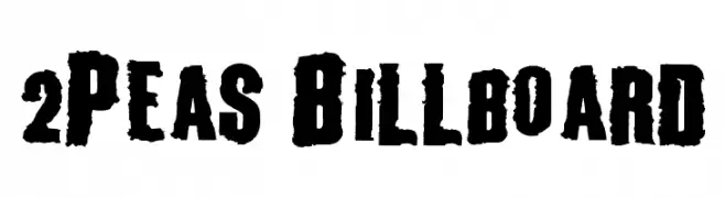
( Fonts by www.twopeasinabucket.com )
A bold, distressed font with a rugged, vintage style.
![2Peas Billboard font caratteri gratis]() Scaricare 1574 Downloads@WebFont
Scaricare 1574 Downloads@WebFont -
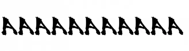
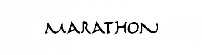
( Fonts by Daniel Zadorozny - www.iconian.com )
A dynamic, handwritten-style font with playful and energetic strokes.
![Marathon font caratteri gratis]() Scaricare 1574 Downloads@WebFont
Scaricare 1574 Downloads@WebFont -
![Video Terminal Screen font caratteri gratis]() Scaricare 1574 Downloads
Scaricare 1574 Downloads -
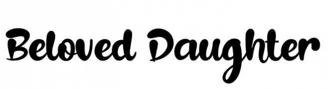
( Fonts by Syaf Rizal - www.creativefabrica.com/ref/53/ - Personal-use only. For commercial use please contact owner. )
A bold, playful script font with smooth, flowing curves and rounded edges.
![Beloved Daughter font caratteri gratis]() Scaricare 1573 Downloads@WebFont
Scaricare 1573 Downloads@WebFont -
( Fonts by peterdraw )
A lively, handwritten-style font with smooth, fluid strokes and a playful appearance.
![Oregano font caratteri gratis]() Scaricare 1573 Downloads@WebFont
Scaricare 1573 Downloads@WebFont -
![DJB Number 2 Pencil Bold font caratteri gratis]() Scaricare 1573 Downloads@WebFont
Scaricare 1573 Downloads@WebFont -
![Khmer OS Fasthand font caratteri gratis]() Scaricare 1573 Downloads@WebFont
Scaricare 1573 Downloads@WebFont -
( Fonts by PampaType - Personal-use only. For commercial use please contact owner. )
A classic serif font with modern elegance and balanced proportions.
![Reforma 1969 Gris font caratteri gratis]() Scaricare 1572 Downloads@WebFont
Scaricare 1572 Downloads@WebFont -
( Fonts by www.studiotypo.com - Personal-use only. For commercial use please contact owner. )
A futuristic, geometric font with clean lines and rounded edges.
![A-Space Demo font caratteri gratis]() Scaricare 1572 Downloads@WebFont
Scaricare 1572 Downloads@WebFont -
( Fonts by Octotype - www.foundmyfont.com - Personal-use only. For commercial use please contact owner. )
A flowing, cursive font with elegant, sweeping lines and artistic flair.
![Blanche de la Fontaine font caratteri gratis]() Scaricare 1572 Downloads@WebFont
Scaricare 1572 Downloads@WebFont -
( Fonts by Blazej Gradziel )
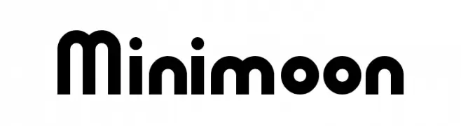
A bold, rounded, and geometric font with a playful and modern style.
![Minimoon font caratteri gratis]() Scaricare 1572 Downloads@WebFont
Scaricare 1572 Downloads@WebFont -
Caratteri di antipixel. For commercial use please contact the owner.
![ItaloRegular font caratteri gratis]() Scaricare 1572 Downloads@WebFont
Scaricare 1572 Downloads@WebFont -
![Arnprior-Regular font caratteri gratis]() Scaricare 1572 Downloads@WebFont
Scaricare 1572 Downloads@WebFont -
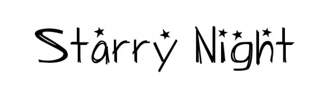
![Starry Night font caratteri gratis]() Scaricare 1572 Downloads@WebFont
Scaricare 1572 Downloads@WebFont -
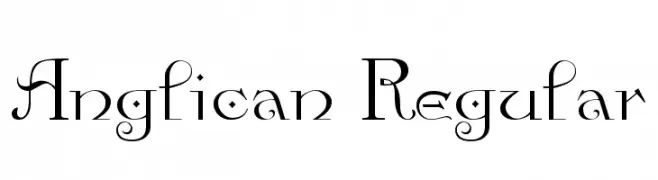
![Anglican Regular font caratteri gratis]() Scaricare 1572 Downloads@WebFont
Scaricare 1572 Downloads@WebFont -
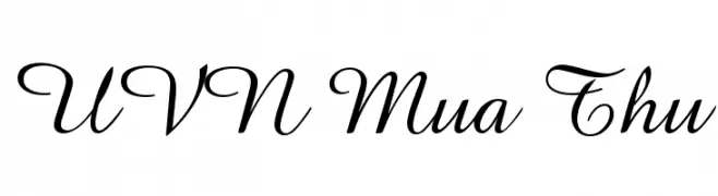
![UVN Mua Thu font caratteri gratis]() Scaricare 1571 Downloads@WebFont
Scaricare 1571 Downloads@WebFont -
( Fonts by Nick Curtis - www.nicksfonts.com )
A high-contrast, modern-vintage font with bold uppercase and refined lowercase letters.
![Ironick NF font caratteri gratis]() Scaricare 1571 Downloads@WebFont
Scaricare 1571 Downloads@WebFont -
( Fonts are free for a personal use only - www.cuttyfruty.com )
A dynamic handwritten font with fluid strokes and playful elegance.
![Ellianarelle's Path font caratteri gratis]() Scaricare 1571 Downloads@WebFont
Scaricare 1571 Downloads@WebFont -
( Fonts by Jacob Fisher - www.pizzadude.dk )
A bold, liquid-like font with a dripping, playful style.
![Liquidism part 2 font caratteri gratis]() Scaricare 1571 Downloads@WebFont
Scaricare 1571 Downloads@WebFont -
![FunkyFresh font caratteri gratis]() Scaricare 1571 Downloads@WebFont
Scaricare 1571 Downloads@WebFont -
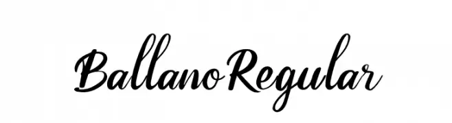
( Fonts by otpirustype studio - Personal-use only. For commercial use please contact owner. )
A cursive, calligraphic font with elegant, flowing strokes and a modern touch.
![BallanoRegular font caratteri gratis]() Scaricare 1570 Downloads@WebFont
Scaricare 1570 Downloads@WebFont -
Caratteri di letterhanna. For commercial use please contact the owner.
( THIS FONT is Free for personal, Paid for commercial use By installing or using this font, you are hereby agree to this Product Usage Agreement: 1. This font is ONLY FOR PERSONAL USE 2. You are REQUIRES A LICENSE for PROMOTIONAL or COMMERCIAL USE 3. You )
A dynamic, flowing script font with elegant, connected strokes.
![Versatile Azalea Regular font caratteri gratis]() Scaricare 1570 Downloads@WebFont
Scaricare 1570 Downloads@WebFont -
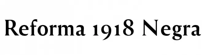
( Fonts by PampaType - Personal-use only. For commercial use please contact owner. )
A bold, classic serif font with high contrast and a slightly condensed style.
![Reforma 1918 Negra font caratteri gratis]() Scaricare 1570 Downloads@WebFont
Scaricare 1570 Downloads@WebFont -
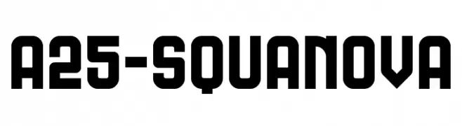
( Angoes25 - www.facebook.com/Angoes25 )
A bold, geometric font with a modern and strong aesthetic.
![A25-SQUANOVA font caratteri gratis]() Scaricare 1570 Downloads@WebFont
Scaricare 1570 Downloads@WebFont -
( Fonts by Geronimo Fonts - Personal-use only. For commercial use please contact owner. )
A modern, geometric monospaced font with rounded edges and a futuristic style.
![Generation Regular font caratteri gratis]() Scaricare 1570 Downloads@WebFont
Scaricare 1570 Downloads@WebFont


Quali sono i font più popolari adesso?
Poppins, Roboto, Montserrat, Open Sans e Lato sono molto usati per le forme pulite e l'ampia applicabilità — dall'identità di marca alle landing page e ai poster.
Quali font si usano spesso nei loghi?
Le sans serif geometriche (es. Poppins, famiglie in stile Gotham) sono scelte comuni per un branding pulito e scalabile. Per un tocco personale restano valide script e stili manoscritti. Abbina un display deciso per i titoli a un corpo testo neutro per riconoscibilità ed equilibrio.
Ogni quanto si aggiorna la lista?
Con regolarità, in base ai download e all'attività reale. Torna spesso per scoprire in anticipo le nuove preferite.
💡 Consiglio: aggiungi ai preferiti — le tendenze cambiano in fretta e i font top di oggi possono ispirare il rebranding di domani.