Benvenuto nelle Font Più Popolari — dove popolarità e qualità si incontrano. Qui trovi i font più scaricati e usati dell'anno. Se cerchi scelte sicure per logo, web o social, inizia da qui.
Ogni font top si distingue per equilibrio, leggibilità e versatilità. Troverai sans serif moderne, script eleganti, serif vintage e display minimalisti.
-
( Fonts by Divide By Zero! - fonts.tom7.com )
An artistic font with elongated features and a modern, elegant style.
 Scaricare 1583 Downloads@WebFont
 -
( Fonts by MJType )
A playful, rounded font with a hand-drawn feel, ideal for casual designs.
![Milk Cream font caratteri gratis]() Scaricare 1582 Downloads@WebFont
Scaricare 1582 Downloads@WebFont -
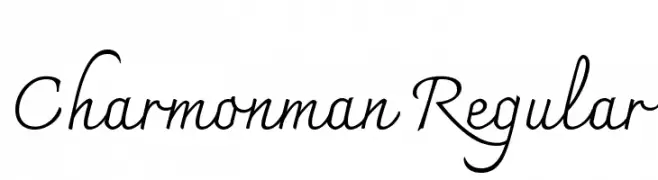
( Copyright 2018 The Charmonman Project Authors (https://github.com/cadsondemak/Charmonman) )
A graceful script font with a flowing, cursive style.
![Charmonman Regular font caratteri gratis]() Scaricare 1582 Downloads@WebFont
Scaricare 1582 Downloads@WebFont -
![Spy Agency Bold font caratteri gratis]() Scaricare 1582 Downloads@WebFont
Scaricare 1582 Downloads@WebFont -
( Fonts by Andrey V. Panov - Personal-use only. For commercial use please contact owner. )
A bold, modern sans-serif font with excellent readability and versatility.
![Istok Bold font caratteri gratis]() Scaricare 1582 Downloads@WebFont
Scaricare 1582 Downloads@WebFont -
-
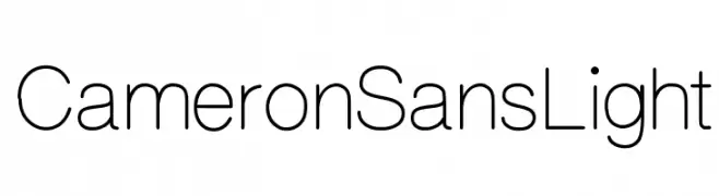
( Shara Weber - sharasfonts.com )
A modern, light sans-serif font with clean lines and balanced proportions.
![CameronSansLight font caratteri gratis]() Scaricare 1582 Downloads@WebFont
Scaricare 1582 Downloads@WebFont -
( Fonts by Geronimo Fonts - Personal-use only. For commercial use please contact owner. )
A bold, geometric font with a modern, industrial style.
![Northwest Regular font caratteri gratis]() Scaricare 1582 Downloads@WebFont
Scaricare 1582 Downloads@WebFont -
![Khedive font caratteri gratis]() Scaricare 1582 Downloads@WebFont
Scaricare 1582 Downloads@WebFont -
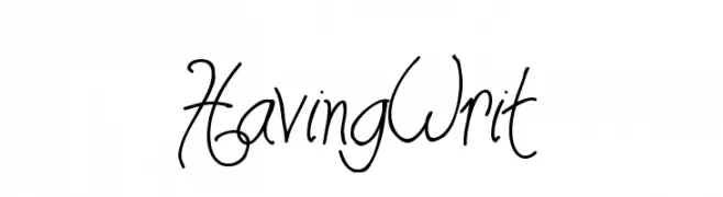
![HavingWrit font caratteri gratis]() Scaricare 1582 Downloads@WebFont
Scaricare 1582 Downloads@WebFont -
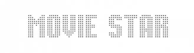
( Fonts by Jonathan Paterson )
A decorative font made of star shapes, perfect for glamorous and theatrical designs.
![Movie Star font caratteri gratis]() Scaricare 1582 Downloads@WebFont
Scaricare 1582 Downloads@WebFont -
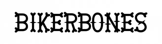
( Fonts by Daniel Gauthier )
A bold, decorative font with characters resembling bones, perfect for thematic designs.
![BikerBones font caratteri gratis]() Scaricare 1582 Downloads@WebFont
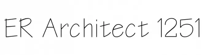
Scaricare 1582 Downloads@WebFont -
![ER Architect 1251 font caratteri gratis]() Scaricare 1582 Downloads@WebFont
Scaricare 1582 Downloads@WebFont -
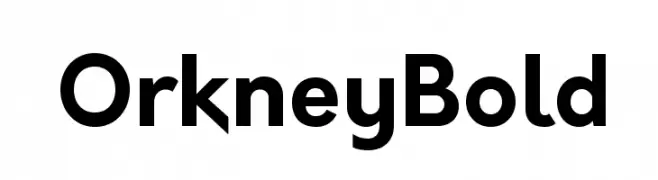
( Fonts by Hanken Design Co. - Personal-use only. For commercial use please contact owner. )
A bold, modern sans-serif font with a clean and geometric design.
![Orkney Bold font caratteri gratis]() Scaricare 1581 Downloads@WebFont
Scaricare 1581 Downloads@WebFont -
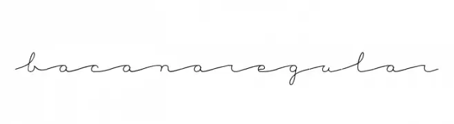
( Fonts by a Mariel Gornati - www.behance.net/marigornati . Personal-use only. For commercial use please contact owner. )
A delicate, handwritten script font with flowing, connected letters.
![BacanaRegular font caratteri gratis]() Scaricare 1581 Downloads@WebFont
Scaricare 1581 Downloads@WebFont -
( Copyright (c) 2012, HaGilda & Mushon Zer-Aviv (
A bold, modern sans-serif font with consistent stroke width and normal spacing.
![Alef Bold font caratteri gratis]() Scaricare 1581 Downloads@WebFont
Scaricare 1581 Downloads@WebFont -
( Copyright (c) 2011 by Brian J. Bonislawsky DBA Astigmatic (AOETI) (astigma@astigmatic.com), with Reserved Font Names "Fascinate" and "Fascinate Inline" )
A bold, retro-inspired font with geometric and playful elements.
![Fascinate-Regular font caratteri gratis]() Scaricare 1581 Downloads@WebFont
Scaricare 1581 Downloads@WebFont -
![Scratch Bold font caratteri gratis]() Scaricare 1581 Downloads@WebFont
Scaricare 1581 Downloads@WebFont -
( Fonts by Apostrophic Lab )
A bold, geometric font with a modern and playful aesthetic.
![Komikazba font caratteri gratis]() Scaricare 1581 Downloads@WebFont
Scaricare 1581 Downloads@WebFont -
( Fonts by Red Hat )
A bold, modern sans-serif font with clean lines and geometric shapes.
![Overpass-Heavy font caratteri gratis]() Scaricare 1580 Downloads@WebFont
Scaricare 1580 Downloads@WebFont -
( Fonts by Adrien Coquet - Personal-use only. For commercial use please contact owner. )
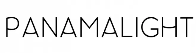
A modern, light sans-serif font with clean lines and balanced spacing.
![Panama Light font caratteri gratis]() Scaricare 1580 Downloads@WebFont
Scaricare 1580 Downloads@WebFont -
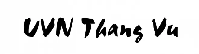
![UVN Thang Vu font caratteri gratis]() Scaricare 1580 Downloads@WebFont
Scaricare 1580 Downloads@WebFont -
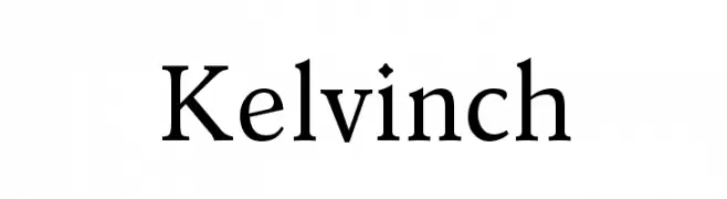
![Kelvinch font caratteri gratis]() Scaricare 1580 Downloads@WebFont
Scaricare 1580 Downloads@WebFont -
( Fonts by www.gliphmaker.com. Personal-use only. For commercial use please contact owner. )
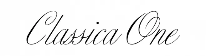
An elegant, ornate script font with flowing, interconnected letters and intricate flourishes.
![Classica One font caratteri gratis]() Scaricare 1580 Downloads@WebFont
Scaricare 1580 Downloads@WebFont -
( Fonts by www.peter-wiegel.de. Personal-use only. For commercial use please contact owner. )
A modern, bold sans-serif font with clean lines and uniform strokes.
![EirikRaude font caratteri gratis]() Scaricare 1580 Downloads@WebFont
Scaricare 1580 Downloads@WebFont -
( Fonts by Galdino Otten - galdinootten.com )
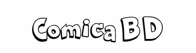
A bold, cartoonish font with a playful, hand-drawn style.
![Comica BD font caratteri gratis]() Scaricare 1580 Downloads@WebFont
Scaricare 1580 Downloads@WebFont -
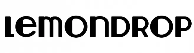
( Fonts by Lauren Thompson - www.nymfont.com )
A bold, playful font with geometric shapes and smooth curves.
![Lemondrop font caratteri gratis]() Scaricare 1580 Downloads@WebFont
Scaricare 1580 Downloads@WebFont -
![Batik font caratteri gratis]() Scaricare 1580 Downloads@WebFont
Scaricare 1580 Downloads@WebFont -
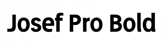
![Josef Pro Bold font caratteri gratis]() Scaricare 1580 Downloads@WebFont
Scaricare 1580 Downloads@WebFont -
( Fonts by Otto Maurer Design )
A whimsical, hand-drawn font with curly embellishments and dynamic strokes.
![Corps-Script font caratteri gratis]() Scaricare 1580 Downloads@WebFont
Scaricare 1580 Downloads@WebFont -
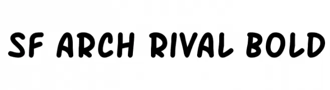
( Fonts by ShyFonts )
A bold, playful font with rounded edges and a casual style.
![SF Arch Rival Bold font caratteri gratis]() Scaricare 1580 Downloads@WebFont
Scaricare 1580 Downloads@WebFont -
( Fonts by Rich Gast - www.greywolfwebworks.com Commerciali Caratteri )
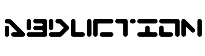
A futuristic, geometric font with bold, rounded shapes and cut-out sections.
![Abduction font caratteri gratis]() Scaricare 1580 Downloads
Scaricare 1580 Downloads -
( Fonts by Hendra Pratama - HPTypework - https://hptypework.com - Personal-use only. For commercial use please contact owner. )
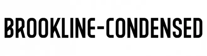
A bold, condensed sans-serif font with a modern, professional appearance.
![BROOKLINE-Condensed font caratteri gratis]() Scaricare 1579 Downloads@WebFont
Scaricare 1579 Downloads@WebFont -
( Fonts by Galdino Otten - galdinootten.com )
A bold, retro font with a playful, psychedelic style.
![Hippie Movement font caratteri gratis]() Scaricare 1579 Downloads@WebFont
Scaricare 1579 Downloads@WebFont -
( Fonts by Mario Arturo - marioarturo.com. Personal-use only. For commercial use please contact owner. Contact the owner for a donation. )
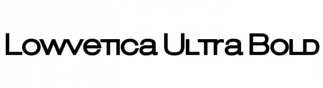
A bold, geometric sans-serif font with a modern and minimalistic design.
![Lowvetica Ultra Bold font caratteri gratis]() Scaricare 1579 Downloads@WebFont
Scaricare 1579 Downloads@WebFont -
( Fonts by a Max Infeld - XEROGRAPHER FONTS - xerographer.blogspot.com . Personal-use only. For commercial use please contact owner. )
A bold, decorative font with a textured, diagonal line pattern.
![identify font caratteri gratis]() Scaricare 1579 Downloads@WebFont
Scaricare 1579 Downloads@WebFont


Quali sono i font più popolari adesso?
Poppins, Roboto, Montserrat, Open Sans e Lato sono molto usati per le forme pulite e l'ampia applicabilità — dall'identità di marca alle landing page e ai poster.
Quali font si usano spesso nei loghi?
Le sans serif geometriche (es. Poppins, famiglie in stile Gotham) sono scelte comuni per un branding pulito e scalabile. Per un tocco personale restano valide script e stili manoscritti. Abbina un display deciso per i titoli a un corpo testo neutro per riconoscibilità ed equilibrio.
Ogni quanto si aggiorna la lista?
Con regolarità, in base ai download e all'attività reale. Torna spesso per scoprire in anticipo le nuove preferite.
💡 Consiglio: aggiungi ai preferiti — le tendenze cambiano in fretta e i font top di oggi possono ispirare il rebranding di domani.