Benvenuto nelle Font Più Popolari — dove popolarità e qualità si incontrano. Qui trovi i font più scaricati e usati dell'anno. Se cerchi scelte sicure per logo, web o social, inizia da qui.
Ogni font top si distingue per equilibrio, leggibilità e versatilità. Troverai sans serif moderne, script eleganti, serif vintage e display minimalisti.
-
( Fonts by Perspectype Studio - Personal-use only. For commercial use please contact owner. )
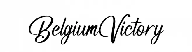
A cursive, handwritten font with elegant loops and a sophisticated style.
 Scaricare 54 Downloads@WebFont
 -
( Fonts by Hanken Design Co. )
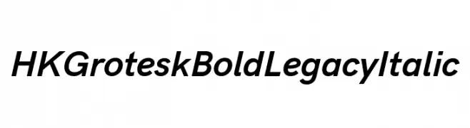
A bold, italicized sans-serif font with a modern and dynamic style.
![HK Grotesk Bold Legacy Italic font caratteri gratis]() Scaricare 54 Downloads@WebFont
Scaricare 54 Downloads@WebFont -
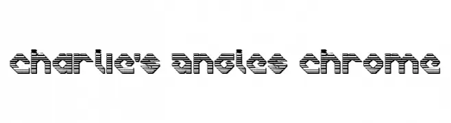
![Charlie's Angles Chrome font caratteri gratis]() Scaricare 54 Downloads@WebFont
Scaricare 54 Downloads@WebFont -
( Fonts by Vladimir Nikolic - www.creativefabrica.com/designer/vladimirnikolic/ - Personal-use only. For commercial use please contact owner. )
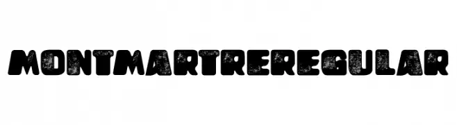
A bold, distressed font with a vintage, rustic appeal.
![Montmartre Regular font caratteri gratis]() Scaricare 54 Downloads@WebFont
Scaricare 54 Downloads@WebFont -
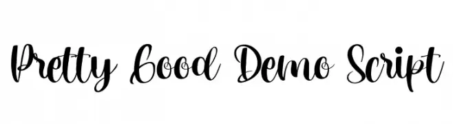
( Fonts by CalligraphyFonts - Personal-use only. For commercial use please contact owner. )
A flowing, cursive script with elegant loops and dynamic contrast.
![Pretty Good Demo Script font caratteri gratis]() Scaricare 54 Downloads@WebFont
Scaricare 54 Downloads@WebFont -
-
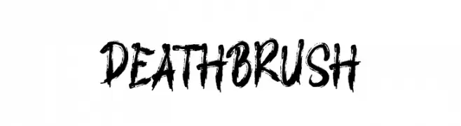
( Fonts by AminMario - Amin Mario - Personal-use only. For commercial use please contact owner. )
A bold, brushstroke font with dynamic, artistic flair.
![DEATH BRUSH font caratteri gratis]() Scaricare 54 Downloads@WebFont
Scaricare 54 Downloads@WebFont -
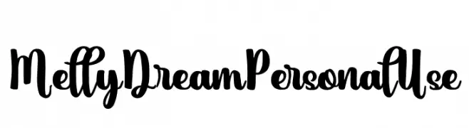
( Fonts by Yumna Family - yumna Type - Personal-use only. For commercial use please contact owner. )
A bold, whimsical script font with flowing, decorative letterforms.
![Melly Dream Personal Use font caratteri gratis]() Scaricare 54 Downloads@WebFont
Scaricare 54 Downloads@WebFont -
( Fonts by ingoFonts - Ingo Zimmermann - Personal-use only. For commercial use please contact owner. )
A modern, italic sans-serif font with clean lines and balanced proportions.
![FaberSansStd-56NormalKursiv font caratteri gratis]() Scaricare 54 Downloads@WebFont
Scaricare 54 Downloads@WebFont -
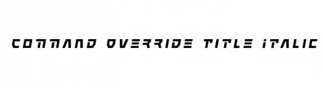
( Iconian Fonts - Daniel Zadorozny - www.iconian.com )
A bold, angular, and slanted font with a futuristic style.
![Command Override Title Italic font caratteri gratis]() Scaricare 54 Downloads@WebFont
Scaricare 54 Downloads@WebFont -
![Charlie's Angles Leftalic font caratteri gratis]() Scaricare 54 Downloads@WebFont
Scaricare 54 Downloads@WebFont -
( Fonts by Jadatype - Jada Akbal - Personal-use only. For commercial use please contact owner. )
A playful, handwritten font with smooth, flowing lines and a whimsical style.
![Sacrediane font caratteri gratis]() Scaricare 54 Downloads@WebFont
Scaricare 54 Downloads@WebFont -
( Fonts by Neogrey Creative - Ivan Filipov - Personal-use only. For commercial use please contact owner. )
A rugged, distressed font with a bold, eroded texture.
![Red October Eroded font caratteri gratis]() Scaricare 54 Downloads@WebFont
Scaricare 54 Downloads@WebFont -
( Fonts by Iconian Fonts )
A bold, geometric font with a futuristic and industrial design.
![Boomstick Laser font caratteri gratis]() Scaricare 54 Downloads@WebFont
Scaricare 54 Downloads@WebFont -
( Fonts by weknow - Wino S Kadir - Personal-use only. For commercial use please contact owner. )
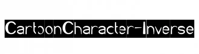
A playful, rounded font with a bold and friendly appearance.
![Cartoon Character-Inverse font caratteri gratis]() Scaricare 54 Downloads@WebFont
Scaricare 54 Downloads@WebFont -
( Gaelleing )
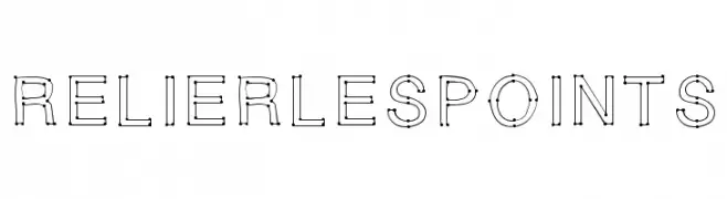
A playful, connect-the-dots style font with uniform stroke width and rounded edges.
![RELIERLESPOINTS font caratteri gratis]() Scaricare 54 Downloads@WebFont
Scaricare 54 Downloads@WebFont -
( Fonts by Peter Wiegel - www.peter-wiegel.de - Personal-use only. For commercial use please contact owner. )
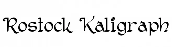
A calligraphic font with elegant, flowing strokes and intricate details.
![Rostock Kaligraph font caratteri gratis]() Scaricare 54 Downloads@WebFont
Scaricare 54 Downloads@WebFont -
( Fonts by Daniel Zadorozny - www.iconian.com - Free for personal use )
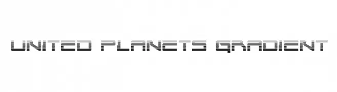
A futuristic font with a gradient line pattern, perfect for tech and digital designs.
![United Planets Gradient font caratteri gratis]() Scaricare 54 Downloads@WebFont
Scaricare 54 Downloads@WebFont -
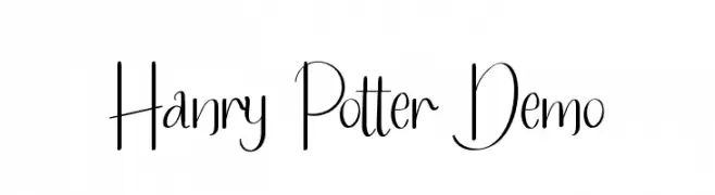
( Fonts by Edric Studio - Personal-use only. For commercial use please contact owner. )
A whimsical, elegant handwritten font with playful flourishes and dynamic strokes.
![Hanry Potter Demo font caratteri gratis]() Scaricare 54 Downloads@WebFont
Scaricare 54 Downloads@WebFont -
( Fonts by Darrell Flood - Personal-use only. For commercial use please contact owner. )
A bold, geometric font with strong, uniform strokes and a modern aesthetic.
![Moonlightning font caratteri gratis]() Scaricare 54 Downloads@WebFont
Scaricare 54 Downloads@WebFont -
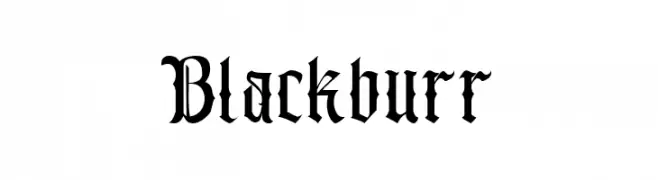
( Fonts by Kong Font - Personal-use only. For commercial use please contact owner. )
A bold, high-contrast blackletter font with intricate, gothic-inspired details.
![Blackburr font caratteri gratis]() Scaricare 54 Downloads@WebFont
Scaricare 54 Downloads@WebFont -
( Fonts by Trf - TRF Fonts - Personal-use only. For commercial use please contact owner. )
An elegant script font with ornate, flowing characters and intricate swashes.
![Gibrael font caratteri gratis]() Scaricare 54 Downloads@WebFont
Scaricare 54 Downloads@WebFont -
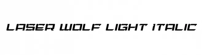
( Iconian Fonts - Daniel Zadorozny - www.iconian.com )
A futuristic, angular, and italicized font with a sleek, modern design.
![Laser Wolf Light Italic font caratteri gratis]() Scaricare 54 Downloads@WebFont
Scaricare 54 Downloads@WebFont -
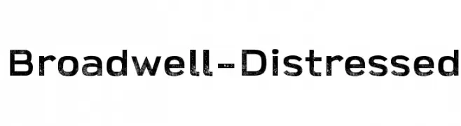
( Parker Creative - Alan Parker - fontbundles.net/parker-creative Commerciali Caratteri )
A distressed, bold font with a vintage, textured style.
![Broadwell-Distressed font caratteri gratis]() Scaricare 54 Downloads
Scaricare 54 Downloads -
( Font Nook - www.geocities.com/weakestlink11/ )
A festive, decorative font featuring Santa Claus and holiday elements.
![Kringle Kapers font caratteri gratis]() Scaricare 54 Downloads@WebFont
Scaricare 54 Downloads@WebFont -
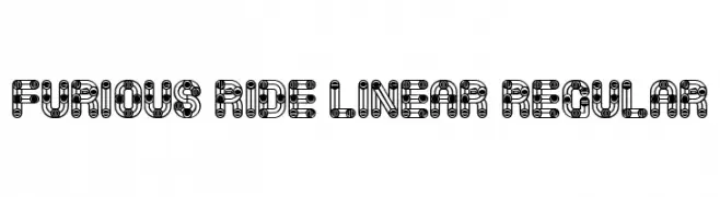
( Fonts by Vladimir Nikolic - https://www.creativefabrica.com/product/educated-deers/ref/144265/ - Personal-use only. For commercial use please contact owner. )
A bold, dynamic font with a unique linear pattern and modern industrial feel.
![Furious Ride Linear Regular font caratteri gratis]() Scaricare 54 Downloads@WebFont
Scaricare 54 Downloads@WebFont -
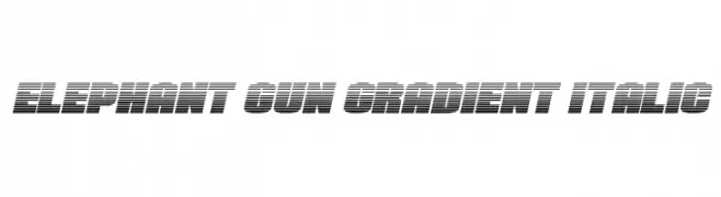
( Fonts by Daniel Zadorozny - www.iconian.com - Personal-use only. For commercial use please contact owner. )
A bold, italicized font with a gradient effect and dynamic horizontal lines.
![Elephant Gun Gradient Italic font caratteri gratis]() Scaricare 54 Downloads@WebFont
Scaricare 54 Downloads@WebFont -
( Fonts by Faldy Kudo - Personal-use only. For commercial use please contact owner. )
A lively, handwritten font with fluid, continuous strokes.
![Shafira font caratteri gratis]() Scaricare 54 Downloads@WebFont
Scaricare 54 Downloads@WebFont -
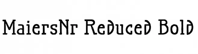
( Fonts by ingoFonts - Ingo Zimmermann - Personal-use only. For commercial use please contact owner. )
A bold, textured serif font with a handcrafted appearance.
![MaiersNr.Reduced-Bold font caratteri gratis]() Scaricare 54 Downloads@WebFont
Scaricare 54 Downloads@WebFont -
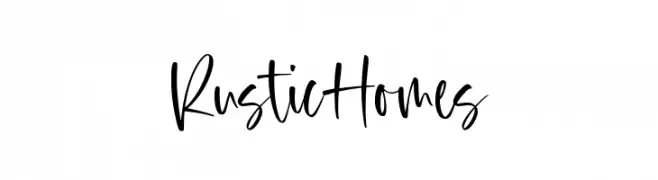
( Fonts by Timur Type )
A lively, handwritten cursive font with a dynamic and fluid style.
![Rustic Homes font caratteri gratis]() Scaricare 54 Downloads@WebFont
Scaricare 54 Downloads@WebFont -
( Fonts by Jprint Studio - Gais Zaelani - Personal-use only. For commercial use please contact owner. )
A modern, geometric font with bold, structured characters.
![Malkana font caratteri gratis]() Scaricare 54 Downloads@WebFont
Scaricare 54 Downloads@WebFont -
( Fonts by Maulana Creative - Gilang Maulana - Personal-use only. For commercial use please contact owner. )
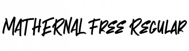
A bold, energetic script font with fluid, interconnected strokes.
![MATHERNAL Free Regular font caratteri gratis]() Scaricare 54 Downloads@WebFont
Scaricare 54 Downloads@WebFont -
( Fonts by Vunira Design - Personal-use only. For commercial use please contact owner. )
An elegant, flowing script font with a sophisticated, calligraphic style.
![DaywalaFREE font caratteri gratis]() Scaricare 54 Downloads@WebFont
Scaricare 54 Downloads@WebFont -
( Masinong Studio - creativemarket.com/masinong )
An elegant script font with flowing, cursive letterforms and intricate details.
![Andella font caratteri gratis]() Scaricare 54 Downloads@WebFont
Scaricare 54 Downloads@WebFont -
( Fonts by GFR Creative - Personal-use only. For commercial use please contact owner. )
A bold, decorative font with intricate, gothic-inspired details.
![AriesA font caratteri gratis]() Scaricare 54 Downloads@WebFont
Scaricare 54 Downloads@WebFont -
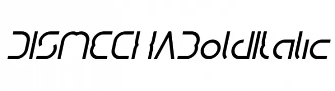
( weknow - Wino S Kadir - www.creativefabrica.com/designer/weknow/ )
A bold, italicized font with a futuristic and dynamic design.
![DISMECHA Bold Italic font caratteri gratis]() Scaricare 54 Downloads@WebFont
Scaricare 54 Downloads@WebFont


Quali sono i font più popolari adesso?
Poppins, Roboto, Montserrat, Open Sans e Lato sono molto usati per le forme pulite e l'ampia applicabilità — dall'identità di marca alle landing page e ai poster.
Quali font si usano spesso nei loghi?
Le sans serif geometriche (es. Poppins, famiglie in stile Gotham) sono scelte comuni per un branding pulito e scalabile. Per un tocco personale restano valide script e stili manoscritti. Abbina un display deciso per i titoli a un corpo testo neutro per riconoscibilità ed equilibrio.
Ogni quanto si aggiorna la lista?
Con regolarità, in base ai download e all'attività reale. Torna spesso per scoprire in anticipo le nuove preferite.
💡 Consiglio: aggiungi ai preferiti — le tendenze cambiano in fretta e i font top di oggi possono ispirare il rebranding di domani.