Benvenuto nelle Font Più Popolari — dove popolarità e qualità si incontrano. Qui trovi i font più scaricati e usati dell'anno. Se cerchi scelte sicure per logo, web o social, inizia da qui.
Ogni font top si distingue per equilibrio, leggibilità e versatilità. Troverai sans serif moderne, script eleganti, serif vintage e display minimalisti.
-
( Fonts by Vunira Design - Personal-use only. For commercial use please contact owner. )
A cursive, handwritten-style font with elegant, flowing characters.
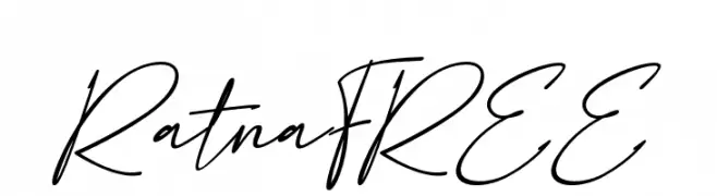 Scaricare 53 Downloads@WebFont
 -
( Fonts by nomlimofont - Personal-use only. For commercial use please contact owner. )
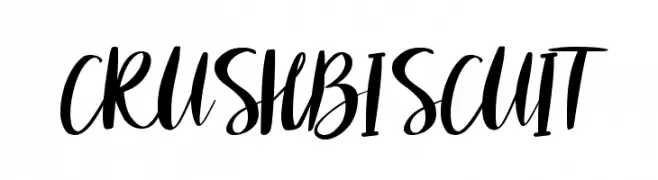
A bold and expressive script font with fluid, dynamic strokes.
![CRUSH BISCUIT font caratteri gratis]() Scaricare 53 Downloads@WebFont
Scaricare 53 Downloads@WebFont -
( Fonts by Masanis Studio - Naufal Anis - Personal-use only. For commercial use please contact owner. )
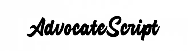
A bold, flowing script font with elegant curves and connected strokes.
![Advocate Script font caratteri gratis]() Scaricare 53 Downloads@WebFont
Scaricare 53 Downloads@WebFont -
( Fonts by Doehantz Studio )
An elegant and sophisticated font with intricate flourishes and monogram style.
![Flourish Monogram font caratteri gratis]() Scaricare 53 Downloads@WebFont
Scaricare 53 Downloads@WebFont -
( Fonts by AVType - Personal-use only. For commercial use please contact owner. )
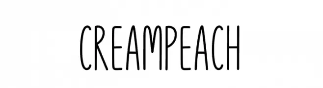
A playful, hand-drawn font with tall, narrow letters and a whimsical style.
![Cream Peach font caratteri gratis]() Scaricare 53 Downloads@WebFont
Scaricare 53 Downloads@WebFont -
-
( Fonts by Kat`s Fun Fonts - Personal-use only. For commercial use please contact owner. )
A playful, Halloween-themed decorative font with cartoonish icons.
![KR Boo City font caratteri gratis]() Scaricare 53 Downloads@WebFont
Scaricare 53 Downloads@WebFont -
( Fonts by erik5541 - Frederik Aristaputra - Personal-use only. For commercial use please contact owner. )
A whimsical and artistic font with elongated, flowing lines and decorative elements.
![Linttang font caratteri gratis]() Scaricare 53 Downloads@WebFont
Scaricare 53 Downloads@WebFont -
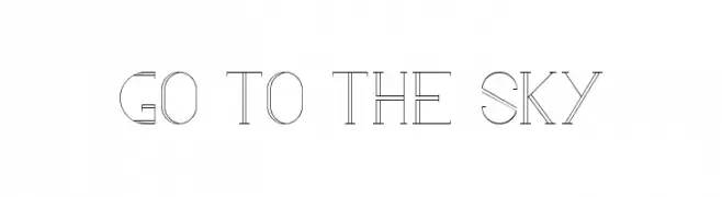
( Jessy Naudin - facebook.com/Devlose )
A modern, geometric font with clean lines and consistent stroke width.
![go to the sky font caratteri gratis]() Scaricare 53 Downloads@WebFont
Scaricare 53 Downloads@WebFont -
( Fonts by ingoFonts - Ingo Zimmermann - Personal-use only. For commercial use please contact owner. )
A modern sans-serif font with an italic slant, offering a sleek and professional look.
![August Sans Reduced 56 Italic font caratteri gratis]() Scaricare 53 Downloads@WebFont
Scaricare 53 Downloads@WebFont -
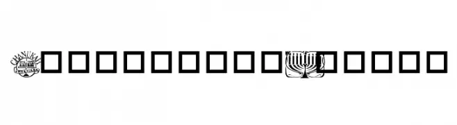
( Dani Foster Herring - dani3d.com/ )
A themed dingbat font with Hanukkah and Jewish festival icons.
![Festival of Lights font caratteri gratis]() Scaricare 53 Downloads@WebFont
Scaricare 53 Downloads@WebFont -
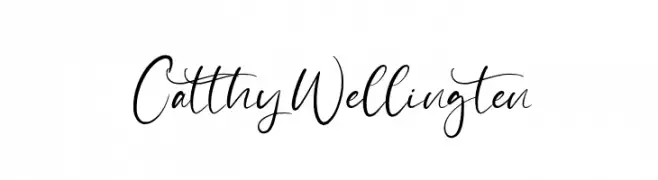
( Fonts by StringLabs - stringlabscreative.com - Personal-use only. For commercial use please contact owner. )
A lively, cursive font with elegant loops and a handwritten feel.
![Catthy Wellingten font caratteri gratis]() Scaricare 53 Downloads@WebFont
Scaricare 53 Downloads@WebFont -
( Fonts by Hugefonts - Personal-use only. For commercial use please contact owner. )
A bold, energetic script font with fluid strokes and a playful style.
![LEMONPIE font caratteri gratis]() Scaricare 53 Downloads@WebFont
Scaricare 53 Downloads@WebFont -
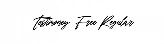
( Fonts by Maulana Creative - Gilang Maulana - Personal-use only. For commercial use please contact owner. )
A dynamic, fluid script font with elegant, flowing lines and cursive letterforms.
![Testimoney Free Regular font caratteri gratis]() Scaricare 53 Downloads@WebFont
Scaricare 53 Downloads@WebFont -
( Fonts by Toto - Personal-use only. For commercial use please contact owner. )
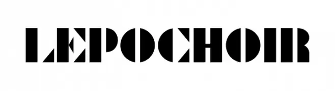
A bold, geometric stencil font with sharp angles and clean lines.
![Le Pochoir font caratteri gratis]() Scaricare 53 Downloads@WebFont
Scaricare 53 Downloads@WebFont -
( Fonts by Woodcutter )
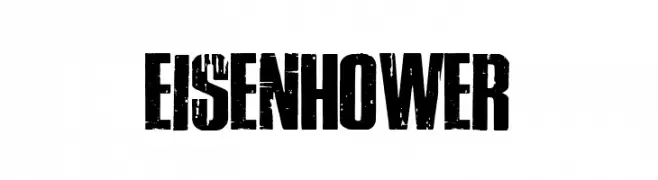
A bold, distressed font with a rugged, textured appearance.
![Eisenhower font caratteri gratis]() Scaricare 53 Downloads@WebFont
Scaricare 53 Downloads@WebFont -
( Noto is a trademark of Google Inc. Noto fonts are open source. All Noto fonts are published under the SIL Open Font License, Version 1.1 )
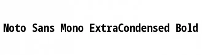
A bold, extra-condensed monospaced sans-serif font ideal for coding and data alignment.
![Noto Sans Mono ExtraCondensed Bold font caratteri gratis]() Scaricare 53 Downloads@WebFont
Scaricare 53 Downloads@WebFont -
( Fonts by LetterFreshStudio - Rizki Andika - Personal-use only. For commercial use please contact owner. )
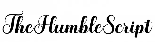
An elegant script font with high contrast and ornate flourishes.
![TheHumbleScript font caratteri gratis]() Scaricare 53 Downloads@WebFont
Scaricare 53 Downloads@WebFont -
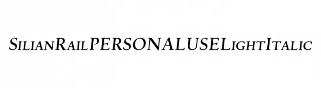
( Fonts by Mans Greback - Personal-use only. For commercial use please contact owner. )
A light, elegant serif font with italic styling, perfect for sophisticated designs.
![Silian Rail PERSONAL USE Light Italic font caratteri gratis]() Scaricare 53 Downloads@WebFont
Scaricare 53 Downloads@WebFont -
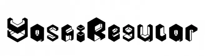
( Fonts by Yussrri Ab )
A bold, three-dimensional geometric font with a modern, decorative style.
![Yashi Regular font caratteri gratis]() Scaricare 53 Downloads@WebFont
Scaricare 53 Downloads@WebFont -
( Fonts by Daniel Zadorozny - www.iconian.com - Personal-use only. For commercial use please contact owner. )
A bold, expanded italic font with jagged edges for a dynamic and edgy appearance.
![Ampire Expanded Italic font caratteri gratis]() Scaricare 53 Downloads@WebFont
Scaricare 53 Downloads@WebFont -
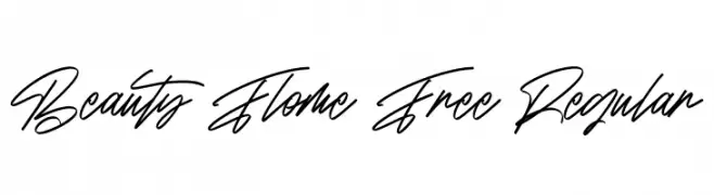
( Fonts by Maulana Creative - Gilang Maulana - Personal-use only. For commercial use please contact owner. )
An elegant, flowing script font with a cursive, handwritten style.
![Beauty Flome Free Regular font caratteri gratis]() Scaricare 53 Downloads@WebFont
Scaricare 53 Downloads@WebFont -
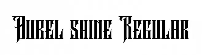
( Fonts by StringLabs - stringlabscreative.com - Personal-use only. For commercial use please contact owner. )
A bold, Gothic-inspired font with intricate, angular details.
![Aurel shine Regular font caratteri gratis]() Scaricare 53 Downloads@WebFont
Scaricare 53 Downloads@WebFont -
( Fonts by Kat`s Fun Fonts - Personal-use only. For commercial use please contact owner. )
A playful, cookie-themed decorative font with a bold, three-dimensional style.
![KR Dunkers font caratteri gratis]() Scaricare 53 Downloads@WebFont
Scaricare 53 Downloads@WebFont -
( Fonts by Truelisan - Personal-use only. For commercial use please contact owner. )
A fluid and elegant handwritten font with dynamic curves and playful special characters.
![Bonagea font caratteri gratis]() Scaricare 53 Downloads@WebFont
Scaricare 53 Downloads@WebFont -
( aldedesign - Alde Saputro - creativemarket.com/aldedesign?u=aldedesign )
A flowing, cursive font with a slight slant, mimicking elegant handwriting.
![Ma Fille Slant font caratteri gratis]() Scaricare 53 Downloads@WebFont
Scaricare 53 Downloads@WebFont -
( Fonts by Kong Font - fontkong.com - Personal-use only. For commercial use please contact owner. )
A dynamic, cursive script font with fluid, expressive strokes.
![The Human Italic font caratteri gratis]() Scaricare 53 Downloads@WebFont
Scaricare 53 Downloads@WebFont -
( Fonts by Hendrick Rolandez - www.moinzek.com - Personal-use only. For commercial use please contact owner. )
A sophisticated, condensed italic font with high contrast and elegant serifs.
![Glamor Condensed Italic font caratteri gratis]() Scaricare 53 Downloads@WebFont
Scaricare 53 Downloads@WebFont -
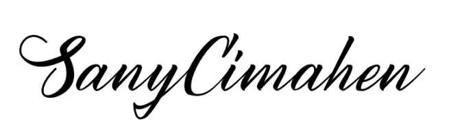
( Fonts by StringLabs - stringlabscreative.com - Personal-use only. For commercial use please contact owner. )
A flowing, cursive script font with elegant, sweeping strokes and ornate flourishes.
![Sany Cimahen font caratteri gratis]() Scaricare 53 Downloads@WebFont
Scaricare 53 Downloads@WebFont -
( Fonts by Riki - Personal-use only. For commercial use please contact owner. )
A dynamic, flowing script font with a bold, handwritten style.
![Ragilac font caratteri gratis]() Scaricare 53 Downloads@WebFont
Scaricare 53 Downloads@WebFont -
![WS Serif font caratteri gratis]() Scaricare 53 Downloads
Scaricare 53 Downloads -
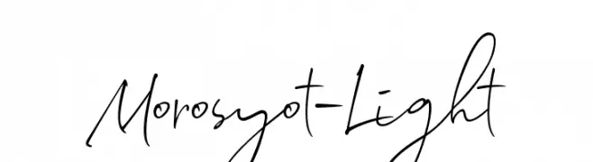
( Fonts by Hindra Permana )
A dynamic, expressive handwritten font with fluid, cursive letterforms.
![Morosyot-Light font caratteri gratis]() Scaricare 53 Downloads@WebFont
Scaricare 53 Downloads@WebFont -
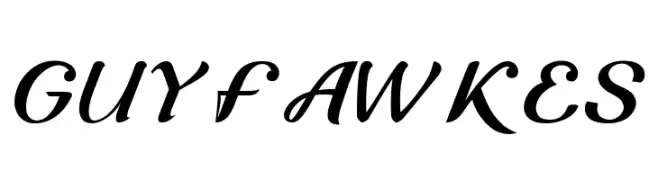
( Fonts by Luxima Creative Studio - Susilo Hidayat - Personal-use only. For commercial use please contact owner. )
A classic, elegant script font with flowing, cursive letterforms.
![Guyfawkes font caratteri gratis]() Scaricare 53 Downloads@WebFont
Scaricare 53 Downloads@WebFont -
( Fonts by Maulana Creative - Gilang Maulana - Personal-use only. For commercial use please contact owner. )
A playful handwritten font with artistic flair and dynamic strokes.
![Lovas Free font caratteri gratis]() Scaricare 53 Downloads@WebFont
Scaricare 53 Downloads@WebFont -
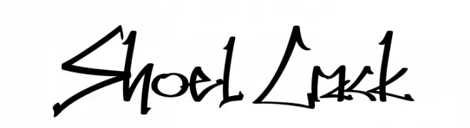
( Fonts by Muhammad Ahwal Bobby - Personal-use only. For commercial use please contact owner. )
A dynamic, edgy handwritten font with a graffiti-like style.
![Shoel Crack font caratteri gratis]() Scaricare 53 Downloads@WebFont
Scaricare 53 Downloads@WebFont -
( Fonts by Zuzulgo Studio - Muhammad Zulfani - Personal-use only. For commercial use please contact owner. )
A bold, playful script font with a handwritten style.
![Gedang font caratteri gratis]() Scaricare 53 Downloads@WebFont
Scaricare 53 Downloads@WebFont


Quali sono i font più popolari adesso?
Poppins, Roboto, Montserrat, Open Sans e Lato sono molto usati per le forme pulite e l'ampia applicabilità — dall'identità di marca alle landing page e ai poster.
Quali font si usano spesso nei loghi?
Le sans serif geometriche (es. Poppins, famiglie in stile Gotham) sono scelte comuni per un branding pulito e scalabile. Per un tocco personale restano valide script e stili manoscritti. Abbina un display deciso per i titoli a un corpo testo neutro per riconoscibilità ed equilibrio.
Ogni quanto si aggiorna la lista?
Con regolarità, in base ai download e all'attività reale. Torna spesso per scoprire in anticipo le nuove preferite.
💡 Consiglio: aggiungi ai preferiti — le tendenze cambiano in fretta e i font top di oggi possono ispirare il rebranding di domani.