Benvenuto nelle Font Più Popolari — dove popolarità e qualità si incontrano. Qui trovi i font più scaricati e usati dell'anno. Se cerchi scelte sicure per logo, web o social, inizia da qui.
Ogni font top si distingue per equilibrio, leggibilità e versatilità. Troverai sans serif moderne, script eleganti, serif vintage e display minimalisti.
-
( Personal-use only. For commercial use please contact owner. )
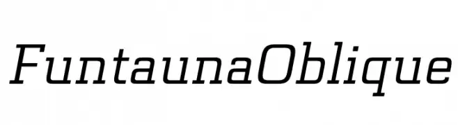
A modern oblique font with sleek, dynamic characters.
 Scaricare 52 Downloads@WebFont
 -
( Fonts by Letternun - Saeful Bahri - Personal-use only. For commercial use please contact owner. )
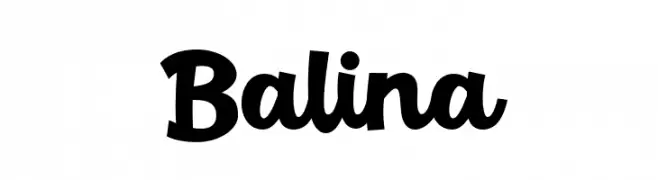
A bold, playful script font with a hand-drawn, energetic style.
![Balina font caratteri gratis]() Scaricare 52 Downloads@WebFont
Scaricare 52 Downloads@WebFont -
( Fonts by Adien Gunarta )
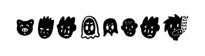
Expressive, hand-drawn font made of cartoon faces.
![Binarung font caratteri gratis]() Scaricare 52 Downloads@WebFont
Scaricare 52 Downloads@WebFont -
( Fonts by Darrell Flood - Personal-use only. For commercial use please contact owner. )
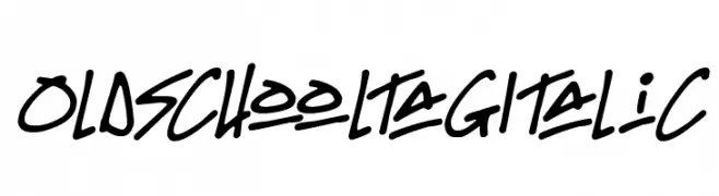
A bold, italicized font with a graffiti-inspired, energetic style.
![Oldschool Tag Italic font caratteri gratis]() Scaricare 52 Downloads@WebFont
Scaricare 52 Downloads@WebFont -
( Fonts by Mans Greback - Personal-use only. For commercial use please contact owner. )
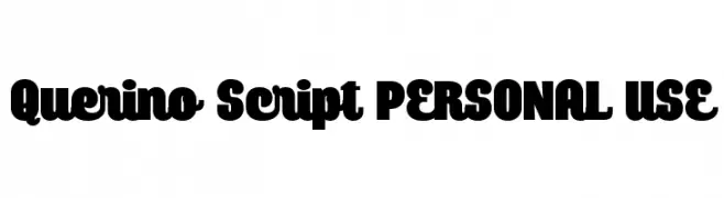
A bold, retro-style font with rounded characters and a playful aesthetic.
![Querino Script PERSONAL USE font caratteri gratis]() Scaricare 52 Downloads@WebFont
Scaricare 52 Downloads@WebFont -
-
( Fonts by Edric Studio - Personal-use only. For commercial use please contact owner. )
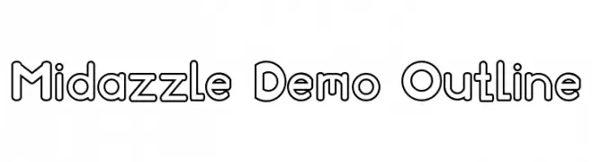
A playful, modern outline font with bold, rounded letterforms.
![Midazzle Demo Outline font caratteri gratis]() Scaricare 52 Downloads@WebFont
Scaricare 52 Downloads@WebFont -
( Fonts by Damn Studio - Personal-use only. For commercial use please contact owner. )
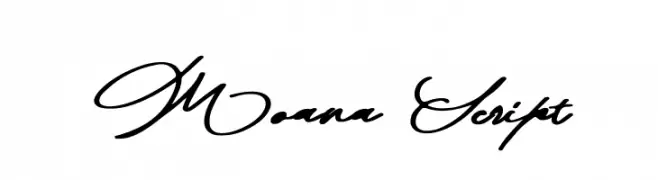
A sophisticated script font with flowing, interconnected letters and ornate uppercase designs.
![Moana Script font caratteri gratis]() Scaricare 52 Downloads@WebFont
Scaricare 52 Downloads@WebFont -
( Fonts by Subectype & Orenari - Rangga Subekti & Ari - Personal-use only. For commercial use please contact owner. )
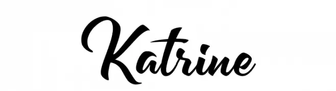
A dynamic and flowing script font with elegant curves and smooth transitions.
![Katrine font caratteri gratis]() Scaricare 52 Downloads@WebFont
Scaricare 52 Downloads@WebFont -
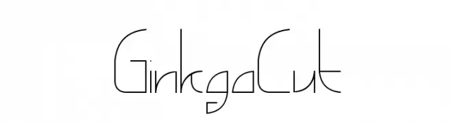
( windsplite - windsplite.com/ )
A modern, geometric font with thin lines and sharp angles, offering a futuristic and elegant look.
![GinkgoCut font caratteri gratis]() Scaricare 52 Downloads@WebFont
Scaricare 52 Downloads@WebFont -
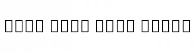
( Noto is a trademark of Google Inc. Noto fonts are open source. All Noto fonts are published under the SIL Open Font License, Version 1.1 )
No valid font characters are visible.
![Noto Sans Cham Light font caratteri gratis]() Scaricare 52 Downloads@WebFont
Scaricare 52 Downloads@WebFont -
( Fonts by Twicolabs Fontdation - Fahrizal Tawakkal - Personal-use only. For commercial use please contact owner. )
A bold, high-contrast serif font with angular serifs and a dynamic style.
![Obsypac font caratteri gratis]() Scaricare 52 Downloads@WebFont
Scaricare 52 Downloads@WebFont -
( Fonts by twinletter - Rozikan - Personal-use only. For commercial use please contact owner. )
A playful, handwritten script font with bold, rounded characters.
![Galont font caratteri gratis]() Scaricare 52 Downloads@WebFont
Scaricare 52 Downloads@WebFont -
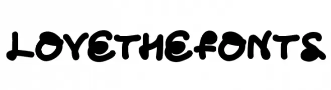
( Darrell Flood )
A bold, playful font with rounded, bubbly characters and a whimsical style.
![Love The Fonts font caratteri gratis]() Scaricare 52 Downloads@WebFont
Scaricare 52 Downloads@WebFont -
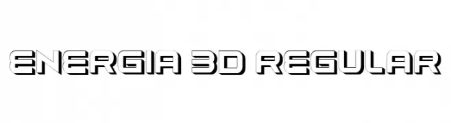
( Fonts by Vladimir Nikolic - www.creativefabrica.com/designer/vladimirnikolic/ - Personal-use only. For commercial use please contact owner. )
A bold, 3D geometric font with a futuristic style.
![Energia 3D Regular font caratteri gratis]() Scaricare 52 Downloads@WebFont
Scaricare 52 Downloads@WebFont -
( Fonts by Bearytype - Dian Hadi - Personal-use only. For commercial use please contact owner. )
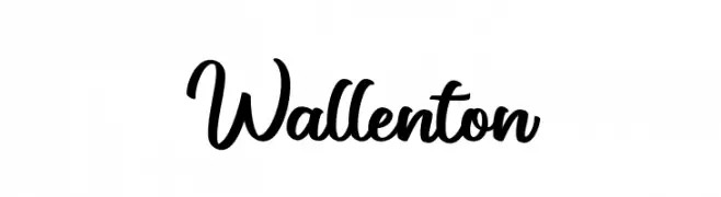
A cursive, elegant font with interconnected letters and a handwritten style.
![Wallenton font caratteri gratis]() Scaricare 52 Downloads@WebFont
Scaricare 52 Downloads@WebFont -
( Fonts by Woodcutter )
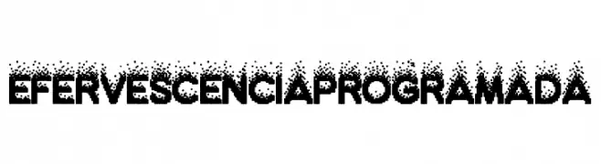
A bold, pixelated font with a dotted gradient effect, ideal for digital or retro-themed designs.
![Efervescencia Programada font caratteri gratis]() Scaricare 52 Downloads@WebFont
Scaricare 52 Downloads@WebFont -
( Fonts by StringLabs - stringlabscreative.com - Personal-use only. For commercial use please contact owner. )
An elegant script font with flowing, cursive letters and intricate flourishes.
![TheSaily font caratteri gratis]() Scaricare 52 Downloads@WebFont
Scaricare 52 Downloads@WebFont -
( Fonts by GorillaBlu - Personal-use only. For commercial use please contact owner. )
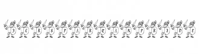
A playful, cartoonish font with Spartan characters integrated into each letter.
![JLR Spartan Pride font caratteri gratis]() Scaricare 52 Downloads@WebFont
Scaricare 52 Downloads@WebFont -
( Fonts by Nirmala Creative - Personal-use only. For commercial use please contact owner. )
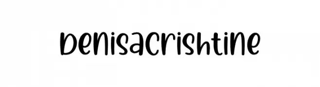
Playful handwritten font with rounded edges.
![Denisa Crishtine font caratteri gratis]() Scaricare 52 Downloads@WebFont
Scaricare 52 Downloads@WebFont -
( Fonts by 177Studio )
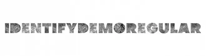
A bold, fingerprint-patterned font with a modern and artistic style.
![identify demo Regular font caratteri gratis]() Scaricare 52 Downloads@WebFont
Scaricare 52 Downloads@WebFont -
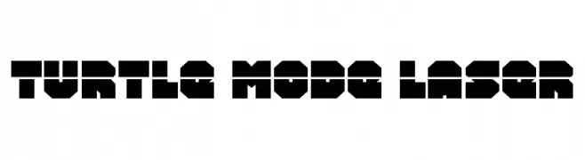
( Fonts by Daniel Zadorozny - www.iconian.com - Personal-use only. For commercial use please contact owner. )
A bold, geometric font with a futuristic and industrial style.
![Turtle Mode Laser font caratteri gratis]() Scaricare 52 Downloads@WebFont
Scaricare 52 Downloads@WebFont -
( Fonts by DmLetter31 - Dimas Prasetyo - Personal-use only. For commercial use please contact owner. )
A dynamic handwritten font with fluid strokes and a casual, sophisticated appearance.
![Alamode font caratteri gratis]() Scaricare 52 Downloads@WebFont
Scaricare 52 Downloads@WebFont -
( Fonts by Graphicfresh - Personal-use only. For commercial use please contact owner. )
A bold, handwritten font with a lively and dynamic style.
![Zaitun font caratteri gratis]() Scaricare 52 Downloads@WebFont
Scaricare 52 Downloads@WebFont -
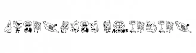
( Fonts by Haviz Fontanime - Personal-use only. For commercial use please contact owner. )
A cartoonish, illustrative display font with each character as a unique drawing.
![SpongeBoB Painting font caratteri gratis]() Scaricare 52 Downloads@WebFont
Scaricare 52 Downloads@WebFont -
( Fonts by VPcreativeshop - Vladimir Fedotov - Personal-use only. For commercial use please contact owner. )
A playful, interconnected script-style font with bold, rounded characters.
![Godlike font caratteri gratis]() Scaricare 52 Downloads@WebFont
Scaricare 52 Downloads@WebFont -
( Fonts by Peter Wiegel - www.peter-wiegel.de - Personal-use only. For commercial use please contact owner. )
A bold, modern font with high contrast and calligraphic elements.
![cbe Bold font caratteri gratis]() Scaricare 52 Downloads@WebFont
Scaricare 52 Downloads@WebFont -
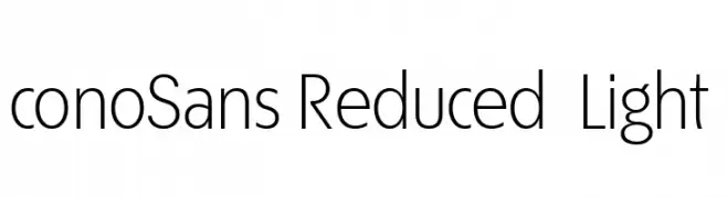
( Fonts by ingoFonts - Ingo Zimmermann - Personal-use only. For commercial use please contact owner. )
A modern, geometric sans-serif font with clean lines and balanced spacing.
![ÉconoSans Reduced 45 Light font caratteri gratis]() Scaricare 52 Downloads@WebFont
Scaricare 52 Downloads@WebFont -
( weknow - Wino S Kadir - www.creativefabrica.com/designer/weknow/ )
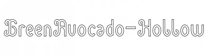
A playful, hollow decorative font with rounded edges and a whimsical style.
![Green Avocado-Hollow font caratteri gratis]() Scaricare 52 Downloads@WebFont
Scaricare 52 Downloads@WebFont -
( Fonts by typeformerstudio.com - Personal-use only. For commercial use please contact owner. )
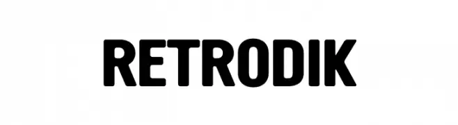
A bold, geometric font with a modern and impactful style.
![RETRODIK font caratteri gratis]() Scaricare 52 Downloads@WebFont
Scaricare 52 Downloads@WebFont -
( Fonts by Nirmala Creative - Personal-use only. For commercial use please contact owner. )
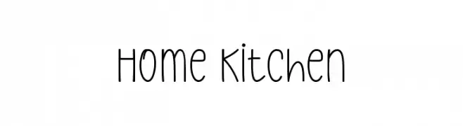
Playful handwritten font with rounded edges.
![Home Kitchen font caratteri gratis]() Scaricare 52 Downloads@WebFont
Scaricare 52 Downloads@WebFont -
( Noto is a trademark of Google Inc. Noto fonts are open source. All Noto fonts are published under the SIL Open Font License, Version 1.1 )
A modern, condensed sans-serif font ideal for UI design.
![Noto Sans Tamil UI Condensed font caratteri gratis]() Scaricare 52 Downloads@WebFont
Scaricare 52 Downloads@WebFont -
( Vincent Alvarez )
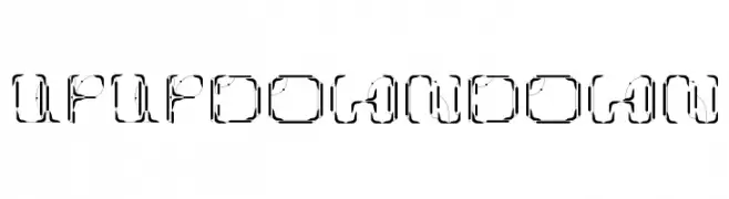
A bold, geometric font with angular, futuristic design elements.
![UpUp DownDown font caratteri gratis]() Scaricare 52 Downloads@WebFont
Scaricare 52 Downloads@WebFont -
( Fonts by Jamie Collins )
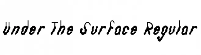
A hand-drawn, organic font with wavy, irregular outlines.
![Under The Surface Regular font caratteri gratis]() Scaricare 52 Downloads@WebFont
Scaricare 52 Downloads@WebFont -
( Fonts by Vladimir Nikolic )
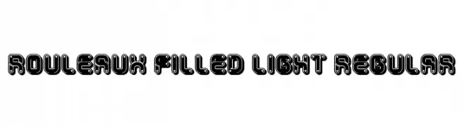
A bold, industrial font with a mechanical, futuristic aesthetic.
![Rouleaux Filled Light Regular font caratteri gratis]() Scaricare 52 Downloads@WebFont
Scaricare 52 Downloads@WebFont -
( Fonts by Vladimir Nikolic - www.creativefabrica.com/designer/vladimirnikolic/ - Personal-use only. For commercial use please contact owner. )
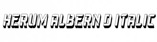
A bold, 3D italic font with a dynamic and modern style.
![Herum Albern 3D Italic font caratteri gratis]() Scaricare 52 Downloads@WebFont
Scaricare 52 Downloads@WebFont


Quali sono i font più popolari adesso?
Poppins, Roboto, Montserrat, Open Sans e Lato sono molto usati per le forme pulite e l'ampia applicabilità — dall'identità di marca alle landing page e ai poster.
Quali font si usano spesso nei loghi?
Le sans serif geometriche (es. Poppins, famiglie in stile Gotham) sono scelte comuni per un branding pulito e scalabile. Per un tocco personale restano valide script e stili manoscritti. Abbina un display deciso per i titoli a un corpo testo neutro per riconoscibilità ed equilibrio.
Ogni quanto si aggiorna la lista?
Con regolarità, in base ai download e all'attività reale. Torna spesso per scoprire in anticipo le nuove preferite.
💡 Consiglio: aggiungi ai preferiti — le tendenze cambiano in fretta e i font top di oggi possono ispirare il rebranding di domani.