Benvenuto nelle Font Più Popolari — dove popolarità e qualità si incontrano. Qui trovi i font più scaricati e usati dell'anno. Se cerchi scelte sicure per logo, web o social, inizia da qui.
Ogni font top si distingue per equilibrio, leggibilità e versatilità. Troverai sans serif moderne, script eleganti, serif vintage e display minimalisti.
-
( گالری فانت فارسی پژوهش آريانا - only compatible with Farsi and Arabic )
A creative and artistic handwritten font with dynamic strokes.
 Scaricare 1400 Downloads@WebFont
 -
( Fonts by Apostrophic Lab )
A tall, narrow, and modern font with clean lines and uniform stroke width.
![Labtop Bold font caratteri gratis]() Scaricare 1400 Downloads@WebFont
Scaricare 1400 Downloads@WebFont -
( Fonts by www.exclamachine.com )
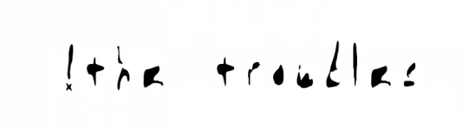
An abstract, hand-drawn font with irregular, brush-like letterforms enclosed in circular shapes.
![!the troubles font caratteri gratis]() Scaricare 1400 Downloads@WebFont
Scaricare 1400 Downloads@WebFont -
![04b09 font caratteri gratis]() Scaricare 1400 Downloads@WebFont
Scaricare 1400 Downloads@WebFont -
( Fonts by Nick Curtis - www.nicksfonts.com )
A bold, three-dimensional geometric font with a striking visual impact.
![FacetsNF font caratteri gratis]() Scaricare 1400 Downloads@WebFont
Scaricare 1400 Downloads@WebFont -
( Fonts by Cumberland Fontworks - http://www222.pair.com/sjohn/fonts.htm - S. John Ross )
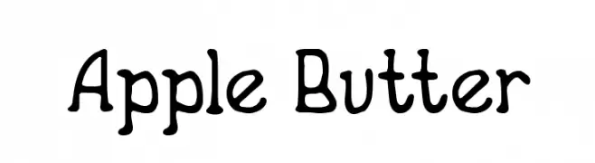
A playful, hand-drawn font with irregular, wavy strokes and a whimsical style.
![Apple Butter font caratteri gratis]() Scaricare 1400 Downloads@WebFont
Scaricare 1400 Downloads@WebFont -
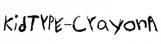
![KidTYPE-CrayonA font caratteri gratis]() Scaricare 1400 Downloads@WebFont
Scaricare 1400 Downloads@WebFont -
( Fonts by Wahyu Eka Prasetya - wepfont.com - Personal-use only. For commercial use please contact owner. )
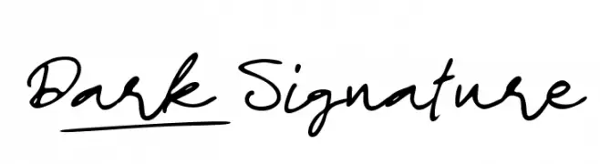
A dynamic, cursive script font with a natural, handwritten flow.
![Dark_Signature font caratteri gratis]() Scaricare 1399 Downloads@WebFont
Scaricare 1399 Downloads@WebFont -
( Fonts by Tüpokompanii )
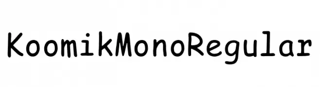
A playful, monospaced font with a handwritten feel and consistent spacing.
![Koomik Mono Regular font caratteri gratis]() Scaricare 1399 Downloads@WebFont
Scaricare 1399 Downloads@WebFont -
( Fonts by Nomo Studio - bybu.es - Personal-use only. For commercial use please contact owner. )
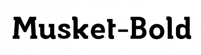
A bold and robust font with strong, thick strokes and a touch of elegance.
![Musket-Bold font caratteri gratis]() Scaricare 1399 Downloads@WebFont
Scaricare 1399 Downloads@WebFont -
( 7NTypes - Situjuh Nazara - 7ntypes.com )
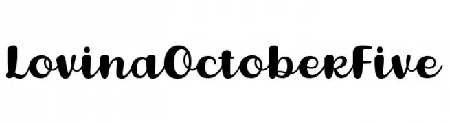
A playful and elegant script font with smooth, flowing characters.
![Lovina October Five font caratteri gratis]() Scaricare 1399 Downloads@WebFont
Scaricare 1399 Downloads@WebFont -
( Fonts by Fajar Wahyu Pribadi )
A graceful and elegant script font with flowing, high-contrast strokes.
![Anomaly font caratteri gratis]() Scaricare 1399 Downloads@WebFont
Scaricare 1399 Downloads@WebFont -
( Fonts by www.studiotypo.com - Personal-use only. For commercial use please contact owner. )
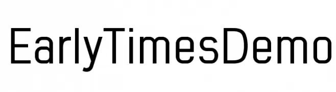
A modern, geometric sans-serif font with clean lines and uniform strokes.
![Early Times Demo font caratteri gratis]() Scaricare 1399 Downloads@WebFont
Scaricare 1399 Downloads@WebFont -
( Fonts by a Neale Davidson - www.pixelsagas.com. Personal-use only. For commercial use please contact owner. )
A bold, geometric font with sharp angles and a futuristic style.
![Megatron font caratteri gratis]() Scaricare 1399 Downloads@WebFont
Scaricare 1399 Downloads@WebFont -
Caratteri di spideraysfonts. For commercial use please contact the owner.
![NAKED font caratteri gratis]() Scaricare 1399 Downloads@WebFont
Scaricare 1399 Downloads@WebFont -
![Ravenna font caratteri gratis]() Scaricare 1399 Downloads@WebFont
Scaricare 1399 Downloads@WebFont -
( Fonts by Jonathan Paquette - www.jonathanpaquette.com )
A bold, distressed font with a rugged, vintage aesthetic.
![Desperado! font caratteri gratis]() Scaricare 1399 Downloads@WebFont
Scaricare 1399 Downloads@WebFont -
( Fonts by or from www.graffitifonts.net )
A playful, bold font with a bubble-like, three-dimensional appearance.
![Somora font caratteri gratis]() Scaricare 1399 Downloads
Scaricare 1399 Downloads -
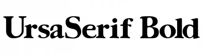
![UrsaSerif Bold font caratteri gratis]() Scaricare 1399 Downloads@WebFont
Scaricare 1399 Downloads@WebFont -
( Fonts by MJType )
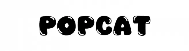
A playful, bold font with a bubbly, rounded design ideal for fun projects.
![Popcat font caratteri gratis]() Scaricare 1398 Downloads@WebFont
Scaricare 1398 Downloads@WebFont -
( Fonts by Goldman Sans - https://design.gs.com/d/design-system/foundation/typography/ - Personal-use only. For commercial use please contact owner. )
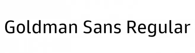
A clean, modern sans-serif typeface with uniform stroke thickness and balanced spacing.
![Goldman Sans Regular font caratteri gratis]() Scaricare 1398 Downloads@WebFont
Scaricare 1398 Downloads@WebFont -
( Copyright (c) 2014 Pooja Saxena (www.poojasaxena.in) )
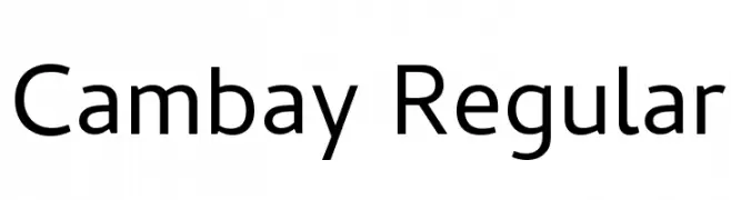
A modern, clean typeface with excellent readability and versatility.
![Cambay Regular font caratteri gratis]() Scaricare 1398 Downloads@WebFont
Scaricare 1398 Downloads@WebFont -
( Fonts by www.someshinzz.com )
A modern, rounded sans-serif font with smooth curves and balanced spacing.
![Plymdale font caratteri gratis]() Scaricare 1398 Downloads@WebFont
Scaricare 1398 Downloads@WebFont -
![Calendary Hands PERSONAL USE DEMO font caratteri gratis]() Scaricare 1398 Downloads@WebFont
Scaricare 1398 Downloads@WebFont -
( Fonts by a cenz qobbal - www.facebook.com/cenzqobbalfonts. Personal-use only. For commercial use please contact owner. )
A bold, decorative font with vintage flair and intricate detailing.
![POP & JAZZ font caratteri gratis]() Scaricare 1398 Downloads@WebFont
Scaricare 1398 Downloads@WebFont -
( Fonts by Grzegorz l - www.glukfonts.pl )
A bold, serif font with strong strokes and a modern yet classic appeal.
![Zantroke font caratteri gratis]() Scaricare 1398 Downloads@WebFont
Scaricare 1398 Downloads@WebFont -
( Fonts by Ingo Zimmermann - www.ingofonts.com )
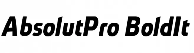
A bold, italic font with a modern and dynamic style.
![AbsolutPro-BoldIt font caratteri gratis]() Scaricare 1398 Downloads@WebFont
Scaricare 1398 Downloads@WebFont -
( Fonts by Tobias Benjamin Kohler - www.uncia.de )
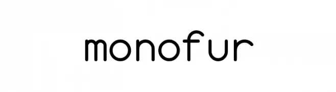
A modern, monospaced typeface with rounded edges and a playful style.
![monofur font caratteri gratis]() Scaricare 1398 Downloads@WebFont
Scaricare 1398 Downloads@WebFont -
![Futurama-Title-Font font caratteri gratis]() Scaricare 1398 Downloads@WebFont
Scaricare 1398 Downloads@WebFont -
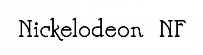
( Fonts by Nick Curtis - www.nicksfonts.com )
A playful and whimsical font with curly serifs and rounded edges.
![Nickelodeon NF font caratteri gratis]() Scaricare 1398 Downloads@WebFont
Scaricare 1398 Downloads@WebFont -
( Fonts by CannotIntoSpaceFonts - KineticPlasma Fonts - Personal-use only. For commercial use please contact owner. )
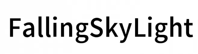
A clean, modern sans-serif font with uniform stroke width and excellent readability.
![Falling Sky Light font caratteri gratis]() Scaricare 1397 Downloads@WebFont
Scaricare 1397 Downloads@WebFont -
( Fonts by Have Fun with Fonts )
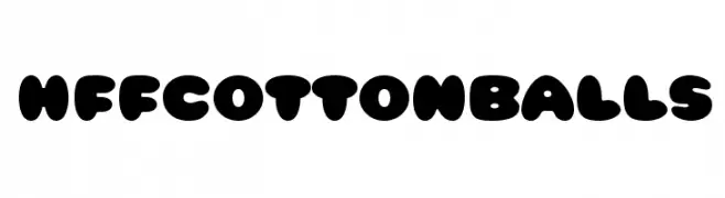
A playful, bold font with rounded, bubble-like characters perfect for fun projects.
![HFF Cotton Balls font caratteri gratis]() Scaricare 1397 Downloads@WebFont
Scaricare 1397 Downloads@WebFont -
( Fonts by a www.fontfabric.com. Personal-use only. For commercial use please contact owner. )
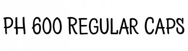
A playful, handwritten font with rounded edges and a casual style.
![PH 600 Regular Caps font caratteri gratis]() Scaricare 1397 Downloads@WebFont
Scaricare 1397 Downloads@WebFont -
![Comic Block DEMO by Marta van Eck font caratteri gratis]() Scaricare 1397 Downloads@WebFont
Scaricare 1397 Downloads@WebFont -
![Pompadour Black font caratteri gratis]() Scaricare 1397 Downloads@WebFont
Scaricare 1397 Downloads@WebFont


Quali sono i font più popolari adesso?
Poppins, Roboto, Montserrat, Open Sans e Lato sono molto usati per le forme pulite e l'ampia applicabilità — dall'identità di marca alle landing page e ai poster.
Quali font si usano spesso nei loghi?
Le sans serif geometriche (es. Poppins, famiglie in stile Gotham) sono scelte comuni per un branding pulito e scalabile. Per un tocco personale restano valide script e stili manoscritti. Abbina un display deciso per i titoli a un corpo testo neutro per riconoscibilità ed equilibrio.
Ogni quanto si aggiorna la lista?
Con regolarità, in base ai download e all'attività reale. Torna spesso per scoprire in anticipo le nuove preferite.
💡 Consiglio: aggiungi ai preferiti — le tendenze cambiano in fretta e i font top di oggi possono ispirare il rebranding di domani.