Benvenuto nelle Font Più Popolari — dove popolarità e qualità si incontrano. Qui trovi i font più scaricati e usati dell'anno. Se cerchi scelte sicure per logo, web o social, inizia da qui.
Ogni font top si distingue per equilibrio, leggibilità e versatilità. Troverai sans serif moderne, script eleganti, serif vintage e display minimalisti.
-
( Free for personal use - Fonts by Markus Schroppel. For commercial license please donate to http://www.die-gute-schrift.de/donation.html )
A bold, hand-drawn font with an artistic and playful style.
 Scaricare 373 Downloads@WebFont
 -
Caratteri di JuanCasco. For commercial use please contact the owner.
( Fonts by Juan Casco - www.juancasco.net )
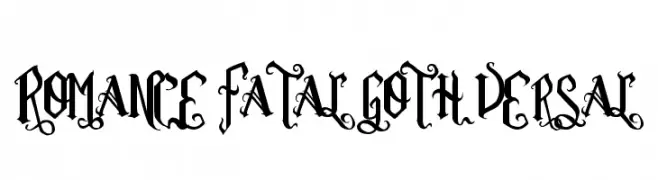
A dramatic, ornate Gothic-style font with intricate flourishes and sharp angles.
![Romance Fatal Goth Versal font caratteri gratis]() Scaricare 373 Downloads@WebFont
Scaricare 373 Downloads@WebFont -
( Fonts by a Galdino Otten - galdinootten.com . Personal-use only. For commercial use please contact owner. )
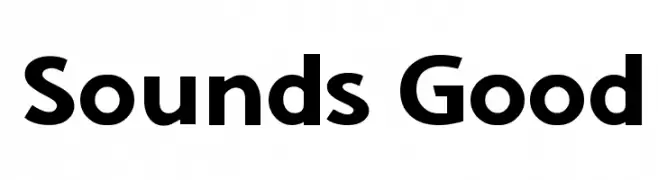
A bold, modern sans-serif font with geometric shapes and uniform strokes.
![Sounds Good font caratteri gratis]() Scaricare 373 Downloads@WebFont
Scaricare 373 Downloads@WebFont -
![Dyspepsia font caratteri gratis]() Scaricare 373 Downloads@WebFont
Scaricare 373 Downloads@WebFont -
( Copyright (c) 2012-2015, The Mozilla Foundation and Telefonica S.A. )
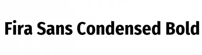
A bold, condensed sans-serif font with a modern and clean design.
![Fira Sans Condensed Bold font caratteri gratis]() Scaricare 373 Downloads@WebFont
Scaricare 373 Downloads@WebFont -
-
( Fonts by Apostrophic Lab )
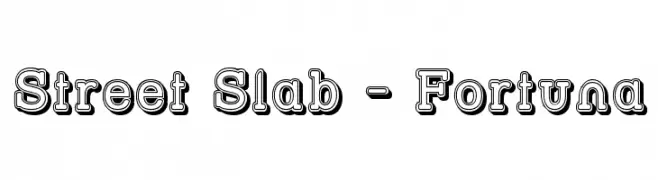
A bold, 3D slab serif font with a shadow effect for impactful designs.
![Street Slab - Fortuna font caratteri gratis]() Scaricare 373 Downloads@WebFont
Scaricare 373 Downloads@WebFont -
( Fonts by ShyFonts )
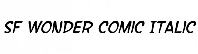
A playful, comic-style italic font with bold, rounded characters.
![SF Wonder Comic Italic font caratteri gratis]() Scaricare 373 Downloads@WebFont
Scaricare 373 Downloads@WebFont -
![JeffreyPrint JL Wide font caratteri gratis]() Scaricare 373 Downloads@WebFont
Scaricare 373 Downloads@WebFont -
( deFharo - Fernando Haro - defharo.com )
A modern and elegant typeface with a clean, balanced design.
![FlamanteCairoBook font caratteri gratis]() Scaricare 373 Downloads@WebFont
Scaricare 373 Downloads@WebFont -
( Fonts by or from www.graffitifonts.net )
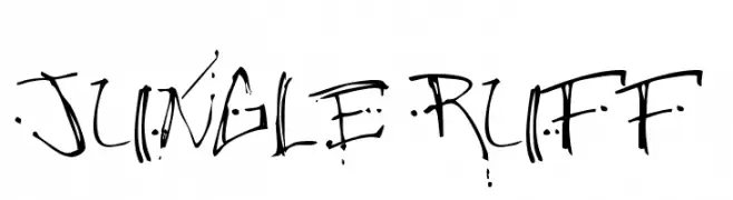
A dynamic, graffiti-inspired font with rough, hand-drawn strokes and a rebellious aesthetic.
![Jungle Ruff font caratteri gratis]() Scaricare 373 Downloads@WebFont
Scaricare 373 Downloads@WebFont


Quali sono i font più popolari adesso?
Poppins, Roboto, Montserrat, Open Sans e Lato sono molto usati per le forme pulite e l'ampia applicabilità — dall'identità di marca alle landing page e ai poster.
Quali font si usano spesso nei loghi?
Le sans serif geometriche (es. Poppins, famiglie in stile Gotham) sono scelte comuni per un branding pulito e scalabile. Per un tocco personale restano valide script e stili manoscritti. Abbina un display deciso per i titoli a un corpo testo neutro per riconoscibilità ed equilibrio.
Ogni quanto si aggiorna la lista?
Con regolarità, in base ai download e all'attività reale. Torna spesso per scoprire in anticipo le nuove preferite.
💡 Consiglio: aggiungi ai preferiti — le tendenze cambiano in fretta e i font top di oggi possono ispirare il rebranding di domani.