Benvenuto nelle Font Più Popolari — dove popolarità e qualità si incontrano. Qui trovi i font più scaricati e usati dell'anno. Se cerchi scelte sicure per logo, web o social, inizia da qui.
Ogni font top si distingue per equilibrio, leggibilità e versatilità. Troverai sans serif moderne, script eleganti, serif vintage e display minimalisti.
-
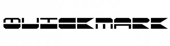
( Fonts by Daniel Zadorozny - www.iconian.com )
A bold, futuristic font with geometric shapes and sharp angles.
 Scaricare 372 Downloads@WebFont
 -
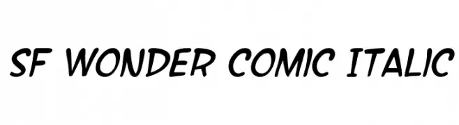
( Fonts by ShyFonts )
A playful, comic-style italic font with bold, rounded characters.
![SF Wonder Comic Italic font caratteri gratis]() Scaricare 372 Downloads@WebFont
Scaricare 372 Downloads@WebFont -
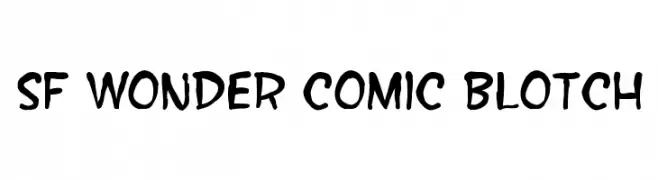
( Fonts by ShyFonts )
A playful, hand-drawn style font with bold, irregular strokes perfect for comic or casual designs.
![SF Wonder Comic Blotch font caratteri gratis]() Scaricare 372 Downloads@WebFont
Scaricare 372 Downloads@WebFont -
( deFharo - Fernando Haro - defharo.com )
A modern and elegant typeface with a clean, balanced design.
![FlamanteCairoBook font caratteri gratis]() Scaricare 372 Downloads@WebFont
Scaricare 372 Downloads@WebFont -
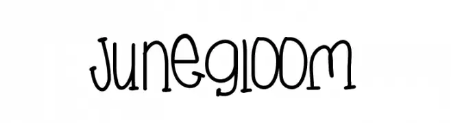
( Fonts by Des Gomez )
A playful, hand-drawn font with a whimsical and friendly style.
![JuneGloom font caratteri gratis]() Scaricare 372 Downloads@WebFont
Scaricare 372 Downloads@WebFont -
-
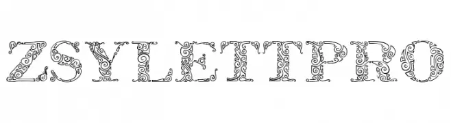
( Fonts by EvasUniqueFonts )
An ornate and decorative font with intricate patterns and a vintage flair.
![ZsylettPro font caratteri gratis]() Scaricare 372 Downloads@WebFont
Scaricare 372 Downloads@WebFont -
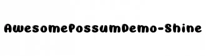
( Fonts by Brittney Murphy Design )
A bold, playful font with rounded, bubbly characters and a hand-drawn feel.
![AwesomePossumDemo-Shine font caratteri gratis]() Scaricare 372 Downloads@WebFont
Scaricare 372 Downloads@WebFont -
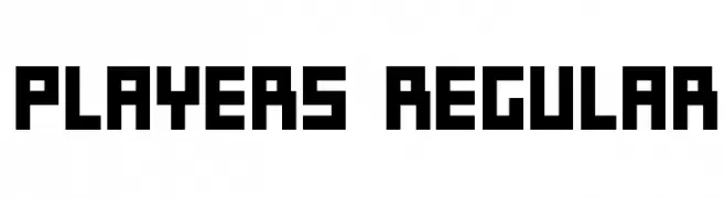
( Vladimir Nikolic - www.coroflot.com/vladimirnikolic )
A bold, geometric font with a blocky, digital appearance.
![Players Regular font caratteri gratis]() Scaricare 372 Downloads@WebFont
Scaricare 372 Downloads@WebFont -
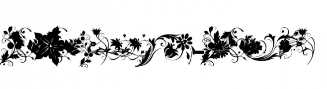
( Fonts by Khaled Aldousari )
Ornate floral decorative font with detailed botanical elements.
![fotograami-flower font caratteri gratis]() Scaricare 372 Downloads@WebFont
Scaricare 372 Downloads@WebFont -
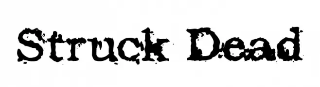
( Fonts by Cumberland Fontworks - http://www222.pair.com/sjohn/fonts.htm - S. John Ross )
A bold, distressed font with a grunge, weathered appearance.
![Struck Dead font caratteri gratis]() Scaricare 372 Downloads@WebFont
Scaricare 372 Downloads@WebFont

Quali sono i font più popolari adesso?
Poppins, Roboto, Montserrat, Open Sans e Lato sono molto usati per le forme pulite e l'ampia applicabilità — dall'identità di marca alle landing page e ai poster.
Quali font si usano spesso nei loghi?
Le sans serif geometriche (es. Poppins, famiglie in stile Gotham) sono scelte comuni per un branding pulito e scalabile. Per un tocco personale restano valide script e stili manoscritti. Abbina un display deciso per i titoli a un corpo testo neutro per riconoscibilità ed equilibrio.
Ogni quanto si aggiorna la lista?
Con regolarità, in base ai download e all'attività reale. Torna spesso per scoprire in anticipo le nuove preferite.
💡 Consiglio: aggiungi ai preferiti — le tendenze cambiano in fretta e i font top di oggi possono ispirare il rebranding di domani.