Benvenuto nelle Font Più Popolari — dove popolarità e qualità si incontrano. Qui trovi i font più scaricati e usati dell'anno. Se cerchi scelte sicure per logo, web o social, inizia da qui.
Ogni font top si distingue per equilibrio, leggibilità e versatilità. Troverai sans serif moderne, script eleganti, serif vintage e display minimalisti.
-
 Scaricare 369 Downloads@WebFont
 -
( Fonts by Iconian Fonts )
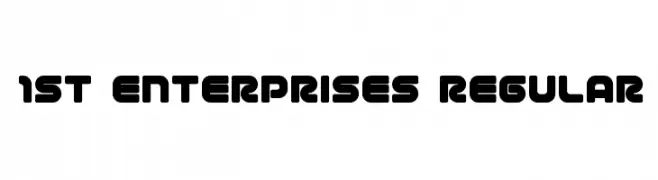
A bold, rounded font with a futuristic and geometric style.
![1st Enterprises Regular font caratteri gratis]() Scaricare 369 Downloads@WebFont
Scaricare 369 Downloads@WebFont -
( Fonts by David Espinosa [Type Sailor] - www.facebook.com/typesailor - Personal-use only. For commercial use please contact owner. )
An elegant serif font with a blend of classic and modern elements.
![Olimpia font caratteri gratis]() Scaricare 369 Downloads@WebFont
Scaricare 369 Downloads@WebFont -
( Ydhra Studio - creativemarket.com/ydhra )
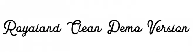
A flowing, cursive font with elegant loops and swirls.
![Royaland Clean Demo Version font caratteri gratis]() Scaricare 369 Downloads@WebFont
Scaricare 369 Downloads@WebFont -
( Fonts by Gyom Seguin - last-soundtrack.daportfolio.com )
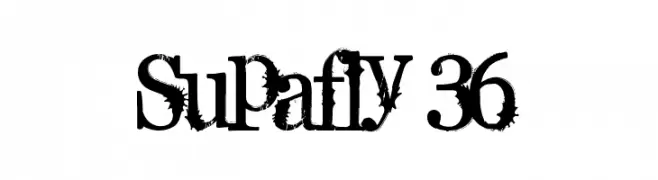
A bold, distressed font with a grunge aesthetic.
![Supafly 36 font caratteri gratis]() Scaricare 369 Downloads@WebFont
Scaricare 369 Downloads@WebFont -
-
( Fonts by Bangkit Tri Setiadi )
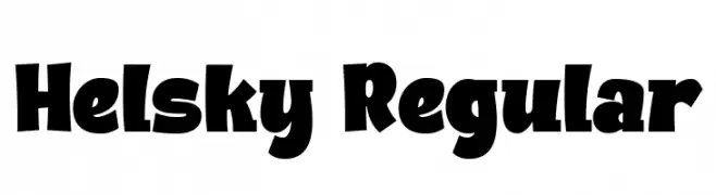
A bold, playful font with exaggerated curves and thick strokes.
![Helsky Regular font caratteri gratis]() Scaricare 369 Downloads@WebFont
Scaricare 369 Downloads@WebFont -
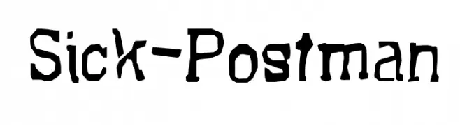
![Sick-Postman font caratteri gratis]() Scaricare 369 Downloads@WebFont
Scaricare 369 Downloads@WebFont -
( Fonts by StringLabs )
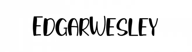
A playful, bold font with rounded strokes and a modern, friendly style.
![Edgar Wesley font caratteri gratis]() Scaricare 369 Downloads@WebFont
Scaricare 369 Downloads@WebFont -
( Fonts by Isnayono )
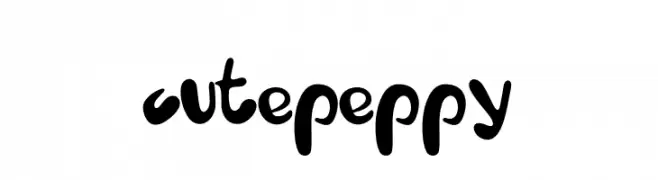
A playful, bold font with rounded, whimsical characters.
![cute peppy font caratteri gratis]() Scaricare 369 Downloads@WebFont
Scaricare 369 Downloads@WebFont -
( Fonts by Bride & Groom www.brideandgroomdirect.co.uk )
A playful, whimsical handwritten font with tall, narrow letters and a casual style.
![Laura-Alternate font caratteri gratis]() Scaricare 369 Downloads@WebFont
Scaricare 369 Downloads@WebFont


Quali sono i font più popolari adesso?
Poppins, Roboto, Montserrat, Open Sans e Lato sono molto usati per le forme pulite e l'ampia applicabilità — dall'identità di marca alle landing page e ai poster.
Quali font si usano spesso nei loghi?
Le sans serif geometriche (es. Poppins, famiglie in stile Gotham) sono scelte comuni per un branding pulito e scalabile. Per un tocco personale restano valide script e stili manoscritti. Abbina un display deciso per i titoli a un corpo testo neutro per riconoscibilità ed equilibrio.
Ogni quanto si aggiorna la lista?
Con regolarità, in base ai download e all'attività reale. Torna spesso per scoprire in anticipo le nuove preferite.
💡 Consiglio: aggiungi ai preferiti — le tendenze cambiano in fretta e i font top di oggi possono ispirare il rebranding di domani.