Benvenuto nelle Font Più Popolari — dove popolarità e qualità si incontrano. Qui trovi i font più scaricati e usati dell'anno. Se cerchi scelte sicure per logo, web o social, inizia da qui.
Ogni font top si distingue per equilibrio, leggibilità e versatilità. Troverai sans serif moderne, script eleganti, serif vintage e display minimalisti.
-
( Fonts by a Neale Davidson - www.pixelsagas.com. Personal-use only. For commercial use please contact owner. )
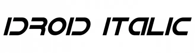
A futuristic, italic font with bold, geometric characters and a modern aesthetic.
 Scaricare 280 Downloads@WebFont
 -
( Fonts by Achmad Yani )
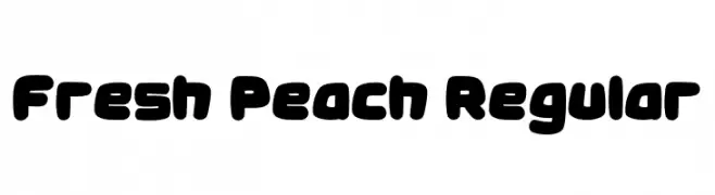
A bold, playful font with rounded edges and a bubbly, retro-modern style.
![Fresh Peach Regular font caratteri gratis]() Scaricare 280 Downloads@WebFont
Scaricare 280 Downloads@WebFont -
( Fonts by a Galdino Otten - galdinootten.com . Personal-use only. For commercial use please contact owner. )
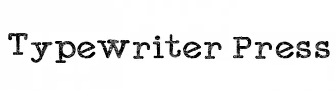
A vintage, textured typewriter-style font with monospaced characters and a bold, authentic look.
![Typewriter Press font caratteri gratis]() Scaricare 280 Downloads@WebFont
Scaricare 280 Downloads@WebFont -
( Free for a personal use. For a commercial use please visit www.kevinandamanda.com )
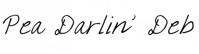
A playful, handwritten font with a whimsical and fluid cursive style.
![Pea Darlin' Deb font caratteri gratis]() Scaricare 280 Downloads@WebFont
Scaricare 280 Downloads@WebFont -
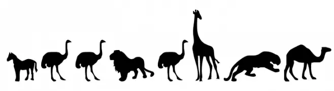
( Fonts by Daniel Zadorozny - www.iconian.com - Free for personal use )
Silhouetted animal shapes in a bold, uniform style.
![Zoologic font caratteri gratis]() Scaricare 280 Downloads@WebFont
Scaricare 280 Downloads@WebFont -
-
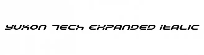
![Yukon Tech Expanded Italic font caratteri gratis]() Scaricare 280 Downloads@WebFont
Scaricare 280 Downloads@WebFont -
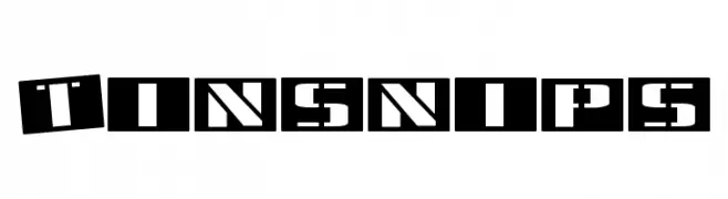
![Tinsnips font caratteri gratis]() Scaricare 280 Downloads@WebFont
Scaricare 280 Downloads@WebFont -
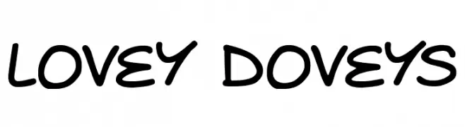
( Fonts by Darrell Flood )
A playful, handwritten-style font with rounded, bold characters.
![Lovey Doveys font caratteri gratis]() Scaricare 280 Downloads@WebFont
Scaricare 280 Downloads@WebFont -
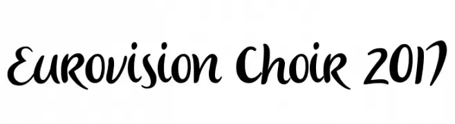
( 538Fonts - storychoice.wix.com/homepage )
A lively and expressive handwritten font with fluid, dynamic strokes.
![Eurovision Choir 2017 font caratteri gratis]() Scaricare 280 Downloads@WebFont
Scaricare 280 Downloads@WebFont -
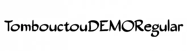
![Tombouctou DEMO Regular font caratteri gratis]() Scaricare 280 Downloads@WebFont
Scaricare 280 Downloads@WebFont
Quali sono i font più popolari adesso?
Poppins, Roboto, Montserrat, Open Sans e Lato sono molto usati per le forme pulite e l'ampia applicabilità — dall'identità di marca alle landing page e ai poster.
Quali font si usano spesso nei loghi?
Le sans serif geometriche (es. Poppins, famiglie in stile Gotham) sono scelte comuni per un branding pulito e scalabile. Per un tocco personale restano valide script e stili manoscritti. Abbina un display deciso per i titoli a un corpo testo neutro per riconoscibilità ed equilibrio.
Ogni quanto si aggiorna la lista?
Con regolarità, in base ai download e all'attività reale. Torna spesso per scoprire in anticipo le nuove preferite.
💡 Consiglio: aggiungi ai preferiti — le tendenze cambiano in fretta e i font top di oggi possono ispirare il rebranding di domani.