Benvenuto nelle Font Più Popolari — dove popolarità e qualità si incontrano. Qui trovi i font più scaricati e usati dell'anno. Se cerchi scelte sicure per logo, web o social, inizia da qui.
Ogni font top si distingue per equilibrio, leggibilità e versatilità. Troverai sans serif moderne, script eleganti, serif vintage e display minimalisti.
-
( Fonts by www.blambot.com )
A playful, handwritten font with a casual and friendly style.
 Scaricare 279 Downloads@WebFont
 -
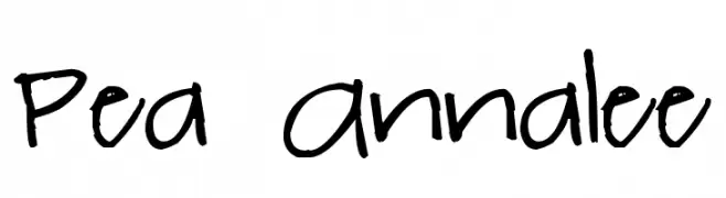
( Free for a personal use. For a commercial use please visit www.kevinandamanda.com )
A playful, casual handwritten font with a dynamic and lively appearance.
![Pea Annalee font caratteri gratis]() Scaricare 279 Downloads@WebFont
Scaricare 279 Downloads@WebFont -
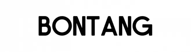
( Fonts by Zuzulgo Studio - Muhammad Zulfani - Personal-use only. For commercial use please contact owner. )
A bold, geometric font with a modern and clean aesthetic.
![Bontang font caratteri gratis]() Scaricare 279 Downloads@WebFont
Scaricare 279 Downloads@WebFont -
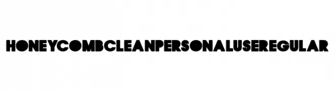
( Fonts by Billy Argel )
A bold, geometric font with a modern and playful aesthetic, ideal for impactful designs.
![HONEYCOMB CLEAN PERSONAL USE Regular font caratteri gratis]() Scaricare 279 Downloads@WebFont
Scaricare 279 Downloads@WebFont -
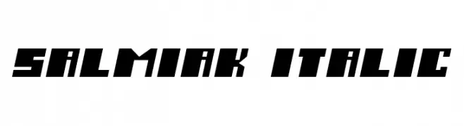
![Salmiak Italic font caratteri gratis]() Scaricare 279 Downloads@WebFont
Scaricare 279 Downloads@WebFont -
-
( Faqih Fawaji )
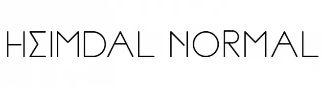
A geometric and minimalist font with clean lines and a modern aesthetic.
![Heimdal Normal font caratteri gratis]() Scaricare 279 Downloads@WebFont
Scaricare 279 Downloads@WebFont -
( Fonts by Matthew Austin Petty - www.disturbed.com )
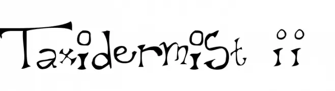
A whimsical, hand-drawn font with playful and irregular letterforms.
![Taxidermist II font caratteri gratis]() Scaricare 279 Downloads@WebFont
Scaricare 279 Downloads@WebFont -
( Fonts by www.junkohanhero.com )
A bold, expressive handwritten font with a playful and casual style.
![Maaliskuu font caratteri gratis]() Scaricare 279 Downloads@WebFont
Scaricare 279 Downloads@WebFont -
( Fonts by Galdino Otten - galdinootten.com )
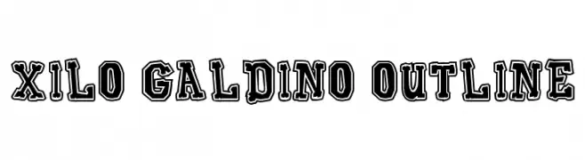
A bold, outlined font with a vintage and decorative style.
![Xilo Galdino Outline font caratteri gratis]() Scaricare 279 Downloads@WebFont
Scaricare 279 Downloads@WebFont -
( Solar Sister - web.archive.org/web/20050308194059/www.hellostranger.com/solarsister/ )
A classic serif font with calligraphic influences and elegant, irregular strokes.
![Asha font caratteri gratis]() Scaricare 279 Downloads@WebFont
Scaricare 279 Downloads@WebFont


Quali sono i font più popolari adesso?
Poppins, Roboto, Montserrat, Open Sans e Lato sono molto usati per le forme pulite e l'ampia applicabilità — dall'identità di marca alle landing page e ai poster.
Quali font si usano spesso nei loghi?
Le sans serif geometriche (es. Poppins, famiglie in stile Gotham) sono scelte comuni per un branding pulito e scalabile. Per un tocco personale restano valide script e stili manoscritti. Abbina un display deciso per i titoli a un corpo testo neutro per riconoscibilità ed equilibrio.
Ogni quanto si aggiorna la lista?
Con regolarità, in base ai download e all'attività reale. Torna spesso per scoprire in anticipo le nuove preferite.
💡 Consiglio: aggiungi ai preferiti — le tendenze cambiano in fretta e i font top di oggi possono ispirare il rebranding di domani.