Benvenuto nelle Font Più Popolari — dove popolarità e qualità si incontrano. Qui trovi i font più scaricati e usati dell'anno. Se cerchi scelte sicure per logo, web o social, inizia da qui.
Ogni font top si distingue per equilibrio, leggibilità e versatilità. Troverai sans serif moderne, script eleganti, serif vintage e display minimalisti.
-
 Scaricare 279 Downloads@WebFont
 -
( Fonts by Maelle.K - Thomas Boucherie )
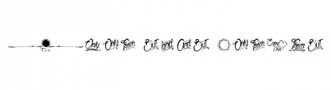
An ornate, calligraphic font with vintage flair and decorative elements.
![From this Moment font caratteri gratis]() Scaricare 279 Downloads@WebFont
Scaricare 279 Downloads@WebFont -
( - www.arthus.nl )
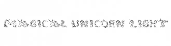
A whimsical font with unicorn and magical motifs, perfect for fantasy themes.
![Magical Unicorn Light font caratteri gratis]() Scaricare 279 Downloads@WebFont
Scaricare 279 Downloads@WebFont -
( Fonts by Jecko Development - www.jeckodevelopment.com )
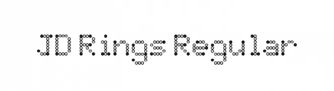
A playful, geometric font made of interconnected circles.
![JD Rings Regular font caratteri gratis]() Scaricare 279 Downloads@WebFont
Scaricare 279 Downloads@WebFont -
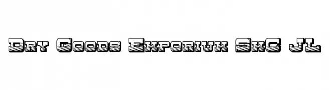
![Dry Goods Emporium SmC JL font caratteri gratis]() Scaricare 279 Downloads@WebFont
Scaricare 279 Downloads@WebFont -
-
( Fonts by a Max Infeld - XEROGRAPHER FONTS - xerographer.blogspot.com . Personal-use only. For commercial use please contact owner. )
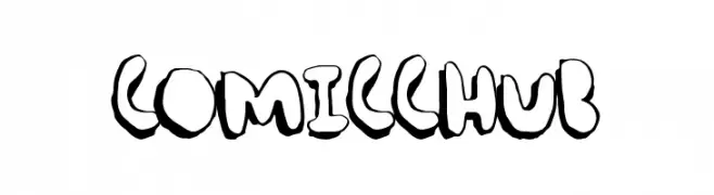
A bold, cartoonish font with a playful, hand-drawn style.
![ComicChub font caratteri gratis]() Scaricare 279 Downloads@WebFont
Scaricare 279 Downloads@WebFont -
( Fonts by a Max Infeld - XEROGRAPHER FONTS - xerographer.blogspot.com . Personal-use only. For commercial use please contact owner. )
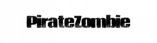
A bold, distressed font with a rugged, weathered texture.
![PirateZombie font caratteri gratis]() Scaricare 279 Downloads@WebFont
Scaricare 279 Downloads@WebFont -
( imagex - www.imagex-fonts.com )
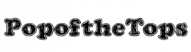
A bold, playful font with a three-dimensional, cartoonish style.
![Pop of the Tops font caratteri gratis]() Scaricare 279 Downloads@WebFont
Scaricare 279 Downloads@WebFont -
( Fonts by Billy Argel - www.billyargel.com - Personal-use only. For commercial use please contact owner. )
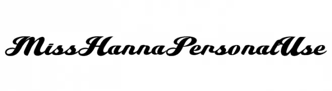
A bold, flowing script font with elegant, cursive letterforms.
![Miss Hanna Personal Use font caratteri gratis]() Scaricare 279 Downloads@WebFont
Scaricare 279 Downloads@WebFont -
( Fonts by Wahyu Eka Prasetya - wepfont.com - Personal-use only. For commercial use please contact owner. )
A bold, sans-serif font with a strong, modern appearance.
![Finish font caratteri gratis]() Scaricare 279 Downloads@WebFont
Scaricare 279 Downloads@WebFont

Quali sono i font più popolari adesso?
Poppins, Roboto, Montserrat, Open Sans e Lato sono molto usati per le forme pulite e l'ampia applicabilità — dall'identità di marca alle landing page e ai poster.
Quali font si usano spesso nei loghi?
Le sans serif geometriche (es. Poppins, famiglie in stile Gotham) sono scelte comuni per un branding pulito e scalabile. Per un tocco personale restano valide script e stili manoscritti. Abbina un display deciso per i titoli a un corpo testo neutro per riconoscibilità ed equilibrio.
Ogni quanto si aggiorna la lista?
Con regolarità, in base ai download e all'attività reale. Torna spesso per scoprire in anticipo le nuove preferite.
💡 Consiglio: aggiungi ai preferiti — le tendenze cambiano in fretta e i font top di oggi possono ispirare il rebranding di domani.