Benvenuto nelle Font Più Popolari — dove popolarità e qualità si incontrano. Qui trovi i font più scaricati e usati dell'anno. Se cerchi scelte sicure per logo, web o social, inizia da qui.
Ogni font top si distingue per equilibrio, leggibilità e versatilità. Troverai sans serif moderne, script eleganti, serif vintage e display minimalisti.
-
( Fonts by www.aka-acid.com )
A bold, geometric font with a digital, pixelated style.
 Scaricare 280 Downloads@WebFont
 -
Caratteri di jlog3000. For commercial use please contact the owner.
( Fonts by John Ocasio. Free for personal use only )
A bold, geometric font with sharp, angular edges and a modern, futuristic style.
![J-LOG Cameron Edge Sans Normal font caratteri gratis]() Scaricare 280 Downloads@WebFont
Scaricare 280 Downloads@WebFont -
![runningNcircles font caratteri gratis]() Scaricare 280 Downloads@WebFont
Scaricare 280 Downloads@WebFont -
( Fonts by Craft Supply Co - Personal-use only. For commercial use please contact owner. )
A modern, geometric sans-serif font with clean lines and uniform stroke width.
![CelinePeachFree-Sans font caratteri gratis]() Scaricare 280 Downloads@WebFont
Scaricare 280 Downloads@WebFont -
( Fonts by Miguel Boveto )
A thorny, edgy font with jagged, chaotic characters.
![ESCOPO font caratteri gratis]() Scaricare 280 Downloads@WebFont
Scaricare 280 Downloads@WebFont -
-
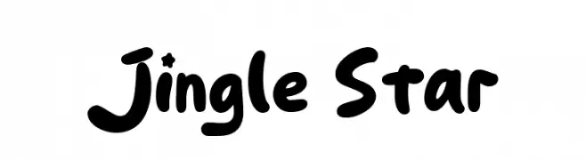
( Fonts by Khurasan )
A playful, bold, and rounded font with a hand-drawn, whimsical style.
![Jingle Star font caratteri gratis]() Scaricare 280 Downloads@WebFont
Scaricare 280 Downloads@WebFont -
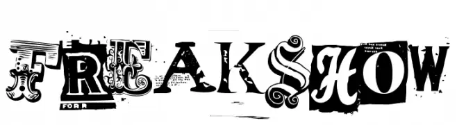
( Fonts by Sharkshock )
A bold, eclectic display typeface inspired by vintage circus posters.
![Freakshow font caratteri gratis]() Scaricare 280 Downloads@WebFont
Scaricare 280 Downloads@WebFont -
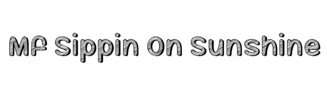
( Fonts by Misti`s Fonts - mistifonts.com - Personal-use only. For commercial use please contact owner. )
A bold, hand-drawn font with a textured, sketch-like pattern and rounded edges.
![Mf Sippin On Sunshine font caratteri gratis]() Scaricare 280 Downloads@WebFont
Scaricare 280 Downloads@WebFont -
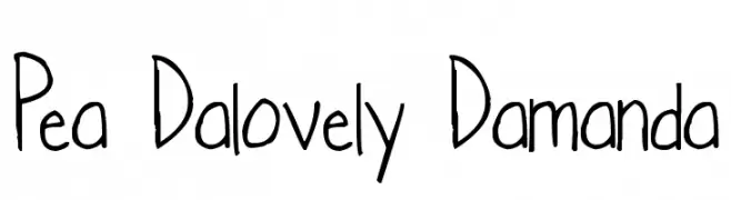
( Free for a personal use. For a commercial use please visit www.kevinandamanda.com )
A playful, casual handwritten font with irregular strokes and a whimsical appearance.
![Pea Dalovely Damanda font caratteri gratis]() Scaricare 280 Downloads@WebFont
Scaricare 280 Downloads@WebFont -
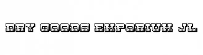
![Dry Goods Emporium JL font caratteri gratis]() Scaricare 280 Downloads@WebFont
Scaricare 280 Downloads@WebFont
Quali sono i font più popolari adesso?
Poppins, Roboto, Montserrat, Open Sans e Lato sono molto usati per le forme pulite e l'ampia applicabilità — dall'identità di marca alle landing page e ai poster.
Quali font si usano spesso nei loghi?
Le sans serif geometriche (es. Poppins, famiglie in stile Gotham) sono scelte comuni per un branding pulito e scalabile. Per un tocco personale restano valide script e stili manoscritti. Abbina un display deciso per i titoli a un corpo testo neutro per riconoscibilità ed equilibrio.
Ogni quanto si aggiorna la lista?
Con regolarità, in base ai download e all'attività reale. Torna spesso per scoprire in anticipo le nuove preferite.
💡 Consiglio: aggiungi ai preferiti — le tendenze cambiano in fretta e i font top di oggi possono ispirare il rebranding di domani.