Benvenuto nelle Font Più Popolari — dove popolarità e qualità si incontrano. Qui trovi i font più scaricati e usati dell'anno. Se cerchi scelte sicure per logo, web o social, inizia da qui.
Ogni font top si distingue per equilibrio, leggibilità e versatilità. Troverai sans serif moderne, script eleganti, serif vintage e display minimalisti.
-
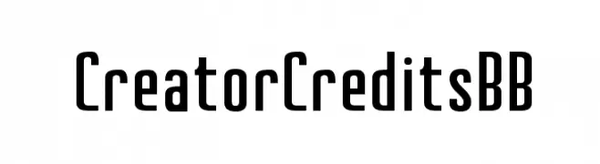
( Fonts by www.blambot.com )
A bold, modern sans-serif font with a tall, narrow design.
 Scaricare 937 Downloads@WebFont
 -
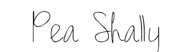
( Free for a personal use. For a commercial use please visit www.kevinandamanda.com )
A playful, whimsical handwritten font with thin, flowing lines.
![Pea Shally font caratteri gratis]() Scaricare 937 Downloads@WebFont
Scaricare 937 Downloads@WebFont -
( Fonts by Apostrophic Lab )
A classic serif font with elegant curves and a vintage touch.
![Mary Jane - Eastern Europe font caratteri gratis]() Scaricare 937 Downloads@WebFont
Scaricare 937 Downloads@WebFont -
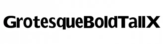
( Fonts by Manfred Klein. Free for private and charity use. Free for commercial with donation to organizations )
A bold, tall font with consistent stroke width and a modern, commanding presence.
![GrotesqueBoldTallX font caratteri gratis]() Scaricare 937 Downloads@WebFont
Scaricare 937 Downloads@WebFont -
( Fonts by Dreadful Productions - http://usersites.horrorfind.com/home/horror/dreadful/ )
A bold, rugged font with a hand-drawn, distressed appearance.
![Last Man on Earth font caratteri gratis]() Scaricare 937 Downloads@WebFont
Scaricare 937 Downloads@WebFont -
-
![Alien ABC font caratteri gratis]() Scaricare 937 Downloads@WebFont
Scaricare 937 Downloads@WebFont -
![Cortin font caratteri gratis]() Scaricare 937 Downloads@WebFont
Scaricare 937 Downloads@WebFont -
( Fonts by Octotype - www.foundmyfont.com - Personal-use only. For commercial use please contact owner. )
A bold, flowing script font with elegant, cursive letterforms.
![TheScalphunters font caratteri gratis]() Scaricare 936 Downloads@WebFont
Scaricare 936 Downloads@WebFont -
( Michael D. Adams - www.triskele.com/roadgeek-fonts/ )
A modern, clean sans-serif font with uniform strokes and high legibility.
![Roadgeek 2005 Transport Medium font caratteri gratis]() Scaricare 936 Downloads@WebFont
Scaricare 936 Downloads@WebFont -
( Copyright 2016 The Saira Project Authors (omnibus.type@gmail.com), with reserved font name "Saira". )
A modern, semi-condensed font with a clean and professional appearance.
![Saira SemiCondensed Medium font caratteri gratis]() Scaricare 936 Downloads@WebFont
Scaricare 936 Downloads@WebFont -
( Copyright 2012 The Encode Project Authors (impallari@gmail.com), with Reserved Font Name "Encode Sansâ€. )
A bold, expanded sans-serif font with a modern and impactful style.
![Encode Sans Expanded Black font caratteri gratis]() Scaricare 936 Downloads@WebFont
Scaricare 936 Downloads@WebFont -
( Fonts by Castcraft Software - OPTI Fonts Archive - opti.netii.net - Personal-use only. For commercial use please contact owner. )
An elegant script font with a refined, flowing style and medium contrast.
![QuillOpti-Regular font caratteri gratis]() Scaricare 936 Downloads@WebFont
Scaricare 936 Downloads@WebFont -
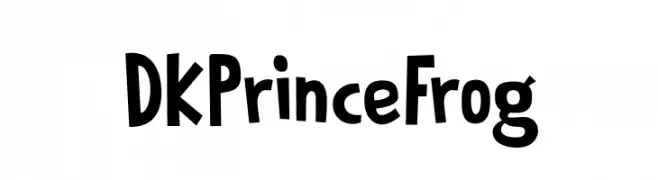
![DKPrinceFrog font caratteri gratis]() Scaricare 936 Downloads@WebFont
Scaricare 936 Downloads@WebFont -
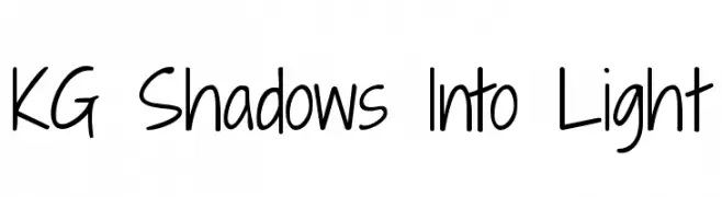
( Fonts by www.kimberlygeswein.com - Kimberly Geswein )
A casual, handwritten font with a friendly and approachable style.
![KG Shadows Into Light font caratteri gratis]() Scaricare 936 Downloads@WebFont
Scaricare 936 Downloads@WebFont -
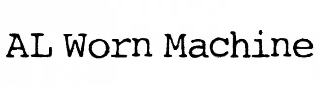
![AL Worn Machine font caratteri gratis]() Scaricare 936 Downloads@WebFont
Scaricare 936 Downloads@WebFont -
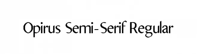
![Opirus Semi-Serif Regular font caratteri gratis]() Scaricare 936 Downloads@WebFont
Scaricare 936 Downloads@WebFont -
( Copyright (c) 2012, Brian J. Bonislawsky DBA Astigmatic (AOETI) (astigma@astigmatic.com), with Reserved Font Names 'Bigelow Rules' )
A whimsical and decorative font with exaggerated serifs and playful strokes.
![Bigelow Rules font caratteri gratis]() Scaricare 936 Downloads@WebFont
Scaricare 936 Downloads@WebFont -
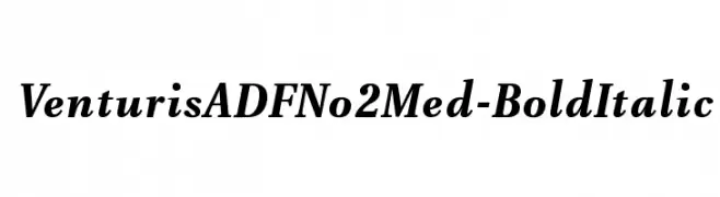
( Fonts by Arkandis Digital Foundry )
A bold, italic serif font with a classic and elegant style.
![VenturisADFNo2Med-BoldItalic font caratteri gratis]() Scaricare 936 Downloads@WebFont
Scaricare 936 Downloads@WebFont -
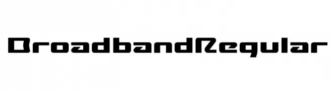
( These fonts are free to use in any private, recreational manner.For commercial go to www.flopdesign.com/fordesign/font.html )
A bold, futuristic font with geometric shapes and angular design.
![BroadbandRegular font caratteri gratis]() Scaricare 936 Downloads@WebFont
Scaricare 936 Downloads@WebFont -
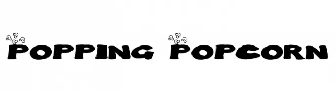
![Popping Popcorn font caratteri gratis]() Scaricare 936 Downloads@WebFont
Scaricare 936 Downloads@WebFont -
![rough Bold font caratteri gratis]() Scaricare 936 Downloads@WebFont
Scaricare 936 Downloads@WebFont -
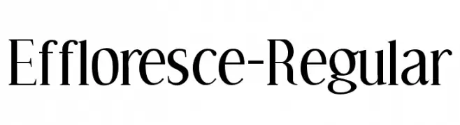
( Fonts by www.typodermicfonts.com - Ray Larabie )
An elegant serif font with high contrast and sharp serifs, perfect for classic and refined designs.
![Effloresce-Regular font caratteri gratis]() Scaricare 936 Downloads@WebFont
Scaricare 936 Downloads@WebFont -
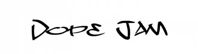
( Fonts by Jacob Fisher - www.pizzadude.dk )
A bold, graffiti-inspired font with sharp, angular lines and dynamic curves.
![Dope Jam font caratteri gratis]() Scaricare 936 Downloads@WebFont
Scaricare 936 Downloads@WebFont -
( Fonts by Dieter Steffmann )
An elegant, calligraphic font with sharp serifs and flowing curves.
![Menuetto font caratteri gratis]() Scaricare 936 Downloads@WebFont
Scaricare 936 Downloads@WebFont -
( Fonts by Mr Fisk - Mike Larsson - fontorama.net )
A bold, distressed font with a rugged, vintage appearance.
![Dr.Enoksen font caratteri gratis]() Scaricare 936 Downloads@WebFont
Scaricare 936 Downloads@WebFont -
![OregonDry font caratteri gratis]() Scaricare 936 Downloads@WebFont
Scaricare 936 Downloads@WebFont -
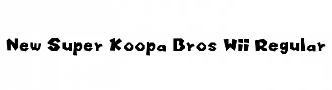
Caratteri di HammerBro101. For commercial use please contact the owner.
![New Super Koopa Bros Wii Regular font caratteri gratis]() Scaricare 935 Downloads@WebFont
Scaricare 935 Downloads@WebFont -
![Holland font caratteri gratis]() Scaricare 935 Downloads@WebFont
Scaricare 935 Downloads@WebFont -
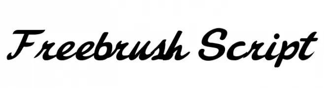
![Freebrush Script font caratteri gratis]() Scaricare 935 Downloads@WebFont
Scaricare 935 Downloads@WebFont -
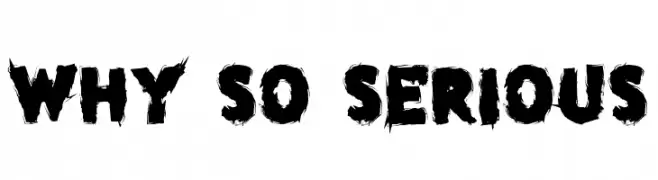
( Fonts by Chris Vile - fontmonger.com - Personal-use only. For commercial use please contact owner. )
A bold, distressed font with rough, brush-like strokes for an edgy look.
![why so serious font caratteri gratis]() Scaricare 935 Downloads@WebFont
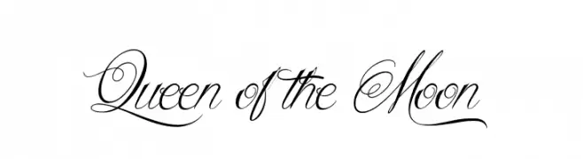
Scaricare 935 Downloads@WebFont -
![Queen of the Moon font caratteri gratis]() Scaricare 935 Downloads@WebFont
Scaricare 935 Downloads@WebFont -
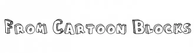
( Fonts by Galdino Otten - galdinootten.com )
A playful, 3D hand-drawn font with bold outlines and textured interiors.
![From Cartoon Blocks font caratteri gratis]() Scaricare 935 Downloads@WebFont
Scaricare 935 Downloads@WebFont -
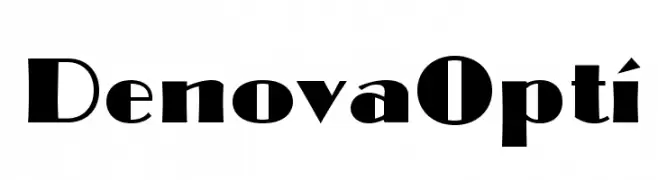
( Fonts by Castcraft Software - opti.netii.net - check the website before use )
A bold, high-contrast font with modern serifs and elegant flourishes.
![DenovaOpti font caratteri gratis]() Scaricare 935 Downloads@WebFont
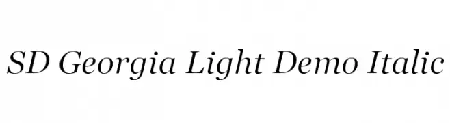
Scaricare 935 Downloads@WebFont -
![SD Georgia Light Demo Italic font caratteri gratis]() Scaricare 935 Downloads@WebFont
Scaricare 935 Downloads@WebFont -
( Fonts by www.typodermicfonts.com - Ray Larabie )
A modern, geometric font with clean lines and a balanced appearance.
![ZrnicRg-Regular font caratteri gratis]() Scaricare 935 Downloads@WebFont
Scaricare 935 Downloads@WebFont


Quali sono i font più popolari adesso?
Poppins, Roboto, Montserrat, Open Sans e Lato sono molto usati per le forme pulite e l'ampia applicabilità — dall'identità di marca alle landing page e ai poster.
Quali font si usano spesso nei loghi?
Le sans serif geometriche (es. Poppins, famiglie in stile Gotham) sono scelte comuni per un branding pulito e scalabile. Per un tocco personale restano valide script e stili manoscritti. Abbina un display deciso per i titoli a un corpo testo neutro per riconoscibilità ed equilibrio.
Ogni quanto si aggiorna la lista?
Con regolarità, in base ai download e all'attività reale. Torna spesso per scoprire in anticipo le nuove preferite.
💡 Consiglio: aggiungi ai preferiti — le tendenze cambiano in fretta e i font top di oggi possono ispirare il rebranding di domani.