Benvenuto nelle Font Più Popolari — dove popolarità e qualità si incontrano. Qui trovi i font più scaricati e usati dell'anno. Se cerchi scelte sicure per logo, web o social, inizia da qui.
Ogni font top si distingue per equilibrio, leggibilità e versatilità. Troverai sans serif moderne, script eleganti, serif vintage e display minimalisti.
-
Caratteri di defharo. For commercial use please contact the owner.
 Scaricare 928 Downloads@WebFont
 -
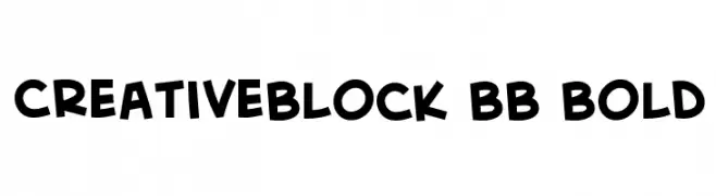
( Fonts by www.blambot.com )
A bold, playful font with a hand-drawn, whimsical style.
![CreativeBlock BB Bold font caratteri gratis]() Scaricare 928 Downloads@WebFont
Scaricare 928 Downloads@WebFont -
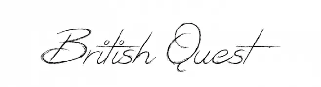
( Fonts by Jonathan S. Harris - www.tattoowoo.com. Personal-use only. For commercial use please contact owner. )
An elegant, flowing script font with intricate, sweeping strokes and a classic calligraphic style.
![British Quest font caratteri gratis]() Scaricare 928 Downloads@WebFont
Scaricare 928 Downloads@WebFont -
Caratteri di antipixel. For commercial use please contact the owner.
![ItaloMedium font caratteri gratis]() Scaricare 928 Downloads@WebFont
Scaricare 928 Downloads@WebFont -
![Feminine Lifetime font caratteri gratis]() Scaricare 928 Downloads@WebFont
Scaricare 928 Downloads@WebFont -
-
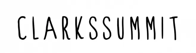
( Fonts by Alex Tomlinson - Skyhaven Fonts - shfonts.com )
A playful, handwritten font with tall, narrow letters and a casual style.
![ClarksSummit font caratteri gratis]() Scaricare 928 Downloads@WebFont
Scaricare 928 Downloads@WebFont -
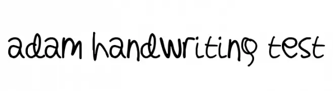
![adam handwriting test font caratteri gratis]() Scaricare 928 Downloads@WebFont
Scaricare 928 Downloads@WebFont -
( Fonts by Apostrophic Lab )
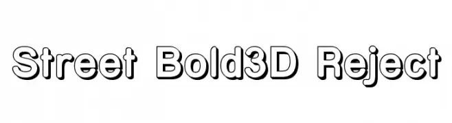
A bold, 3D font with strong outlines and a playful, dynamic style.
![Street Bold3D Reject font caratteri gratis]() Scaricare 928 Downloads@WebFont
Scaricare 928 Downloads@WebFont -
![Hairy Monster font caratteri gratis]() Scaricare 928 Downloads@WebFont
Scaricare 928 Downloads@WebFont -
![Serif72Beta-BlackItalic font caratteri gratis]() Scaricare 928 Downloads@WebFont
Scaricare 928 Downloads@WebFont -
![MediciText font caratteri gratis]() Scaricare 928 Downloads@WebFont
Scaricare 928 Downloads@WebFont -
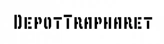
![DepotTrapharet font caratteri gratis]() Scaricare 928 Downloads@WebFont
Scaricare 928 Downloads@WebFont -
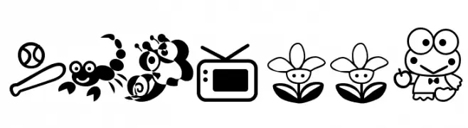
![Keroppi font caratteri gratis]() Scaricare 928 Downloads@WebFont
Scaricare 928 Downloads@WebFont -
![Sophia font caratteri gratis]() Scaricare 928 Downloads@WebFont
Scaricare 928 Downloads@WebFont -
![Almonte Woodgrain font caratteri gratis]() Scaricare 928 Downloads@WebFont
Scaricare 928 Downloads@WebFont -
( Fonts by Mans Greback - www.mansgreback.com - Personal-use only. For commercial use please contact owner. )
An elegant and decorative serif font with intricate swirls and embellishments.
![Saint Carell PERSONAL Regular font caratteri gratis]() Scaricare 927 Downloads@WebFont
Scaricare 927 Downloads@WebFont -
( Fonts by MadeType - Personal-use only. For commercial use please contact owner. )
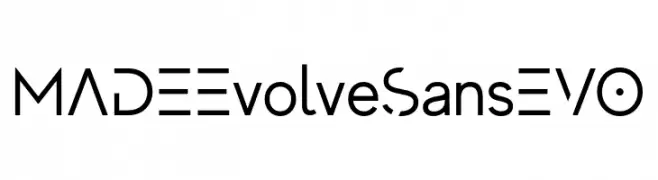
A modern geometric sans-serif font with unique character cuts and a sleek design.
![MADEEvolveSansEVO font caratteri gratis]() Scaricare 927 Downloads@WebFont
Scaricare 927 Downloads@WebFont -
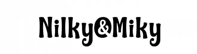
( 7NTypes - Situjuh Nazara - 7ntypes.com )
A playful, bold font with rounded, whimsical characters.
![Nilky & Miky font caratteri gratis]() Scaricare 927 Downloads@WebFont
Scaricare 927 Downloads@WebFont -
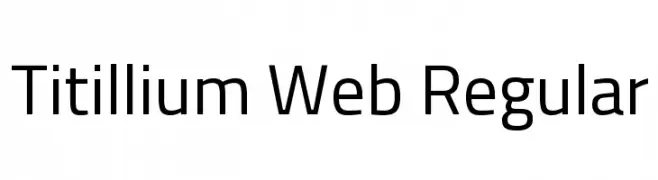
( Copyright (c) 2009-2011 by Accademia di Belle Arti di Urbino and students of MA course of Visual design. Some rights reserved. )
A modern, clean sans-serif font with excellent readability and versatility.
![Titillium Web Regular font caratteri gratis]() Scaricare 927 Downloads@WebFont
Scaricare 927 Downloads@WebFont -
![Salt font caratteri gratis]() Scaricare 927 Downloads@WebFont
Scaricare 927 Downloads@WebFont -
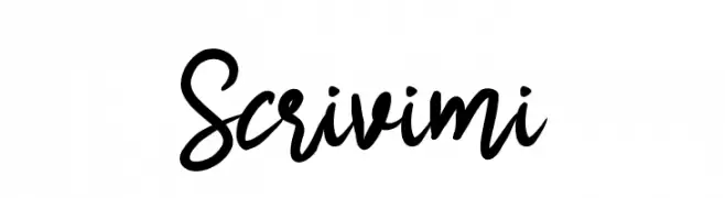
![Scrivimi font caratteri gratis]() Scaricare 927 Downloads@WebFont
Scaricare 927 Downloads@WebFont -
( Fonts by Steve Gardner - www.explogos.com. Personal-use only. For commercial use please contact owner. )
A bold, geometric font with a vintage shadow effect.
![Statement Shadow Regular font caratteri gratis]() Scaricare 927 Downloads@WebFont
Scaricare 927 Downloads@WebFont -
( Fonts by www.gliphmaker.com. Personal-use only. For commercial use please contact owner. )
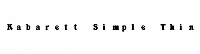
A playful, decorative font with wavy edges and a handcrafted feel.
![Kabarett Simple Thin font caratteri gratis]() Scaricare 927 Downloads@WebFont
Scaricare 927 Downloads@WebFont -
( Fonts by a Neale Davidson - www.pixelsagas.com. Personal-use only. For commercial use please contact owner. )
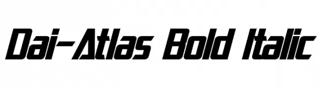
A bold, italicized font with a modern, dynamic style and tight character spacing.
![Dai-Atlas Bold Italic font caratteri gratis]() Scaricare 927 Downloads@WebFont
Scaricare 927 Downloads@WebFont -
![DKSnemand font caratteri gratis]() Scaricare 927 Downloads@WebFont
Scaricare 927 Downloads@WebFont -
( Fonts by www.aka-acid.com )
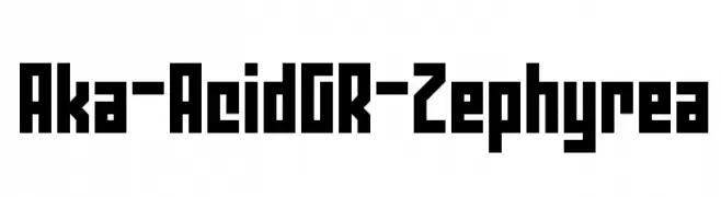
A bold, geometric font with a strong, industrial style.
![Aka-AcidGR-Zephyrea font caratteri gratis]() Scaricare 927 Downloads@WebFont
Scaricare 927 Downloads@WebFont -
( Copyright 2017 The Exo Project Authors (https://github.com/NDISCOVER/Exo-1.0) )
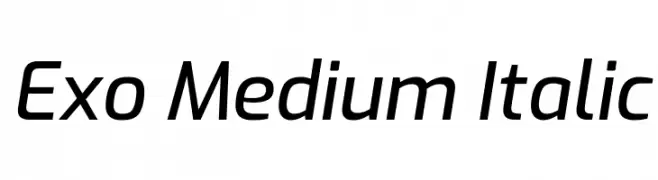
A modern, italicized font with a sleek, geometric design.
![Exo Medium Italic font caratteri gratis]() Scaricare 927 Downloads@WebFont
Scaricare 927 Downloads@WebFont -
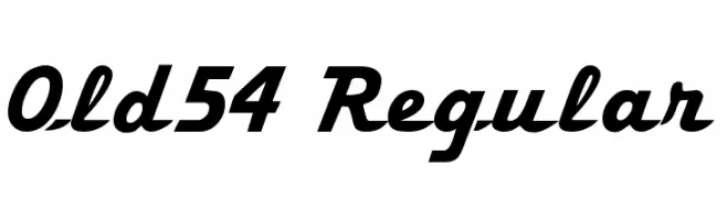
![Old54 Regular font caratteri gratis]() Scaricare 927 Downloads@WebFont
Scaricare 927 Downloads@WebFont -
![Desi font caratteri gratis]() Scaricare 927 Downloads@WebFont
Scaricare 927 Downloads@WebFont -
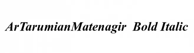
![ArTarumianMatenagir Bold Italic font caratteri gratis]() Scaricare 927 Downloads@WebFont
Scaricare 927 Downloads@WebFont -
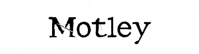
![Motley font caratteri gratis]() Scaricare 927 Downloads@WebFont
Scaricare 927 Downloads@WebFont -
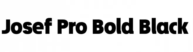
![Josef Pro Bold Black font caratteri gratis]() Scaricare 927 Downloads@WebFont
Scaricare 927 Downloads@WebFont -
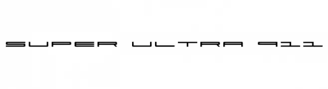
![Super Ultra 911 font caratteri gratis]() Scaricare 927 Downloads
Scaricare 927 Downloads -
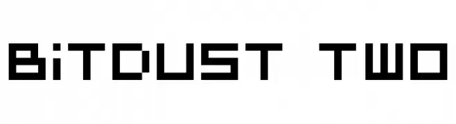
( Fonts by dustBUST - Andreas Nylin )
A bold, pixelated font with a geometric, digital aesthetic.
![BitDust Two font caratteri gratis]() Scaricare 927 Downloads@WebFont
Scaricare 927 Downloads@WebFont -
( Fonts by Alpaprana - Personal-use only. For commercial use please contact owner. )
An elegant, flowing script font with graceful curves and decorative swashes.
![Cranberry font caratteri gratis]() Scaricare 926 Downloads@WebFont
Scaricare 926 Downloads@WebFont


Quali sono i font più popolari adesso?
Poppins, Roboto, Montserrat, Open Sans e Lato sono molto usati per le forme pulite e l'ampia applicabilità — dall'identità di marca alle landing page e ai poster.
Quali font si usano spesso nei loghi?
Le sans serif geometriche (es. Poppins, famiglie in stile Gotham) sono scelte comuni per un branding pulito e scalabile. Per un tocco personale restano valide script e stili manoscritti. Abbina un display deciso per i titoli a un corpo testo neutro per riconoscibilità ed equilibrio.
Ogni quanto si aggiorna la lista?
Con regolarità, in base ai download e all'attività reale. Torna spesso per scoprire in anticipo le nuove preferite.
💡 Consiglio: aggiungi ai preferiti — le tendenze cambiano in fretta e i font top di oggi possono ispirare il rebranding di domani.