Benvenuto nelle Font Più Popolari — dove popolarità e qualità si incontrano. Qui trovi i font più scaricati e usati dell'anno. Se cerchi scelte sicure per logo, web o social, inizia da qui.
Ogni font top si distingue per equilibrio, leggibilità e versatilità. Troverai sans serif moderne, script eleganti, serif vintage e display minimalisti.
-
 Scaricare 930 Downloads@WebFont
 -
( Fonts by The League of Moveable Type - theleagueofmoveabletype.com )
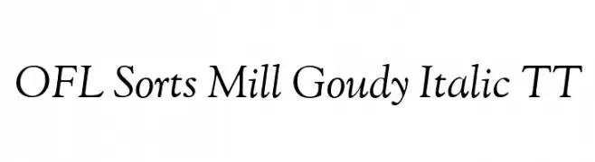
An elegant serif italic font with smooth curves and classic style.
![OFL Sorts Mill Goudy Italic TT font caratteri gratis]() Scaricare 930 Downloads@WebFont
Scaricare 930 Downloads@WebFont -
( Fonts by Daniel Zadorozny - www.iconian.com - Free for personal use )
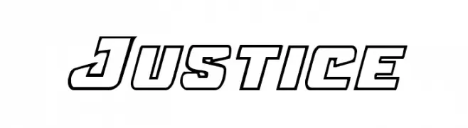
A bold, geometric font with outlined characters and a modern, dynamic style.
![Justice font caratteri gratis]() Scaricare 930 Downloads@WebFont
Scaricare 930 Downloads@WebFont -
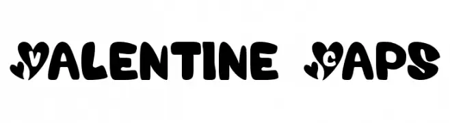
![Valentine Caps font caratteri gratis]() Scaricare 930 Downloads@WebFont
Scaricare 930 Downloads@WebFont -
( Fonts by ShyFonts )
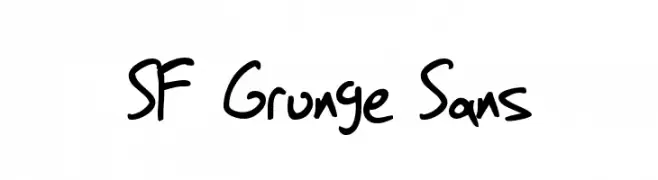
A casual, handwritten font with a grunge aesthetic and irregular strokes.
![SF Grunge Sans font caratteri gratis]() Scaricare 930 Downloads@WebFont
Scaricare 930 Downloads@WebFont -
-
( Fonts by http://perso.calixo.net/~uzim/ )
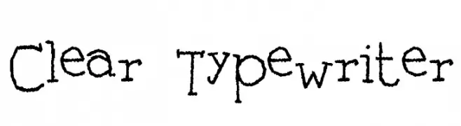
A vintage, typewriter-style font with a hand-drawn, monospaced design.
![Clear Typewriter font caratteri gratis]() Scaricare 930 Downloads@WebFont
Scaricare 930 Downloads@WebFont -
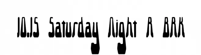
![10.15 Saturday Night R BRK font caratteri gratis]() Scaricare 930 Downloads@WebFont
Scaricare 930 Downloads@WebFont -
( Fonts by Get Studio - Hermansyah , - Personal-use only. For commercial use please contact owner. )
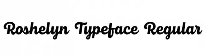
A bold, dynamic script typeface with a modern, flowing style.
![Roshelyn Typeface Regular font caratteri gratis]() Scaricare 929 Downloads@WebFont
Scaricare 929 Downloads@WebFont -
( Fonts by Inermedia Studio )
A bold, playful font with rounded, bubbly characters ideal for fun and whimsical designs.
![ABCDE font caratteri gratis]() Scaricare 929 Downloads@WebFont
Scaricare 929 Downloads@WebFont -
( Fonts by Fajar Abdul Fattah - https://fontbundles.net/sibelumpagi-studio - Personal-use only. For commercial use please contact owner. )
A bold, playful handwritten font with rounded, connected letters.
![Astonia font caratteri gratis]() Scaricare 929 Downloads@WebFont
Scaricare 929 Downloads@WebFont -
( Fonts by StudioTypo - Personal-use only. For commercial use please contact owner. )
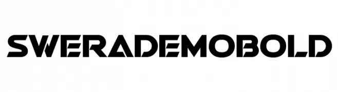
A bold, geometric font with a futuristic and angular design.
![Swera Demo Bold font caratteri gratis]() Scaricare 929 Downloads@WebFont
Scaricare 929 Downloads@WebFont -
( 7NTypes - Situjuh Nazara - 7ntypes.com )
A bold, rounded font with a playful and friendly style.
![Clambake October Six Bold font caratteri gratis]() Scaricare 929 Downloads@WebFont
Scaricare 929 Downloads@WebFont -
( Copyright 2018 Boutros International. (http://www.boutrosfonts.com) )
A modern, extra bold sans-serif font with clean lines and strong presence.
![Tajawal ExtraBold font caratteri gratis]() Scaricare 929 Downloads@WebFont
Scaricare 929 Downloads@WebFont -
( Fonts by Lomig - Personal-use only. For commercial use please contact owner. )
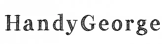
A playful, hand-drawn font with a unique striped pattern and decorative style.
![HandyGeorge font caratteri gratis]() Scaricare 929 Downloads@WebFont
Scaricare 929 Downloads@WebFont -
( Fonts by Dmitry Astakhov - www.behance.net/adonis-abe1e - Personal-use only. For commercial use please contact owner. )
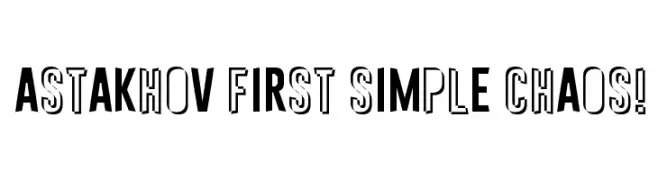
A bold, dynamic font with a mix of solid and outlined characters, perfect for impactful designs.
![Astakhov First Simple Chaos! font caratteri gratis]() Scaricare 929 Downloads@WebFont
Scaricare 929 Downloads@WebFont -
( Fonts by deFharo )
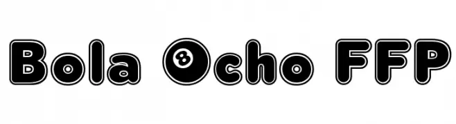
A bold, rounded font with a playful, modern look and thick outlines.
![Bola Ocho FFP font caratteri gratis]() Scaricare 929 Downloads@WebFont
Scaricare 929 Downloads@WebFont -
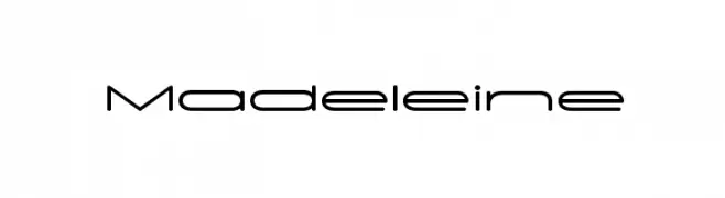
![Madeleine font caratteri gratis]() Scaricare 929 Downloads@WebFont
Scaricare 929 Downloads@WebFont -
( Fonts by Castcraft Software - OPTI Fonts Archive - opti.netii.net - Personal-use only. For commercial use please contact owner. )
An elegant and flowing script font with decorative loops and swirls.
![PeninsulaScriptOpti-Three font caratteri gratis]() Scaricare 929 Downloads@WebFont
Scaricare 929 Downloads@WebFont -
( Fonts by a Neale Davidson - www.pixelsagas.com. Personal-use only. For commercial use please contact owner. )
A bold, italicized font with a dynamic and modern style.
![Invaders Bold Italic font caratteri gratis]() Scaricare 929 Downloads@WebFont
Scaricare 929 Downloads@WebFont -
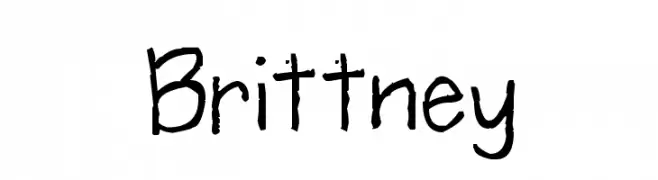
![Brittney font caratteri gratis]() Scaricare 929 Downloads@WebFont
Scaricare 929 Downloads@WebFont -
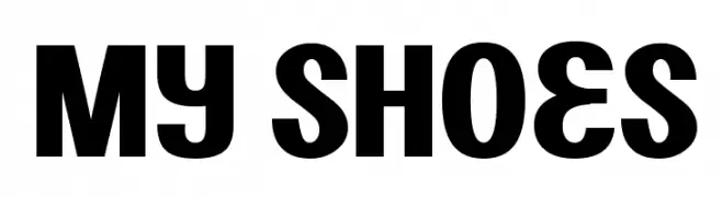
![My Shoes font caratteri gratis]() Scaricare 929 Downloads@WebFont
Scaricare 929 Downloads@WebFont -
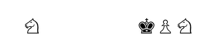
![Chess-Alpha font caratteri gratis]() Scaricare 929 Downloads@WebFont
Scaricare 929 Downloads@WebFont -
( Fonts by Daniel Gauthier )
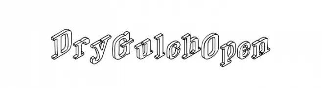
A bold, 3D outline font with a playful yet structured aesthetic.
![DryGulchOpen font caratteri gratis]() Scaricare 929 Downloads@WebFont
Scaricare 929 Downloads@WebFont -
( Fonts by ShyFonts )
A bold, oblique, and modern font with sharp angles and a futuristic style.
![SF Theramin Gothic Bold Oblique font caratteri gratis]() Scaricare 929 Downloads@WebFont
Scaricare 929 Downloads@WebFont -
( Fonts by www.fontalicious.com )
A dot-based, pixelated font with a retro digital style.
![Gas font caratteri gratis]() Scaricare 929 Downloads@WebFont
Scaricare 929 Downloads@WebFont -
( Fonts by Jacob Fisher - www.pizzadude.dk )
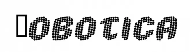
A futuristic dot matrix font with a digital, pixelated style.
![Robotica font caratteri gratis]() Scaricare 929 Downloads@WebFont
Scaricare 929 Downloads@WebFont -
( Fonts by Holydie Studio - Personal-use only. For commercial use please contact owner. )
A bold, handwritten font with a playful and energetic style.
![Rutthers Goals font caratteri gratis]() Scaricare 928 Downloads@WebFont
Scaricare 928 Downloads@WebFont -
( Fonts by Cristiano Sobral - Personal-use only. For commercial use please contact owner. )
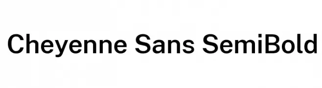
A modern, semi-bold sans-serif font with a clean and geometric design.
![Cheyenne Sans SemiBold font caratteri gratis]() Scaricare 928 Downloads@WebFont
Scaricare 928 Downloads@WebFont -
( HvD Fonts - Hannes von Döhren - www.hvdfonts.com )
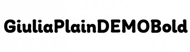
A bold, rounded font with smooth curves and consistent weight.
![Giulia Plain DEMO Bold font caratteri gratis]() Scaricare 928 Downloads@WebFont
Scaricare 928 Downloads@WebFont -
( Fonts by Måns Grebäck )
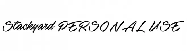
A bold, flowing script font with elegant, cursive letterforms.
![Stackyard PERSONAL USE font caratteri gratis]() Scaricare 928 Downloads@WebFont
Scaricare 928 Downloads@WebFont -
( Fonts by CannotIntoSpaceFonts - KineticPlasma Fonts - Personal-use only. For commercial use please contact owner. )
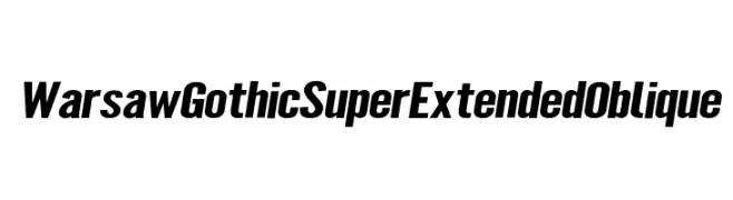
A bold, oblique, and super extended font with a modern, dynamic style.
![Warsaw Gothic SuperExtended Oblique font caratteri gratis]() Scaricare 928 Downloads@WebFont
Scaricare 928 Downloads@WebFont -
( Copyright 2016 The Manuale Project Authors (omnibus.type@gmail.com) )
A semi-bold serif font with a classic yet modern style, offering excellent readability.
![Manuale SemiBold font caratteri gratis]() Scaricare 928 Downloads@WebFont
Scaricare 928 Downloads@WebFont -
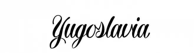
Caratteri di defharo. For commercial use please contact the owner.
![Yugoslavia font caratteri gratis]() Scaricare 928 Downloads@WebFont
Scaricare 928 Downloads@WebFont -
( Fonts by www.blambot.com )
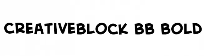
A bold, playful font with a hand-drawn, whimsical style.
![CreativeBlock BB Bold font caratteri gratis]() Scaricare 928 Downloads@WebFont
Scaricare 928 Downloads@WebFont -
( Fonts by Jonathan S. Harris - www.tattoowoo.com. Personal-use only. For commercial use please contact owner. )
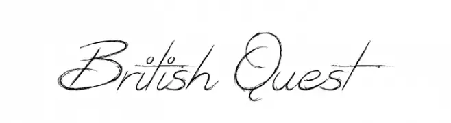
An elegant, flowing script font with intricate, sweeping strokes and a classic calligraphic style.
![British Quest font caratteri gratis]() Scaricare 928 Downloads@WebFont
Scaricare 928 Downloads@WebFont


Quali sono i font più popolari adesso?
Poppins, Roboto, Montserrat, Open Sans e Lato sono molto usati per le forme pulite e l'ampia applicabilità — dall'identità di marca alle landing page e ai poster.
Quali font si usano spesso nei loghi?
Le sans serif geometriche (es. Poppins, famiglie in stile Gotham) sono scelte comuni per un branding pulito e scalabile. Per un tocco personale restano valide script e stili manoscritti. Abbina un display deciso per i titoli a un corpo testo neutro per riconoscibilità ed equilibrio.
Ogni quanto si aggiorna la lista?
Con regolarità, in base ai download e all'attività reale. Torna spesso per scoprire in anticipo le nuove preferite.
💡 Consiglio: aggiungi ai preferiti — le tendenze cambiano in fretta e i font top di oggi possono ispirare il rebranding di domani.