Benvenuto nelle Font Più Popolari — dove popolarità e qualità si incontrano. Qui trovi i font più scaricati e usati dell'anno. Se cerchi scelte sicure per logo, web o social, inizia da qui.
Ogni font top si distingue per equilibrio, leggibilità e versatilità. Troverai sans serif moderne, script eleganti, serif vintage e display minimalisti.
-
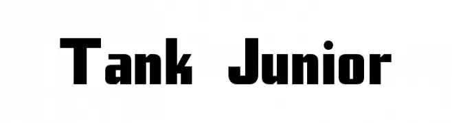
( Fonts by Levi Halmos )
A bold, geometric font with strong, uniform strokes and a modern style.
 Scaricare 932 Downloads@WebFont
 -
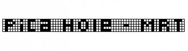
( Fonts by Apostrophic Lab )
A pixelated, grid-based font with a retro digital aesthetic.
![Pica Hole - MRT font caratteri gratis]() Scaricare 932 Downloads@WebFont
Scaricare 932 Downloads@WebFont -
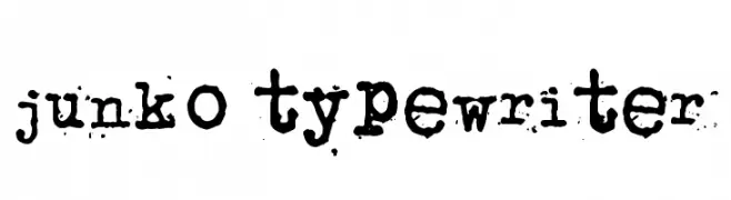
( Fonts by www.junkohanhero.com )
A vintage, distressed typewriter-style font with a textured, stamped appearance.
![junko typewriter font caratteri gratis]() Scaricare 932 Downloads@WebFont
Scaricare 932 Downloads@WebFont -
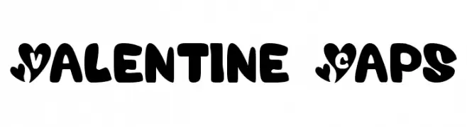
![Valentine Caps font caratteri gratis]() Scaricare 932 Downloads@WebFont
Scaricare 932 Downloads@WebFont -
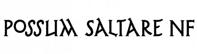
![Possum Saltare NF font caratteri gratis]() Scaricare 932 Downloads@WebFont
Scaricare 932 Downloads@WebFont -
-
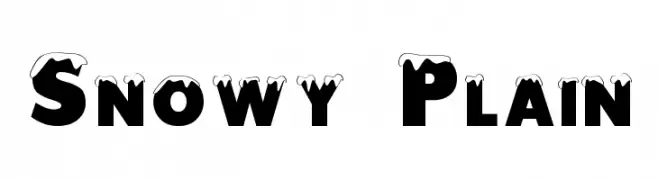
![Snowy Plain font caratteri gratis]() Scaricare 932 Downloads@WebFont
Scaricare 932 Downloads@WebFont -
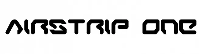
( Fonts by Daniel Zadorozny - www.iconian.com - Free for personal use )
A futuristic, geometric font with bold, angular shapes and a digital aesthetic.
![Airstrip One font caratteri gratis]() Scaricare 932 Downloads@WebFont
Scaricare 932 Downloads@WebFont -
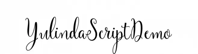
( Fonts by Barland )
An elegant script font with flowing, ornate characters and graceful numerals.
![YulindaScriptDemo font caratteri gratis]() Scaricare 931 Downloads@WebFont
Scaricare 931 Downloads@WebFont -
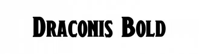
( Fonts by a Neale Davidson - www.pixelsagas.com. Personal-use only. For commercial use please contact owner. )
A bold, dramatic font with strong, angular strokes for impactful designs.
![Draconis Bold font caratteri gratis]() Scaricare 931 Downloads@WebFont
Scaricare 931 Downloads@WebFont -
( www.helloimflo.net )
A modern, minimalist font with tall, slender characters and a playful touch.
![HipsterishFontNormal font caratteri gratis]() Scaricare 931 Downloads@WebFont
Scaricare 931 Downloads@WebFont -
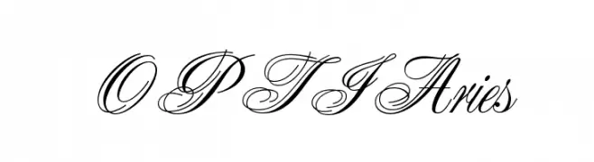
( Fonts by Castcraft Software - opti.netii.net - check the website before use )
An elegant script font with high contrast and decorative uppercase letters.
![OPTIAries font caratteri gratis]() Scaricare 931 Downloads@WebFont
Scaricare 931 Downloads@WebFont -
( گالری فانت فارسی پژوهش آريانا - only compatible with Farsi and Arabic )
A bold, modern font with geometric influences, perfect for impactful headlines.
![Shirin font caratteri gratis]() Scaricare 931 Downloads@WebFont
Scaricare 931 Downloads@WebFont -
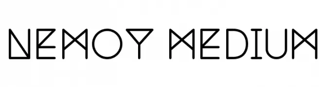
![Nemoy Medium font caratteri gratis]() Scaricare 931 Downloads@WebFont
Scaricare 931 Downloads@WebFont -
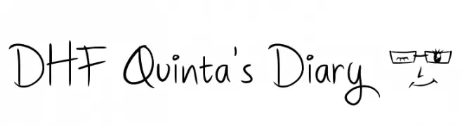
( fb.me/dexsar.harry )
A playful, handwritten font with a whimsical and informal style.
![DHF Quinta's Diary @ font caratteri gratis]() Scaricare 931 Downloads@WebFont
Scaricare 931 Downloads@WebFont -
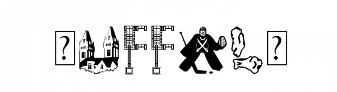
( - michellegodfrey.com )
A decorative font featuring Buffalo landmarks and symbols within each character.
![BuffalO font caratteri gratis]() Scaricare 931 Downloads@WebFont
Scaricare 931 Downloads@WebFont -
![HappyFrame font caratteri gratis]() Scaricare 931 Downloads@WebFont
Scaricare 931 Downloads@WebFont -
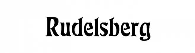
( Fonts by Dieter Steffmann )
A bold, blackletter-style font with dramatic, angular strokes.
![Rudelsberg font caratteri gratis]() Scaricare 931 Downloads@WebFont
Scaricare 931 Downloads@WebFont -
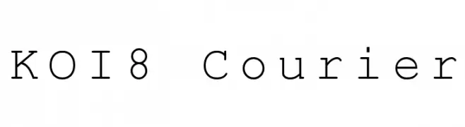
![KOI8 Courier font caratteri gratis]() Scaricare 931 Downloads@WebFont
Scaricare 931 Downloads@WebFont -
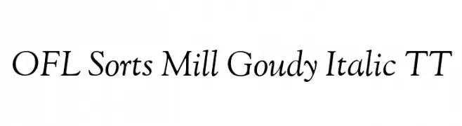
( Fonts by The League of Moveable Type - theleagueofmoveabletype.com )
An elegant serif italic font with smooth curves and classic style.
![OFL Sorts Mill Goudy Italic TT font caratteri gratis]() Scaricare 931 Downloads@WebFont
Scaricare 931 Downloads@WebFont -
![Chess-Alpha font caratteri gratis]() Scaricare 931 Downloads@WebFont
Scaricare 931 Downloads@WebFont -
( Fonts by www.norfok.com - Norfok® Incredible Font Design - Thomas W. Otto )
A bold, dripping font with a spooky, horror-themed style.
![CSNPWDT NFI font caratteri gratis]() Scaricare 931 Downloads@WebFont
Scaricare 931 Downloads@WebFont -
( Fonts by www.koenhachmang.com - Glitch )
A sleek, modern italic sans-serif font with smooth curves and consistent strokes.
![Y2K Neophyte Italic font caratteri gratis]() Scaricare 931 Downloads@WebFont
Scaricare 931 Downloads@WebFont -
( Fonts by Dieter Schumacher )
A modern, sleek font with elongated, narrow characters and a minimalistic style.
![Slimania font caratteri gratis]() Scaricare 931 Downloads@WebFont
Scaricare 931 Downloads@WebFont -
( Fonts by Mocha Frappuccino - Personal-use only. For commercial use please contact owner. )
A bold, 3D font with a futuristic and dynamic style.
![Super Drift 3D font caratteri gratis]() Scaricare 930 Downloads@WebFont
Scaricare 930 Downloads@WebFont -
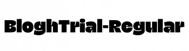
( Fonts by Eko Bimantara - Personal-use only. For commercial use please contact owner. )
A bold, blocky font with high contrast and uniform width, perfect for headlines and logos.
![BloghTrial-Regular font caratteri gratis]() Scaricare 930 Downloads@WebFont
Scaricare 930 Downloads@WebFont -
( Fonts by Inermedia Studio )
A bold, playful font with rounded, bubbly characters ideal for fun and whimsical designs.
![ABCDE font caratteri gratis]() Scaricare 930 Downloads@WebFont
Scaricare 930 Downloads@WebFont -
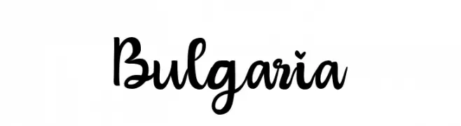
( Fonts by StringLabs - stringlabscreative.com - Personal-use only. For commercial use please contact owner. )
A playful and dynamic script font with a handwritten feel.
![Bulgaria font caratteri gratis]() Scaricare 930 Downloads@WebFont
Scaricare 930 Downloads@WebFont -
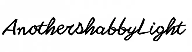
( Fonts by Zetafonts - Personal-use only. For commercial use please contact owner. )
A playful, handwritten font with bold strokes and a dynamic slant.
![Another shabby Light font caratteri gratis]() Scaricare 930 Downloads@WebFont
Scaricare 930 Downloads@WebFont -
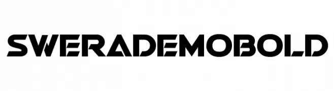
( Fonts by StudioTypo - Personal-use only. For commercial use please contact owner. )
A bold, geometric font with a futuristic and angular design.
![Swera Demo Bold font caratteri gratis]() Scaricare 930 Downloads@WebFont
Scaricare 930 Downloads@WebFont -
( Fonts by ndiscovered - Personal-use only. For commercial use please contact owner. )
A modern, geometric font with clean lines and balanced proportions.
![Exo 2.0 font caratteri gratis]() Scaricare 930 Downloads@WebFont
Scaricare 930 Downloads@WebFont -
![Germinabunt Regular Rough [DEMO] font caratteri gratis]() Scaricare 930 Downloads@WebFont
Scaricare 930 Downloads@WebFont -
( HackFonts - hackfonts.blogspot.com.co/ )
A bold, geometric font with strong angles and a modern look.
![Slugterra font caratteri gratis]() Scaricare 930 Downloads@WebFont
Scaricare 930 Downloads@WebFont -
( Fonts by Måns Grebäck )
A flowing, cursive font with a handwritten, elegant style.
![Haydon Brush PERSONAL USE font caratteri gratis]() Scaricare 930 Downloads@WebFont
Scaricare 930 Downloads@WebFont -
( Fonts by prescottdesignshop.com - Personal-use only. For commercial use please contact owner. )
A modern, light sans-serif font with clean lines and elegant proportions.
![PassionSansPDac-Light font caratteri gratis]() Scaricare 930 Downloads@WebFont
Scaricare 930 Downloads@WebFont -
( Fonts by Situjuh Nazara - 7ntypes.com - Personal-use only. For commercial use please contact owner. )
A bold, italic font with a dynamic and modern style.
![Gobold Italic font caratteri gratis]() Scaricare 930 Downloads@WebFont
Scaricare 930 Downloads@WebFont


![Germinabunt Regular Rough [DEMO] font caratteri gratis](https://d144mzi0q5mijx.cloudfront.net/img/G/E/Germinabunt-Regular-Rough-DEMO.webp)
Quali sono i font più popolari adesso?
Poppins, Roboto, Montserrat, Open Sans e Lato sono molto usati per le forme pulite e l'ampia applicabilità — dall'identità di marca alle landing page e ai poster.
Quali font si usano spesso nei loghi?
Le sans serif geometriche (es. Poppins, famiglie in stile Gotham) sono scelte comuni per un branding pulito e scalabile. Per un tocco personale restano valide script e stili manoscritti. Abbina un display deciso per i titoli a un corpo testo neutro per riconoscibilità ed equilibrio.
Ogni quanto si aggiorna la lista?
Con regolarità, in base ai download e all'attività reale. Torna spesso per scoprire in anticipo le nuove preferite.
💡 Consiglio: aggiungi ai preferiti — le tendenze cambiano in fretta e i font top di oggi possono ispirare il rebranding di domani.