Benvenuto nelle Font Più Popolari — dove popolarità e qualità si incontrano. Qui trovi i font più scaricati e usati dell'anno. Se cerchi scelte sicure per logo, web o social, inizia da qui.
Ogni font top si distingue per equilibrio, leggibilità e versatilità. Troverai sans serif moderne, script eleganti, serif vintage e display minimalisti.
-
( Fonts by Syaf Rizal - Khurasan - Personal-use only. For commercial use please contact owner. )
A lively, expressive handwritten font with dynamic strokes and playful bounce.
 Scaricare 788 Downloads@WebFont
 -
( Typodermic Fonts - Ray Larabie - www.typodermicfonts.com/ )
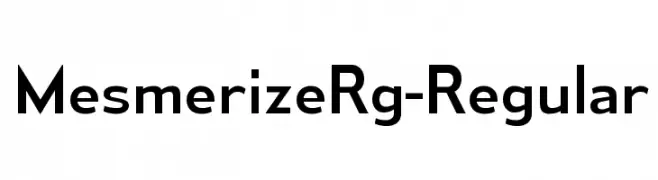
A modern, geometric sans-serif font with balanced proportions and a professional appearance.
![MesmerizeRg-Regular font caratteri gratis]() Scaricare 788 Downloads@WebFont
Scaricare 788 Downloads@WebFont -
( Thirtypath - www.thirtypath.com )
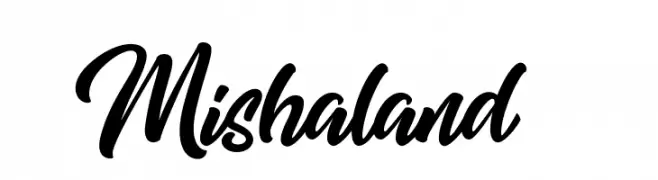
A bold, expressive script font with a dynamic, handwritten style.
![Mishaland font caratteri gratis]() Scaricare 788 Downloads@WebFont
Scaricare 788 Downloads@WebFont -
( Måns Grebäck - www.mansgreback.com )
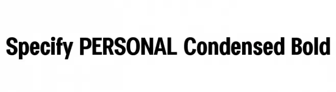
A bold, condensed font with tight spacing and a modern style.
![Specify PERSONAL Condensed Bold font caratteri gratis]() Scaricare 788 Downloads@WebFont
Scaricare 788 Downloads@WebFont -
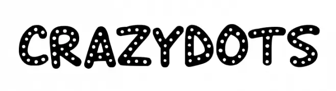
![Crazy Dots font caratteri gratis]() Scaricare 788 Downloads@WebFont
Scaricare 788 Downloads@WebFont -
-
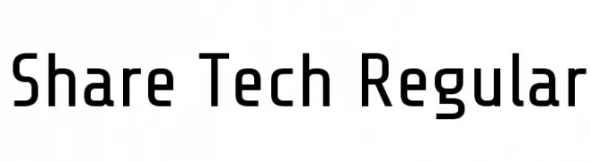
( Copyright 2012 The Share Tech Project Authors (post@carrois.com), with Reserved Font Name 'Share’. )
A modern, geometric sans-serif font with balanced spacing and clear characters.
![Share Tech Regular font caratteri gratis]() Scaricare 788 Downloads@WebFont
Scaricare 788 Downloads@WebFont -
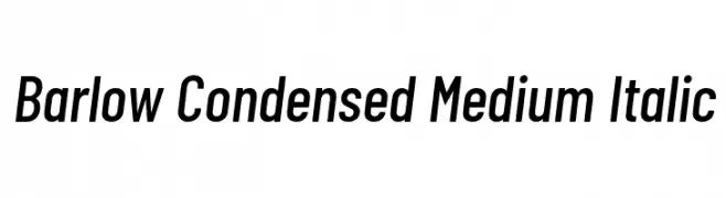
( Copyright 2017 The Barlow Project Authors (https://github.com/jpt/barlow) )
A modern, condensed italic font with medium weight and sleek design.
![Barlow Condensed Medium Italic font caratteri gratis]() Scaricare 788 Downloads@WebFont
Scaricare 788 Downloads@WebFont -
( Fonts by www.chequered.ink - Chequered Ink - Personal-use only. For commercial use please contact owner. )
A bold, modern font with thick, uniform strokes for impactful design.
![Balls of Bastille font caratteri gratis]() Scaricare 788 Downloads@WebFont
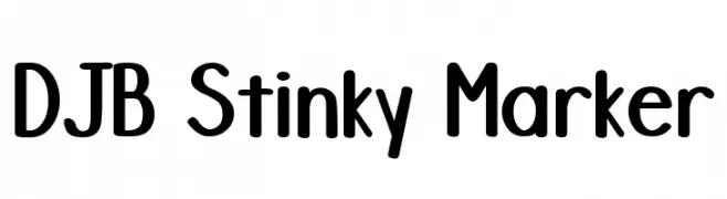
Scaricare 788 Downloads@WebFont -
![DJB Stinky Marker font caratteri gratis]() Scaricare 788 Downloads@WebFont
Scaricare 788 Downloads@WebFont -
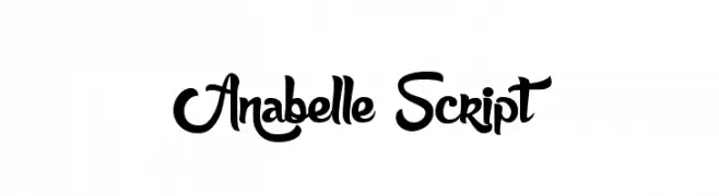
( Fonts by Maelle.K - Thomas Boucherie )
A playful, cursive script font with flowing, interconnected letters.
![Anabelle Script font caratteri gratis]() Scaricare 788 Downloads@WebFont
Scaricare 788 Downloads@WebFont -
( Fonts by Castcraft Software - opti.netii.net - check the website before use )
A modern serif font with clean lines and balanced proportions.
![OPTICounsilMedium font caratteri gratis]() Scaricare 788 Downloads@WebFont
Scaricare 788 Downloads@WebFont -
![Unholy Trade font caratteri gratis]() Scaricare 788 Downloads@WebFont
Scaricare 788 Downloads@WebFont -
( Copyright (c) 2011, Eduardo Tunni (http://www.tipo.net.ar) )
A classic serif font with a modern touch, offering elegance and readability.
![Mate-Regular font caratteri gratis]() Scaricare 788 Downloads@WebFont
Scaricare 788 Downloads@WebFont -
![WC ROUGHTRAD Bta Bold font caratteri gratis]() Scaricare 788 Downloads@WebFont
Scaricare 788 Downloads@WebFont -
( Fonts by Blue Vinyl - Jess Latham - www.bvfonts.com )
A bold, Gothic-inspired font with a distressed, hand-crafted appearance.
![Gothic Ultra Trendy font caratteri gratis]() Scaricare 788 Downloads@WebFont
Scaricare 788 Downloads@WebFont -
![chillyRegular font caratteri gratis]() Scaricare 788 Downloads@WebFont
Scaricare 788 Downloads@WebFont -
( Fonts by Jacob Fisher - www.pizzadude.dk )
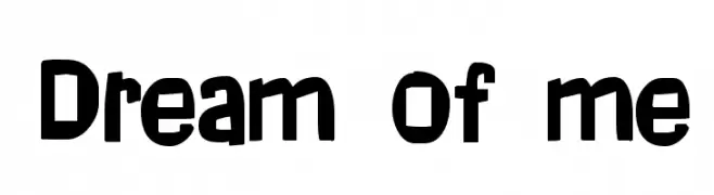
A bold, playful font with a hand-drawn, whimsical style.
![Dream of me font caratteri gratis]() Scaricare 788 Downloads@WebFont
Scaricare 788 Downloads@WebFont -
( Free for a personal use. For a commercial use please visit www.kevinandamanda.com )
A playful, bold font with rounded, bubble-like characters enclosed in shapes.
![Chewy Stewy font caratteri gratis]() Scaricare 788 Downloads@WebFont
Scaricare 788 Downloads@WebFont -
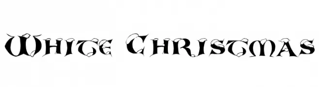
![White Christmas font caratteri gratis]() Scaricare 788 Downloads@WebFont
Scaricare 788 Downloads@WebFont -
( Fonts by Peter S. Baker )
A decorative font with historical charm and intricate details.
![Anglo-Saxon Caps font caratteri gratis]() Scaricare 788 Downloads@WebFont
Scaricare 788 Downloads@WebFont -
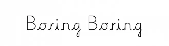
![Boring Boring font caratteri gratis]() Scaricare 788 Downloads@WebFont
Scaricare 788 Downloads@WebFont -
( Fonts by Zetafonts - Personal-use only. For commercial use please contact owner. )
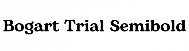
A bold, serif font with a classic and elegant style.
![Bogart Trial Semibold font caratteri gratis]() Scaricare 787 Downloads@WebFont
Scaricare 787 Downloads@WebFont -
( Fonts by wep )
A bold, playful handwritten font with thick, rounded strokes.
![Decak font caratteri gratis]() Scaricare 787 Downloads@WebFont
Scaricare 787 Downloads@WebFont -
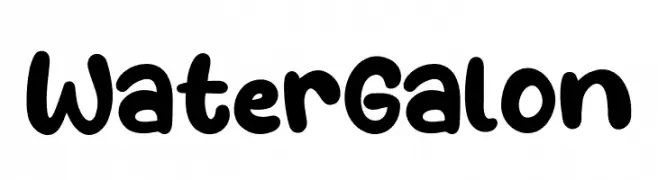
( Fonts by Khurasan )
A playful, bold font with rounded, thick strokes and a whimsical style.
![Water Galon font caratteri gratis]() Scaricare 787 Downloads@WebFont
Scaricare 787 Downloads@WebFont -
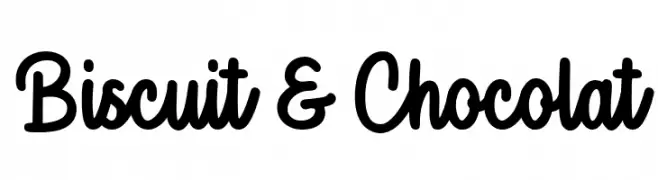
( Fonts by Octotype - www.foundmyfont.com - Personal-use only. For commercial use please contact owner. )
A bold, playful script font with a friendly, handwritten style.
![Biscuit & Chocolat font caratteri gratis]() Scaricare 787 Downloads@WebFont
Scaricare 787 Downloads@WebFont -
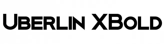
( Fonts by Antonio Rodrigues Jr - Personal-use only. For commercial use please contact owner. )
A bold, modern font with geometric lines and high contrast.
![Uberlin XBold font caratteri gratis]() Scaricare 787 Downloads@WebFont
Scaricare 787 Downloads@WebFont -
( Billy Argel - billyargel.com/ )
A bold, cursive font with decorative loops and high contrast, perfect for artistic projects.
![Antonine Personal Use Regular font caratteri gratis]() Scaricare 787 Downloads@WebFont
Scaricare 787 Downloads@WebFont -
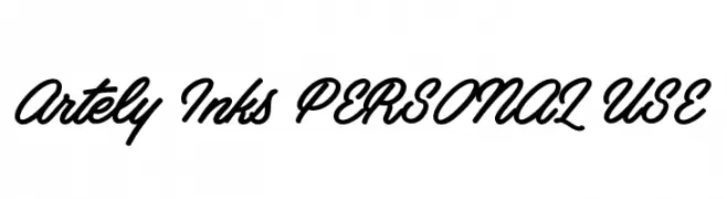
( Måns Grebäck - www.mansgreback.com )
A flowing, cursive font with a handwritten, elegant style.
![Artely Inks PERSONAL USE font caratteri gratis]() Scaricare 787 Downloads@WebFont
Scaricare 787 Downloads@WebFont -
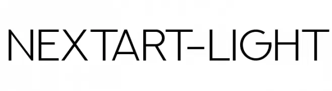
( Alexander Pravdin )
A modern, geometric sans-serif font with clean lines and balanced proportions.
![NEXTART-Light font caratteri gratis]() Scaricare 787 Downloads@WebFont
Scaricare 787 Downloads@WebFont -
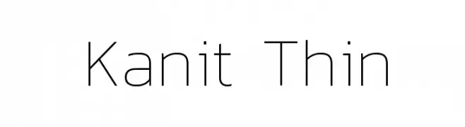
( Copyright (c) 2015, Cadson Demak (info@cadsondemak.com) )
A sleek, modern sans-serif font with thin, elegant lines and geometric precision.
![Kanit Thin font caratteri gratis]() Scaricare 787 Downloads@WebFont
Scaricare 787 Downloads@WebFont -
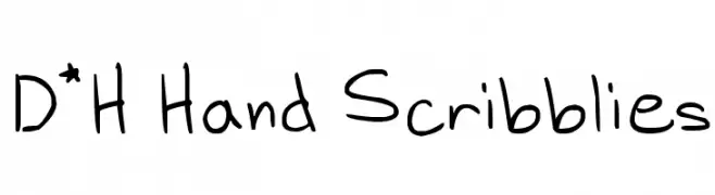
( Fonts by www.fontpanda.com. Personal-use only. For commercial use please contact owner. )
A playful, casual handwritten font with a doodle-like style.
![D*H Hand Scribblies font caratteri gratis]() Scaricare 787 Downloads@WebFont
Scaricare 787 Downloads@WebFont -
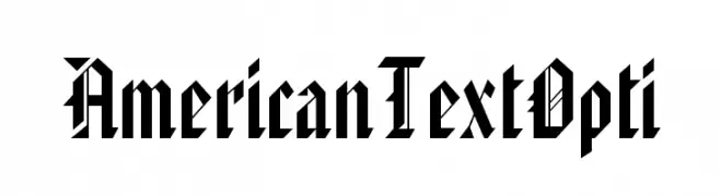
( Fonts by Castcraft Software - opti.netii.net - check the website before use )
A bold, angular blackletter font with a modern twist.
![AmericanTextOpti font caratteri gratis]() Scaricare 787 Downloads@WebFont
Scaricare 787 Downloads@WebFont -
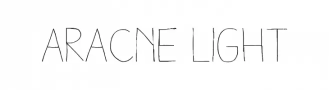
Caratteri di antipixel. For commercial use please contact the owner.
![Aracne Light font caratteri gratis]() Scaricare 787 Downloads@WebFont
Scaricare 787 Downloads@WebFont -
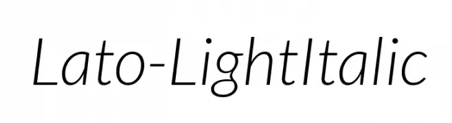
( Copyright (c) 2010-2011 by tyPoland Lukasz Dziedzic with Reserved Font Name "Lato". )
A modern, light, and italic sans-serif font with elegant slanted characters.
![Lato-LightItalic font caratteri gratis]() Scaricare 787 Downloads@WebFont
Scaricare 787 Downloads@WebFont -
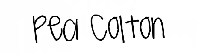
( Free for a personal use. For a commercial use please visit www.kevinandamanda.com )
A playful, casual handwritten font with a whimsical and informal style.
![Pea Colton font caratteri gratis]() Scaricare 787 Downloads@WebFont
Scaricare 787 Downloads@WebFont


Quali sono i font più popolari adesso?
Poppins, Roboto, Montserrat, Open Sans e Lato sono molto usati per le forme pulite e l'ampia applicabilità — dall'identità di marca alle landing page e ai poster.
Quali font si usano spesso nei loghi?
Le sans serif geometriche (es. Poppins, famiglie in stile Gotham) sono scelte comuni per un branding pulito e scalabile. Per un tocco personale restano valide script e stili manoscritti. Abbina un display deciso per i titoli a un corpo testo neutro per riconoscibilità ed equilibrio.
Ogni quanto si aggiorna la lista?
Con regolarità, in base ai download e all'attività reale. Torna spesso per scoprire in anticipo le nuove preferite.
💡 Consiglio: aggiungi ai preferiti — le tendenze cambiano in fretta e i font top di oggi possono ispirare il rebranding di domani.