Benvenuto nelle Font Più Popolari — dove popolarità e qualità si incontrano. Qui trovi i font più scaricati e usati dell'anno. Se cerchi scelte sicure per logo, web o social, inizia da qui.
Ogni font top si distingue per equilibrio, leggibilità e versatilità. Troverai sans serif moderne, script eleganti, serif vintage e display minimalisti.
-
( Michael D. Adams - www.triskele.com/roadgeek-fonts/ )
A modern sans-serif font with clean lines and a slightly condensed style.
 Scaricare 783 Downloads@WebFont
 -
( APH Products - www.aph.org/products/aphont.html )
A bold, modern sans-serif font with excellent readability and balanced proportions.
![APHont Bold font caratteri gratis]() Scaricare 783 Downloads@WebFont
Scaricare 783 Downloads@WebFont -
( Jef Triforce - Francisco Arellano - www.ixipcalli.com )
A modern, rounded sans-serif font with smooth edges and excellent readability.
![Copilme Light font caratteri gratis]() Scaricare 783 Downloads@WebFont
Scaricare 783 Downloads@WebFont -
( Eliezer Grawe - www.behance.net/eliezergrawe )
A playful, rounded, and slightly condensed font with a modern and approachable style.
![Mangaba font caratteri gratis]() Scaricare 783 Downloads@WebFont
Scaricare 783 Downloads@WebFont -
( Alexander Pravdin )
A modern, geometric sans-serif font with clean lines and balanced proportions.
![NEXTART-Light font caratteri gratis]() Scaricare 783 Downloads@WebFont
Scaricare 783 Downloads@WebFont -
-
![Caranda Personal Use font caratteri gratis]() Scaricare 783 Downloads@WebFont
Scaricare 783 Downloads@WebFont -
![.VnArabiaH font caratteri gratis]() Scaricare 783 Downloads
Scaricare 783 Downloads -
( Fonts by www.svenpels.com - Personal-use only. For commercial use please contact owner. )
A bold, impactful font with thick, uniform strokes for strong visual presence.
![The Black Font font caratteri gratis]() Scaricare 783 Downloads@WebFont
Scaricare 783 Downloads@WebFont -
( Copyright (c) 2012, Impallari Type (www.impallari.com). )
A clean, modern sans-serif typeface with excellent readability.
![Amiko Regular font caratteri gratis]() Scaricare 783 Downloads@WebFont
Scaricare 783 Downloads@WebFont -
( Fonts by Fran Fernandez - Personal-use only. For commercial use please contact owner. )
An edgy, gothic font with claw-like serifs and a bold, dramatic style.
![A Monster Free font caratteri gratis]() Scaricare 783 Downloads@WebFont
Scaricare 783 Downloads@WebFont -
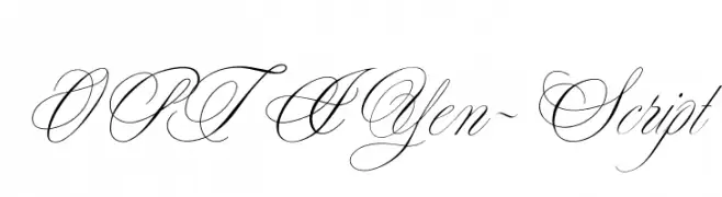
( Fonts by Castcraft Software - OPTI Fonts Archive - opti.netii.net - Personal-use only. For commercial use please contact owner. )
An elegant script font with intricate loops and high contrast, perfect for formal and decorative use.
![OPTIYen-Script font caratteri gratis]() Scaricare 783 Downloads@WebFont
Scaricare 783 Downloads@WebFont -
( Fonts by Alex Tomlinson - Skyhaven Fonts - shfonts.com )
A casual, handwritten font with a dynamic and organic feel.
![OceanCoastlines-Regular font caratteri gratis]() Scaricare 783 Downloads@WebFont
Scaricare 783 Downloads@WebFont -
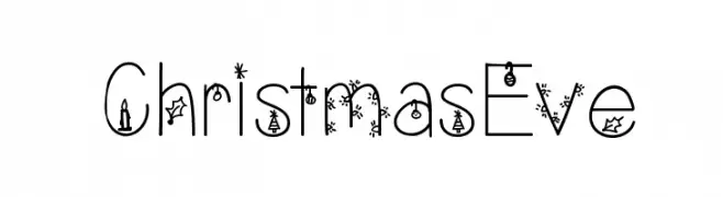
( Fonts by Vanessa Bays - bythebutterfly.com )
A festive, decorative font with Christmas-themed embellishments on each character.
![ChristmasEve font caratteri gratis]() Scaricare 783 Downloads@WebFont
Scaricare 783 Downloads@WebFont -
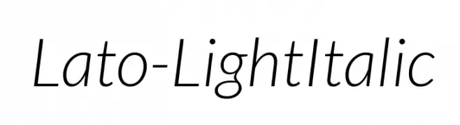
( Copyright (c) 2010-2011 by tyPoland Lukasz Dziedzic with Reserved Font Name "Lato". )
A modern, light, and italic sans-serif font with elegant slanted characters.
![Lato-LightItalic font caratteri gratis]() Scaricare 783 Downloads@WebFont
Scaricare 783 Downloads@WebFont -
![Sacred Place Light font caratteri gratis]() Scaricare 783 Downloads@WebFont
Scaricare 783 Downloads@WebFont -
![BUILDER font caratteri gratis]() Scaricare 783 Downloads@WebFont
Scaricare 783 Downloads@WebFont -
( Fonts by Galdino Otten - galdinootten.com )
A classic serif font with elegant, refined strokes and pronounced serifs.
![Fine Serif font caratteri gratis]() Scaricare 783 Downloads@WebFont
Scaricare 783 Downloads@WebFont -
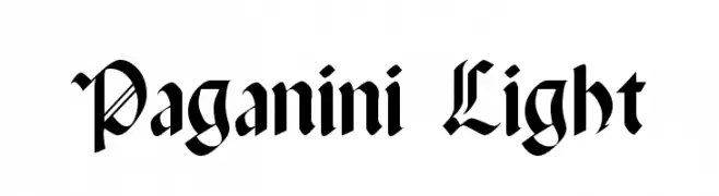
( Fonts by Dieter Steffmann )
An ornate blackletter font with intricate, angular designs and a medieval aesthetic.
![Paganini Light font caratteri gratis]() Scaricare 783 Downloads@WebFont
Scaricare 783 Downloads@WebFont -
![Kruti Dev 090 Bold font caratteri gratis]() Scaricare 783 Downloads@WebFont
Scaricare 783 Downloads@WebFont -
![Nancy font caratteri gratis]() Scaricare 783 Downloads@WebFont
Scaricare 783 Downloads@WebFont -
( Fonts by Manfred Klein - manfred-klein.ina-mar.com )
A classic serif font with elegant strokes and pronounced serifs.
![Imprimerie font caratteri gratis]() Scaricare 783 Downloads@WebFont
Scaricare 783 Downloads@WebFont -
( Fonts by Daniel Zadorozny - www.iconian.com )
A bold, playful font with a comic book style and 3D effect.
![Comic Book Commando 3D font caratteri gratis]() Scaricare 783 Downloads@WebFont
Scaricare 783 Downloads@WebFont -
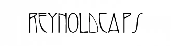
![ReynoldCaps font caratteri gratis]() Scaricare 783 Downloads
Scaricare 783 Downloads -
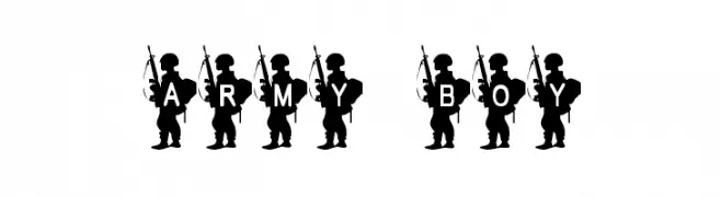
![Army Boy font caratteri gratis]() Scaricare 783 Downloads@WebFont
Scaricare 783 Downloads@WebFont -
( Fonts by Graham Meade - GemFonts )
A modern, line-patterned font with geometric structure and dynamic appeal.
![Barred Out font caratteri gratis]() Scaricare 783 Downloads@WebFont
Scaricare 783 Downloads@WebFont -
( Fonts by joeBob graff-X )
A hand-drawn, artistic font with irregular line thickness and geometric shapes.
![doctorBob font caratteri gratis]() Scaricare 783 Downloads@WebFont
Scaricare 783 Downloads@WebFont -
( Fonts by Oktora Mila - Personal-use only. For commercial use please contact owner. )
A modern sans-serif font with smooth curves and uniform strokes.
![Gumela font caratteri gratis]() Scaricare 782 Downloads@WebFont
Scaricare 782 Downloads@WebFont -
( Fonts by Chris Glover - https://fontbundles.net/sunkissedminimalist - Personal-use only. For commercial use please contact owner. )
A bold, flowing script font with a modern, playful aesthetic.
![Thursday Vibin font caratteri gratis]() Scaricare 782 Downloads@WebFont
Scaricare 782 Downloads@WebFont -
( Noto is a trademark of Google Inc. Noto fonts are open source. All Noto fonts are published under the SIL Open Font License, Version 1.1 )
Elegant serif font with bold, italicized style and balanced contrast.
![Noto Serif Display Bold Italic font caratteri gratis]() Scaricare 782 Downloads@WebFont
Scaricare 782 Downloads@WebFont -
( Fonts by Alma Gomez )
A playful, handwritten font with tall, narrow letters and a slight slant.
![Tulip font caratteri gratis]() Scaricare 782 Downloads@WebFont
Scaricare 782 Downloads@WebFont -
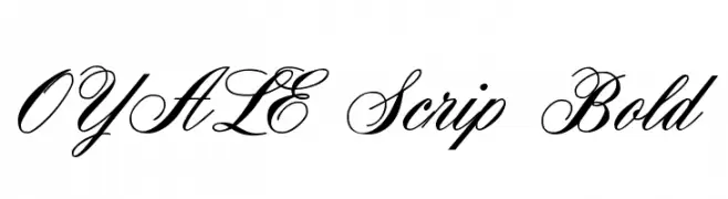
( Fonts by Castcraft Software - OPTI Fonts Archive - opti.netii.net - Personal-use only. For commercial use please contact owner. )
An elegant, flowing script font with intricate loops and flourishes.
![OYALE Scrip Bold font caratteri gratis]() Scaricare 782 Downloads@WebFont
Scaricare 782 Downloads@WebFont -
( Fonts by www.monofonts.com. Personal-use only. For commercial use please contact owner. )
A bold, modern sans-serif font with clean lines and strong presence.
![SanFrediano-Bold font caratteri gratis]() Scaricare 782 Downloads@WebFont
Scaricare 782 Downloads@WebFont -
( Fonts by www.kimberlygeswein.com - Kimberly Geswein )
A bold, hand-drawn font with a playful shadow effect.
![KG Summer Sunshine Blackout font caratteri gratis]() Scaricare 782 Downloads@WebFont
Scaricare 782 Downloads@WebFont -
![friendly robot font caratteri gratis]() Scaricare 782 Downloads@WebFont
Scaricare 782 Downloads@WebFont -
( Fonts by a Max Infeld - XEROGRAPHER FONTS - xerographer.blogspot.com . Personal-use only. For commercial use please contact owner. )
A bold, distressed font with a vintage, rugged appearance.
![SummerBlacktop font caratteri gratis]() Scaricare 782 Downloads@WebFont
Scaricare 782 Downloads@WebFont


Quali sono i font più popolari adesso?
Poppins, Roboto, Montserrat, Open Sans e Lato sono molto usati per le forme pulite e l'ampia applicabilità — dall'identità di marca alle landing page e ai poster.
Quali font si usano spesso nei loghi?
Le sans serif geometriche (es. Poppins, famiglie in stile Gotham) sono scelte comuni per un branding pulito e scalabile. Per un tocco personale restano valide script e stili manoscritti. Abbina un display deciso per i titoli a un corpo testo neutro per riconoscibilità ed equilibrio.
Ogni quanto si aggiorna la lista?
Con regolarità, in base ai download e all'attività reale. Torna spesso per scoprire in anticipo le nuove preferite.
💡 Consiglio: aggiungi ai preferiti — le tendenze cambiano in fretta e i font top di oggi possono ispirare il rebranding di domani.