Benvenuto nelle Font Più Popolari — dove popolarità e qualità si incontrano. Qui trovi i font più scaricati e usati dell'anno. Se cerchi scelte sicure per logo, web o social, inizia da qui.
Ogni font top si distingue per equilibrio, leggibilità e versatilità. Troverai sans serif moderne, script eleganti, serif vintage e display minimalisti.
-
( Fonts by Vít Čondák )
A playful, casual handwritten font with smooth, flowing lines.
 Scaricare 674 Downloads@WebFont
 -
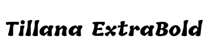
( Copyright (c) 2014, Indian Type Foundry (info@indiantypefoundry.com). )
A bold, playful handwritten-style font with rounded characters.
![Tillana ExtraBold font caratteri gratis]() Scaricare 674 Downloads@WebFont
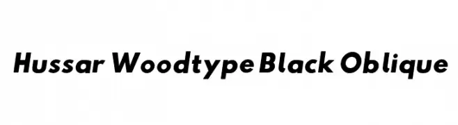
Scaricare 674 Downloads@WebFont -
![Hussar Woodtype Black Oblique font caratteri gratis]() Scaricare 674 Downloads@WebFont
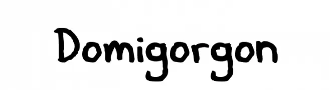
Scaricare 674 Downloads@WebFont -
![Domigorgon font caratteri gratis]() Scaricare 674 Downloads@WebFont
Scaricare 674 Downloads@WebFont -
( Fonts by Barry Bujol - theoriginal19.blogspot.com )
A bold, distressed font with ornate, vintage embellishments.
![Chicago House font caratteri gratis]() Scaricare 674 Downloads@WebFont
Scaricare 674 Downloads@WebFont -
-
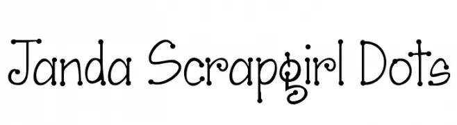
( Fonts by www.kimberlygeswein.com - Kimberly Geswein )
A playful, dotted font with a whimsical and informal style.
![Janda Scrapgirl Dots font caratteri gratis]() Scaricare 674 Downloads@WebFont
Scaricare 674 Downloads@WebFont -
( Copyright (c) 2007, Greek Font Society (www.greekfontsociety.org | gfs@greekfontsociety.org) )
A bold, modern typeface with geometric shapes and consistent stroke width.
![GFS Neohellenic Bold font caratteri gratis]() Scaricare 674 Downloads@WebFont
Scaricare 674 Downloads@WebFont -
( Fonts by www.blambot.com )
A bold, dynamic, and playful handwritten font with thick strokes.
![EvilGeniusBB-Bold font caratteri gratis]() Scaricare 674 Downloads@WebFont
Scaricare 674 Downloads@WebFont -
( Fonts by Michael Tension - www.TensionType.com )
A bold, italic handwritten font with a lively and dynamic style.
![F*ck Beans Italic font caratteri gratis]() Scaricare 674 Downloads@WebFont
Scaricare 674 Downloads@WebFont -
![12 Halloween Signs LT font caratteri gratis]() Scaricare 674 Downloads@WebFont
Scaricare 674 Downloads@WebFont -
![Illustrate IT font caratteri gratis]() Scaricare 674 Downloads@WebFont
Scaricare 674 Downloads@WebFont -
( Fonts by www.peter-wiegel.de. Personal-use only. For commercial use please contact owner. )
A bold, modern font with wide, geometric characters and strong legibility.
![Berlin Email Wide Semibold font caratteri gratis]() Scaricare 674 Downloads@WebFont
Scaricare 674 Downloads@WebFont -
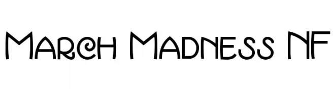
( Fonts by Nick Curtis - www.nicksfonts.com )
A playful, dynamic font with geometric and organic shapes.
![March Madness NF font caratteri gratis]() Scaricare 674 Downloads@WebFont
Scaricare 674 Downloads@WebFont -
![jazz-pickle font caratteri gratis]() Scaricare 674 Downloads@WebFont
Scaricare 674 Downloads@WebFont -
( Fonts by Apostrophic Lab )
A bold, geometric font with a modern and futuristic style.
![Futurex Phat font caratteri gratis]() Scaricare 674 Downloads@WebFont
Scaricare 674 Downloads@WebFont -
( Fonts by Emil Bertell - www.fenotype.com )
A bold, geometric font with a digital, pixelated style.
![Optimal font caratteri gratis]() Scaricare 674 Downloads@WebFont
Scaricare 674 Downloads@WebFont -
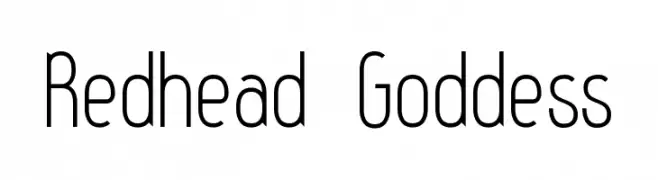
( Fonts by Levi Halmos )
A sleek, modern font with elongated, narrow characters and a minimalist style.
![Redhead Goddess font caratteri gratis]() Scaricare 674 Downloads@WebFont
Scaricare 674 Downloads@WebFont -
( Fonts by Iconian Fonts - Daniel Zadorozny )
A bold, italicized font with a futuristic, shadowed design.
![Gunship Shadow Ital font caratteri gratis]() Scaricare 674 Downloads@WebFont
Scaricare 674 Downloads@WebFont -
![Dream Orphans Bold Italic font caratteri gratis]() Scaricare 674 Downloads@WebFont
Scaricare 674 Downloads@WebFont -
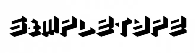
( Fonts by Emil Bertell - www.fenotype.com )
A bold, three-dimensional geometric font with a strong shadow effect.
![simpletype font caratteri gratis]() Scaricare 674 Downloads@WebFont
Scaricare 674 Downloads@WebFont -
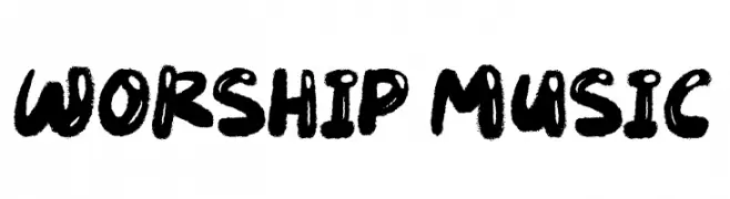
( Fonts by JSH creates )
A bold, brush-style font with a hand-drawn, energetic appearance.
![Worship Music font caratteri gratis]() Scaricare 673 Downloads@WebFont
Scaricare 673 Downloads@WebFont -
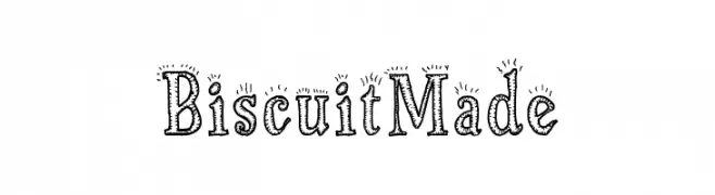
( Fonts by Galdino Otten Fonts - www.galdinootten.com - Personal-use only. For commercial use please contact owner. )
A playful, hand-drawn font with decorative, dotted outlines.
![Biscuit Made font caratteri gratis]() Scaricare 673 Downloads@WebFont
Scaricare 673 Downloads@WebFont -
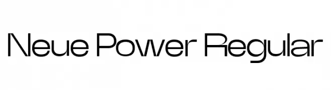
Caratteri di powertype. For commercial use please contact the owner.
( Neue Power )
A modern, geometric sans-serif font with clean lines and balanced proportions.
![Neue Power Regular font caratteri gratis]() Scaricare 673 Downloads@WebFont
Scaricare 673 Downloads@WebFont -
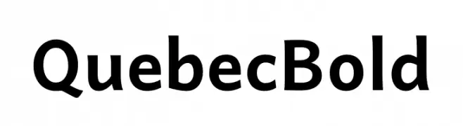
( Fonts by Victor Gaultney, Annie Olsen, Pablo Ugerman - Personal-use only. For commercial use please contact owner. )
A bold, modern sans-serif font with clean lines and balanced proportions.
![Quebec Bold font caratteri gratis]() Scaricare 673 Downloads@WebFont
Scaricare 673 Downloads@WebFont -
( Fonts by www.selawetype.com - Personal-use only. FOR DONATION https://www.paypal.me/selawe . For commercial use please contact owner. )
A bold, brush-style script font with high contrast and dynamic flair.
![RODAMAS font caratteri gratis]() Scaricare 673 Downloads@WebFont
Scaricare 673 Downloads@WebFont -
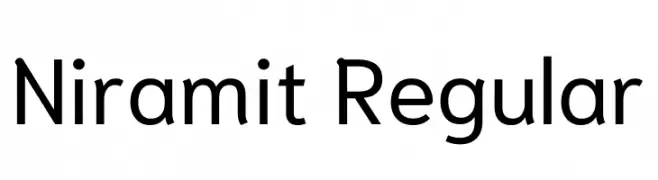
( Copyright 2018 the Niramit Project Authors (https://github.com/cadsondemak/Niramit) )
A modern sans-serif font with clean lines and excellent readability.
![Niramit Regular font caratteri gratis]() Scaricare 673 Downloads@WebFont
Scaricare 673 Downloads@WebFont -
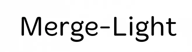
( Fonts by Philatype - Personal-use only. For commercial use please contact owner. )
A modern, geometric sans-serif font with clean lines and balanced spacing.
![Merge-Light font caratteri gratis]() Scaricare 673 Downloads@WebFont
Scaricare 673 Downloads@WebFont -
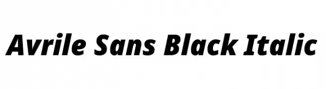
( Fonts by Cristiano Sobral - Personal-use only. For commercial use please contact owner. )
A bold, italic sans-serif font with a modern and dynamic style.
![Avrile Sans Black Italic font caratteri gratis]() Scaricare 673 Downloads@WebFont
Scaricare 673 Downloads@WebFont -
( Fonts by Stefan Peev, Context Ltd - Personal-use only. For commercial use please contact owner. )
A bold, modern serif font with strong serifs and a classic yet contemporary look.
![LibraSerifModern-Bold font caratteri gratis]() Scaricare 673 Downloads@WebFont
Scaricare 673 Downloads@WebFont -
( Iconian Fonts - Daniel Zadorozny - www.iconian.com )
A futuristic, geometric font with sharp, angular letterforms.
![Promethean Title font caratteri gratis]() Scaricare 673 Downloads@WebFont
Scaricare 673 Downloads@WebFont -
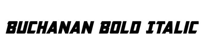
( Iconian Fonts - Daniel Zadorozny - www.iconian.com )
A bold, italicized font with a strong, dynamic presence.
![Buchanan Bold Italic font caratteri gratis]() Scaricare 673 Downloads@WebFont
Scaricare 673 Downloads@WebFont -
( Fonts by Chris Vile - fontmonger.com - Personal-use only. For commercial use please contact owner. )
A bold, Western-inspired font with thick strokes and decorative cut-out shapes.
![San Antonio Charros font caratteri gratis]() Scaricare 673 Downloads@WebFont
Scaricare 673 Downloads@WebFont -
( Fonts by Tarin Yuangtrakul - www.tarinyuangtrakul.com - Personal-use only. For commercial use please contact owner. )
A sleek, geometric font with consistent stroke width and modern design.
![Infinity 1 font caratteri gratis]() Scaricare 673 Downloads@WebFont
Scaricare 673 Downloads@WebFont -
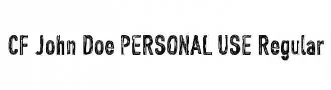
( Fonts by CloutierFontes )
A bold, hand-drawn font with a textured, sketch-like appearance.
![CF John Doe PERSONAL USE Regular font caratteri gratis]() Scaricare 673 Downloads@WebFont
Scaricare 673 Downloads@WebFont -
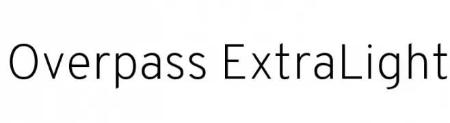
( Copyright (c) 2016 by Red Hat, Inc. All rights reserved. )
A clean, modern typeface with geometric precision and thin strokes.
![Overpass ExtraLight font caratteri gratis]() Scaricare 673 Downloads@WebFont
Scaricare 673 Downloads@WebFont


Quali sono i font più popolari adesso?
Poppins, Roboto, Montserrat, Open Sans e Lato sono molto usati per le forme pulite e l'ampia applicabilità — dall'identità di marca alle landing page e ai poster.
Quali font si usano spesso nei loghi?
Le sans serif geometriche (es. Poppins, famiglie in stile Gotham) sono scelte comuni per un branding pulito e scalabile. Per un tocco personale restano valide script e stili manoscritti. Abbina un display deciso per i titoli a un corpo testo neutro per riconoscibilità ed equilibrio.
Ogni quanto si aggiorna la lista?
Con regolarità, in base ai download e all'attività reale. Torna spesso per scoprire in anticipo le nuove preferite.
💡 Consiglio: aggiungi ai preferiti — le tendenze cambiano in fretta e i font top di oggi possono ispirare il rebranding di domani.