Benvenuto nelle Font Più Popolari — dove popolarità e qualità si incontrano. Qui trovi i font più scaricati e usati dell'anno. Se cerchi scelte sicure per logo, web o social, inizia da qui.
Ogni font top si distingue per equilibrio, leggibilità e versatilità. Troverai sans serif moderne, script eleganti, serif vintage e display minimalisti.
-
( Fonts by Tarin Yuangtrakul - www.tarinyuangtrakul.com - Personal-use only. For commercial use please contact owner. )
A sleek, geometric font with consistent stroke width and modern design.
 Scaricare 673 Downloads@WebFont
 -
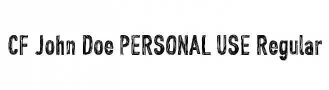
( Fonts by CloutierFontes )
A bold, hand-drawn font with a textured, sketch-like appearance.
![CF John Doe PERSONAL USE Regular font caratteri gratis]() Scaricare 673 Downloads@WebFont
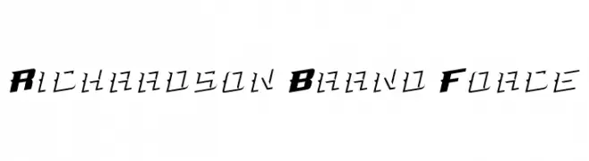
Scaricare 673 Downloads@WebFont -
![Richardson Brand Force font caratteri gratis]() Scaricare 673 Downloads@WebFont
Scaricare 673 Downloads@WebFont -
( Fonts by Castcraft Software - opti.netii.net - check the website before use )
An elegant script font with flowing, cursive letterforms and intricate flourishes.
![OPTIAjax font caratteri gratis]() Scaricare 673 Downloads@WebFont
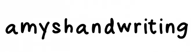
Scaricare 673 Downloads@WebFont -
![amyshandwriting font caratteri gratis]() Scaricare 673 Downloads@WebFont
Scaricare 673 Downloads@WebFont -
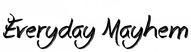
-
![Everyday Mayhem font caratteri gratis]() Scaricare 673 Downloads@WebFont
Scaricare 673 Downloads@WebFont -
![Kalhor font caratteri gratis]() Scaricare 673 Downloads@WebFont
Scaricare 673 Downloads@WebFont -
( گالری فانت فارسی پژوهش آريانا - only compatible with Farsi and Arabic )
A bold, geometric font with a modern and dynamic style.
![Nasim font caratteri gratis]() Scaricare 673 Downloads@WebFont
Scaricare 673 Downloads@WebFont -
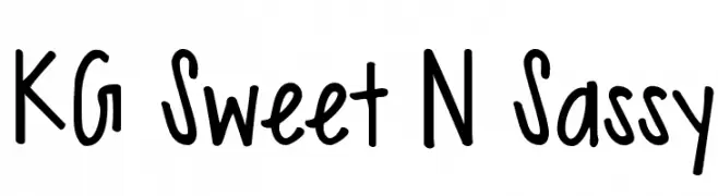
( Fonts by www.kimberlygeswein.com - Kimberly Geswein )
A playful, handwritten font with a casual and friendly appearance.
![KG Sweet N Sassy font caratteri gratis]() Scaricare 673 Downloads@WebFont
Scaricare 673 Downloads@WebFont -
( Fonts by Mans Greback - www.mawns.com )
A bold, condensed serif font with strong, angular serifs.
![Rider Condensed Bold font caratteri gratis]() Scaricare 673 Downloads@WebFont
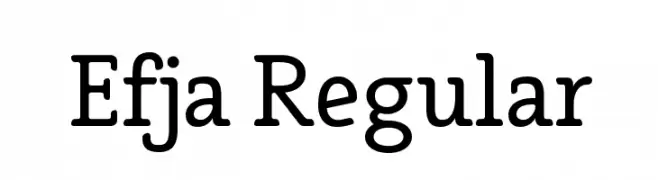
Scaricare 673 Downloads@WebFont -
![Efja Regular font caratteri gratis]() Scaricare 673 Downloads@WebFont
Scaricare 673 Downloads@WebFont -
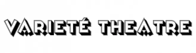
( Fonts by www.peter-wiegel.de. Personal-use only. For commercial use please contact owner. )
A bold, three-dimensional display font with a dramatic, theatrical style.
![Varieté Theatre font caratteri gratis]() Scaricare 673 Downloads@WebFont
Scaricare 673 Downloads@WebFont -
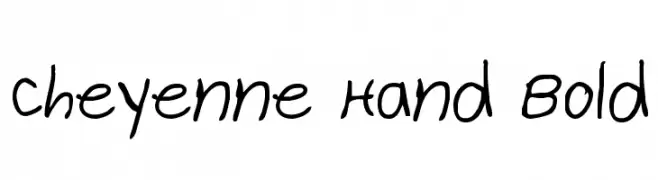
( Fonts by Daniel Zadorozny - www.iconian.com )
A bold, handwritten font with a casual and playful style.
![Cheyenne Hand Bold font caratteri gratis]() Scaricare 673 Downloads@WebFont
Scaricare 673 Downloads@WebFont -
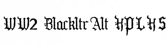
( Fonts by HPLHS Prop Fonts - Andrew H. Leman http://www.cthulhulives.org/toybox/propdocs/propfonts.html )
A bold, gothic Blackletter font with intricate, medieval-style details.
![WW2 BlackltrAlt HPLHS font caratteri gratis]() Scaricare 673 Downloads@WebFont
Scaricare 673 Downloads@WebFont -
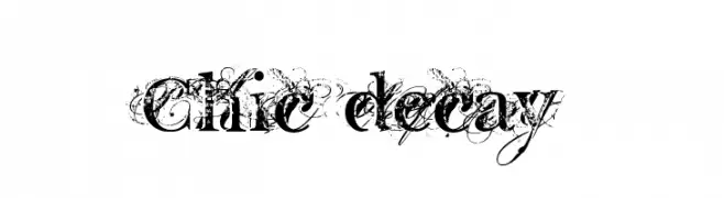
( Fonts by Gyom Seguin - last-soundtrack.daportfolio.com )
A decorative serif font with a distressed, artistic flair.
![Chic decay font caratteri gratis]() Scaricare 673 Downloads@WebFont
Scaricare 673 Downloads@WebFont -
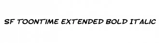
( Fonts by ShyFonts )
A bold, italicized font with a playful, cartoonish style.
![SF Toontime Extended Bold Italic font caratteri gratis]() Scaricare 673 Downloads@WebFont
Scaricare 673 Downloads@WebFont -
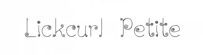
( Fonts by Graham Meade - GemFonts )
A whimsical font with curly swirls and a delicate, artistic flair.
![Lickcurl Petite font caratteri gratis]() Scaricare 673 Downloads@WebFont
Scaricare 673 Downloads@WebFont -
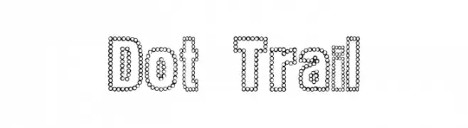
( Fonts by www.houseoflime.com )
A playful, dotted font ideal for creative and informal designs.
![Dot Trail font caratteri gratis]() Scaricare 673 Downloads@WebFont
Scaricare 673 Downloads@WebFont -
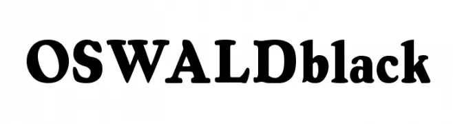
![OSWALDblack font caratteri gratis]() Scaricare 673 Downloads
Scaricare 673 Downloads -
( Fonts by gluk - Grzegorz l - Personal-use only. For commercial use please contact owner. )
A bold, modern sans-serif font with geometric precision.
![Nesatho font caratteri gratis]() Scaricare 672 Downloads@WebFont
Scaricare 672 Downloads@WebFont -
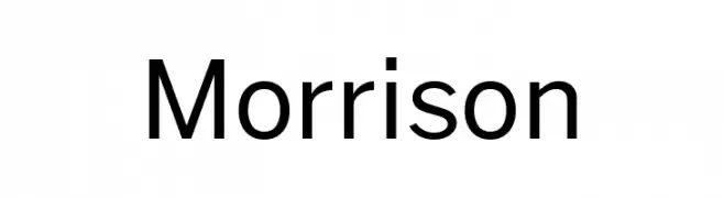
( Fonts by Pablo Impallari, Rodrigo Fuenzalida (Modified by Dan O. Williams) - Personal-use only. For commercial use please contact owner. )
A modern, clean sans-serif font with balanced spacing and consistent stroke width.
![Morrison font caratteri gratis]() Scaricare 672 Downloads@WebFont
Scaricare 672 Downloads@WebFont -
( Personal-use only. For commercial use please contact owner. )
A modern, geometric font with consistent stroke width and balanced characters.
![Cubellan font caratteri gratis]() Scaricare 672 Downloads@WebFont
Scaricare 672 Downloads@WebFont -
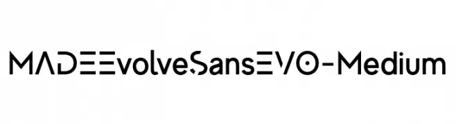
( Fonts by MadeType - Personal-use only. For commercial use please contact owner. )
A modern, geometric sans-serif font with a bold, futuristic style.
![MADEEvolveSansEVO-Medium font caratteri gratis]() Scaricare 672 Downloads@WebFont
Scaricare 672 Downloads@WebFont -
( Fonts by Farul Arjianto - creativemarket.com/typefar - Personal-use only. For commercial use please contact owner. )
A bold, expressive handwritten font with flowing cursive letterforms.
![Amanise font caratteri gratis]() Scaricare 672 Downloads@WebFont
Scaricare 672 Downloads@WebFont -
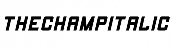
( Fonts by Edric Studio www.creativefabrica.com/designer/edricstudio/ - Personal-use only. For commercial use please contact owner. )
A bold, italic font with geometric shapes and a dynamic, modern style.
![THE CHAMP Italic font caratteri gratis]() Scaricare 672 Downloads@WebFont
Scaricare 672 Downloads@WebFont -
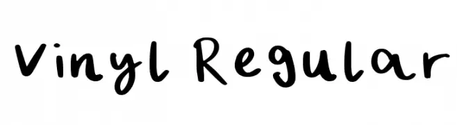
( Fonts by Hangry Panda Fonts - Personal-use only. For commercial use please contact owner. )
A playful, handwritten font with smooth, flowing curves.
![Vinyl Regular font caratteri gratis]() Scaricare 672 Downloads@WebFont
Scaricare 672 Downloads@WebFont -
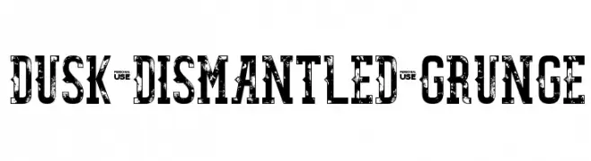
( LJ Design Studios - www.ljdesignstudios.com )
A bold, distressed font with a grunge aesthetic and vintage appeal.
![Dusk Dismantled Grunge font caratteri gratis]() Scaricare 672 Downloads@WebFont
Scaricare 672 Downloads@WebFont -
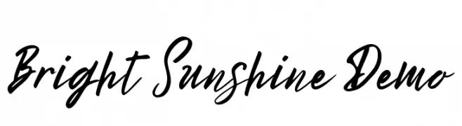
( Mindtype Co. - Putra Khan - creativemarket.com/putra_khan?u=putra_khan )
A dynamic and expressive script font with fluid, sweeping strokes.
![Bright Sunshine Demo font caratteri gratis]() Scaricare 672 Downloads@WebFont
Scaricare 672 Downloads@WebFont -
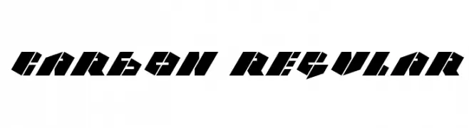
( Fonts by Krunoslav Sokic - model850.deviantart.com - Personal-use only. For commercial use please contact owner. )
A bold, angular font with a futuristic and geometric design.
![CARBON Regular font caratteri gratis]() Scaricare 672 Downloads@WebFont
Scaricare 672 Downloads@WebFont -
![Arenzi font caratteri gratis]() Scaricare 672 Downloads@WebFont
Scaricare 672 Downloads@WebFont -
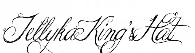
![Jellyka King's Hat font caratteri gratis]() Scaricare 672 Downloads@WebFont
Scaricare 672 Downloads@WebFont -
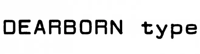
![DEARBORN type font caratteri gratis]() Scaricare 672 Downloads@WebFont
Scaricare 672 Downloads@WebFont -
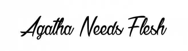
( Fonts by Greg Medina - www.dcoxy.com - Personal-use only. For commercial use please contact owner. )
A dynamic, flowing script font with elegant, cursive letterforms.
![Agatha Needs Flesh font caratteri gratis]() Scaricare 672 Downloads@WebFont
Scaricare 672 Downloads@WebFont -
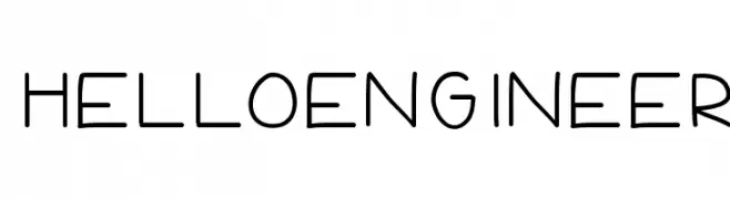
( Fonts by Jen Jones )
A playful, casual handwritten font with rounded, even strokes.
![HelloEngineer font caratteri gratis]() Scaricare 672 Downloads@WebFont
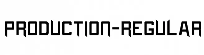
Scaricare 672 Downloads@WebFont -
![Production-Regular font caratteri gratis]() Scaricare 672 Downloads@WebFont
Scaricare 672 Downloads@WebFont


Quali sono i font più popolari adesso?
Poppins, Roboto, Montserrat, Open Sans e Lato sono molto usati per le forme pulite e l'ampia applicabilità — dall'identità di marca alle landing page e ai poster.
Quali font si usano spesso nei loghi?
Le sans serif geometriche (es. Poppins, famiglie in stile Gotham) sono scelte comuni per un branding pulito e scalabile. Per un tocco personale restano valide script e stili manoscritti. Abbina un display deciso per i titoli a un corpo testo neutro per riconoscibilità ed equilibrio.
Ogni quanto si aggiorna la lista?
Con regolarità, in base ai download e all'attività reale. Torna spesso per scoprire in anticipo le nuove preferite.
💡 Consiglio: aggiungi ai preferiti — le tendenze cambiano in fretta e i font top di oggi possono ispirare il rebranding di domani.