Benvenuto nelle Font Più Popolari — dove popolarità e qualità si incontrano. Qui trovi i font più scaricati e usati dell'anno. Se cerchi scelte sicure per logo, web o social, inizia da qui.
Ogni font top si distingue per equilibrio, leggibilità e versatilità. Troverai sans serif moderne, script eleganti, serif vintage e display minimalisti.
-
( Fonts by Allouse Studio )
A fluid, elegant handwritten font with a natural cursive flow.
 Scaricare 105 Downloads@WebFont
 -
( Fonts by Xerographer Fonts )
A rugged, textured font with a chiseled, handcrafted appearance.
![PerfectChisle font caratteri gratis]() Scaricare 105 Downloads@WebFont
Scaricare 105 Downloads@WebFont -
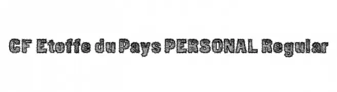
( Fonts by CloutierFontes )
A textured, fabric-inspired font with bold outlines and a handcrafted feel.
![CF Etoffe du Pays PERSONAL Regular font caratteri gratis]() Scaricare 105 Downloads@WebFont
Scaricare 105 Downloads@WebFont -
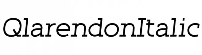
( Fonts by Qwerks )
A classic, italicized font with moderate contrast and elegant styling.
![Qlarendon Italic font caratteri gratis]() Scaricare 105 Downloads@WebFont
Scaricare 105 Downloads@WebFont -
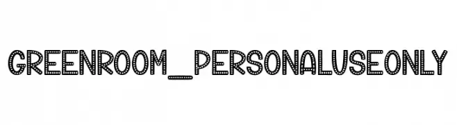
( Fonts by dcoxy )
A bold, decorative font with a dotted marquee style.
![Green Room_PersonalUseOnly font caratteri gratis]() Scaricare 105 Downloads@WebFont
Scaricare 105 Downloads@WebFont -
-
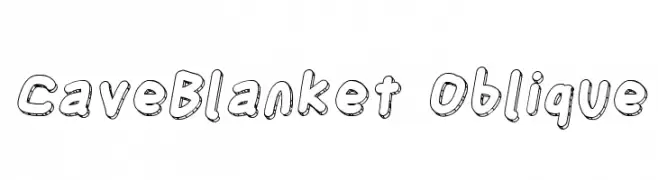
![CaveBlanket Oblique font caratteri gratis]() Scaricare 105 Downloads@WebFont
Scaricare 105 Downloads@WebFont -
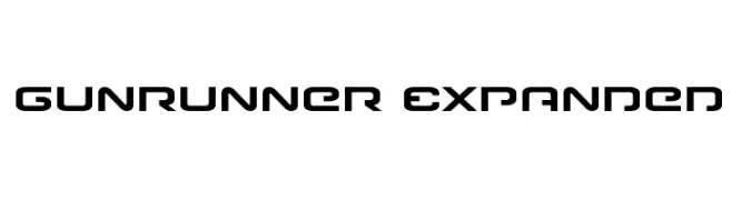
( Fonts by Iconian Fonts )
A futuristic, geometric font with bold, expanded characters and a tech-inspired style.
![Gunrunner Expanded font caratteri gratis]() Scaricare 105 Downloads@WebFont
Scaricare 105 Downloads@WebFont -
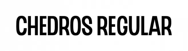
( Fonts by surotype - Adil Budianto - Personal-use only. For commercial use please contact owner. )
A bold, modern sans-serif font with clean lines and strong presence.
![CHEDROS Regular font caratteri gratis]() Scaricare 105 Downloads@WebFont
Scaricare 105 Downloads@WebFont -
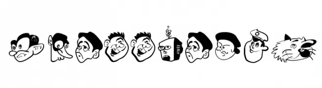
( Fonts by Manfred Klein. Free for private and charity use. Free for commercial with donation to organizations )
Cartoon caricature heads form each character in a bold, playful style.
![KoeppHeads font caratteri gratis]() Scaricare 105 Downloads@WebFont
Scaricare 105 Downloads@WebFont -
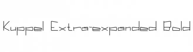
![Kuppel Extra-expanded Bold font caratteri gratis]() Scaricare 105 Downloads@WebFont
Scaricare 105 Downloads@WebFont

Quali sono i font più popolari adesso?
Poppins, Roboto, Montserrat, Open Sans e Lato sono molto usati per le forme pulite e l'ampia applicabilità — dall'identità di marca alle landing page e ai poster.
Quali font si usano spesso nei loghi?
Le sans serif geometriche (es. Poppins, famiglie in stile Gotham) sono scelte comuni per un branding pulito e scalabile. Per un tocco personale restano valide script e stili manoscritti. Abbina un display deciso per i titoli a un corpo testo neutro per riconoscibilità ed equilibrio.
Ogni quanto si aggiorna la lista?
Con regolarità, in base ai download e all'attività reale. Torna spesso per scoprire in anticipo le nuove preferite.
💡 Consiglio: aggiungi ai preferiti — le tendenze cambiano in fretta e i font top di oggi possono ispirare il rebranding di domani.