Benvenuto nelle Font Più Popolari — dove popolarità e qualità si incontrano. Qui trovi i font più scaricati e usati dell'anno. Se cerchi scelte sicure per logo, web o social, inizia da qui.
Ogni font top si distingue per equilibrio, leggibilità e versatilità. Troverai sans serif moderne, script eleganti, serif vintage e display minimalisti.
-
( Fonts by weknow - Wino S Kadir )
A modern, angular font with a futuristic and geometric design.
 Scaricare 105 Downloads@WebFont
 -
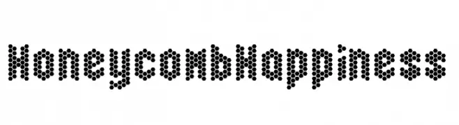
( Fonts by Chequered Ink )
A decorative font with characters made of hexagonal honeycomb patterns.
![Honeycomb Happiness font caratteri gratis]() Scaricare 105 Downloads@WebFont
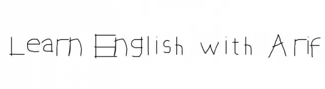
Scaricare 105 Downloads@WebFont -
![Learn English with Arif font caratteri gratis]() Scaricare 105 Downloads@WebFont
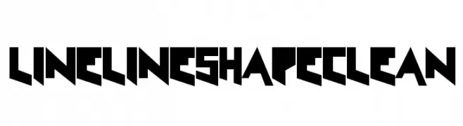
Scaricare 105 Downloads@WebFont -
![LineLineShapeClean font caratteri gratis]() Scaricare 105 Downloads@WebFont
Scaricare 105 Downloads@WebFont -
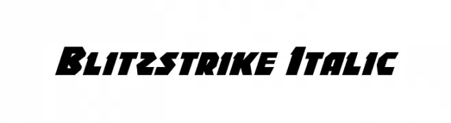
( Fonts by Daniel Zadorozny - www.iconian.com )
A bold, italic, and angular font with a futuristic style.
![Blitzstrike Italic font caratteri gratis]() Scaricare 105 Downloads@WebFont
Scaricare 105 Downloads@WebFont -
-
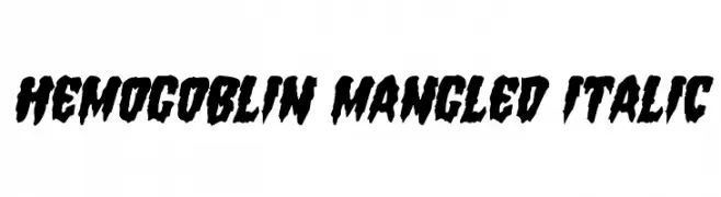
( Iconian Fonts - Daniel Zadorozny - www.iconian.com )
A bold, jagged, and chaotic font with an italic slant, perfect for impactful designs.
![Hemogoblin Mangled Italic font caratteri gratis]() Scaricare 105 Downloads@WebFont
Scaricare 105 Downloads@WebFont -
( Fonts by clever creature )
Playful handwritten font with elongated characters.
![Sqwoze font caratteri gratis]() Scaricare 105 Downloads@WebFont
Scaricare 105 Downloads@WebFont -
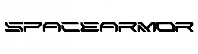
( Fonts by MaknaStudio - www.maknastudio.com - Personal-use only. For commercial use please contact owner. )
Futuristic, angular, tech-inspired font.
![SPACE ARMOR font caratteri gratis]() Scaricare 105 Downloads@WebFont
Scaricare 105 Downloads@WebFont -
Caratteri di glyphstyle. For commercial use please contact the owner.
( NOTE: This demo font is for PERSONAL USE ONLY! But any donation are very appreciated. Paypal account for donation : https://www.paypal.me/dimasardhi full version: https://www.glyphstyle.net/forteast/ contact us at styleglyph@gmail.com And follow my i )
A bold and dynamic font with thick strokes and slightly condensed letterforms.
![Forteast Demo font caratteri gratis]() Scaricare 105 Downloads@WebFont
Scaricare 105 Downloads@WebFont -
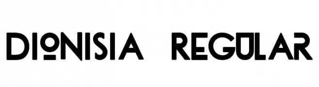
( Fonts by Tano Veron )
A bold, geometric font with a modernist design and strong emphasis on lines.
![dionisia-Regular font caratteri gratis]() Scaricare 105 Downloads@WebFont
Scaricare 105 Downloads@WebFont


Quali sono i font più popolari adesso?
Poppins, Roboto, Montserrat, Open Sans e Lato sono molto usati per le forme pulite e l'ampia applicabilità — dall'identità di marca alle landing page e ai poster.
Quali font si usano spesso nei loghi?
Le sans serif geometriche (es. Poppins, famiglie in stile Gotham) sono scelte comuni per un branding pulito e scalabile. Per un tocco personale restano valide script e stili manoscritti. Abbina un display deciso per i titoli a un corpo testo neutro per riconoscibilità ed equilibrio.
Ogni quanto si aggiorna la lista?
Con regolarità, in base ai download e all'attività reale. Torna spesso per scoprire in anticipo le nuove preferite.
💡 Consiglio: aggiungi ai preferiti — le tendenze cambiano in fretta e i font top di oggi possono ispirare il rebranding di domani.