Benvenuto nelle Font Più Popolari — dove popolarità e qualità si incontrano. Qui trovi i font più scaricati e usati dell'anno. Se cerchi scelte sicure per logo, web o social, inizia da qui.
Ogni font top si distingue per equilibrio, leggibilità e versatilità. Troverai sans serif moderne, script eleganti, serif vintage e display minimalisti.
-
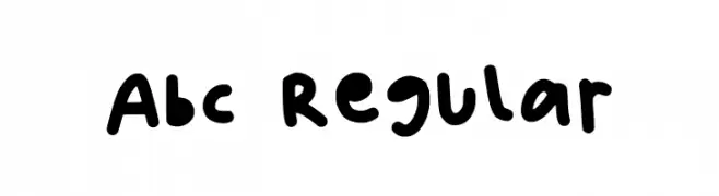
( Fonts by Indi(e)ra )
A playful, hand-drawn font with bold, rounded strokes and a casual vibe.
 Scaricare 105 Downloads@WebFont
 -
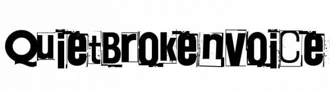
( Fonts by Juha Korhonen )
A distressed, collage-style font with a chaotic and artistic appearance.
![Quiet Broken Voice font caratteri gratis]() Scaricare 105 Downloads@WebFont
Scaricare 105 Downloads@WebFont -
( Fonts by Fanastudio )
A playful, bold font with rounded edges and a hand-drawn look.
![DIOMIRA font caratteri gratis]() Scaricare 105 Downloads@WebFont
Scaricare 105 Downloads@WebFont -
( Fonts by Fonts of Chaos - www.fontsofchaos.com - check the website before use the fonts! )
A decorative font with elongated vertical strokes and geometric patterns.
![Daryl is Parano Regular font caratteri gratis]() Scaricare 105 Downloads@WebFont
Scaricare 105 Downloads@WebFont -
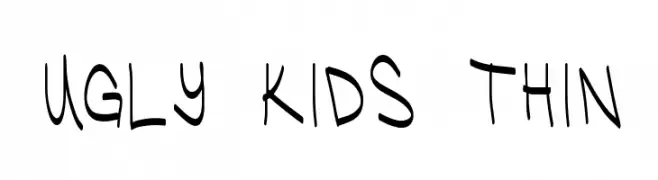
( Fonts by Chris Vile )
A playful, hand-drawn font with a whimsical and childlike style.
![Ugly Kids Thin font caratteri gratis]() Scaricare 105 Downloads@WebFont
Scaricare 105 Downloads@WebFont -
-
( Iconian Fonts - Daniel Zadorozny - www.iconian.com )
A bold, twisted, and playful font with a hand-drawn, energetic style.
![Mister Twisted Leaning font caratteri gratis]() Scaricare 105 Downloads@WebFont
Scaricare 105 Downloads@WebFont -
( Fonts by IBM )
A modern, monospaced font with a clean and geometric design.
![IBM Plex Mono font caratteri gratis]() Scaricare 105 Downloads@WebFont
Scaricare 105 Downloads@WebFont -
( Fonts by Khurasan )
A playful, bold font with rounded, bubbly characters.
![Alice Smile font caratteri gratis]() Scaricare 105 Downloads@WebFont
Scaricare 105 Downloads@WebFont -
( Fonts by DumadiStyle )
A bold, blocky font with rounded edges for a strong, modern look.
![Block Force font caratteri gratis]() Scaricare 105 Downloads@WebFont
Scaricare 105 Downloads@WebFont -
![Sharps Regular font caratteri gratis]() Scaricare 105 Downloads@WebFont
Scaricare 105 Downloads@WebFont


Quali sono i font più popolari adesso?
Poppins, Roboto, Montserrat, Open Sans e Lato sono molto usati per le forme pulite e l'ampia applicabilità — dall'identità di marca alle landing page e ai poster.
Quali font si usano spesso nei loghi?
Le sans serif geometriche (es. Poppins, famiglie in stile Gotham) sono scelte comuni per un branding pulito e scalabile. Per un tocco personale restano valide script e stili manoscritti. Abbina un display deciso per i titoli a un corpo testo neutro per riconoscibilità ed equilibrio.
Ogni quanto si aggiorna la lista?
Con regolarità, in base ai download e all'attività reale. Torna spesso per scoprire in anticipo le nuove preferite.
💡 Consiglio: aggiungi ai preferiti — le tendenze cambiano in fretta e i font top di oggi possono ispirare il rebranding di domani.