Benvenuto nelle Font Più Popolari — dove popolarità e qualità si incontrano. Qui trovi i font più scaricati e usati dell'anno. Se cerchi scelte sicure per logo, web o social, inizia da qui.
Ogni font top si distingue per equilibrio, leggibilità e versatilità. Troverai sans serif moderne, script eleganti, serif vintage e display minimalisti.
-
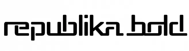
( Fonts by Apostrophic Lab )
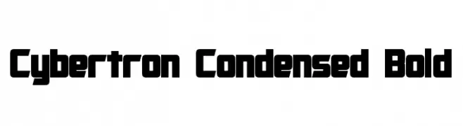
A bold, geometric font with a modern and futuristic style.
 Scaricare 431 Downloads@WebFont
 -
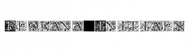
( Fonts by Paul Lloyd )
Ornate, decorative initials with floral motifs in a vintage style.
![Florana_Initials font caratteri gratis]() Scaricare 431 Downloads@WebFont
Scaricare 431 Downloads@WebFont -
![KBFirstGradeGrown font caratteri gratis]() Scaricare 431 Downloads@WebFont
Scaricare 431 Downloads@WebFont -
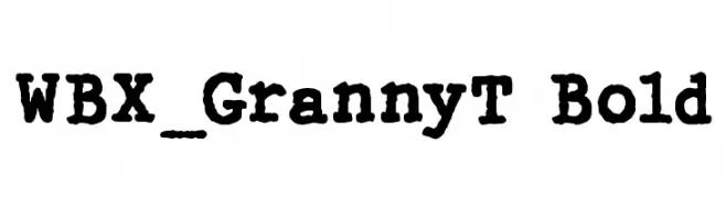
( Fonts by Vigilante Typeface Corporation Larry Yerkes. Personal-use only. For commercial use please contact owner. )
A bold, textured font with a vintage, handcrafted appearance.
![WBX_GrannyT Bold font caratteri gratis]() Scaricare 431 Downloads@WebFont
Scaricare 431 Downloads@WebFont -
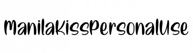
( Fonts by Typhoon Type - Suthi Srisopha - www.typhoontype.net - Personal-use only. For commercial use please contact owner. )
A bold, playful handwritten font with smooth, flowing curves.
![ManilaKissPersonalUse font caratteri gratis]() Scaricare 431 Downloads@WebFont
Scaricare 431 Downloads@WebFont -
-
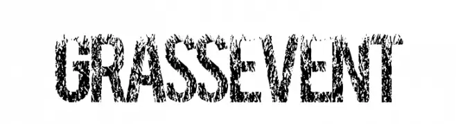
( Fonts by a Max Infeld - XEROGRAPHER FONTS - xerographer.blogspot.com . Personal-use only. For commercial use please contact owner. )
A textured, nature-inspired font with a rugged, organic appearance.
![GRASSEVENT font caratteri gratis]() Scaricare 431 Downloads@WebFont
Scaricare 431 Downloads@WebFont -
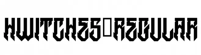
( Fonts by www.legacyofdefeat.com )
A bold, angular font with a gothic and modern aesthetic.
![HWitches-Regular font caratteri gratis]() Scaricare 431 Downloads@WebFont
Scaricare 431 Downloads@WebFont -
![so this is it font caratteri gratis]() Scaricare 431 Downloads@WebFont
Scaricare 431 Downloads@WebFont -
( Fonts by Almeera Studio - Rinto Dwi Nugroho - Personal-use only. For commercial use please contact owner. )
A lively, handwritten font with a playful and elegant style.
![SantaFe font caratteri gratis]() Scaricare 431 Downloads@WebFont
Scaricare 431 Downloads@WebFont -
![pix-PixelFJVerdana12pt font caratteri gratis]() Scaricare 431 Downloads
Scaricare 431 Downloads -
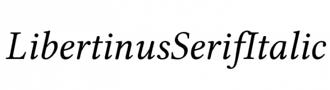
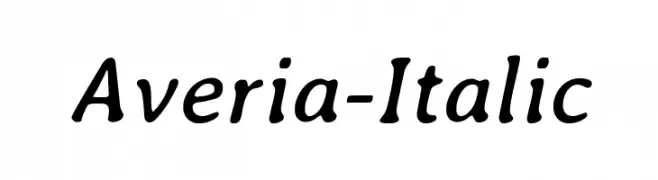
( Fonts by Philipp H. Poll - Personal-use only. For commercial use please contact owner. )
An elegant serif font with an italic slant, offering a classic and sophisticated look.
![Libertinus Serif Italic font caratteri gratis]() Scaricare 431 Downloads@WebFont
Scaricare 431 Downloads@WebFont -
![Cybertron Condensed Bold font caratteri gratis]() Scaricare 431 Downloads@WebFont
Scaricare 431 Downloads@WebFont -
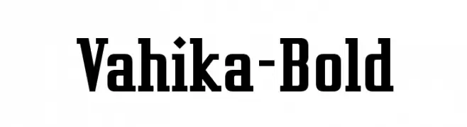
( Fonts by www.typodermicfonts.com - Ray Larabie )
A bold, slab serif font with strong, well-defined characters.
![Vahika-Bold font caratteri gratis]() Scaricare 431 Downloads@WebFont
Scaricare 431 Downloads@WebFont -
( Fonts by www.aenigmafonts.com )
A modern script-sans hybrid with smooth, connected strokes and a dynamic feel.
![Registry -BRK- font caratteri gratis]() Scaricare 431 Downloads@WebFont
Scaricare 431 Downloads@WebFont -
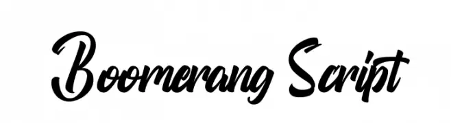
( Fonts by Thirtypath - Personal-use only. For commercial use please contact owner. )
A bold and dynamic script font with flowing, energetic letterforms.
![Boomerang Script font caratteri gratis]() Scaricare 431 Downloads@WebFont
Scaricare 431 Downloads@WebFont -
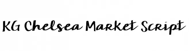
![KG Chelsea Market Script font caratteri gratis]() Scaricare 431 Downloads@WebFont
Scaricare 431 Downloads@WebFont -
( Fonts by a Neale Davidson - www.pixelsagas.com. Personal-use only. For commercial use please contact owner. )
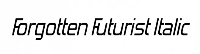
A bold, italicized font with a futuristic and dynamic style.
![Starkiller Italic font caratteri gratis]() Scaricare 431 Downloads@WebFont
Scaricare 431 Downloads@WebFont -
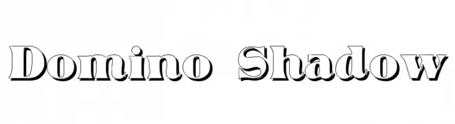
( Fonts by Typographer Mediengestaltung - Personal-use only. For commercial use please contact owner. )
A bold serif font with a 3D shadow effect, perfect for impactful headlines.
![Domino Shadow font caratteri gratis]() Scaricare 431 Downloads@WebFont
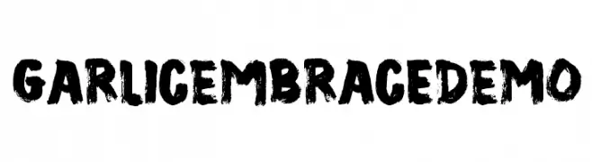
Scaricare 431 Downloads@WebFont -
![GarlicEmbraceDEMO font caratteri gratis]() Scaricare 431 Downloads@WebFont
Scaricare 431 Downloads@WebFont -
( Fonts by Galdino Otten - Personal-use only. For commercial use please contact owner. )
A playful, hand-drawn font with whimsical details and a bold, cartoonish style.
![Pet Shop font caratteri gratis]() Scaricare 431 Downloads@WebFont
Scaricare 431 Downloads@WebFont -
![Averia-Italic font caratteri gratis]() Scaricare 431 Downloads@WebFont
Scaricare 431 Downloads@WebFont -
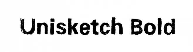
![Unisketch Bold font caratteri gratis]() Scaricare 431 Downloads@WebFont
Scaricare 431 Downloads@WebFont -
![Forgotten Futurist Italic font caratteri gratis]() Scaricare 431 Downloads@WebFont
Scaricare 431 Downloads@WebFont -
( Fonts by Projeto Tipo da Fonte )
A bold, angular Gothic font with a modern, cyberpunk twist.
![CiberGotica font caratteri gratis]() Scaricare 431 Downloads@WebFont
Scaricare 431 Downloads@WebFont -
( Fonts by Origin Type )
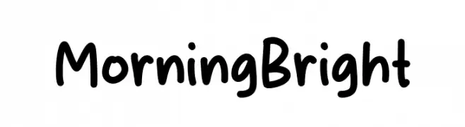
Playful handwritten font with rounded edges.
![Morning Bright font caratteri gratis]() Scaricare 431 Downloads@WebFont
Scaricare 431 Downloads@WebFont -
( Fonts by Apostrophic Lab )
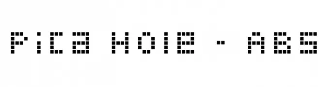
A pixelated, retro-style font with a blocky, geometric design.
![Pica Hole - ABS font caratteri gratis]() Scaricare 430 Downloads@WebFont
Scaricare 430 Downloads@WebFont -
![Umberette font caratteri gratis]() Scaricare 430 Downloads@WebFont
Scaricare 430 Downloads@WebFont -
( Fonts by dalerms - Daler Mukhiddinov - Personal-use only. For commercial use please contact owner. )
A bold, condensed font with a strong, modern presence.
![Krisha Regular font caratteri gratis]() Scaricare 430 Downloads@WebFont
Scaricare 430 Downloads@WebFont -
( Fonts by Vladimir Nikolic - www.creativefabrica.com/designer/vladimirnikolic/ - Personal-use only. For commercial use please contact owner. )
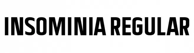
A bold, modern font with clean lines and strong presence.
![Insominia Regular font caratteri gratis]() Scaricare 430 Downloads@WebFont
Scaricare 430 Downloads@WebFont -
( www.southype.com )
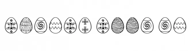
Hand-drawn Easter egg illustrations with varied decorative patterns.
![Easter eggs ST font caratteri gratis]() Scaricare 430 Downloads@WebFont
Scaricare 430 Downloads@WebFont -
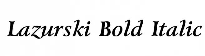
![Lazurski Bold Italic font caratteri gratis]() Scaricare 430 Downloads
Scaricare 430 Downloads -
( Fonts by Village Type and Design LLC & Cristiano Sobral - Personal-use only. For commercial use please contact owner. )
A bold, italicized sans-serif font with a modern and dynamic style.
![Tanohe Sans Bold Italic font caratteri gratis]() Scaricare 430 Downloads@WebFont
Scaricare 430 Downloads@WebFont -
( Fonts by dartcanada.tripod.com - Darren Rigby )
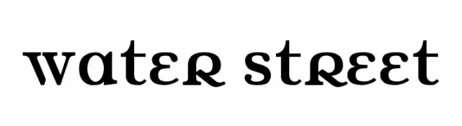
A bold, high-contrast serif font with a modern yet classic style.
![Water Street font caratteri gratis]() Scaricare 430 Downloads@WebFont
Scaricare 430 Downloads@WebFont -
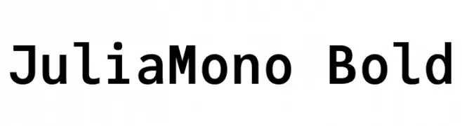
( Fonts by cormullion )
A bold, monospaced font with clean lines and high legibility.
![JuliaMono Bold font caratteri gratis]() Scaricare 430 Downloads@WebFont
Scaricare 430 Downloads@WebFont -
![Roicamonta Words font caratteri gratis]() Scaricare 430 Downloads@WebFont
Scaricare 430 Downloads@WebFont


Quali sono i font più popolari adesso?
Poppins, Roboto, Montserrat, Open Sans e Lato sono molto usati per le forme pulite e l'ampia applicabilità — dall'identità di marca alle landing page e ai poster.
Quali font si usano spesso nei loghi?
Le sans serif geometriche (es. Poppins, famiglie in stile Gotham) sono scelte comuni per un branding pulito e scalabile. Per un tocco personale restano valide script e stili manoscritti. Abbina un display deciso per i titoli a un corpo testo neutro per riconoscibilità ed equilibrio.
Ogni quanto si aggiorna la lista?
Con regolarità, in base ai download e all'attività reale. Torna spesso per scoprire in anticipo le nuove preferite.
💡 Consiglio: aggiungi ai preferiti — le tendenze cambiano in fretta e i font top di oggi possono ispirare il rebranding di domani.