Benvenuto nelle Font Più Popolari — dove popolarità e qualità si incontrano. Qui trovi i font più scaricati e usati dell'anno. Se cerchi scelte sicure per logo, web o social, inizia da qui.
Ogni font top si distingue per equilibrio, leggibilità e versatilità. Troverai sans serif moderne, script eleganti, serif vintage e display minimalisti.
-
( Fonts by Arkandis Digital Foundry )
A bold and italicized font with strong, consistent strokes and a dynamic slant.
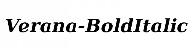 Scaricare 432 Downloads@WebFont
 -
( Fonts by a Max Infeld - XEROGRAPHER FONTS - xerographer.blogspot.com . Personal-use only. For commercial use please contact owner. )
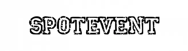
A bold, distressed font with a vintage, grunge aesthetic.
![SpotEvent font caratteri gratis]() Scaricare 432 Downloads@WebFont
Scaricare 432 Downloads@WebFont -
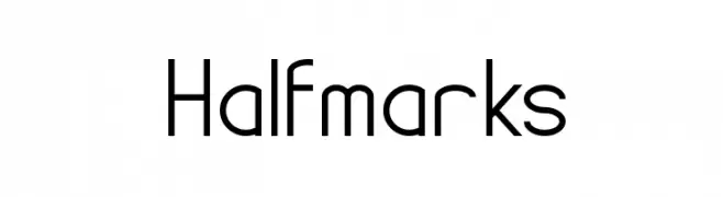
![Halfmarks font caratteri gratis]() Scaricare 432 Downloads@WebFont
Scaricare 432 Downloads@WebFont -
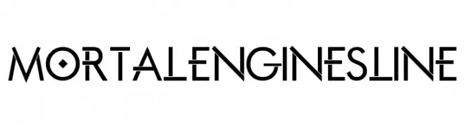
![Mortal Engines Line font caratteri gratis]() Scaricare 432 Downloads@WebFont
Scaricare 432 Downloads@WebFont -
![Voyager NBP font caratteri gratis]() Scaricare 432 Downloads@WebFont
Scaricare 432 Downloads@WebFont -
-
( Fonts by Morning Time Studio - Personal-use only. For commercial use please contact owner. )
A bold, rounded font with a playful and friendly style.
![Melon Honey font caratteri gratis]() Scaricare 432 Downloads@WebFont
Scaricare 432 Downloads@WebFont -
( Fonts by www.fugit-tempus.de )
A bold, extended font with narrow, tightly spaced characters.
![SF Iron Gothic Extended font caratteri gratis]() Scaricare 432 Downloads@WebFont
Scaricare 432 Downloads@WebFont -
( Chris Vile - www.chrisvile.com )
A bold, futuristic font with geometric elements and high contrast.
![WilaMilita font caratteri gratis]() Scaricare 432 Downloads@WebFont
Scaricare 432 Downloads@WebFont -
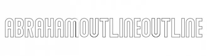
( Sabrtype - creativemarket.com/Sabrtype )
A modern, bold outline font with geometric letterforms and consistent width.
![Abraham Outline Outline font caratteri gratis]() Scaricare 432 Downloads@WebFont
Scaricare 432 Downloads@WebFont -
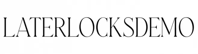
( Fonts by Letterhend Studio - Hendry Juanda - Personal-use only. For commercial use please contact owner. )
A refined serif font with high contrast and elegant serifs.
![LaterlocksDEMO font caratteri gratis]() Scaricare 432 Downloads@WebFont
Scaricare 432 Downloads@WebFont -
![unciaal font caratteri gratis]() Scaricare 432 Downloads@WebFont
Scaricare 432 Downloads@WebFont -
![Jacek Zieba-Jasinski Regular font caratteri gratis]() Scaricare 432 Downloads@WebFont
Scaricare 432 Downloads@WebFont -
( Fonts by Kong Font - https://fontkong.com/ - Personal-use only. For commercial use please contact owner. )
A modern, elegant script font with flowing, cursive characters.
![Margarett font caratteri gratis]() Scaricare 432 Downloads@WebFont
Scaricare 432 Downloads@WebFont -
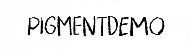
( Fonts by Pizzadude )
A textured, hand-drawn font with an informal, artistic style.
![PigmentDEMO font caratteri gratis]() Scaricare 432 Downloads@WebFont
Scaricare 432 Downloads@WebFont -
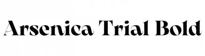
( Fonts by Zetafonts - Personal-use only. For commercial use please contact owner. )
A bold, high-contrast serif font with a dramatic and elegant style.
![Arsenica Trial Bold font caratteri gratis]() Scaricare 432 Downloads@WebFont
Scaricare 432 Downloads@WebFont -
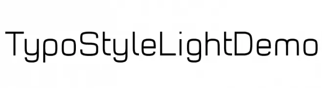
( Fonts by www.studiotypo.com - Personal-use only. For commercial use please contact owner. )
A modern, geometric sans-serif font with uniform stroke widths and rounded edges.
![Typo Style Light Demo font caratteri gratis]() Scaricare 432 Downloads@WebFont
Scaricare 432 Downloads@WebFont -
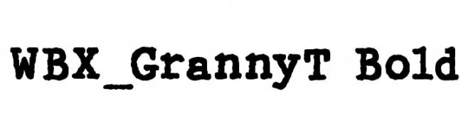
( Fonts by Vigilante Typeface Corporation Larry Yerkes. Personal-use only. For commercial use please contact owner. )
A bold, textured font with a vintage, handcrafted appearance.
![WBX_GrannyT Bold font caratteri gratis]() Scaricare 432 Downloads@WebFont
Scaricare 432 Downloads@WebFont -
![Glovebox font caratteri gratis]() Scaricare 432 Downloads@WebFont
Scaricare 432 Downloads@WebFont -
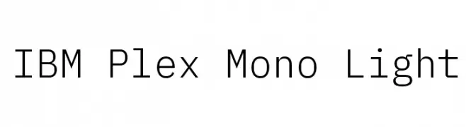
( Copyright © 2017 IBM Corp. with Reserved Font Name "Plex" )
A clean, modern monospaced font with light strokes and geometric design.
![IBM Plex Mono Light font caratteri gratis]() Scaricare 432 Downloads@WebFont
Scaricare 432 Downloads@WebFont -
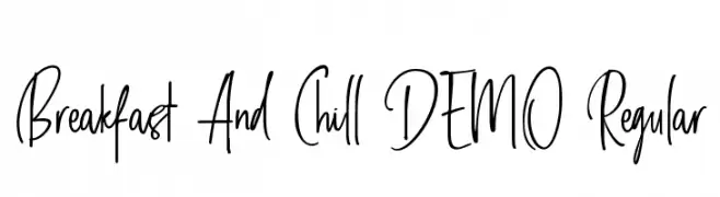
![Breakfast And Chill DEMO Regular font caratteri gratis]() Scaricare 432 Downloads@WebFont
Scaricare 432 Downloads@WebFont -
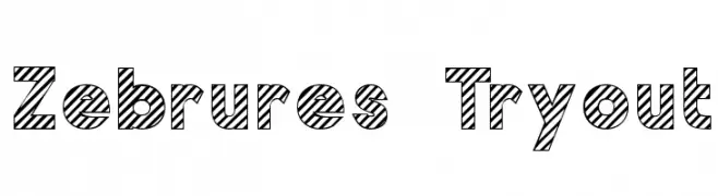
![Zebrures Tryout font caratteri gratis]() Scaricare 432 Downloads@WebFont
Scaricare 432 Downloads@WebFont -
![so this is it font caratteri gratis]() Scaricare 432 Downloads@WebFont
Scaricare 432 Downloads@WebFont -
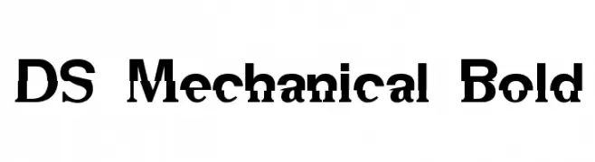
![DS Mechanical Bold font caratteri gratis]() Scaricare 432 Downloads@WebFont
Scaricare 432 Downloads@WebFont -
( Fonts by www.aenigmafonts.com )
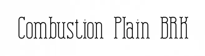
A decorative serif font with elongated serifs and a tall, narrow structure.
![Combustion Plain BRK font caratteri gratis]() Scaricare 432 Downloads@WebFont
Scaricare 432 Downloads@WebFont -
( Fonts by weknow - Wino S Kadir )
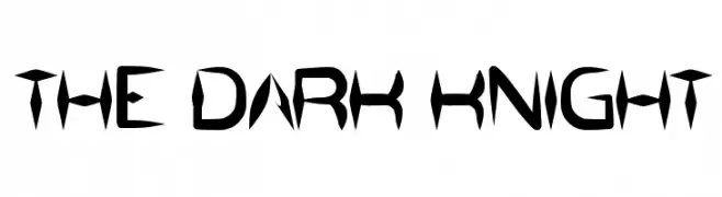
A bold, angular font with a modern gothic flair, perfect for dramatic designs.
![the dark knight font caratteri gratis]() Scaricare 432 Downloads@WebFont
Scaricare 432 Downloads@WebFont -
( Fonts by Misti`s Fonts - mistifonts.com - Personal-use only. For commercial use please contact owner. )
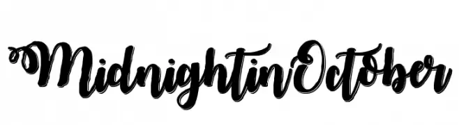
A bold, decorative script font with elegant swashes and high contrast.
![MidnightinOctober font caratteri gratis]() Scaricare 432 Downloads@WebFont
Scaricare 432 Downloads@WebFont -
![pix-PixelFJVerdana12pt font caratteri gratis]() Scaricare 432 Downloads
Scaricare 432 Downloads -
( Fonts by Philipp H. Poll - Personal-use only. For commercial use please contact owner. )
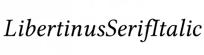
An elegant serif font with an italic slant, offering a classic and sophisticated look.
![Libertinus Serif Italic font caratteri gratis]() Scaricare 432 Downloads@WebFont
Scaricare 432 Downloads@WebFont -
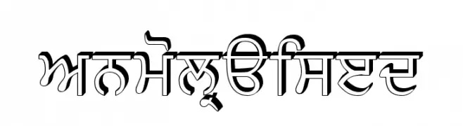
![AnmolRaised font caratteri gratis]() Scaricare 432 Downloads@WebFont
Scaricare 432 Downloads@WebFont -
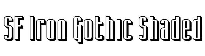
( Fonts by www.fugit-tempus.de )
A bold, gothic-style font with a shaded, three-dimensional effect.
![SF Iron Gothic Shaded font caratteri gratis]() Scaricare 432 Downloads@WebFont
Scaricare 432 Downloads@WebFont -
( Fonts by Rich Gast - www.greywolfwebworks.com Commerciali Caratteri )
A bold, distressed font with a glitch-like effect, ideal for tech-inspired designs.
![Ground Zero font caratteri gratis]() Scaricare 432 Downloads
Scaricare 432 Downloads -
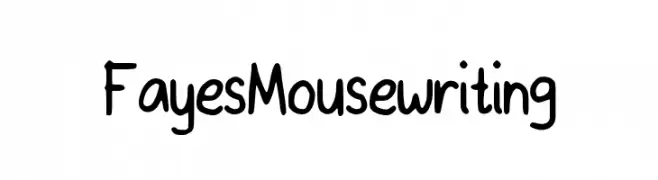
![FayesMousewriting font caratteri gratis]() Scaricare 432 Downloads@WebFont
Scaricare 432 Downloads@WebFont -
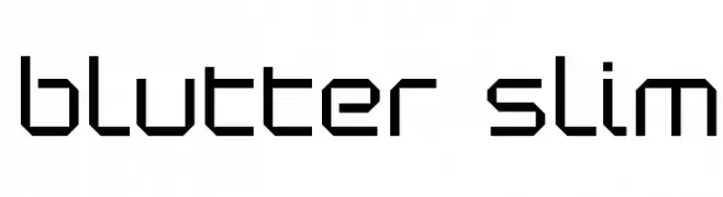
( Fonts by www.koenhachmang.com - Glitch )
A geometric, modern font with angular, block-like characters.
![Blutter Slim font caratteri gratis]() Scaricare 432 Downloads@WebFont
Scaricare 432 Downloads@WebFont -
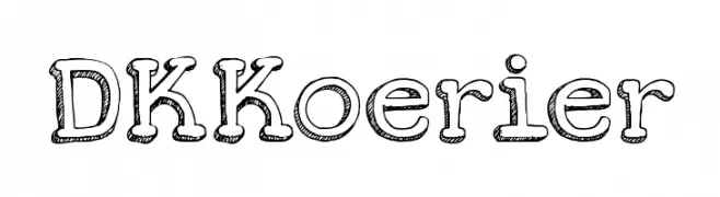
![DKKoerier font caratteri gratis]() Scaricare 432 Downloads@WebFont
Scaricare 432 Downloads@WebFont -
( Fonts by Mr Fisk - Mike Larsson - fontorama.net )
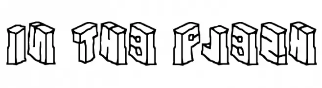
A bold, 3D block font with a modern, geometric style and shadow effect.
![In The Flesh font caratteri gratis]() Scaricare 432 Downloads@WebFont
Scaricare 432 Downloads@WebFont


Quali sono i font più popolari adesso?
Poppins, Roboto, Montserrat, Open Sans e Lato sono molto usati per le forme pulite e l'ampia applicabilità — dall'identità di marca alle landing page e ai poster.
Quali font si usano spesso nei loghi?
Le sans serif geometriche (es. Poppins, famiglie in stile Gotham) sono scelte comuni per un branding pulito e scalabile. Per un tocco personale restano valide script e stili manoscritti. Abbina un display deciso per i titoli a un corpo testo neutro per riconoscibilità ed equilibrio.
Ogni quanto si aggiorna la lista?
Con regolarità, in base ai download e all'attività reale. Torna spesso per scoprire in anticipo le nuove preferite.
💡 Consiglio: aggiungi ai preferiti — le tendenze cambiano in fretta e i font top di oggi possono ispirare il rebranding di domani.