Benvenuto nelle Font Più Popolari — dove popolarità e qualità si incontrano. Qui trovi i font più scaricati e usati dell'anno. Se cerchi scelte sicure per logo, web o social, inizia da qui.
Ogni font top si distingue per equilibrio, leggibilità e versatilità. Troverai sans serif moderne, script eleganti, serif vintage e display minimalisti.
-
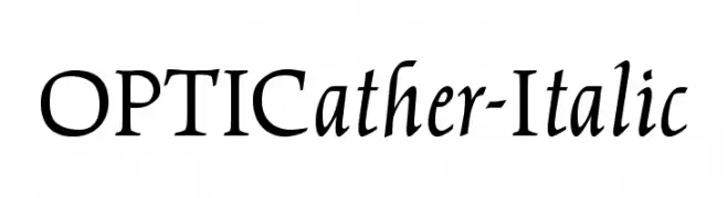
( Fonts by Castcraft Software - opti.netii.net - check the website before use )
A classic serif font with elegant italicized lines and medium contrast.
 Scaricare 415 Downloads@WebFont
 -
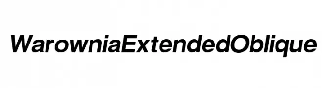
( Fonts by CannotIntoSpaceFonts - KineticPlasma Fonts - Personal-use only. For commercial use please contact owner. )
A modern, oblique font with extended width and consistent stroke width for a sleek, professional look.
![Warownia Extended Oblique font caratteri gratis]() Scaricare 415 Downloads@WebFont
Scaricare 415 Downloads@WebFont -
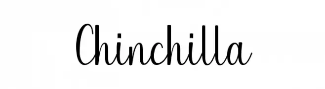
( JoeeCreative - Joe Creative - creativemarket.com/JoeeCreative )
A charming script font with elegant, flowing curves and a handwritten feel.
![Chinchilla font caratteri gratis]() Scaricare 415 Downloads@WebFont
Scaricare 415 Downloads@WebFont -
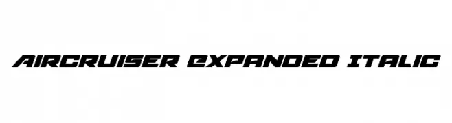
( Fonts by Daniel Zadorozny - www.iconian.com - Free for personal use )
A bold, expanded, and italicized font with a modern, dynamic style.
![Aircruiser Expanded Italic font caratteri gratis]() Scaricare 415 Downloads@WebFont
Scaricare 415 Downloads@WebFont -
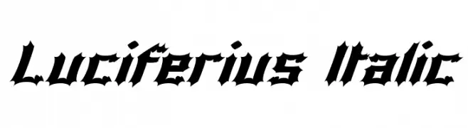
( Fonts by Apostrophic Lab )
A bold, gothic-inspired italic font with sharp, angular edges and dramatic flair.
![Luciferius Italic font caratteri gratis]() Scaricare 415 Downloads@WebFont
Scaricare 415 Downloads@WebFont -
-
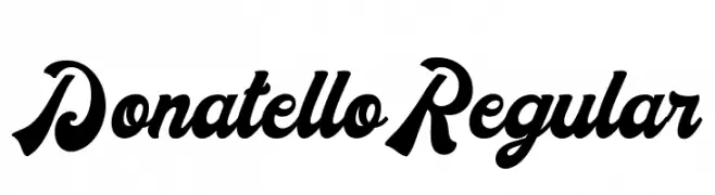
( Fonts by madeDeduk - Personal-use only. For commercial use please contact owner. )
A bold, dynamic script font with high contrast and flowing characters.
![DonatelloRegular font caratteri gratis]() Scaricare 415 Downloads@WebFont
Scaricare 415 Downloads@WebFont -
![Criminal Upright font caratteri gratis]() Scaricare 415 Downloads@WebFont
Scaricare 415 Downloads@WebFont -
![Groteski Bold font caratteri gratis]() Scaricare 415 Downloads@WebFont
Scaricare 415 Downloads@WebFont -
( Allen R. Walden )
A geometric, angular font with a futuristic, digital display style.
![Crystal Italic font caratteri gratis]() Scaricare 415 Downloads
Scaricare 415 Downloads -
( Fonts by Alexander Pravdin - Personal-use only. For commercial use please contact owner. )
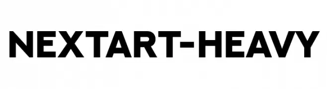
A bold, geometric font with a modern and clean aesthetic.
![NEXTART-Heavy font caratteri gratis]() Scaricare 415 Downloads@WebFont
Scaricare 415 Downloads@WebFont -
( Fonts by Jacob Fisher - www.pizzadude.dk )
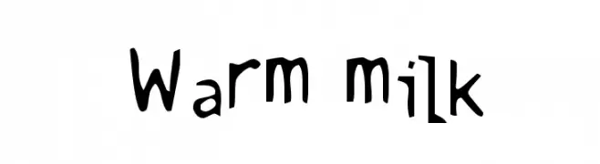
A playful, hand-drawn style with irregular strokes and a whimsical vibe.
![Warm milk font caratteri gratis]() Scaricare 415 Downloads@WebFont
Scaricare 415 Downloads@WebFont -
( Fonts by Maulana Creative )
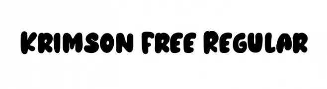
A bold, playful font with rounded, bubbly characters and a retro vibe.
![Krimson Free Regular font caratteri gratis]() Scaricare 415 Downloads@WebFont
Scaricare 415 Downloads@WebFont -
( Fonts by Daniel Zadorozny - www.iconian.com )
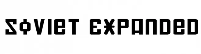
A bold, geometric font with an industrial, Soviet-era aesthetic.
![Soviet Expanded font caratteri gratis]() Scaricare 415 Downloads@WebFont
Scaricare 415 Downloads@WebFont -
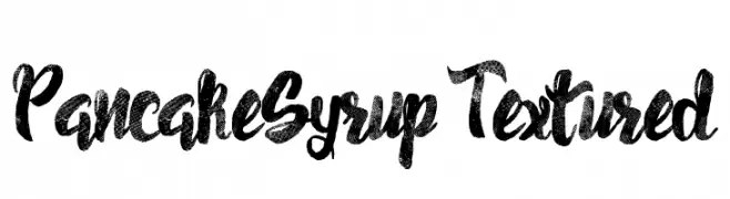
![Pancake Syrup - Textured font caratteri gratis]() Scaricare 415 Downloads@WebFont
Scaricare 415 Downloads@WebFont -
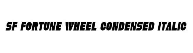
![SF Fortune Wheel Condensed Italic font caratteri gratis]() Scaricare 415 Downloads@WebFont
Scaricare 415 Downloads@WebFont -
![Shepherdy font caratteri gratis]() Scaricare 415 Downloads@WebFont
Scaricare 415 Downloads@WebFont -
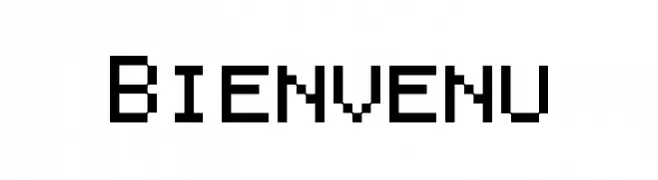
( Fonts by a Neale Davidson - www.pixelsagas.com. Personal-use only. For commercial use please contact owner. )
A pixelated, monospaced font with a retro digital aesthetic.
![Bienvenu font caratteri gratis]() Scaricare 415 Downloads@WebFont
Scaricare 415 Downloads@WebFont -
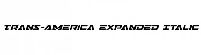
( Fonts by Daniel Zadorozny - www.iconian.com )
A bold, italicized, and expanded font with a modern, dynamic style.
![Trans-America Expanded Italic font caratteri gratis]() Scaricare 415 Downloads@WebFont
Scaricare 415 Downloads@WebFont -
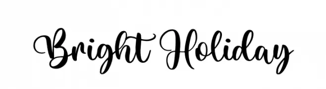
( Fonts by RaffaSyad Studio - www.creativefabrica.com/designer/r-studio/ - Personal-use only. For commercial use please contact owner. )
A lively and flowing script font with elegant curves and playful loops.
![Bright Holiday font caratteri gratis]() Scaricare 415 Downloads@WebFont
Scaricare 415 Downloads@WebFont -
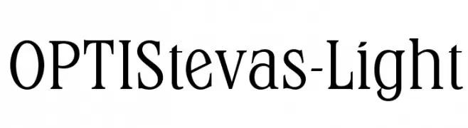
( Fonts by Castcraft Software - OPTI Fonts Archive - opti.netii.net - Personal-use only. For commercial use please contact owner. )
A classic serif font with elegant strokes and a light weight.
![OPTIStevas-Light font caratteri gratis]() Scaricare 415 Downloads@WebFont
Scaricare 415 Downloads@WebFont -
![SPAtlantis font caratteri gratis]() Scaricare 415 Downloads@WebFont
Scaricare 415 Downloads@WebFont -
( Fonts by Vanessa Bays - bythebutterfly.com )
A playful, hand-drawn font with tall, narrow letters and whimsical doodles.
![LittleMissPriss font caratteri gratis]() Scaricare 415 Downloads@WebFont
Scaricare 415 Downloads@WebFont -
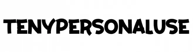
( Fonts by twinletter )
A bold, playful font with a hand-drawn, whimsical style.
![Teny Personal Use font caratteri gratis]() Scaricare 415 Downloads@WebFont
Scaricare 415 Downloads@WebFont -
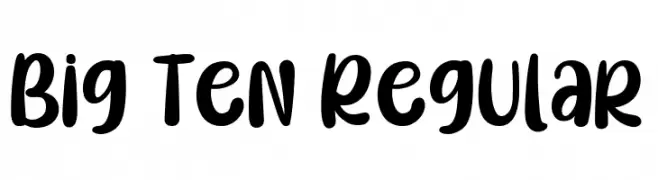
( Fonts by Type on Studio )
A bold, playful font with rounded, thick strokes and a slightly condensed style.
![Big Ten Regular font caratteri gratis]() Scaricare 415 Downloads@WebFont
Scaricare 415 Downloads@WebFont -
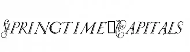
( Paul Lloyd Fonts )
An elegant, decorative font with floral-adorned capitals and sleek, italicized lowercase letters.
![Springtime_Capitals font caratteri gratis]() Scaricare 415 Downloads@WebFont
Scaricare 415 Downloads@WebFont -
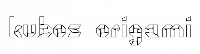
![kubos origami font caratteri gratis]() Scaricare 415 Downloads@WebFont
Scaricare 415 Downloads@WebFont -
( Fonts by Perspectype Studio - Letterena.com - Personal-use only. For commercial use please contact owner. )
A lively and energetic handwritten font with fluid strokes and playful curves.
![Yesillow font caratteri gratis]() Scaricare 415 Downloads@WebFont
Scaricare 415 Downloads@WebFont -
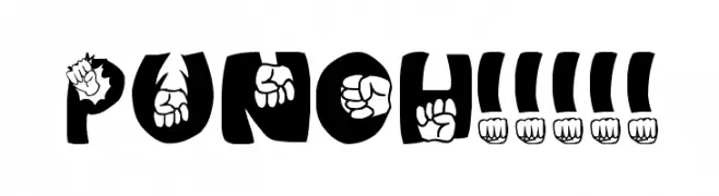
![PUNCH!!!!! font caratteri gratis]() Scaricare 415 Downloads@WebFont
Scaricare 415 Downloads@WebFont -
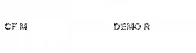
![CF Motherboard DEMO Regular font caratteri gratis]() Scaricare 415 Downloads@WebFont
Scaricare 415 Downloads@WebFont -
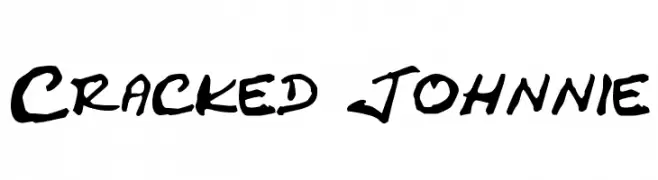
( Fonts by pOPdOG fONTS - Dimitris Kolyris - popdog_fonts.tripod.com Commerciali Caratteri )
A bold, textured script font with a cracked, distressed appearance.
![Cracked Johnnie font caratteri gratis]() Scaricare 415 Downloads
Scaricare 415 Downloads -
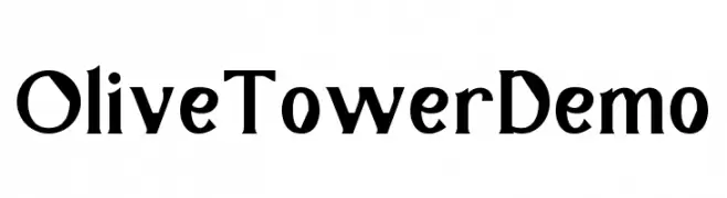
( Fonts by Noah Type - noahtype.com - Personal-use only. For commercial use please contact owner. )
A bold, modern font with high contrast and geometric influences.
![OliveTowerDemo font caratteri gratis]() Scaricare 415 Downloads@WebFont
Scaricare 415 Downloads@WebFont -
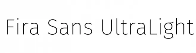
( Fonts by Mozilla Foundation - Personal-use only. For commercial use please contact owner. )
A modern, ultra-light sans-serif font with clean lines and high legibility.
![Fira Sans UltraLight font caratteri gratis]() Scaricare 415 Downloads@WebFont
Scaricare 415 Downloads@WebFont -
![Yamaxanadu font caratteri gratis]() Scaricare 415 Downloads@WebFont
Scaricare 415 Downloads@WebFont -
![Aayat Quraan 5 font caratteri gratis]() Scaricare 415 Downloads@WebFont
Scaricare 415 Downloads@WebFont -
![Goodlights font caratteri gratis]() Scaricare 415 Downloads@WebFont
Scaricare 415 Downloads@WebFont


Quali sono i font più popolari adesso?
Poppins, Roboto, Montserrat, Open Sans e Lato sono molto usati per le forme pulite e l'ampia applicabilità — dall'identità di marca alle landing page e ai poster.
Quali font si usano spesso nei loghi?
Le sans serif geometriche (es. Poppins, famiglie in stile Gotham) sono scelte comuni per un branding pulito e scalabile. Per un tocco personale restano valide script e stili manoscritti. Abbina un display deciso per i titoli a un corpo testo neutro per riconoscibilità ed equilibrio.
Ogni quanto si aggiorna la lista?
Con regolarità, in base ai download e all'attività reale. Torna spesso per scoprire in anticipo le nuove preferite.
💡 Consiglio: aggiungi ai preferiti — le tendenze cambiano in fretta e i font top di oggi possono ispirare il rebranding di domani.